Today’s post is a guest post by True Colour Expert and dear friend Claire Jefford. She’s sharing how her projects have evolved since she participated my True Colour Expert Training (still seats left in Dallas for November):
Have you ever experienced the eye-opening magic of Maria Killam’s colour insights?
You know, those things you can no longer unsee? Basically, it’s like a revelation that rewires your perception of colour and design.
If you’ve been down this design road, chances are a specific project immediately comes to mind. And you likely remember the moment your minds-eye pointed directly to it, making it an unforgettable lesson.
One you can’t simply unsee.
An early decorating project
For me it was one of my first custom decorating projects and it came 6 months after opening my design firm in 2011. My client wanted a new look for her dated living room. As you can see from the before image, the room was reminiscent of Laura Ashley with a busy traditional floral pattern on the sofa, loveseat, accent cushions and window treatments. It was so mathcy-matchy!
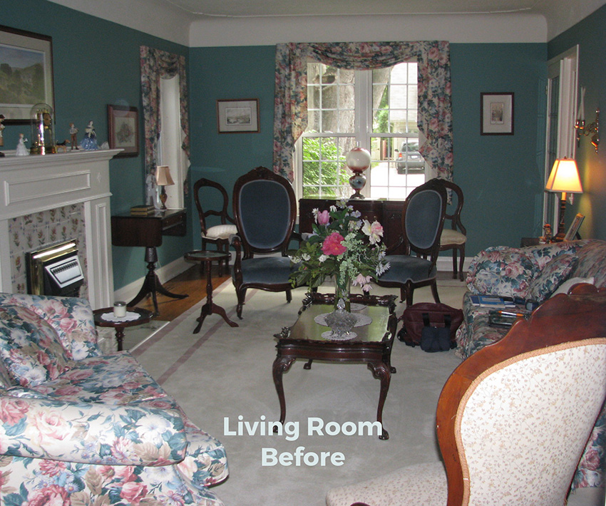
I started with a new floor plan to eliminate some of the furniture as the room was quite cluttered. We were reusing some of my clients antique pieces, so the room would remain traditional which wasn’t my usual style, but I was excited to redesign it with a fresh look in mind by doing an entirely new colour scheme.
Updating bossy fireplace tile
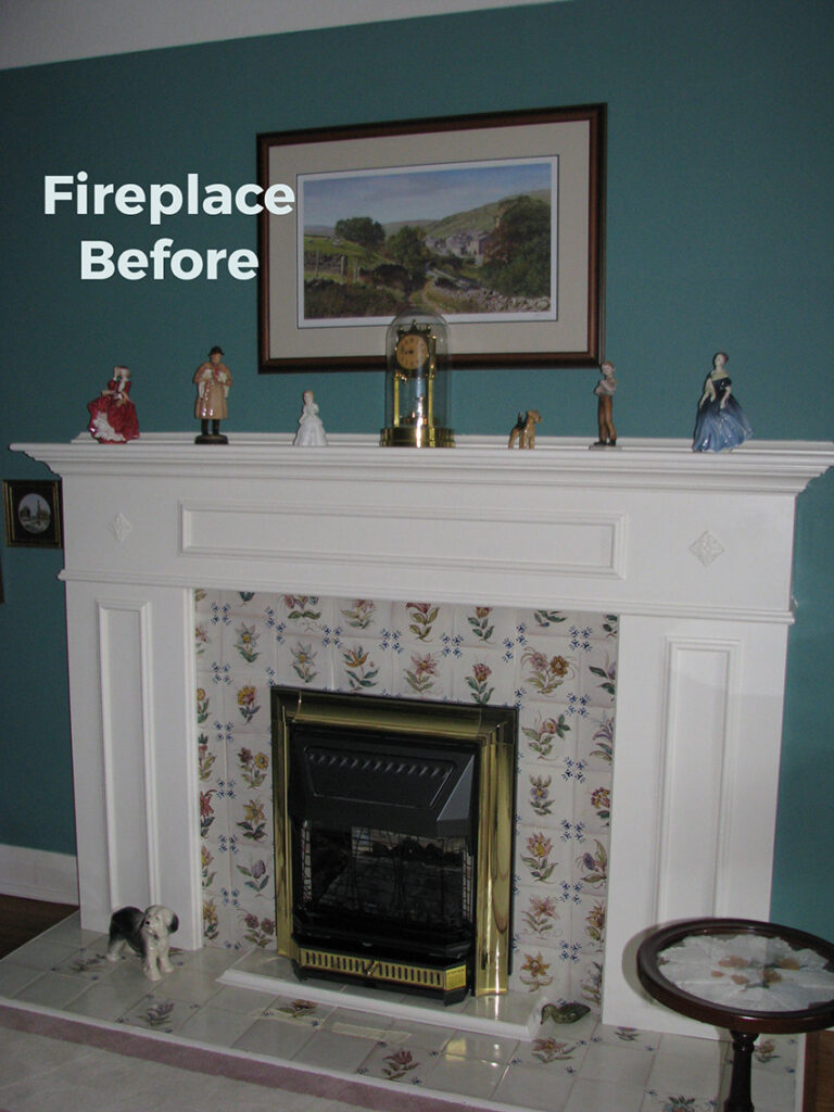
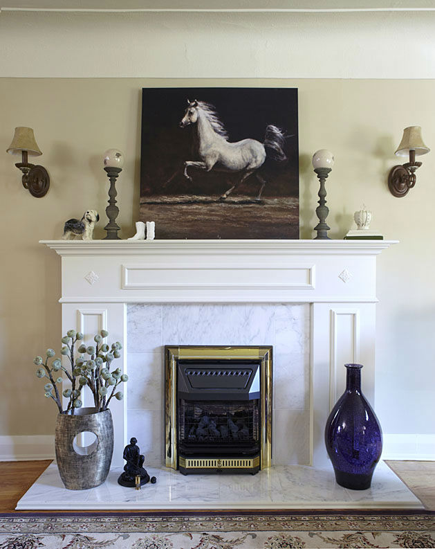
The stumbling block, and where I made a mistake that I could not unsee after taking Maria’s colour course the following year, was with the fireplace design. I knew that the tiles around the fireplace would need to be updated if my clients wanted to move the decor in a new direction, which they were quite surprised to hear.
I explained that if the pink, green and yellow hand painted tiles around the fireplace and on the hearth were to stay, I would need to use those same colours in the decor to create flow.
Maria likes to call this type of finish ‘a bossy element’ and I agree. A similar term that I like to use is, ‘The bully in the room’.
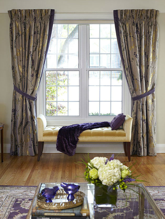
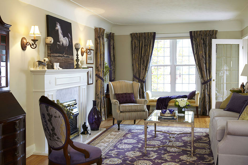
So I selected a Carrara marble square tile as a replacement. The idea was to up my choices for bringing in a whole new colour scheme which was a deep purple, a camouflage green tone and golden yellows, supported by soft beige tones in the sofa fabric.
I felt pretty good about choosing the wall colour I selected which was Abingdon Putty by Benjamin Moore. It’s a green-leaning yellow beige, and is part of Maria’s Colour Boards Collection.
How to choose the right white paint colour
But when it came to choosing white for the mantle and trim, what I didn’t know at the time, was that not every go-to white works in every situation. And because we were still in the decade where beiges were the most popular neutral and the go-to white was Cloud White, that’s what I specified to the contractor.
It was only AFTER Maria’s colour training that I could put words to the mistake I had made…Cloud White was too creamy for the cool, Carrara marble tile. The updated fireplace tile was a very cool blue grey and true white colour combination which was in no way repeated in the yellow beige, off white and purple colour scheme. Doh!
You can’t unsee it now that you know what you learned from Maria, right?
As I learned, true white or blue white looks best with Carrara marble. You can pair off white with it if you’re repeating the cool tones of the blue grey. And some marble presents creamier than other slabs. But in this case, the marble looks like much too cool a white for this room.
A successful bathroom project after becoming a True Colour Expert
Fast forward to the fall of 2012 when I was hired to design an entire second floor for a Toronto client. This was AFTER I took Maria’s Choosing True Colour Expert Training earlier that year.
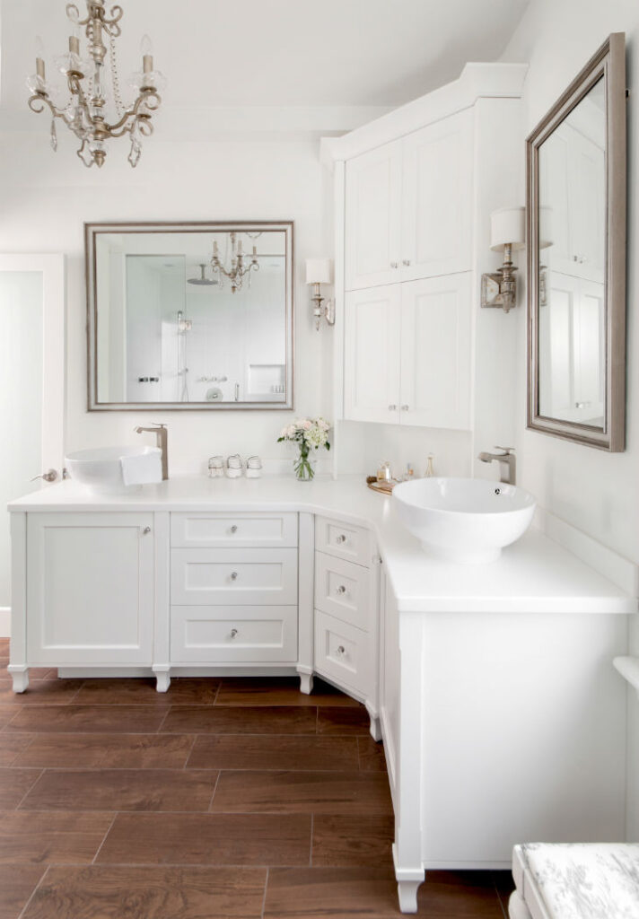
As part of the renovation, my client asked for an all-white bathroom and this time, I was up more than up for the challenge and no longer terrified of choosing whites.
Since becoming a True Colour Expert, I had way more confidence and knew that in order to determine which white was going to be the best choice, I needed to look at all the hard finishes together with my large colour boards.
This beautiful bathroom by Claire Jefford Inc. is featured in my White is Complicated eBook
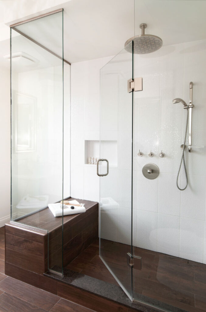
I selected Snowfall White for the wall colour, ceilings, trim and for the beautiful corner vanity we had custom built. This was also one of the earliest projects where you might have seen a hardwood-looking tile on the floor as this type of product was new to the market at the time. It was the perfect choice that grounded the space and provided much needed warmth to the design.
What also helps this bathroom to remain timeless, is that there are no ‘bullies in the room’ pushing the colour direction one way or another. My clients have the freedom to accessorize this bathroom with any colour and switch it up as they please, just as Maria shows you how to do in her Colour Rescue Series on Youtube.
My first published project!
But do you want to know the best part about this project for me? It was when I shared this bathroom design on social media and Maria reached out because she was so impressed by it, that she asked if she could include it in her White is Complicated ebook.
Of course I said yes and was absolutely over the moon to have this be my first ever published project.
You can see more of my ‘Snowfall White & Charlotte Sparkles’ second floor renovation project in my professional interior design portfolio here. In case you were wondering who Charlotte is, she’s the precious white fluffy cat you see on the vintage stool by the window.
Identifying with colour
All of the designs in my portfolio have been named based on a feature paint colour used in that project, so it’s easy to navigate when you are seeking inspiration on a specific colour for your next interior decorating project.
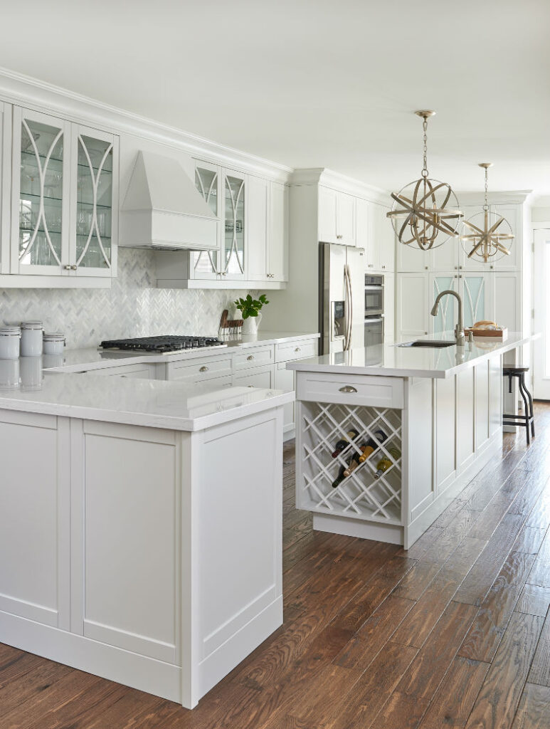
For example, if you want to see more of my design projects with white custom cabinetry, the kitchen project below is called ‘Oxford White & Millwork Marvel’. In that design you will notice another Carrara marble tile, but this time in a herringbone pattern on the kitchen backsplash. And Oxford White, what Maria refers to as a True White, was used on the cabinetry and the island.
Oxford White Kitchen Design by Claire Jefford Inc.
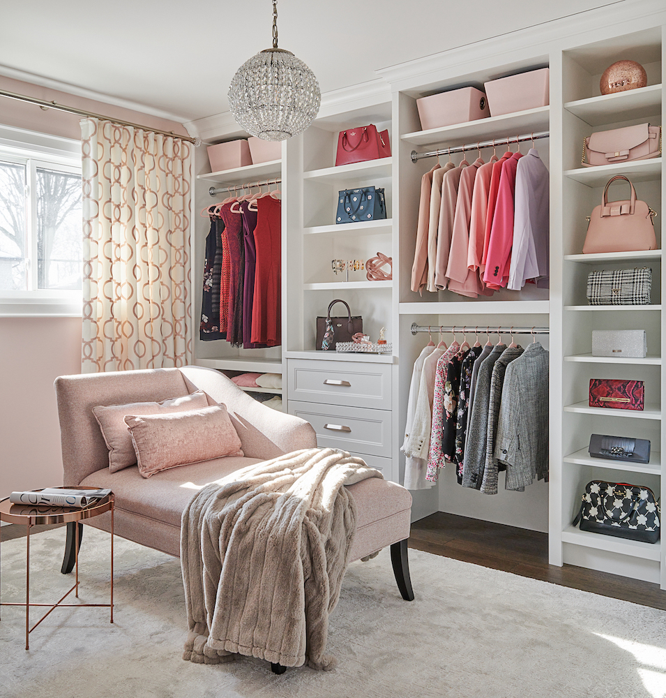
For this project of my sisters ‘dressing room’ I titled it ‘Chantilly Lace & Dreamy Organization’. The cabinetry in that stunning dressing room was done in Chantilly Lace and when you enter that project, look out for the custom spinning shoe rack that holds 72 pairs of shoes.
Custom Dressing Room in Chantilly Lace by Claire Jefford Inc.
Maria’s True Colour Expert training marks a significant milestone in my design career.
Hearing Maria articulate why neutral undertones are an important colour consideration and how not all whites are the same was invaluable for me. I always tell other designers that becoming a True Colour Expert was one of the best investments I ever made in my business.
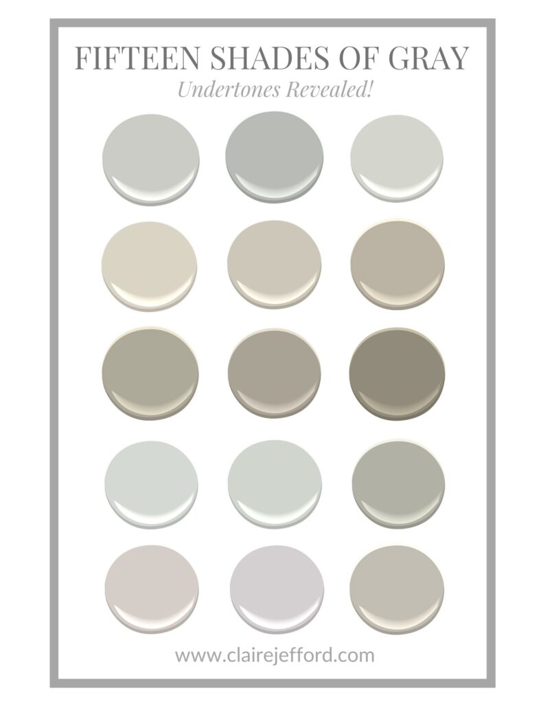
I have two resources you can access for free! My Fifteen Shades of Gray download here and my White Trending Paint Series here.
Thank you so much Claire for sharing some of your beautiful projects!
Claire is now both an interior decorator and highly sought after business coach. She helps her clients set up their systems to make sure the process of engaging clients and getting fairly paid is as smooth and painless as possible. This is super valuable because besides getting colour right, the business end of things is what emerging decorators struggle with most!
Learn how to price YOUR services with Claire inside my community!
So I’m excited to announce that Claire will be making a guest appearance inside my True Colour Insider community! She’ll be hosting a coaching session to talk about pricing.
You have to be a True Colour Expert to access this level of coaching inside, so JOIN NOW! Choose monthly or annual, cancel anytime!
And if you aren’t a True Colour Expert yet–what are you waiting for? 😉 Enrollment is closing soon. This is your last chance to enroll in True Colour Expert Training this fall!
The world needs more True Colour Experts and this is the EASIEST WAY to turn your colour skills and decorating talents into a lucrative side business! #2025Goals
p.s. There’s still time to access the FREE Lamps video lesson inside when you join the community before MIDNIGHT, Friday, October 11!
Related Posts
Just give me a white paint colour, please




Loved your work! I’ve enjoyed your previous pieces too; they’re always a fun read!
Thanks Sarah!!
Thank you, Claire, for your post. You’ve been an inspiration and your portfolio contains some amazing spaces. What I enjoy about you and Maria is your passion for integrating color. Cheers and all good!
Yes, I love colour!!! It’s rare for me to do a project that is all neutral – except that all-white bathroom. Thanks so much Karen.
While I definitely see the cream versus the blue/white, I don’t think it’s bad. Marble is a natural stone, and it always looks beautiful. Plus putting some blue accents around it distracts you from obsessing about the cream. I also adore the horse painting on the mantle. I think the styling makes it work.
Thanks for your feedback, Stacy. For me, what was most eye-opening after I took Maria’s course, is realizing that with that specific project I was clueless about the differences at all. Thankfully, that’s not a problem anymore! But I am still a stickler for not mixing cream and cool whites, it just feels wrong to me 🙂
Nice work. I agree with Stacy though. Cream and off-white with blue/white marble isn’t always bad and as we move away from stark white trends, I think that fireplace looks fine. The shiny brass is more jarring than the marble. I think it depends on the mood of the room. If the cream and blue/white marble are consciously mixed, it can give the room some personality. It could be an old world feel of aged, oil-based paint and blue/white marble or it could be a modern subtle pairing of cream and blue/gray/white.
Hi Melissa. The clients were adament about keeping the brass fireplace insert, so we had to work with it 🙂
Love, love, love! Thank you!
🙂
Laughed out loud when I saw the Before picture, because I had never seen that exact floral fabric anywhere except on my own couch that I bought in the 1990s, and still have. Have been looking for a new sofa for years, but they just don’t make them like they used to.
Lovely post about whites and the importance of undertones. Personally, I love the creamier whites, and the cloud white looks beautiful, but can see that it may not be the right choice for Carrera.
Great post Claire and I’m excited to hear more on the True Colour Insider community!
Thanks Rachel. I can’t wait to be there with you all, and Maria, next Friday!