When choosing colours to coordinate with stone, why settle on a colour that’s meh, or even kind of awful, when it’s this simple to get the colour bang on perfectly beautiful! It’s all in the undertones.
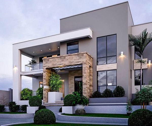
Which stone colour is right for your new build exterior?
Back when I did more in person consulting – I now have an incredibly effective process for helping more clients with projects all over the world with my edesign packages! – my client was building a retirement home in a warmer city, in another Province. The challenge was that she wasn’t there every day to make sure everything was going according to her specifications. Remember, a few weeks ago we learned you get what you inspect, not what you expect.
Her contractor had installed the wrong colour roof (which in the end, I assured her she could keep because it did not impact the curb appeal of her home in any way).
Halfway through construction (when her builder was calling for decisions) she flew in to consult with me because, she confided, “We have walked through so many homes, and most recently a 3 million dollar show house that was just plain bad. The colours didn’t match, the kitchen was ugly. We’re spending a lot of money and we don’t want to make a bunch of mistakes.”
Isn’t it great that you no longer need to fly to my studio to get my advice? Check out my eDesign packages here.
What are the undertones of stone?
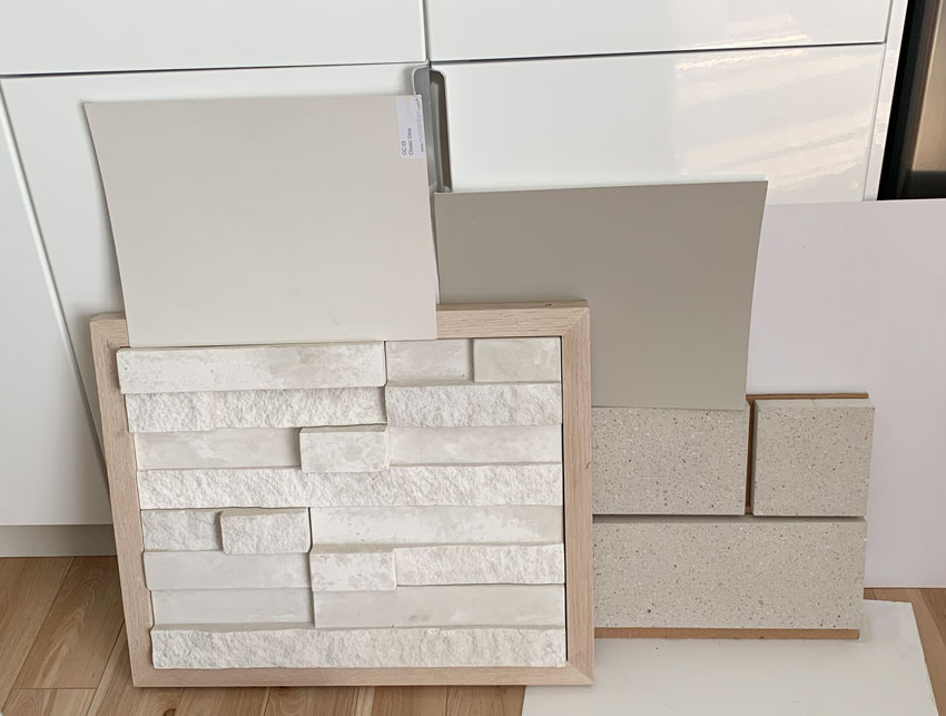
She arrived with this stone that she was considering for the exterior:
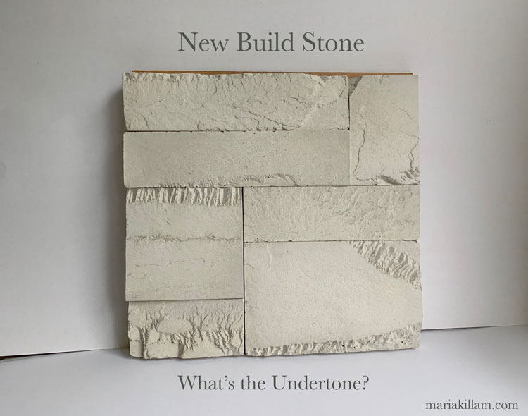
Well what does it look like to you? Is it obvious? Does the undertone jump out at you?
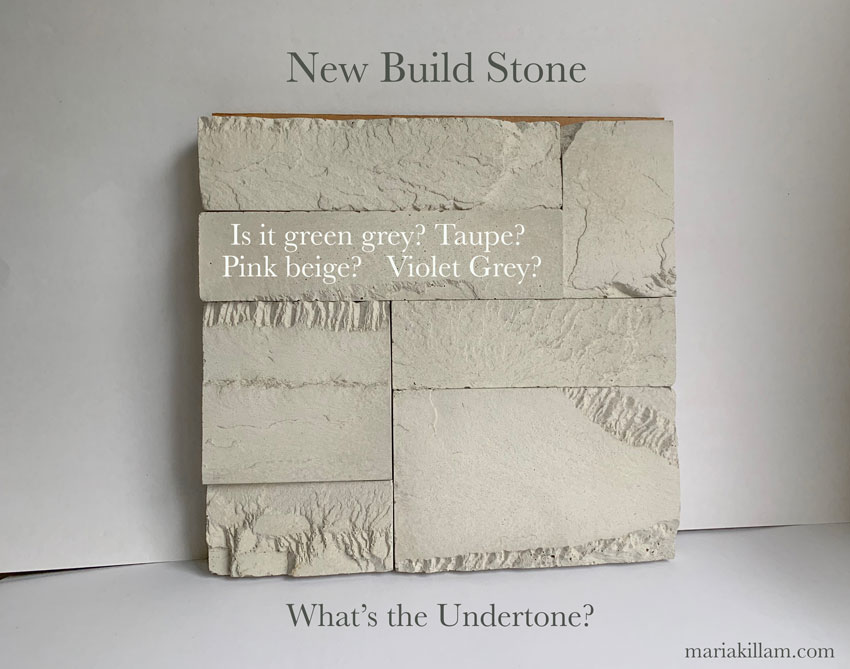
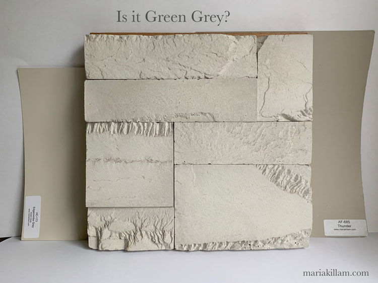
My client saw pink in it and wasn’t loving it. But that’s because her builder had painted up a sample that was green grey (Thunder on the right below).
I also put up Edgecomb Grey (a lighter green grey) on the left, so you could see that the stone is not green grey.
But was it pink beige? I immediately pulled out my large curated samples and placed the pink beige samples behind the stone:
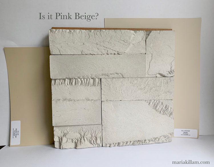
Nope.
Now it also looks like it could be taupe right? That’s what I said it was. Especially when you’re comparing it to pink beige.
So I pulled out my taupe samples (below):
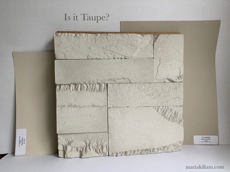
By now she was just off the entire stone. She didn’t want pink or taupe stone. However, if you look again, it’s not quite taupe either is it?
It’s getting much closer, but now we see violet right?
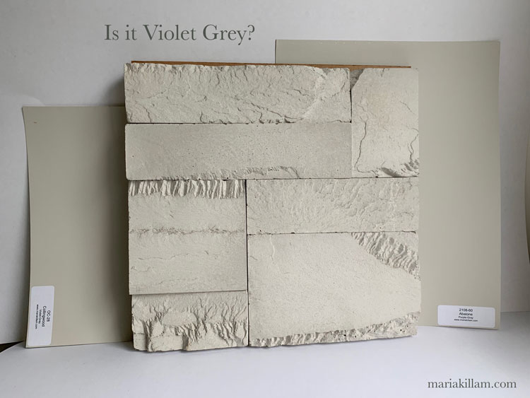
Look at how nicely it matches the violet grey samples in my System for Specifying Colour (above).
Using the Colour Wheel and my System for Specifying Colour
Let’s place my Understanding Undertones colour wheel on the stone as well:
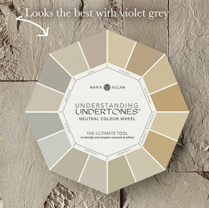
My Understanding Undertones Neutral Colour Wheel
So here’s the thing. And I know a lot of you have this colour wheel already. It’s the single most useful way to identify the undertone of anything.
This is exactly how it works.
Wait. There’s one more taupe we haven’t seen that’s slightly less pink than Cedar Key and it’s Pale Oak. So let’s compare Pale Oak and Collingwood again, but this time together:
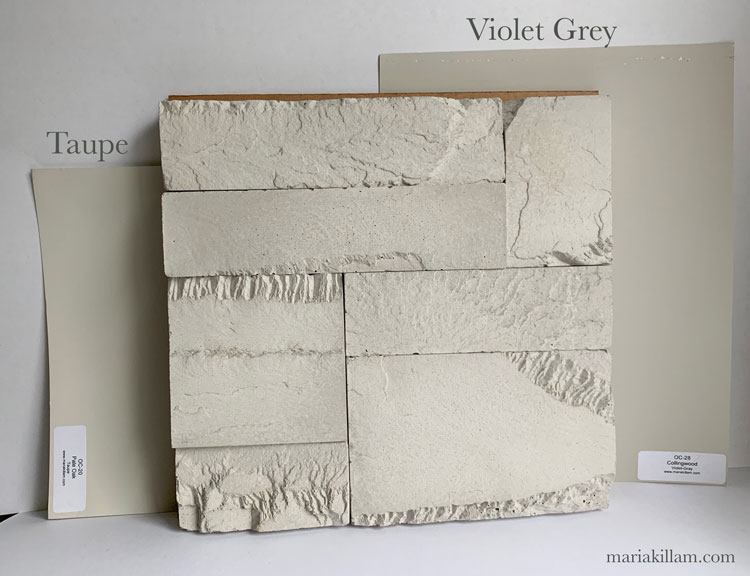
They both look like they could work.
And often you’ll see a couple of possibilities when you are moving the colour wheel around your home on different fabrics and finishes.
What this means is that you pull out both sets of large painted samples from each undertone to see which one is perfect.
The difference between ‘meh’ and perfect, is easy to see once you have a large sample.
For exteriors, I normally would take it a step further and paint up large swatches outside on your stucco if this was the stone you were installing on your house. I walk you through exactly how I did this on our new house to get the colour just right in my Exterior Masterclass.
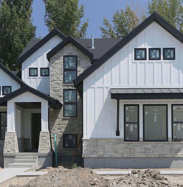
If you’re doing orange beige stone with taupe (as they are often found together, below) you’ll want the right taupe on your house (and not the wrong green grey which would make it look close but not quite perfect).
Then you would also ask, is the white on this house right? Was the blue grey stone on the foundation and walkway the right choice as well? What do you think?
Testing colour the right way is important.
Did you get that? Never just assume you’ve nailed it, especially if you are still learning and training your eye on what to see.
However, didn’t we narrow down the colours fast?
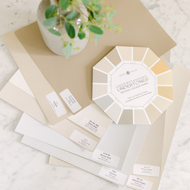
So even better than purchasing just the neutral colour wheel, get it bundled with a set of my Colour System Neutrals and Whites large painted colour boards so you have the entire range of colours in large samples so you can get your neutrals and whites perfect! The wheel comes with the boards in either Benjamin Moore colours or Sherwin Williams.
What you’ll learn in my Masterclass on Exterior Colour Selection
Learn more about choosing neutrals and whites for exteriors in my self guided Masterclass on Exterior Colour Selection. It includes 18 information packed, focussed modules to cover every aspect of your exterior project.
 In Module 4, you’ll learn what colour white this house should have been in order to coordinate better with the stone (below). In Module 6, you’ll learn whether this even should have been specified. And in Module 8, we’ll talk about balancing trim colour (which is a common mistake people make).
I’ll also teach you about the colour of concrete and we’ll talk about whether pink beige steps were the right choice here:
You can watch and rewatch the modules you need to focus on for your project. Including what’s the most timeless and versatile stone for your exterior.

PS. What did my client choose in the end? She brought two more samples and we settled on the white stone (on the left) below:
Using my System is the difference between finding the perfect colour quickly vs. choosing a colour that looks a bit off that you’ll have to try to ignore because a complete repaint is expensive.
So save yourself time and money and get my Exterior Masterclass. On top of detailed modules on every possible consideration for your exterior project, I’ll walk you through all the neutral undertones in my system, everything you need to know about white and cream, plus a list of my favourite go to exterior colours.
I’d love to hear about your exterior colour disasters and successes in the comments!
Related posts:
The Best Colour Advice on Painting your Exterior
The Shortcut to Testing Exterior Colour; Before & After
The One Thing you Must Do Before Choosing Exterior Colour


This is a very helpful post, one that I hope anyone considering a new build or exterior renovation will bookmark.
I was once under the false impression that natural stone was a “neutral” and matched anything. That couldn’t be further from the truth. Now that I understand the importance of undertones in the stone, it’s easy to identify plenty of “opportunities” where an exterior could be vastly improved with an updated paint color that works with the stone.
You also refer to one of the modules in your exterior masterclass course which will help determine when to add stone to an exterior and when it’s not needed. For the last 15-20 years or longer soooo many new builds include stone on the exterior “just because”. Often this is not necessary. When applied seemingly at random or on the wrong style house, it can detract from the beauty of the home.
(Worst yet when stone is placed at foundation level on the front facade and wraps about 12 inches around each side of the home then stops.)
Thanks for informational posts like this one which are great references due to the photos included.
The violet gray is the best, but the green gray does not look bad…the violet just looks perfect!
I would just point out that most builders and painters in construction are men. Men can be color blind much more often than women who just carry the gene. Men sometimes don’t realize they ARE colorblind and often dont want to believe it.
Consider that when they suggest sample colirs/matches..,
Or put another way, some people are color blind and some decorators color choices are simply “personal” and haven’t been “vented or validated” with a proven process such as Maria’s …if you have Maria’s color wheel and color charts, there is no need to ask for suggestions…or if you do, then simply validate their suggestions with the tools you have from Maria.
I plan to have repainted the wood on my mostly-brick home, so I purchased Maria’s neutrals Sherwin-Williams boards. The samples she showed above will really help me take the next step in using the boards. Overall, determining undertones is very difficult for me, but seeing the steps she used with her client will really help. Thank you