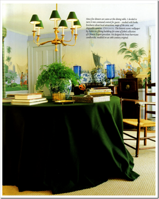
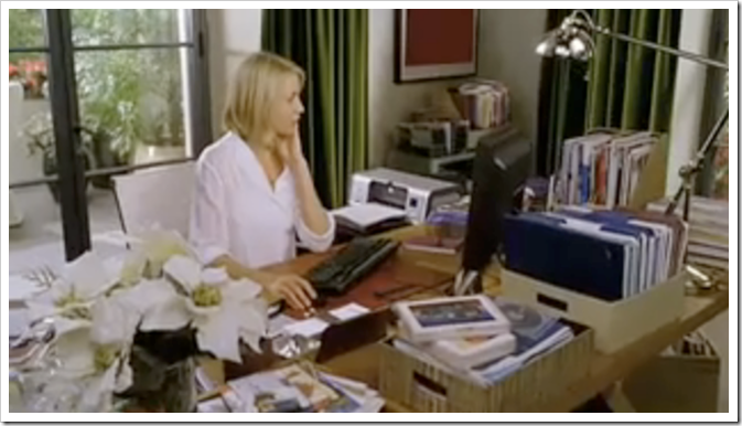
I have wanted green velvet drapes somewhere in my house ever since I saw The Holiday movie with Cameron Diaz. And by the way I’m calling it Kelly Green because I think it’s so much more current than saying Forest Green. Then I was at Cote de Texas the other day reading about the big debate on Bunny Williams Kips Bay Living room and saw this room designed by Bunny which I instantly loved so I had to post it here!
Here is her office in The Holiday—love those drapes, they are way more amazing in the movie (this picture is blurry)! I even have a sample of the fabric in my office. However, I need to buy this house and renovate first, in order to install them!
I have heard the mantra “All greens go together” and I think it’s mostly true; what do you think?
Since all greens go together in nature, it makes sense that they should work in interior design right?
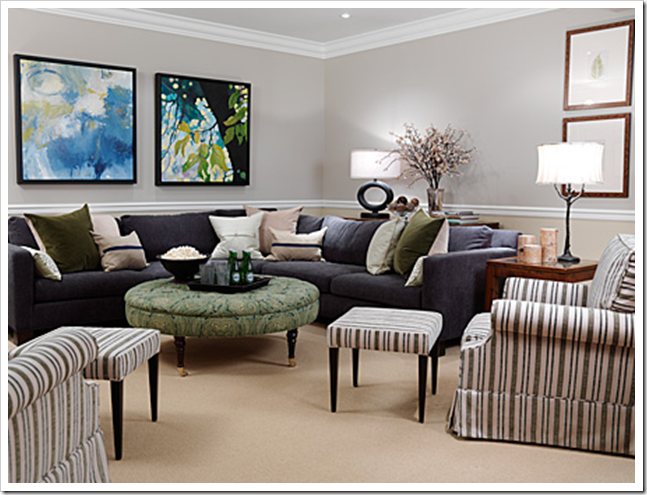
Anyone that reads this blog knows how I feel about mixing clean and dirty colours together in design. The only time I have seen that it actually works is with greens. Here is another example:
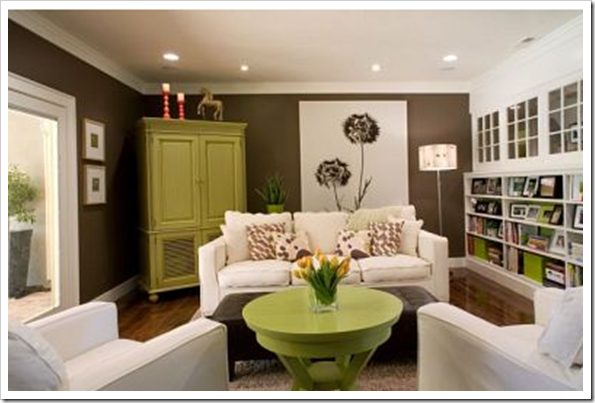 Image source
Here we have olive green walls and a matching ottoman, mixed with a fresh ‘clean’ green in the painted armoire and end table. You could even throw in a clean yellow (like they’ve done with the addition of the tulips) and it would look great!
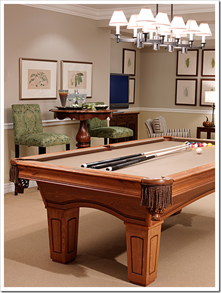
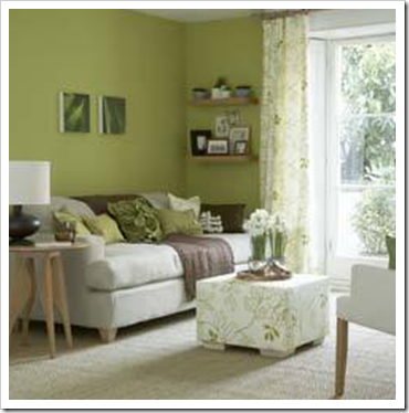 Image source
Here the ‘clean green’ is on the walls and in the printed ottoman and drapery. The throw, lamp and pictures frames are in a ‘muddy’ olive green. Notice here, there is lots of white in both images!
White is the perfect neutral with light, fresh colours, including blues, turquoise, pinks, etc.
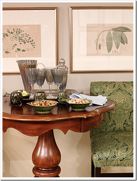
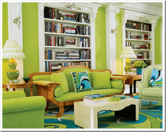 Image source
Here we have mostly an all ‘clean green’ room with a hit of turquoise. Notice there’s still plenty of white to keep the look fresh. Which brings me to the point of this post. I thought I’d include my opinion on this living room by Bunny Williams to add to everyone else.
I’m not as fussed about the red egg-chair, other than to say it doesn’t make sense from a design perspective, simply because the colour (or the style) is not repeated anywhere else in the room.
It does visually appear as if ‘the client’ (I know it’s a show house) wanted it to stay and the designer ignored it.
My opinion is that the turquoise is clean while the rest of the colours in the room (except the lipstick red chair) are muddy. That to me is the biggest reason why it’s not the most spectacular room in the world. And, like I said in my comment to Joni, Bunny Williams is brilliant to decorate a room that created this much publicity!
Well my lovelies, what do you think?
Related posts:
The Best way to Update Forest Green
When to use White vs. Dark Colours
Three Ways to Describe Colour
What everyone Should know about Beige



Thanks for the shout out. I happen to love blue and green together. just not turq and olive green together. yuck. thanks for the mention!!!!
Joni
Hi, I think your wonderful! but being a certain vintage and recognizing that color names are to some extent BS – forest green and kelly green are NOT interchangeable…really the are vastly different!
but color names are subjective- I have always thought being the namer of paint colors would be a great job!
Kind regards,
Kathleen
kind regards
Fascinating subject,Great post. I too love blues and greens and I also agree that all greens go together just as they do in nature. Love the pictures, especially turquoise and green, and find the last one with the red chair fabulous. I love the fact that Bunny Williams placed the chair in there to add some energy to the symmetry. It does match with the orange (in my humble opinion) and there is red on the table, which it picks up. It echoes what is going on on the wall.
I am not a famous designer either (not yet anyway 🙂 ) I think we are moving away from the matched set look. Funny how we all see different things. For me the blue is light and the orange and brown heavier- so the red counter balances the brown.
Take the red chair out and the room is too brown. thanks for posting
I love the pea green room. I am also a big fan of green, so soothing.
Yay Sarah Richardson! She is my new favorite person. Okay, about the lavender, I gues I'm just trying to understand the clean/dirty color concept, and I feel like sometimes lavender gets a bad rap. Would you say it's clean or dirty? Or, does it depend on what it's paired with?
I don't think I would dare to mix the cleans and dirties, even in green. I've got a few small accessories in older shades of green and I don't think they'd look right with some of the fresher shades we're seeing now.
This is a topic I'll leave to the experts; they might be able to pull it off, but not me!
I do think all greens go together but, like you say, they need a neutral like white or brown to keep them from getting lost in each other. And I get what you say about clean and dirty colors, but I do really like most elements of the Williams room… especially the unexpected color pairings.
Wow- Right you are- Bunny Williams create a fabulouly publicized room! I like the fact that it's eclectic in many ways! It surely made that Wow statement! Great post! PLease visit my blog for my take on Ms. Williams room!
Take Care!
Michelle
Zuniga Interiors
I have to agree that all greens go together, but I think that in nature you would rarely find only greens. To me, totally untrained I wouldn't try it, but I would totally have a room that was designed that way. Did that make a lick of sense? I love the blue with the green, but again, I don't know if I could get it right. Have to admit that I hate the BW room, the red chair is completely wrong, not just the color, but the style. With a tiny bit of tweeking I would love the room. But, again, what do I know?
I wore Forest Green or Bottle Green for 5 years in high school so it's understandable that green is not one of my favourite colours. I have a few clients who love the colour and I did practically a whole house in green tints, shades, paint, accessories, the lot. It did look sensational and the client loved it because it was her right through. If I were to choose a green it would be a brighter fresher green with a turquoise or aqua. Then again I have it in my logo in a fresh green with turquoise on chocolate brown and everyone thinks it's great. I think colours, like beauty, is in the eye of the beholder…..but the mix does have work, unlike the egg chair.
I love Sarah Richardson. I wish HGTV would get hip and air her show in the states. They air them on Fine Living, but they don't air all the episodes and they tend to repeat episodes quite often.
I like Bunny Williams, but I just don't get the Kips Bay room.
I loooove green. My kitchen is green – like a mossy/avacado green if that makes sense, and I'm happy to hear that I can mix it up a bit in adjacent rooms.
But I'm really writing to say: THANK YOU for helping me understand why my initial reaction to this room was unfavorable. I am novice enough to have been swayed by the mag that this is Bunny Williams and by golly it's brilliant… and now I can comfortably return to my original assessment that the red chair needs to go & that the wall color & turq paintings don't "go" with the rest of the furniture & acc.
I laughed when I saw your comment on Joni's blog.
Yes, this room has certainly gotten its share of bloggy attention.
It certainly isn't my favorite room that Bunny Williams has done.
You picked out perfect images to make your point.
Green can be such a soothing color in a room when done right.
xo
Brooke
I really enjoy your blog and you have certainly given me some new insights into color. I am old enough(57) to remember kelly green and navy blue being the go- together colors (especially in clothing-handbags-the ones with the wooden handles)
Hi Maria!!! thanks for the mention!!! I'm a green-lover too and totally think you can mix greens. (and am doing it in my LR.)
I also have to say that I did love the Bunny Williams' olive green paired with the turquoise walls. It's a color combo I just love. call me crazy 😉 It reminds me of a chardonnay bottle with an aqua ball jar and i love that combo..
anyway, i need to email you as i am having some SERIOUS color issues with my LR and my green velvet sofa!!! ahhhhhhh
xoxoxo
Great post. I love all greens, and I really like blues and greens together (especially the "cleaner" colors).
My former mother in law had green everywhere ( and I do mean everywhere) in the seventies and eighties and I could not stand it. Now with the fresh shades, and the way the designers are using green I have a whole new outlook. That first image of Bunny's with the skirted table is to die for! I also adore blues and greens together
When I was a senior in college in 1971, I decorated my room in turquoise and olive green with smatterings of red. Thought I was so cool. Today BW's room suffocates me. The scale of the art overwhelms me, and my eye fails to find a safe, comfortable place to land. In a showcase home, BW has the right to do whatever pleases her. It is theater: it instructs, it informs, it challenges. But for all of us in the audience, we have our own power. We can agree or not. We can buy the magazine or not. We can buy from BeeLine Homes or not. Checks (or not!) balances things out. I think the most important lesson I learned from all of this, is that I feel comfortable in myself to say I'm not buying this. Not a small lesson at all.
As I wrote in my comment on Joni's post about Bunny Williams Kips Bay LR. The Changing Look of Friends said…
"I love my Sunday mornings with you, Ms Joni. I love it when there is a debate on someones Design, so much fun reading what everyone has to say about this room. I do have to say that I couldn't wait to read the comments to see what Maria of "Color Me Happy" would have to say about rude mix of colors. With that being said you must know I too have problems with that room. The "any thing goes" look just doesn't work for me. Pick it apart, delete, delete, and separate, and you could have two fine designs."
Dear Design Wanna Be,
Lavender can be either clean or dirty! BM 2071-60 is a clean/fresh lavender and 2116-60 could be interpreted as lavender in some lights and gray in other lights. Basically a clean colour is white plus the colour. 'Dirty' colours have been 'grayed' by adding gray or black or the opposite colour on the colour wheel (in this case) yellow to tone it down.
Maria
I have a bolt of green velvet that I have been saving for YEARS. I keep waiting for a chance to use it but it's just too darn hot in NC for velvet draperies.
I'm a little relieved to hear that all greens go together because I think I have dirty drapes and clean walls in my study ! 😉
Having seen Bunny Williams room in person, the colors represented in photos do not do it justice. The clarity and brightness of the color of the green velvet on the sofas was beautiful with the wall color. I think we all know that velvet cannot be photographed well. Neither color has been accurately captured in photos. As for the red chair, let's just say, "no guts, no glory".
I never even noticed those green drapes in the movie The Holiday and I've watched that movie over and over. I think I'm looking more at the windows and the light pouring in which is what bothers me about areas in my home.
A few weeks ago I was watching Paula Deen's cooking program and the cameras panned a view of her eating area. I was so thrilled that I had turned on the DVR to capture the gorgeous ceiling to floor green checked drapes that I was immediately drawn to. Made me want to repaint my red dining room so I could have similar drapes made. The green was just so fresh and alive. So I've got my own green drape lust going on too.
It was quite enlightening to read your comments about the Bunny Williams showcase house on Joni's blog. I think you hit the nail on the head with the clean versus dirty colors. And of course, I'm no professional, but I can see it clearly and it makes so much sense. If the green sofas were exchanged for a cleaner green, then it might work, despite the red chair. As it is, it looks like a mishmash and attacks my senses. Would love to view it in person to see if I would feel differently about it.
I love the idea that all greens go together. Adore the room with the green painted armoire and end table with the white sofas. We have green in our kitchen presently and even though the wallpaper and tile are a bit outdated in my mind, I've always loved the color of it. We also have a blue/green paint in our master bedroom and bath and I love it. Unfortunately, as usual, the hubs wants to paint it tan or beige or some other boring neutral. Not that I'm against neutrals, but I'm keeping the color on the walls as long as possible except maybe refreshing it a bit.
I, too, absolutely adore Sarah Richardson's style and hang out on her website and watch her program faithfully. It seems that most of my favorite designers are Canadians. Wonder why that is since I live in Texas?
Warmest regards, Maria!
Victoria
Holy cow I am always on the wrong side of the curve! HA HA. I am repainting my office. I sampled two kelly greens and just couldnt attach to them. But I found the most lovely dusty purple and decided on that instead. Damn.
Funny thing I was going to paint the walls grey and purchase a yellow sofa too. So I managed to screw it up twice!
I Love Olive velvet with bright teal/Peacock Blue, made a gorgeous outfit once of those. Also my last kitchen was RL Regent Metalic Moss RM28 with antique dishes with bright pear green and blue, brown croc floor, burlap tablecloth, multi green pictures and Beautiful Victorian Setee of Green Velvet (muddy celery green). All Greens work together!
Funny, I was thinking about greens and greens the other day and concluded that mixing is fine. Besides, I want to think that. My kitchen cabinets are a muddy green, which I like, and I don't want to feel limited.
The only things I like about Bunny's room is the wall color, turquoise upholstery fabric and giant artichoke prints. The egg chair is absolutely a red herring!
Maybe green is one of those colours that's really flexible. All I really liked about Bunny's room was the turquoise walls, that's where my eye went first. Otherwise, everything combined, I believe there was simply too much.
I love most shades of green and think mixing shades of green is fine in most cases. Great post – made me think!
Also, thanks for adding me to your blogroll! So sweet.
xo,
cristin
Okay… so now I'm ready to throw out the yellow and go green!
I was feeling really stressed out at work – dingy white walls that hadn't been painted in probably 15 years (state budgets, you know). So I got permission to paint my office.
My son and my friend, Michael, painted my office a beautiful sea-foam green with white trim. I have a navy blue lamp on my desk – ditched the flourescents. So peaceful. I love it here! I love green!
So… geez… green it is!
Thanks, Maria!
Hmmmm…. not loving Bunny's Kips Bay living room. There's just too much going on — it kind of hurts my eyes!! And I don't like the combination of colours or the patterns in the room.
Maybe I'm missing something, but nothing about the room works for me. The red egg chair in particular really bugs me!!
As for mixing greens — if it works in nature, then it'll work in your home 🙂 I love the combination of chocolate brown and apple green — like a tree, I guess 🙂
We're posting our colour personality quiz answers on Friday — be sure to come by and check them out!! 🙂
Kelly
It just goes to prove that you can't always judge a room by a picture. There is a lot going on in Miss Williams' beautiful room, but it real life it was layered, fresh, welcoming, and comfortable. Well, all except for maybe "that" chair. Some rooms just don't photograph well, or aren't well photographed.
i totally agree. If you look to nature for examples, you can see a myriad of greens all mixed together. I've read that there are more greens than any other color in the spectrum. I tend to think of green as a neutral, as you can pretty much pair it with anything. Great post, Maria!
Hi Rachel,
Thanks for your comment, you just brought up an excellent point I did not mention in this post, not only that all greens go together but all colours go with green!
Maria
Man, all this time I thought kelly green was the colour of a grass irish knoll. Shamrock green.
But you are saying it is interchangeable with forest green? Forest green, the green answer to navy blue? The patron colour of spruce beer?
So confused. From where does my misconception stem? Is it because Gene Kelly was in Brigadoon? 😛
I'm loving kelly green lately. I can't get enough of it – at least for my wardrobe. I haven't gotten up the courage to bring it into the house. Yet. 😉
Hi Kiley,
Kelly green is a brighter, fresher green than 'forest' green but they are the same intensity, which is why they are confusing.
Maria
I love love love green. I have always worn green and I remember in the eighties how people would look at me and say, "oh, green." in a vaguely confused sort of way. I say a resounding no to turquoise and olive unless you are someone who likes to be outrageously different. Someone like that would also add a red bucket chair. I don't like a designerish/too well matched look so I like a room to have something a little off, but not that off.
I adore this Bunny Willims room because for once it has more than the standard three colors. If I had to live in it, I'd probably brighten up the living room curtains to copper to add to the vibrancy or tone down the wall color a bit. But her choice of shapes, cool artwork, and willingness to experiment with tricky color combinations is super.
Hellooo, New here. But being a fan of all things paint, painted and due to be painted or sewn….I must say the bottom photo is hard to look at.
You've used the word muddy which is about it. It is heavy against a colour which is light/ethereal; the furnishings seem to be slumped on the floor, while the walls seem to be pushing back to open the room. I would've asked for a refund!! :}
Maria, I LOVE the yummy green velvet fabric on the table in the first picture of this blog! It's amazing how this shade of green can feel equally as masculine OR feminine, depending upon its surroundings. My husband loves any shade of dark green, and it looks so "manly" in that context… yet, somehow it can still be soft and lovely enough to be made into the most elegant window treatments (as you mentioned in your post). In addition, I ADORE almost all grey-greens, in that they are truly a wonderful "new neutral". Thanks for sharing your insight and perspective! Kimberly Grigg
Bunny Williams does courageous and interesting things, but…there are times when I want her to restrain just a tad on contrasting elements (just my opinion). Here is a better photo of Kip Bay from her site: http://www.bunnywilliams.com/interiordesign/detail/8
The nod to red in the room is more prominent here, flowers, painting, container with red somethings. Bunny has never believed in less is more. Bunny is Bunny.
If greens are an exception to the rule in terms of being able to mix clean and dirty greens together, can a dirty green go with cleaner, nongreen colors?
I think what bothers me about the room are the pillows and throw on the sofas. Change those and the room would look so much better to my eye. I love the sofas and pretty much everything else in the room.
I love greens, and have them all over my house. But, they’re all muted, dirty greens. I’m simplistic: prefer to keep clean and dirty separate, and like blue greens to be separated from yellow greens. In nature, most foliage greens are clean and bright so that’s why they work together. Also, the majority are more yellow green than blue green. Flower colors also tend to be clear an DC bright, not muddy.
I don’t remember commenting on this post but I see that I said NC was too hot for velvet draperies. Guess what I’m making for my dining room…..velvet draperies !
We have a dark velvet “forest green” sofa. Also, we have a light greenish/yellowish wingback chair not too far from that where my husband sits to watch tv. I have never liked the way those two items look together and have wanted to change the color of the chair ever since I purchased it. Don’t know what color to choose, but I love turquoise–perhaps that is a stretch. Perhaps will go with light grey, but that seems too blah! Help. Another problem to solve.
I just want to respond to your idea that in nature all greens go together. And I’d have to say that’s kind of a yes and no. In concept yes. But when you look at the fact that your bright neon greens come in the spring. That is the color of new plant growth. Think, new leaves budding on your trees. Then think of the colors of the leaves throughout the season, they change and become deeper colors. During summer they may be a jelly green to a emerald green, and at the end of the season they become more muddy colors as the tree is starting to get ready for its dormant season. While the same tree produces the clean bright neon green, kelly greens and muddy olive greens they don’t all happen at the same time in the same season. So putting clean greens and dirty greens together is combining spring, summer, and fall. And if those colors don’t happen in nature together it makes sense that it wouldn’t go together inside your house either.
Kelly green not jelly green.