Terreeia and I are still looking for a personal assistant, if you know anyone, please send them this link.
As the black and white trend continues to spread all over the country, I’m seeing more and more homes painted black where BLACK DOES NOT BELONG.
And the following style of home is a perfect example.
I received these photos and email from a lovely reader:
“I read Maria’s blog today about happy, exterior colours and it made me think of my poor old Century home that was destroyed by the current owner.
This is a very clear “what would Maria NOT do”.
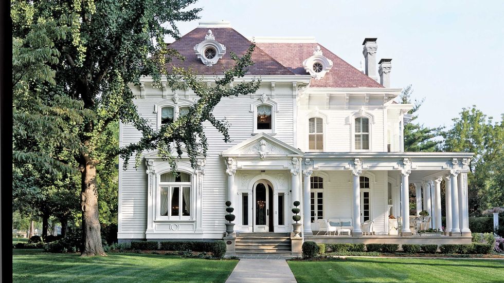
First picture is how I painted the house after we purchased it and at that time it had the red roof, but the entire house was also painted red.”
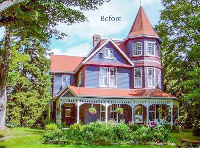
“Since I couldn’t change the roof, I chose Hale Navy siding, cream trim and accents of yellow in the gingerbread and doors.
We owned it for 20 years and everyone in our town LOVED that house.
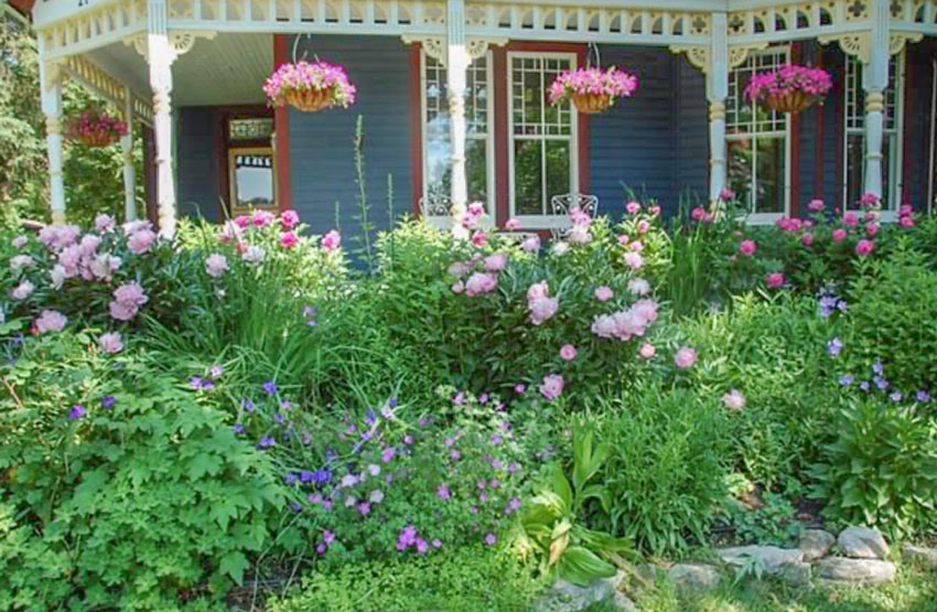
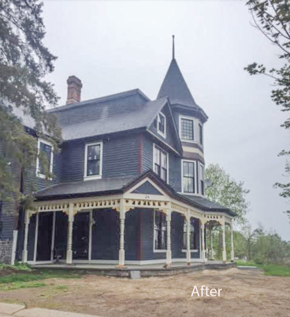
Second photo shows new black windows, black roof and inappropriate use of modern gray granite which wraps around the side of the house. It is now a mish-mash of century and modern and has been sitting empty and gutted for 3 years. Don’t get me started on the destruction of all the perennial gardens.Not sure what the owner thought they were doing?
PS. When I owned it, it made the cover of Style at Home magazine. Now I think it belongs on the cover of What the F$*@? magazine”
I cannot stress this enough.
Black or any shade of dark, bleak charcoal does NOT and I repeat NOT belong on a Victorian style, character home, nor does it belong on a home with a wrap around porch or even a front porch.
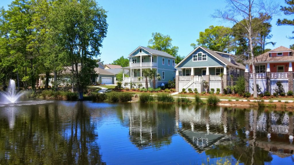
Black also does not belong on a cottage style home. It’s a cottage. Even the word cottage immediately makes me think cute and colourful (below).
If I’m sitting on a porch, I want it to be bright and light and happy (below)!
Black feels oppressive very fast so tread lightly in this trend, too much black quickly becomes harsh, flat and predictable.
I also received this email along with these photos from Gina Pardoe a True Colour Expert:
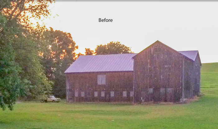
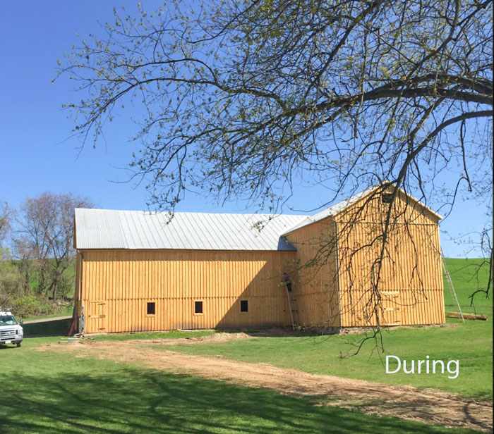
The photos above show my barn in its BEFORE (2014), DURING (2015), and AFTER (Yesterday) phases. It had been naturally turning gray in areas, aging in others, and looking pretty crappy. We needed a stain with thick coverage and enough pigment for UV protection.I’m sending my utmost gratitude to you for giving me the confidence to test a few boards with sample colors and choose the winner. I added enough black trim for some detail, but didn’t want to go crazy with unbalanced lines going in every direction.My oldest son was married here four years ago, and my second son was married this past Saturday. Now it’s an official venue we’ll soon be a offeing for rent. Hopefully we can recuperate at least half of the $$$$$ we’ve spent on renovations. The interior is just as pretty.Again, thank you, thank you! You have been such an important part of my successful design business!’
This is the perfect application for drama, along with a more modern, flat, contemporary home. There are two homes like I’m describing already on the blog, here and here.
If you’re a member of my Exterior Masterclass this paint colour will be available on the facebook page!
If you’d like to learn my System for Specifying Colour to transform your home or business, register here.
September 29 & 30, 2021 SOLD OUT!
October 2 & 3, 2021 (Weekend dates)
October 21 & 22, 2021
October 28 & 29, 2021 (back to regular day-time hours)
It’s the only way to get a Killam Colour System kit delivered to your door.
Remember, we will mail you a Killam Colour System kit with the NEW colour wheel, a paint fan deck and several other helpful resources including tiles and fabric for this hands-on training.



The first house in black reminds me of The Addams Family house. So sad to see such a lovely home and garden ruined.
The gray barn is beautiful!
Painting that Victorian gray was a crime against humanity! 😉
That said, I do recall one cottage painted a very dark charcoal gray (I think the color was called Black Bean?) on a blog.
It was beautiful on that cottage because it had gobs of white trim and a colorful garden all around.
You have to really know what you’re doing to make it work, and I think major white trim is the key.
I agree! There are some homes near me given an ‘update’ with heavy charcoal and some of them are just awful, all charcoal with no contrast. The only one that looks good has masses of bright white trim and a lovely garden. The grey trend is everywhere and too many people chose the wrong tones and wrong shades. I’m in Australia and greys need to have a warm green undertone because that is our landscape of gum trees and grey-green leaves. So people wonder why their newly rendered cool toned mid grey looks blue next to everything else. People learn about the colour wheel but few people understand the importance of undertones especially in neutrals.
I think that was the home of the lady that blogs at Thegardenerscottage. I agree it looks lovely.
It is actually historically accurate to paint period sashes black (or red or green), but the the sashes only and obviously not the entire house. Ugh. I can’t believe they removed those beautiful windows too.
Yes we are seeing black on cottages in the boreal forest. Dreadful. Saskatoon is having a virtual parade of homes that are filled with GREY inside and out. Absolutely no creativity nor color. After the 4th one I quit looking.
How horrifying! I’m sure the neighbors of that dreadful house are not happy either. It reminds me of a gorgeous Victorian in my husband’s hometown, just a few blocks from where he was raised. The house used to be painted a glorious shade of lavender, with deep purple trim and red window sashes. It was glorious and everyone loved it. Several magazines featured it. And then it sold. The new owners painted it a very drab brown poop with a lighter shade of poop trim. It became the saddest house in the neighborhood! There’s a reason these are called painted ladies, and they should be painted colors that enhance their architecture.
I was thinking the same thing as Lauren’s comment, The Addams Family house!! Or a haunted mansion…. Definitely not a good look. And the loss of those pretty gardens is criminal! It was all so pretty before.
I love the barn transformation though 👌
LOL I was thinking from a scary King novel but didn’t watch TV as much as my sister did.
Oh my. I am sure your poor reader feels sick every time she thinks about her formerly beautiful home. As someone who sought out a particular pink peony, and then moved it across the country into a temporary home, another temporary home and then into its current final spot, it even makes me feel sick to see the destruction of the gardens.
Homes in my area are all newish and are mostly stucco, some wood siding. About 16 years ago, the first stucco one was painted a very dark colour. I drove past it regularly, it was very visible on a corner, and it was so jarring. As time went on, so many painted their stucco dark brown, charcoal etc. Ug. Just not nice.
Now I see that original one has been painted to white stucco. lol All of those who never went for the dark fad are now back in vogue without spending any money.
“….. it belongs on the cover of What the F$*@? magazine” Hilarious, yet so true!
Just in time for Halloween, because that that place looks haunted.
Wish I could see the inside with those black windows.
I often wonder if owners ever stumble across posts like this and are horrified to see their homes on the do not ever do this list?
Great job on he barn.
Thanks for sharing and for the laughs!
My former neighbor had painted his gingerbread Victorian in Southern Homes and Gardens colors: soft cream, with accents of soft green and pink. It was gorgeous. People driving by would just stop and stare. This spring he jumped on the black and white bandwagon, and painted it white with all black trim (including the dogwood ornamentations at the top) and now it looks both sad and stupid. I can send photos.