My lovely eDesign client Beth offers colour and design consultations for her own clients using my colour boards. But when the time came to update her own dated brown exterior, she knew she wanted expert advice anyway.
Tackling your exterior is a big expensive job. It makes sense to seek the opinion of a trusted expert to make sure you’re on the right track. Even if you do know what you’re doing with colour. So she opted for our Exterior Bundle eDesign consultation for peace of mind.
The perfect wilderness spot
She has a beautiful property on a lake with beautiful natural surroundings and lots of wildlife. Here is a group of wood ducks hanging around in her tree.
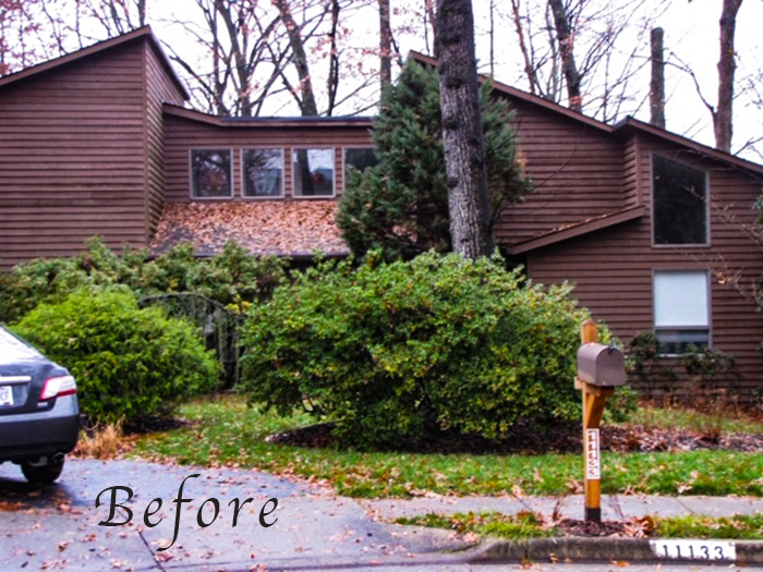
But she didn’t love the look of the house. Here is her before photo below. Doesn’t it seem like dark reddish brown was the go to colour for this style of home in the 70s and 80s? Kinda like black is now!
Beth’s exterior before
She had this to say about the look of her house before the transformation:
“(It’s a) giant hulking red-brown ugliness”, and “by the way, the bird (osprey) in one of the photos often hangs out in our yard to fish from an oak tree, and her expression really says it all about how I – and the osprey – feel about the current colors.”
I love that she had this photo to describe how she felt, so awesome!
Beth’s photo of her Osprey neighbour is titled “Ick Ugly Colors.” This gave me a belly laugh.
She was looking for ways to make the house look less imposing and blocky. She wondered about maybe introducing some contrast, or painting different sections different colours to break it up. And she really wanted some blue.
Get trusted advice when you need clarity on your ideas
But this is why it’s worth seeking trusted advice or affirmation for your ideas. Even if you are adept at design. And even if you’re a design professional. As most designers have experienced, it’s often hard to gain perspective on projects for your own house. And as I said before, an exterior paint job is a big expensive one.
For a fresher look, she was hoping to be able to incorporate some blue with a new metal accent roof. But no matter how talented a designer you are, you can’t turn an austere 70s modern cedar home into a pretty cottage with crisp trim and blue accents.
Just like in life sometimes you just need a trusted friend to help you get clarity, in design, it makes sense to get expert advice to help you eliminate the ideas that won’t work and get clarity on the ones that will and why.
You can’t make it what it’s not
My advice was that the best look for this style of house is a simple monochromatic look.
It’s meant to have some gravity and be impressive in its bulkiness. It needs to be treated in a simple modern way. As often is the case, less is more.
It simply needed a more current colour.
She asked for a new colour for the front door and the metal roof over the entrance. And she needed a new colour for the cedar in a solid stain. By the way, solid stain can be made in most SW and BM colours. And solid stain is different from semi transparent stain, which interacts with wood in often unpredictable ways.
With solid stain, you can test it just like a paint colour.
My advice
This is my note to her in her presentation:
Dear Beth,
What a beautiful location you have! Your windows are indeed taupe, which is defined as having an undertone of pink or violet in my system, although the pink in these windows is barely noticeable, they are more violet taupe, and may even have faded to a violet gray.
The modern style of your house is designed to have a more monochromatic look so your siding should relate to the taupe windows, but it will be much fresher than your dated reddish brown siding so the overall look will be much more current.
I hope you aren’t too disappointed, but I don’t think any kind of blue accent roof will work on this style of house. It’s not cottagey or traditional enough to pull off a whimsical pop of colour like that. The style of your house is inspired by the Modernist/Brutalist Movement (it’s an off putting term for an important style of architecture popularized in the 60s and 70s with a clean contemporary look that focuses on simplicity of colour, form and material). And it’s meant to have impressive blocky volumes as it does.
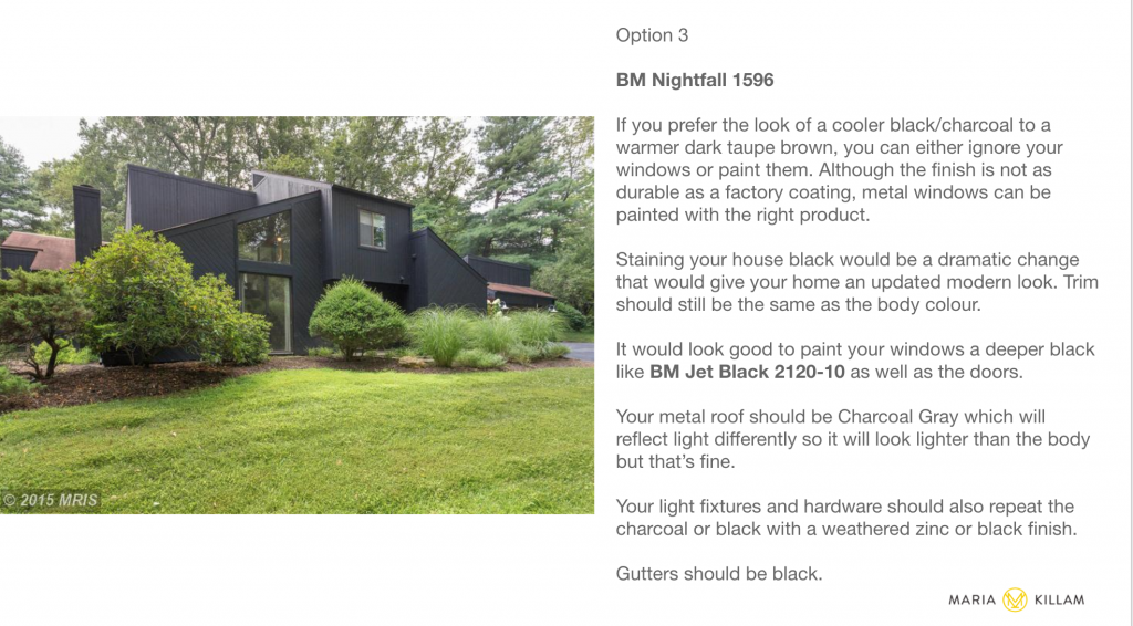
It’s important to stay true to the architecture of the house, even it it’s not your favourite. This style of house is always painted in “architectural colours” like brown, taupe and grey (true brutalist architecture is most often plain green grey concrete, but yours is not true Brutalist, only inspired by it). Recently, there is a trend to paint this style of house charcoal and black which makes them look very modern. Lauren Leiss did this with her home which was similar here.
Thank you for buying this consultation!
In order to get a fresher look, she needed less of a tweak than she thought. She just had to get rid of the dated warm brown and replace it with a more current colour.
Isn’t it fascinating how a once trendy colour can just scream dated? It would be very challenging to make a brown this red/warm look current. IT JUST ISN’T. And since the WHOLE house is coated in it, the WHOLE house looks dated.
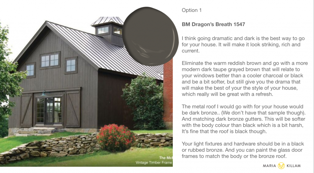
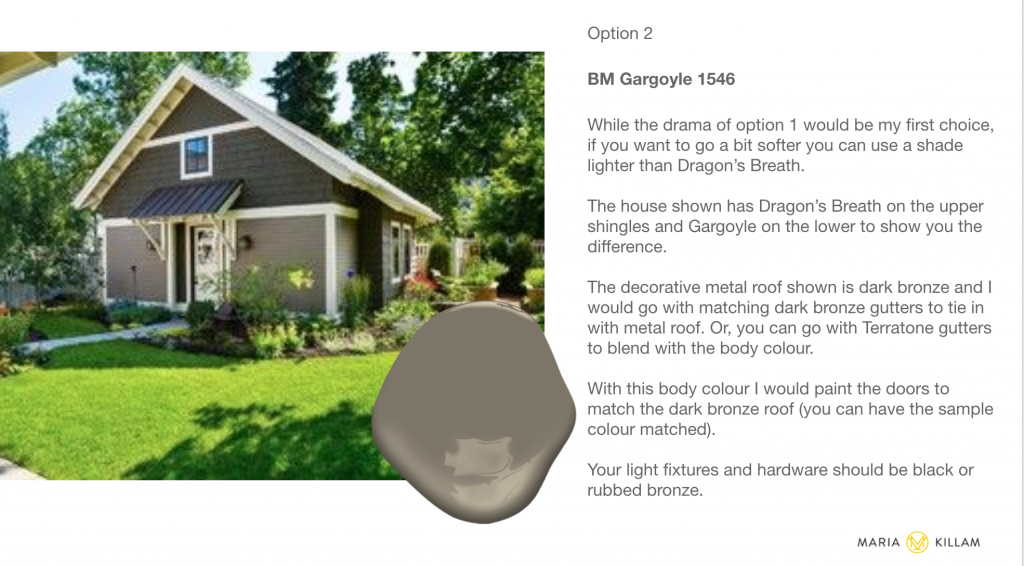
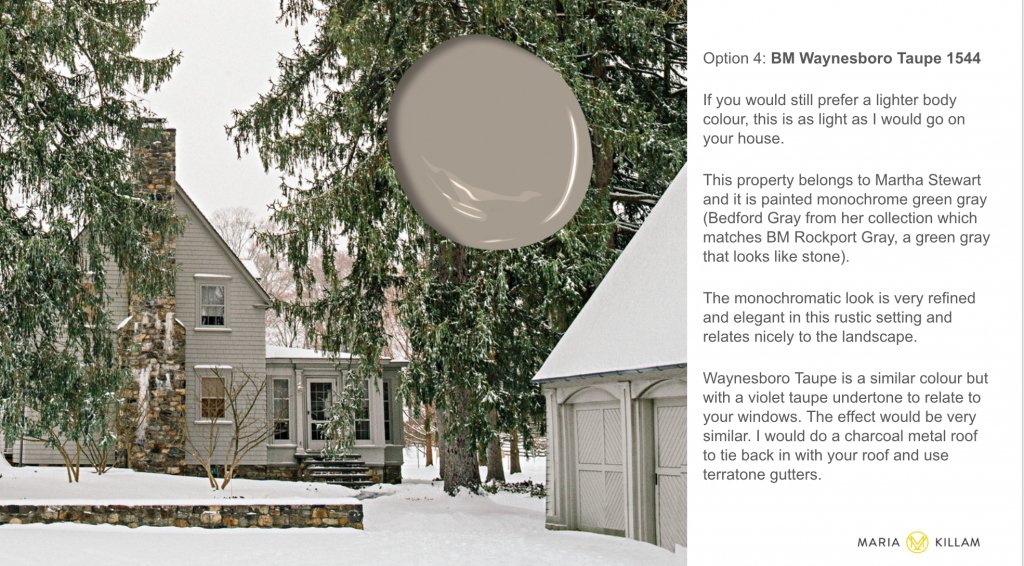
These are the options I provided for her:
My first suggestion was a dramatic dark, more greyed and modern brown.
And I suggested as options a couple of lighter taupes that would coordinate with the windows for a more current look.
And I also give her a charcoal option where she would essentially be ignoring her windows, or, I suggested, she could paint them. Charcoal looks so beautiful in lush green surroundings on this style of house.
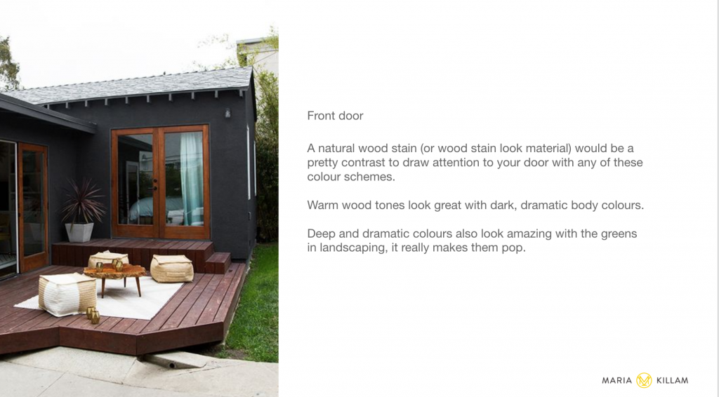
As well as a suggestion for her door (below).
What happened next
Beth consulted with her neighbourhood board who thought the deepest options were too dark.
Then her painter assisted with colour testing so she could be sure she had the right colour. Proper colour testing is a the most important step in any eDesign colour consultation and when you consult with me. I provide detailed instructions for how to test colour the right way.
This is what she had to say when she sent us her after photos (we LOVE after photos):
I thought you might like to see the final outcome of our house. We did end up going with Waynesboro Taupe, the lightest color. It does get pinky for several hours but so does every single taupe we’ve tried, which makes sense. But I love it.
The one change we made was going with dark bronze for gutters and the full-view door to match the dark bronze new metal roof over the entryway, rather than go with the charcoal you suggested to tie in with the mainly black roof. Why? Because the roof isn’t seen, and the charcoal looked too light.
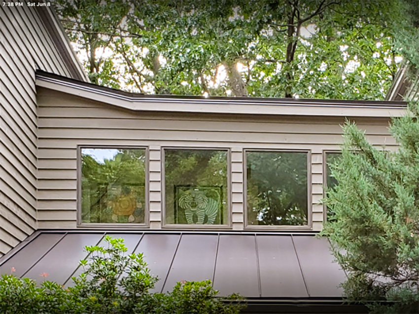
An unexpected small change with huge impact, thanks to our roofer: Last year when then rest of the roof was replaced, flashing at the top – over the four windows – looked wavy and was too wide, plus it appeared as though a piece was missing. It was not missing functionally, since there actually are two roof lines there, but the roofing company agreed it looked bad and offered to change it by making it narrower and adding that piece.
Well our magic roofer saw that the boards under the flashing was not 100% straight, which made the flashing look wavy, so he BENT the flashing in two spots to create two additional lines to fool the eye. It now looks crisp and more high end. He didn’t tell me he was going to do that!
I know you had said to mostly ignore the window frames, but they looked awful by most colors, and now they look “on purpose.”
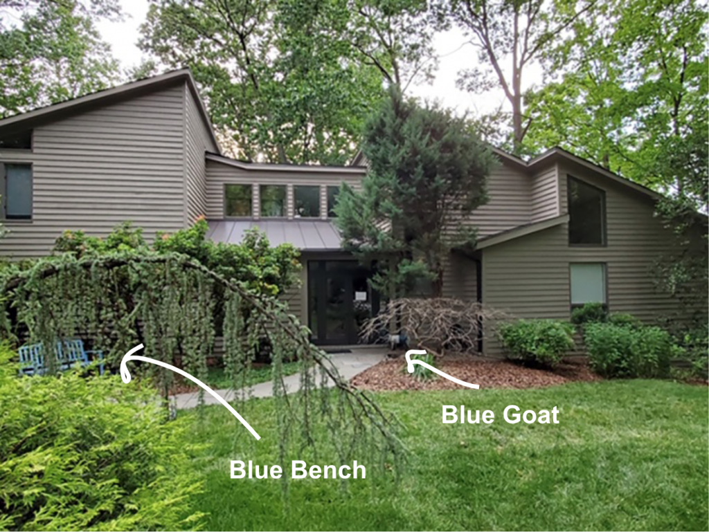
We added a blue bench outside, plus our painter painted the existing bench in the entryway a darker shade of blue, and of course we have our blue and white goat outside. so I get my blue.
So many people have said it looks like an entirely different house, and I never would have gone with the main color on my own. (I was told the darkest color, which actually looked greenish, would have never been approved.)
I’ve attached a couple photos with before and after – you will be able to tell the difference, haha. The roof *is* dark bronze; the sun shining on it makes it look lighter.
Thank you and all the best
-Beth
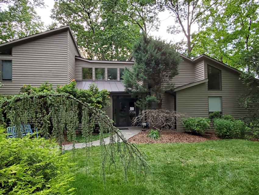
And here it is!
Beth’s house after
So much better right? And it really didn’t need to be completely reinvented. In many cases a small change in degrees can get you right back on track. Often, it can be a subtle undertone tweak. But the outcome is dramatically better.
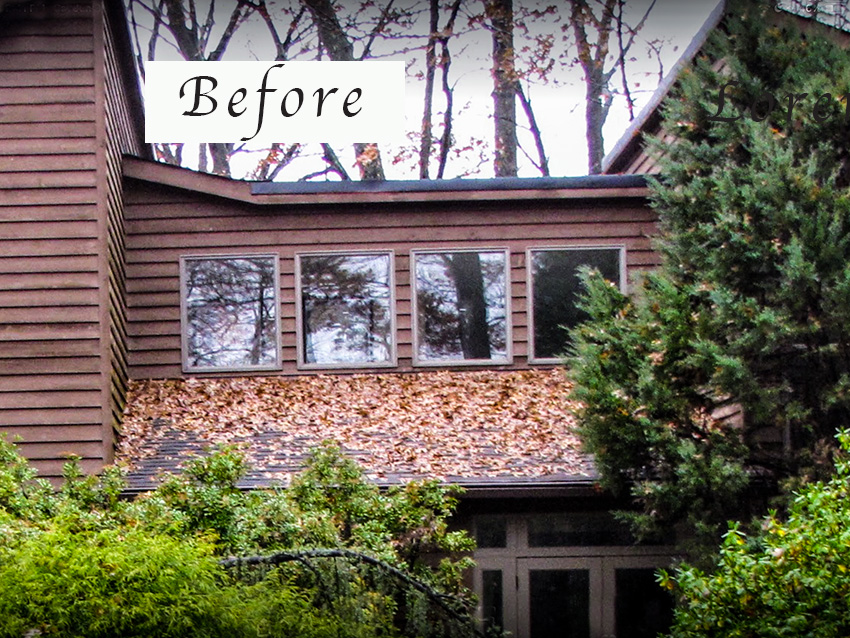
Here is the accent roof before (below).
And after with the new bronze standing seam roof (below). Even though her main roof is charcoal, she was able to go with bronze on the accent roof because the charcoal shingles really aren’t visible. You can see how her roofer fixed up the flashing for her.
Beth’s new standing seam metal accent roof after
And here again is the before.
And the lovely after below. You can see her blue and white metal sculpted goat and garden bench where she got her blue fix.
Beth’s House After: BM Waynesboro Taupe in solid stain
Thank you so much Beth for sharing your beautiful home with us!
If you’d like to transform your exterior, check out our exterior packages here.
Related Posts
Black Contemporary Exterior eDesign Consultation; Before & After





Where I live in the mountains, though most of the houses are some form of traditional rustic, a portion are in this modern style. The owners are updating them in the colors you recommend, Maria.
The transformations are always amazing. I’m seeing more and more of these older modern-style houses looking so much fresher.
Also more people with wood interior walls are painting or white-washing their wood walls in an off-white color, and it’s gorgeous.
Simply stunning in that setting!
What a wonderful transformation!
The transformation is stunning, tasteful and modern. I love the chosen color, it’s spot on. However, I wish they had removed the pine tree in front. It doesn’t seem to serve a purpose and, in my humble opinion, detracts from the overall curb appeal of the house.
Thank you. The tree serves several purposes: it holds two bird nests (one for a returning couple), provides birds a quick escape from predators if they’re in the close-by bird bath, plus provides privacy – for us, not the birds. Huge windows at the landing/staircase go up to the second floor vaulted ceiling. Window coverings are not wallet-friendly. (Sometimes I don’t wear quite enough or wear a raggedy t-shirt as a nightshirt and don’t want to hurt the eyes of passersby.)
To your point, yes, not ideal. It’s been trimmed/neatened since the photos were taken.
I love this reminder that the purpose of a tree is not just aesthetic for the human eye, and love the awareness you have of the wildlife around your house.
Thank you! Moving here to enjoy nature/wildlife, I figure it just makes sense to give back: planting native plants, providing water (for birds that don’t drink out of a lake or when water is frozen plug-in heaters or baths), food, etc. We bought wood duck nesting boxes; our HOA installed them for us. The National Wildlife Federation has an on-line self-certification program to designate your yard – or balcony – a “backyard habitat.” You can even get a little sign to post.
Don’t forget… Trees also clean our air! A very important purpose to serve. 😉
Wow, this transformation is so great! Trust me, when the time comes to paint our pinky-beige stucco house, I’ll be calling you, Maria!
Wow !!! Pictures say it all !!!
It is wonderful to see that classic architectural style honoured in that way. The colour augments the beautiful style, rather than trying to make it into something it is it not which would shortly look dated. Bravo to Maria and the thoughtful homeowner and her trades people for this gorgeous transformation.
I love these posts! It’s so helpful to learn from others’ victories! Thank you.
Thank you for blogging about our house, Maria. And what a gift – I never felt happy looking at it. The tiny lake and nature sold me, not the house. Now every time I drive up I smile.
Maria and Tricia know I went through color angst and they were so patient! (See quote below.) I painted *many* 18×24 samples (Mighty Board), plus 1/2-sheets of drywall with Maria’s colors and others. When finally narrowed down, my painter kindly painted huge swatches against corners and windows, since rough cedar shingles and shadows give more oomph and accuracy than smooth drywall. “I just want you to be happy!” he kept saying. (Truth: he was scared he’d have to re-paint it.)
I’ve never enjoyed exterior color consultations, other than doors/windows if the house color was fine as is, only reluctantly doing them for occasional interior clients who begged. The constant light shifts and so much green made every color look a bit off at some point. And the color we chose made even the skinny windows look good – which I would not have believed possible. Thanks again.
“Patience and perseverance have a magical effect before which difficulties disappear and obstacles vanish.” —John Quincy Adams
Paint can have such a dramatic effect. Especially when it is done well, as in this case. It was worth the testing and the wait. Brava to all involved!
Magnificent! It looks like a brand new build, but better!! I’m so happy we got to see the “after” pictures! Thank you!