This post is also an “Ask Maria” question. So here it is:
“I have painted my family room with BM Clay Beige except the focal fireplace wall which I selected SW Exclusive Plum (6263). I am happy with those colors.
I personally like colors that make you feel lifted, happy, and free, especially with punch of a nice color(s) here and there. So, this new trend that is coming sounds so great for me!! I like BM color of 2014 selections (below)! Though I do not have enough deep blue to associate in my house. . .
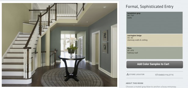
I originally wanted to have very simple neutral wall color and have red accents through foyer and family room (as my front door is red: SW 6054 Canyon clay). I still like that idea but i also liked BM foyer idea pictures (attached) as it is not so typical foyer and that is what I went after.
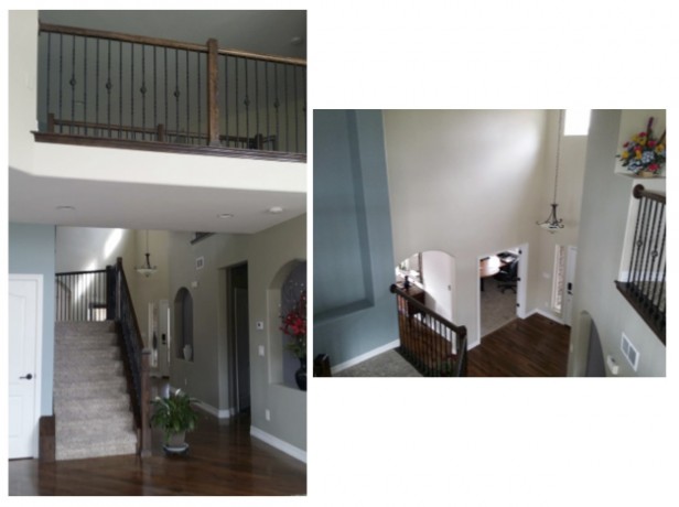
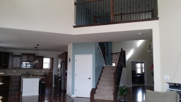
The colors on the wall are: SW 6148 Wool Skein (foyer, as you enter, and upstairs hallway/catwalk), SW 7644 Gateway Gray (hallway to the family room, and to the garage) with two accent niches with SW 6277 Special Gray (to tie with family room fireplace wall accent), and SW 0031 Dutch Tile Blue. (thought brown, green, blue would make it like earth, trees, and sky though blue got too dark and not so airy for sky…)
I like: How Wool Skein looks against front door when it is left open, and how it looks against wood trim. I like how Dutch tile blue looks against dark wood. My husband and two daughters loves gateway gray. I like the colors through family room to the hallway wall, Exclusive plum, Clay beige and Gateway Gray.
The problem is that I am not happy with as whole. “Wool skein” does not go nice with clay beige where the color meets upstairs at the catwalk. I am not sure about this color… The biggest problem is the “blue”. It is not right blue. I think I should pick two colors; one color for foyer and hall way on the first floor, and one color on the stair wall. ( but then which color do you recommend for the catwalk/hall way on the second floor where you can see from foyer and family room?)
I do not have to stick with any of those colors, though less to change is easier…I could even use Gateway Gray for the office (off of Foyer), or guestroom (off of Family room, which might be a good idea…Yes??)
What is your suggestion?”
This is a great question because you are not alone in this dilemma. Here’s why your colours are bothering you right now.
It doesn’t matter how many times I have said it here on this blog, here, here and here. It still doesn’t land for so many people because you move into a new house, look around at your blank walls and think that’s the place where you should start when choosing a colour scheme.
So many people make the novice mistake of assuming that once they get their paint colours chosen, it’ll be downhill from there.
Especially if you’re not a decorator so it might not occur to you that your living room needs to be decorated first. We all have our talents right? I can’t do what you can do but I can definitely help you chose a starting point that will then immediately provide you with a colour scheme that is more than just beige or grey.
Okay, so back to choosing colours. Our walls are either covered in the previous homeowners choices or they are blank, waiting for our personality. So we start looking at paint colours and trying to figure out which colour/s work the best.
And here is where the problem starts. Paint stores sell PAINT not fabric or furniture so when the consumer arrives at a paint store they get a brochure with colour palettes that have been chosen to give you “Inspiration”.
If a colour consultant wants to get colour training, there are many courses to be found that teach you how to choose colours schemes that look good together just by spinning the colour wheel.
This does not help you learn how to choose colour in a real house with existing fixed elements that are for the most part wrong in so many cases, not unlike the finishes this homeowner has inherited.
First, let’s dissect this random colour palette, chosen by the paint company.
The reason my reader is not at all happy about the blue is because dark greyed blues like this generally start to feel like a mans den or a teenage boys room.
The yellow beige is well, beige. No one is painting their walls beige right now unless they have an earthier palette.
I can count on one hand how many times I have specified a beige this year for a client. And if I selected beige it’s because it coordinated with existing fixed elements, certainly not for a main neutral in an empty house.
The trend right now is “Fresh” and nothing about these colours says “Fresh”.
My reader also clearly said “I personally like colors that make you feel lifted, happy, and free”, the colours in that Benjamin Moore foyer are anything but.
She also reported how her family members felt about the colours they had painted so far in her house and she was very specific in outlining her preferences and feelings about the existing colours as well.
The reason why she did that is because the colours don’t relate to anything. That’s when we criticize colour the most.
It’s just plain hard to love a bald paint colour all by itself.
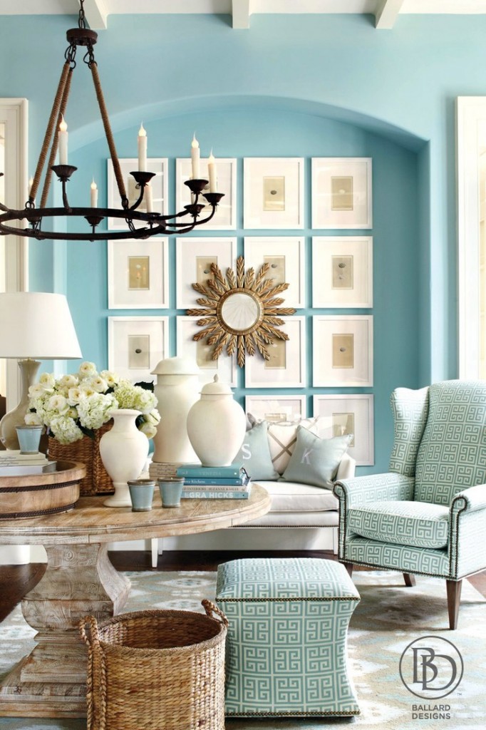
The reason why we’re covering our walls in shades of pale warm or cool greys is because we’re now decorating with colours that, in the past, were commonly found in children’s rooms. Bright, clean, happy.
Grey is the perfect backdrop in furniture or walls for all these bright and happy colours.
The green in the paint store brochure is muted and earthy as well. This works if you have existing furniture you need to work around but if you are starting with nothing, this colour palette is not as popular. Right now, in 2014 anyway.
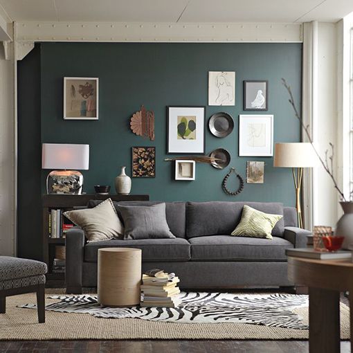
{click on image for source}
Here’s a living room with a dark blue/green behind a charcoal sofa. If you like this room it’s because it’s heavily styled. Take away everything except the sofa and the wall colour, and you might not give this interior a second glance.
The problem with choosing random colours first, is now you have to run around trying to match a $50 gallon of paint to furniture, accessories, carpets.
Way easier to decorate first and then coordinate your paint colours.
If you decided to paint your house first, using “inspiration colours” off a brochure, you’d now be extremely limited with your choices and would probably have to go custom because it would be much harder to shop off-the-shelf.
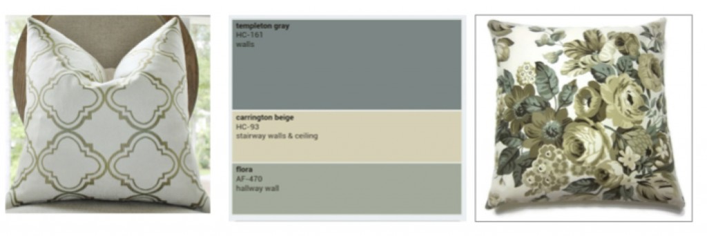
I went looking for throw pillows from Etsy to see what I could find to go with this random palette, and here’s what I came up with:
This patterned pillow on the right, was the closest that I could find to your palette and even then you can see that the blue in the pillow is not exactly right. The reason these colours are hard to find is because they are technically considered, dated right now.
And the colours are very muted and dull, not the look and feel you are after.
So here’s my best advice. Stop painting your walls which will narrow your choices further and further and focus on decorating your great room instead. Then once you have a palette chosen, you can paint the rest of your house.
Regarding your question about SW Wool Skein and BM Clay Beige, they are too close to work together in the same interior. Choose the one you like the best and paint over the second neutral.
I would also consider replacing your existing sage green furniture from the 90s. Much better to start fresh since your great room is basically empty except for your sofas. A new house is the perfect excuse to start new and fresh. Keeping your existing sofas will boss around your entire colour scheme and again, not give you the “lifted, happy and free” feeling that you’re craving!
Do you have furniture that’s bossing you around?
If you have a question for my Ask Maria series, take a picture in good natural light and without flash and send it to [email protected].
Related posts:
Are you Waiting for your Paint Colours to Propose?
Canned Colour Combinations; Why They Don’t Work
6 Ways to Choose the Perfect Neutral Paint Colour
If you would like help creating a palette for your home, become a client. Online or In-person.
To get your exterior colours right, download my How to Choose Exterior Colours with Confidence webinar and get my go-to list of colours.
Download my eBook, How to Choose Paint Colours – It’s All in the Undertones to get my complete step-by-step system on how to get colour to do what you want.
To make sure the undertones in your home are right, get some large samples!
And, if you would like to learn how to choose colour with confidence, become a True Colour Expert.





I have a pink beige sectional that I can’t wait to get rid of! The paint is currently SW Rainwashed so it looks ok, but I have not repeated the pink beige anywhere else because I want it out. Now I have to figure out what color sofa to get… White? Linen? Dove Gray? Navy? and still have it go with everything else that is existing.
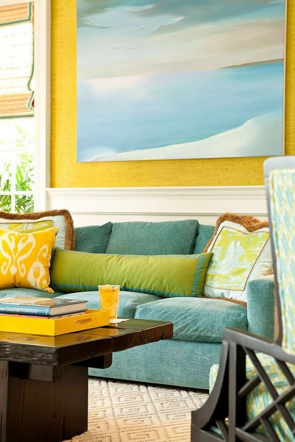
Maria’s yellow sofa inspired me to get a green sofa. It was like being given permission to go bold rather than settle for a neutral. Allow yourself to dream in color and choose a sofa color that matches your personality!
I have a muted yellow sofa with my Quietude walls – I’m happy with it. I think yellow would go nice with your Rainwashed.
When did we stop thinking about what we love vs what is the current trend. I love purple and blue greens and deep reds. My pallet never worked with beige. My sister loves fall colors, deep orange and olive greens. Her home does not work with the current gray trend.
My advise is to pick the colors you love and the neutral that works best with those colors.
Hi Jennifer,
I totally agree with you, choosing the colours that you love first is EXACTLY what everyone should do and then choose the correct beige or grey or colours to coordinate. AND this reader obviously wants to have a house decorated in the current ‘fresh’ trend because she clearly articulated that right up front.
Which is why my advice looked the way it did.
Maria
Maria, I totally agree with you on this one. I am so frustrated when a client has already painted, even if it’s a neutral, and I have to work around the paint color. I always tell clients that I pick the paint color last.
This post seems totally edited and perfectly written!
Excellent.
Totally agree about the content and structure of this post. Hope it’s ok to point out a small typo though..”The reason why we’re covering our walls in shades of pale warm or cool greys is because we’re now decorating with colours that were formally found in children’s rooms”….I believe this should be “formerly”. Love reading the blog Maria, and the transformation of your agree is just amazing!
Sorry..don’t know where the word “agree” came from…should have read “garden”.. Blame the iPad autocorrect!
So agree Maria. So many folks choose their colours in isolation & then wonder why they don’t go together. A beautiful painting, an elegant carpet or wonderful textile can all be inspiration for a wonderful colour palette. No sense at all in letting existing colours or ugly furnishings boss us around! An fresh is so much happier than these dreary shades.
Thank you for this post. Something just ‘clicked’ with me. I now know how to start after procrastinating for ages because I didn’t know where to begin 🙂
It is a revelation to me that you pick the paint colors last. This is me, picking my jaw up off the floor (it’s been there since Wednesday, when I first heard the idea in Maria’s (awesome) Renovate with Confidence webinar.
‘Way easier to decorate first and then coordinate your paint colours.”
this is great advice, but sometimes it just isn’t feasible…we recently purchased a home adjacent to our vineyard, it will be renovated, but needs to be done in stages…first thing we will pick out is the hardwood flooring (throughout), next thing is paint…we have furnishings that will be used, dining room table, master bedroom, but the rest will be chosen at a later date…
so for now paint color has to come first…not going to live with the dingy, dirty paint left by the previous owner!
so what is your suggestion for whole house painting when you know it will eventually be redone, as the rooms come together?
That’s when you pick the right neutral that coordinates with most of your existing fixed elements and get a fresh coat of paint on everything. Then when you start decorating, add colour in the rooms where you want it: But trying to choose 8 colours in advance like the example in this post is just a recipe for frustration. And you’ll still need to repaint because it will still be less expensive then buying all custom to go with your paint colours. Here’s a post about how to choose a neutral: https://mariakillam.com/perfectneutral/
My sister-in-law was moving into an older home. She had picked paint colors & had hired painters. They were coming the next day. I stopped by to see the house & paint swatches were up. Just random colors that I knew wouldn’t work with her existing furniture. I asked why she selected the colors she did & her response was “Cause I liked them.”
OK, then. And my husband gave me the signal to stay out of it.
On the ride home, I expressed my concern & my husband said “Not everyone is like you. They can live with things & colors that don’t all work together.”
What I LOVE about you Maria, Is that you can take the random disorganized, thoughts about color that bang around my head and articulate them! Great post!
A most excellent post. Proves that hitting the repeat button over and over can finally find its way thru the muddle!
We just moved into a new rental townhouse and I’m actually attacking this one from both ends. I love bright happy colours but I also like warm rich colours — so I am not a grey fan. I’d rather use cream or white or something like that for my neutral or backdrop.
At our new place, most of the rooms came painted bright, happy colours that are the right colours to go with my furniture and decor — they’re just a few shades brighter than I would have dared. So overall I’m happy to live with the existing colours and see if I need to tone it down.
The bedroom is painted soft blue, which is a bit of a problem, because it needs an accent and I may not have the right stuff. I could repaint, but I’m willing to give this blue a shot and see what I can come up with affordably, or what happens if reuse some existing things but play with the proportions for each colour. I won’t buy anything that I don’t like enough to reuse sometime/somewhere else.
Whereas the one or two spaces that are painted in shades of mud, as opposed to cream or white? And the trim that ought to be crisp white and isn’t? *Those* I will find ways and time to repaint, now that it’s obvious how much the colour is lifting my spirits! (I should watch for a sale on trim paint and the right brushes.)
Great post, Maria. Happy Friday!
It’s funny. Years and years ago, I used to watch a decorator program where the guy talked about his 7 layers of design. His first layer was paint and architecture, and then layer 4 or 5 was high ticket upholstery items. I remember thinking then that paint seemed like the wrong place to start. I always thought it would be easier to select your upholstery items first, and then coordinate the paint rather than the other way around.
Anyway, my point in sharing this is the reason why so many people do it in the wrong order is because for years people have been told to do it wrong!
Perfect follow-up post for what we’ve been learning in Color Summer School. Again, so happy the previous owners of my house only repainted the LR/DR, kitchen/laundry room and hallway and didn’t paint the bedrooms or baths. The yellow beige is working well in the LR/DR now with the artwork and furniture and style of my house (only a very very slight nag that it may be slightly off but happy enough now and can deal with that later if necessary). Knew from the start that I’ll be repainting the kitchen/laundry when I paint the cabinets, etc. Had they painted the bedrooms/baths in the same color, I would have been totally limited. I’ve been having fun putting those two rooms together and liking the results, and now choosing wall color will be a relatively easy finishing touch. The great thing about you, Maria, is that you’re always teaching us in everything you do. This post is perfect as is the Fix My Colours series.
Thank you Maria, As someone who works with fabric and furniture all day long, one of the most frustrating parameters is to have to find fabric to go with a paint colour! It happens far more than anyone really wants to know! And it is ridiculously stupid! It really limits the customers opportunity to express themselves and feel comfortable in their own home! IN THIS CASE, EVERYONE SHOULD LISTEN TO YOU MARIA!
Thank you for a really helpful post and a good, blunt reminder of things you’ve said elsewhere. It’s really timely because we are about to repaint our living room – starting the prep tomorrow. Some time in the next year we’re going to replace our couch with a leather one, and replace our stained old beige carpet with hardwood floor (the wood will be medium brown and on the warm side, and the sofa would be warm and medium-dark). We’ll also be getting a new large bookcase in white or wood. There are no other fixed elements like a fireplace or anything. Is this a case where we can pick the paint color first, because the leather and wood will go with anything, like blue jeans…? It would be great to get your two cents – thanks!
The colors we’ll be picking from for the walls will most likely be either a creamy off-white, pale blue/green/grey, or very pale sage. (And if we go with the off-white then we’ll probably paint the ceiling blue.) We can then pick a rug and throw pillows etc so that they don’t clash with whatever paint we decide on.
Another great post. This is why we are all such fans of you!
Great post Maria. We are always working with clients in our BM store who are in a panic to get the walls painted because they have new flooring/cabinets/lighting, etc., going in tomorrow.
We do the best we can coordinating colour with the samples but of course, we’re working blind. So, as you advise, spend the money on a colour consult at least, before choosing paint colours. It costs a lot less than repainting and avoids some of the frustration.
many times I have gone into a new build to measure for all new furniture etc etc and clients want a paint colour or colours before I leave… or they have had another designer in and they have picked colours for the whole EMPTY house, and not soft interesting colours no no wild out of this world colours…
thank you for this post, I will be sending them to your blog to read this next time… x
Brilliant post! Maybe we’ve heard it before, but this post really lays it out in a way to truly understand it. Thanks!
Maria,
I agree 100% with everything you said. I’m just a self-taught color consultant, so it’s nice to hear that the advice I’ve been giving is in line with what an established professional is saying.
Homeowners should realize that without any decor to reference or even an ‘inspiration room’ photo, it’s difficult to suggest many strong colors. A good example is the yellow room you showed; while fabulous, how intimidating would that appear if you saw it with no decor at all in place?