Learn how to choose exterior house colours for your existing home or new build. I’ve packaged all my exterior design advice and answers to your questions about home exterior colour in my new Masterclass Exterior Colour Selection online training!
After over 4 months of development during the Spring and Summer of 2019, plus more than 20 years of experience, and thousands of colour consultations completed — it’s finally here.
I know exterior is only half of the expert training I need to have online, but the rest will take some time to create! So after many years of emails with readers asking about online training, I’m starting with the outside of your home!
NEW! Online Exterior Masterclass on Choosing Colours
I’m so thrilled to announce that my new Online Exterior Masterclass on Choosing Colours is now available!
This is the only course that will give you the step-by-step process for choosing the perfect colours for your exterior using my tried and proven System for Specifying Colour.
Not only that, it will help you navigate the trend cycles to arrive at the most classic and timeless look for any exterior.
My new Masterclass is the ultimate shortcut for learning to choose exterior colour like an expert. I’ve distilled my years of experience and insight into clear, universal principles that anyone can learn and apply to master colour for exteriors.
START HERE to watch the first module for free!
CLICK HERE TO JOIN THE MASTERCLASS
Let me start by sharing a great example below that illustrates just a few of the concepts covered in this comprehensive online colour training.
How to Choose Exterior House Colour
I received this question the other day along with a photo:
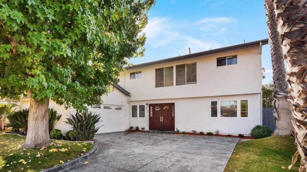
I’ve just bought a new home. It’s built in 1965, and has very little curb appeal. It needs new windows. The stucco is currently white, so I’ve considered black windows to add some contrast.
If I do white retrofit vinyl windows I think it will look bad unless we paint the house a contrasting color. I’m also bothered by the asymmetry of the windows and front door, so I’m worried about drawing attention to that with contrasting windows. Any advice?
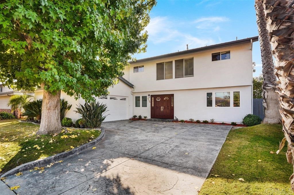
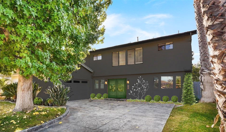
Before
Did You Know that Managing Contrast is an Important Concept for Getting Exterior Colour Right?
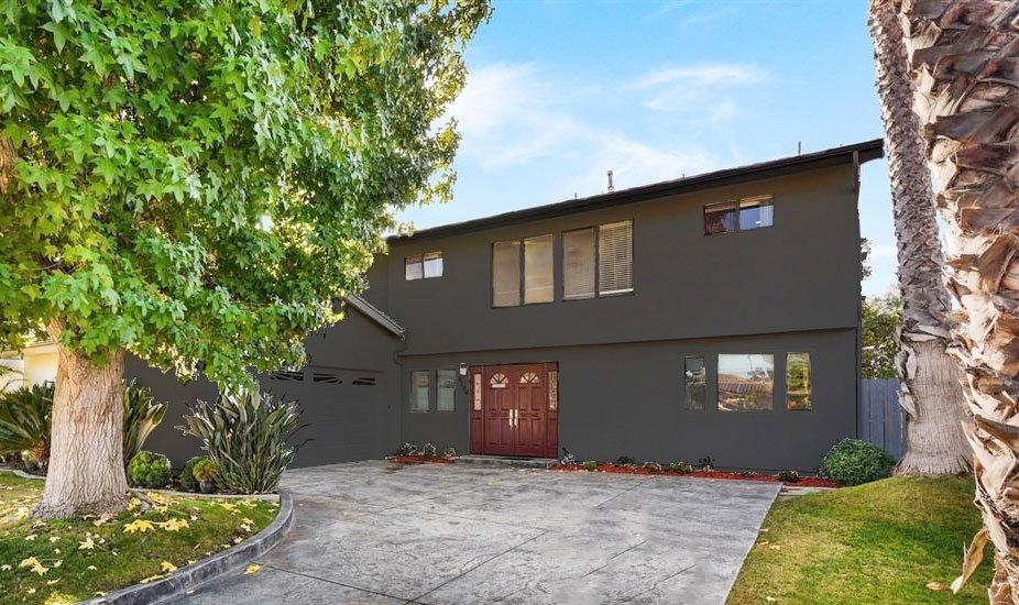
I agree, the window design needs a complete makeover. However, if that’s not in the budget, black windows with a matching dark body colour will definitely help hide the asymmetrical windows, as well as take the attention away from the dirty looking driveway.
Low contrast and consistent, blending colour creates a seamless coherent exterior look.
HOT TIP: low contrast and consistent, blending colour creates a seamless coherent look, high contrast draws attention to disparate elements. Use low contrast where you want certain disjointed elements to “go away”. Windows typically read dark on an exterior anyway, so if they are random in size or shape, and you don’t want to draw attention to them, consider a dark body colour as a possible solution.
Let’s see how that would look, shall we?
It’s better but now the door really looks wrong. It’s way too traditional for this more contemporary style home. The dated cherry stain isn’t helping either. It’s important to be aware of the style of your home when making selections like colour, window and door style. These are the details that can make or break the look of your exterior.
Never Underestimate the Power of Good Landscaping
I asked MaryAnne White, my Landscape Designer to weigh in on the landscaping since that’s also such a great way to take the attention away from architecture that is lacking.
Since working with her so closely on my home (and all while long-distance from New York) it’s one of the first things I notice when I look at the architecture and colour of a client’s home. I often suggest landscaping instead of more expensive “upgrades” like trendy stone, to improve the curb appeal of someone’s home.
I cover this topic in Module 12: Curb Appeal Begins with Landscaping.
She suggested the new evergreen shrubs and a metal sculpture in between the front door and the windows on the right. This way it would look the same all year.
I added modern doors into the image in black.
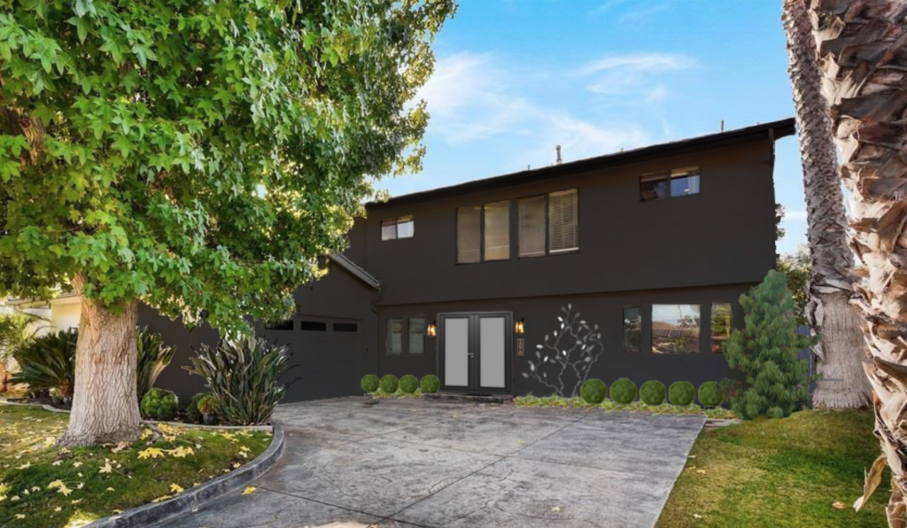
Much better. Now the choppy windows are way less of a feature than they were when the house was white and the new shrubs greatly enhance the curb appeal!
If we also added new black windows to this home, I would make sure the window frames were skinny.
If you are choosing new windows for a renovation or new build, your questions will be covered in Module 5: Windows: The First Step in a New Build.
This module, all about windows, also includes a book recommendation that no one should live without, to inform your new build, as well as the three most important features your new home should have.
What are the best front door colours?
Now, could the front door be a different colour?
How about yellow? A clean yellow often looks fabulous on a more modern home:
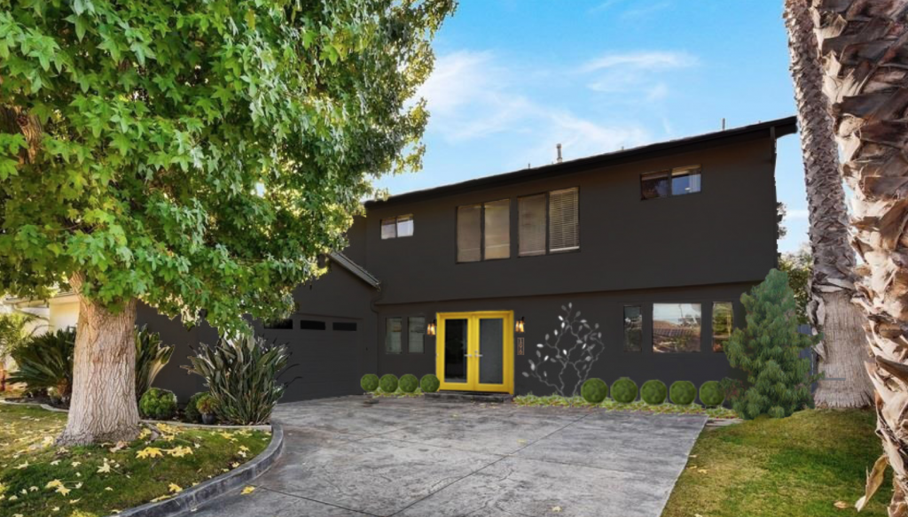
Definitely NO. Why does it look bad?
POP QUIZ: Tell me why the yellow door doesn’t work in the comments below, and in a of couple days I’ll post the answer.
And here’s the door in green. It relates nicely to the green trees and shrubs all around but if it doesn’t feel modern enough, you could stick with the black door and then we would just see the new landscaping instead.
Then you’ll discover Module 10: The Best Front Door Colours to help you navigate which colour is right for your home.
CLICK HERE TO JOIN THE MASTERCLASS
Here’s the home exterior before again:
and the home exterior after:
After
Everything about exteriors that I’ve learned, tested, and perfected over 20 years is packed into this course.
And it comes with lifetime access. You can use this to improve every exterior you’ll ever own, for the rest of your life.
And now it can all be yours.


Maria –
I know you have magic.
But I have to say .
“ that was totally amazing “
I wouldn’t have ever dreamed that could change like that ….
And didn’t mean changing everything out like windows etc .’
I’m in “AWE “
Thank you great blog !
I think the yellow doors are screaming “look at me” which would be fine on a new architectural build. The black on black version is subdued but relevant. The house is older, not very pretty, but this scheme is modern and brings into into the new decade/centrury. In New Zealand we are nearly at saturation point with black houses (and kitchens) but people love them.
In regards to the door, it is because it has warm undertones, compared with the cool undertones of the charcoal. It also seems to draw my attention to the windows above, where as the black glass doors don’t.
based on the “lesson” included in your post I would think the yellow is too much of a contrast against the main body of the house and makes the off-center doors stand out even more. And this would draw attention to the less than preferred offset front doors. The dark color and the dark doors and new landscaping suggestion is fantastic!
It is the only part of the frontage that provides high contrast, and furthermore, the color doesn’t connect with anything else visible, so it sticks out like a sore thumb.
The yellow is too much contrast! The black door looks much better along with the body color of the house and the new landscaping. That should all last for a long time until other options can fit in the budget. And if there is work to be done inside there will be time to focus on it. Great ideas to fix the problem!
I think the yellow door is a clean and dirty color problem.
Wow lady, you are amazing! That is amazing bang for the buck.
I think the yellow doors don’t work because the brightness and shape look so similar to the upper windows my eye goes there too and thence notices all the asymmetry of the elevation all over.
One thing about the yellow doors is that there is no other yellow to relate to so it stands out awkwardly. I think the fact that it’s not a solid door contributes to the effect.
I would love to see the copper sculpture be a bottle tree with cobalt blue bottles. This would pick up on the blue / purple tones when the Birds of Paradise are in bloom. I would also add a cobalt blue pot on either side of the door with a tall skinny green plant.
P.S. Is this house in LA ? Palm trees and a maple in the same yard ? Hmmm
I think the yellow is too bold and it doesn’t relate/repeat in any other color area on the house or its environs. I do like the charcoal doors (which is odd, because I do not like black/dark usually), but maybe a lighter gray/silver/blue that would coordinate with the metal sculpture would work for the doors?
Hi Maria,
OH, I watched your video about the exterior course and found a couple of good advices for myself 👌 I hear for the first time about the importance of the contrast of trims …
I like dark colors in architecture: they are calming and fit well the natural landscapes.. 🌳🌲 The black houses are like rocks surrounded by the forest .. 🏞😍 HaHa, I have never seen bright yellow in the exterior, it pretty much offends the eye. The only color that would be a great match to this black house is grey. It is close to black and green and look very natural on the house.
The yellow doors don’t relate to anything so although they are a complete contrast I don’t think it works.
The yellow creates too much contrast which in the lesson you want to try to reduce the contrast between the trim and house colour as much as possible. As well the yellow relates to nothing else in, on or around the house so there is no repetition of the colour.
Great advice for this howeowner! Congrats on the new course.
I watched your free module yesterday. Then drove to the grocery store through my neighborhood. All of a sudden, so many of the color schemes of the neighborhood homes looked haphazard. Came home and bought the course so I could understand more about why that is, and what to do about it!
Haha, I love that! I appreciate that you took the time to comment xo
I would go with a nice dark barn red or medium charcoal door… or if I was feeling really funky I would do ballet pink because black and pink are classics in the dance world
The yellow door is too clean, it draws attention to the dirty color of the driveway.
Nailed it!! A lot of commenters thought it was because it doesn’t relate to anything but lots of front doors are a stand alone colour, it’s the driveway yes! Maria
Nothing relates to the yellow. Nothing!
About the door- is it a clean and dirty issue?
Yes it doesn’t work with the dirty looking driveway. But it’s fine with the black house! Maria
As soon as it was offered, I bought your Exterior Color Selection Masterclass and immediately got started. Finished it yesterday. What an excellent course, Maria! I loved it and found it very well thought out and presented. Thanks for offering these online for those of us who can’t come in person to one of your training sessions.
Thanks so much Kim! xo Maria
Congrats to the driveway commenter!
But even without the driveway, when the photo is scrolled down so it can’t be seen? It’s still screaming traffic accident neon and to my eyes is a nope. Coral, please, if color is wanted.
My first thought was the dirty driveway. It stands out more than anything. If I really wanted a lovely yellow door and that was all that was standing in my way, I would bust out some soap and a power washer and clean the filthy driveway. Easy peasy.