Update on the Homies Awards at Apartment Therapy – thank you so much to all of you that have voted for me, I am honoured!! Click here to vote if anyone else feels so inclined 🙂
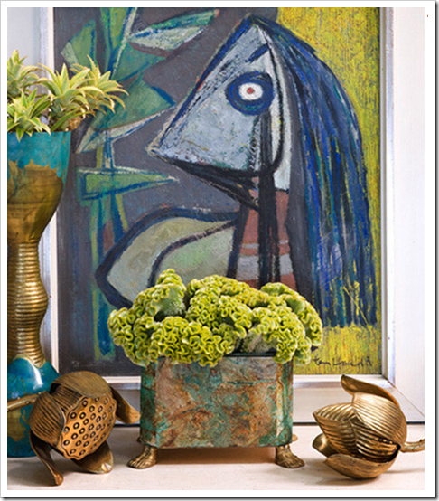
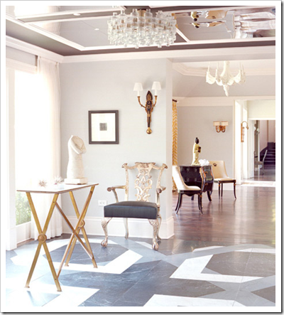
Kelly Wearstler and I now have something in common besides that I love her style! I now have a Facebook Fan Page, click here if you’d like to follow me. When I found Kelly’s fan page today I read that she has a new website, so I found some new images to share with you!


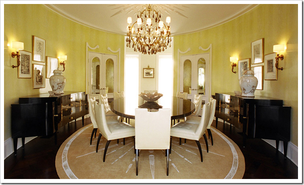
All images from Kelly Wearstler, Inc.
Okay, anyone that wants to play, I have a question: What is the undertone of the area rug compared to the walls? I’m guessing it just shows up this way on camera but it’s a good opportunity for a colour lesson!
**Thanks to everyone who guessed and here’s what I see. The area rug has an orange undertone which I technically consider to be the 4th undertone of beige–some might argue with that but when you hold up all 4 paint chips to compare it’s in there too. I just don’t talk about it because it’s rare that someone will paint their entire house in a shade of butterscotch beige (which basically end up on maybe 2 strips in the entire paint deck, one is BM Boardwalk, Roxbury Caramel, Richmond Gold, etc).
If you would like to transform the way you see colour, become a True Colour Expert.
Related posts:
What Everyone should Know About Beige
While you’re here, subscribe to this feed so you don’t miss out!


Oooh, I don't want to be wrong! I think the rug has an orange undertone when compared to the yellow walls. It almost makes the walls look greenish.
The rooms are beautiful and I like the furniture and accessories – we don't see these styles every day.
I'll take a guess at the undertones. The wall has a green undertone and the area rug has orange.
I concur with Sara and Marlo. Even the chairs, ceiling and painted door mouldings seem to have an orange undertone … while the wall colour (greeny-yellow) seems to clash (but then again, it could just be my monitor settings).
I'm quite sure I'm wrong, but it looks pink to me, compared to the walls.
I admire much of the work of Ms. Wearstler, especially her bold use of colour, but lately some of it seems overwrought and overdone. But, all of her rooms are definitely dramatic and distinctly her.
Looks definitely orange, but I guess it may vary on different monitors.
And how I love that turquoise table! I could look at it all day…
I'll cast another vote for orange, too…but it almost seems so obvious that it could be wrong. But I'll go with that, anyway..!
Welcome to Facebook! It's a great networking tool.
I think the rug has a pink undertone.
I'm going with an orange undertone.
I'm going to say the undertone of the walls is green and the rug is either pink or orange.
I love the inspiration photos today! My vote is a pink undertone in the rug.
Love the color of the walls! I say pink for undertone in rug.
The rug looks a bit pink to me.
As beige has either a pink, yellow or green undertone, I feel the rug photos more pink than either yellow or green. I find the walls yellow with a hint of green. The rung does not go in the photo but that may be the lighting in the room. I too see a bit of orange in the rung as pictured. I do not like the rug and wall colors together as pictured.
Your blog is so inspiring. It's almost like sitting in an interior design class
Thank you for creating such a wonderful blog.
I was just on her website myself. Love how the rug in the last photo reflects the pattern on the ceiling.
Delighted to have found your blog. I am a co-developer of a patented color system called Color with No Regrets which I teach around the country. Color always seems like the best kept secret, and yet, the truth is simply to honor saturations and undertones, (clean and dirty) and it is so easy. Love your practical approach to color. Look forward to reading your blog.
OK, I am just going to admit that I am not a KW fan! But, I am a huge fan of yours.
I have posted my year end favorites, and of course one of your posts is on it! Best wishes for a wonderful 2010.
I especially like the first, third, and fifth images…hmm, not sure why the odd numbers!? KW does have an amazing sense of style.
Happy New Year,
marcie
Love your new FB page, Maria! As you know, I'm a huge fan.
I'll attempt this, but not sure I will be correct. On my computer the rug looks to have an orange undertone although I was looking for those ugly pinky beige undertones that make me cringe. I just know that I don't like it much for some reason. So give us the answer, please.
I've been looking all over for this!
Thanks.
Maria, is Wilmington Tan one of those butterscotch beiges?
Hi Cate,
No Wilmington Tan I would categorize as a 'gold beige' and all golds have a greeny yellow look to them. A butterscotch colour is more like Boardwalk or Roxbury Caramel.
Maria