Installing patterned tile in your kitchen can easily go sideways. Before you fall in love with the trendy new encaustic tile, here are some dos and don’ts to help guide you in the right design direction for your kitchen.
Every time I see a badly installed Encaustic tile or just too much pattern, even if it’s well-designed, I get further validation (in my mind) that it’s my job on this blog to direct you towards the most classic, simple, solid tile – which is often subway tile. Period.
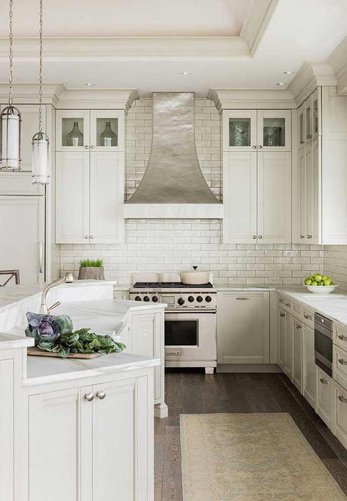
Subway tile backsplash – via Pinterest
And just in case you’re rolling your eyes (Hey, I can see you :), I’m talking about white or cream tile that leaves you with options down the road for changing other colours.
I’m not married to subway tile, I just prefer it over most patterns because of the classic nature of it. But hey, white or cream in any pattern, is still way better than blotchy and busy patterns that date super fast.
Anything that commits you to one particular colour scheme forever, starts to scream trendy and far from a timeless look.
The other day, I received this email from one of my lovely readers:
I just discovered your blog. . . wish I had found it before renovating our new old fixer upper! We spent a fortune on renovations to a 35 yr old run down house and a year and a half later I’m regretting almost all of the design choices our designer pushed us into making. I realized much too late in the process that the designer had a totally different vision for our house than we did.
So long story short, one of the biggest mistakes we made was choosing a very expensive square floral marble kitchen backsplash. What I really wanted was white subway to go with the white cabinet uppers and carrera looking quartz counters. The designer told us she would never let us put something so generic as subway tile. What a mistake it was to listen to that advice!
As soon as the first square of busy floral marble went up I knew it was wrong.
Our contractor told us that ripping it out would be a nightmare and that our only solution would be to possibly find a very thin glass tile to install over it.
I’m desperate to find a better solution. I even thought about panelling over it with shiplap, but how do you have wood behind a stove top?
Ugh… have you encountered this dilemma with your clients? Is there an easy fix? I tried to find an answer on your blog but didn’t see anything specific to our problem.
Help, my designer didn’t let me choose boring subway tile!
Here is my response:
Okay so here’s the thing. First, your contractor is likely not interested in the job if he is calling it a ‘nightmare.’ I spoke to my good friend Jan Romanuk who is a kitchen and bath designer and she said she manages the removal of tile often and it shouldn’t cost you more than $1,000 even if you end up having to do some drywall repair.
When my sister Elizabeth took out her ‘then trendy tuscan dark travertine tile’ and replaced it with the ‘cheapest tile there is’ according to her contractor, it cost $750 for the tiles and labour.
So, my recommendation is that you find someone else to do it.
And it should be white subway tile, definitely not shiplap.
Here are my do’s and don’ts for using patterned tile:
DO Keep your patterned tile paired with a solid surface.
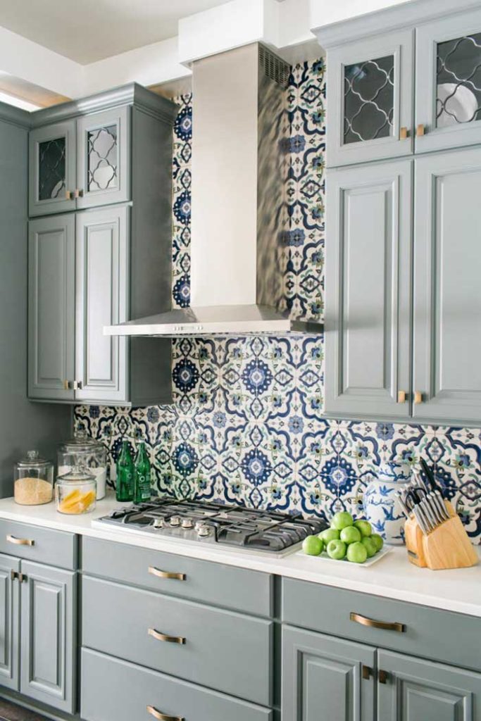
Image via HGTV
The ‘one pattern quota’ in hard finishes applies here just like it does in most interiors. Once you have chosen your patterned tile floor, countertop or backsplash, the rest should be solid.
It’s rare that I see an installation with two patterns where I think “That works!”
And occasionally it does, but if you have personally, NOT seen it installed, I would rather you go safe and follow my advice which is solid with pattern, period. The end.
In this kitchen above. The backsplash is the most important feature and the countertop is solid. As it should be.
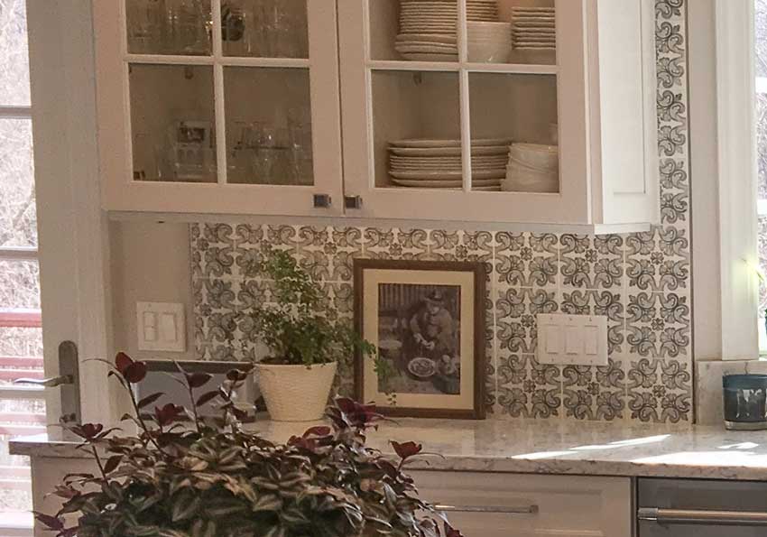
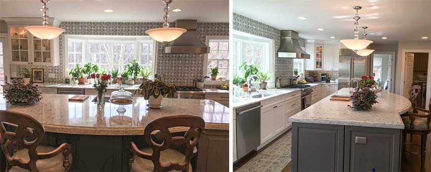
Overall, the colours do work in my readers kitchen, the tile relates to the charcoal island. And the ‘veins’ in the quartz are curvy so they do work with the flower tile but it does make the overall look busier.
Which leads me to my next point:
DO Keep your hard finishes quiet.
Everyone, and I mean everyone seems to be madly in love with all these widely available patterns but, think about it? As fabulous as they seem now, how much will you love them after you’ve been staring at them for 3, 5, 7 or 10 years?
And will the next homeowner be just as in love with your very PERSONAL choice?
Likely NOT.
Most likely it will be installed wrong, maybe you chose something too big or too small so the scale looks off, or you combined them with the wrong colours, because most of the time, that’s how it goes.
DON’T go crazy with your new tile crush
One of my True Colour Experts recently posted some pictures of a kitchen and great room to get some input from other TCE’s on colours and options. She had clients who were having trouble selling their house and the wife thought it was the carpet in the adjoining great room.
It was NOT the carpet, but the TILE.
At the time of the installation, husband was so in love with the earthy and (now unfortunately dated) tuscan tile, he had the tile guy cover the sides of the island with it, even adding it to the archway that led from the kitchen to the entry of the home.
The wife finally had to put a stop to the tile shenanigans.
And after all that, now, they are painting out all the wood around the tile including the cabinets in order to make the interior more fresh and appealing to buyers.
DO introduce patterned tile in a boring and bland commercial interior
A lot of the Encaustic tile is LARGE SCALE. Great for large spaces like a commercial interior. Not so great in your small laundry room, for example.
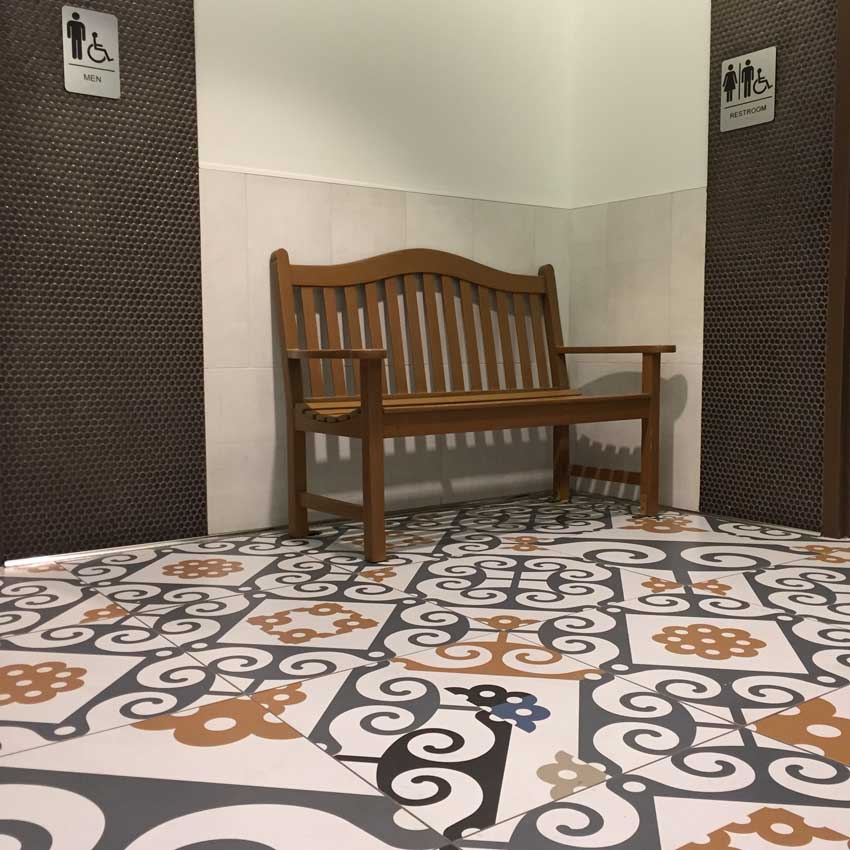
I saw this installation in a hallway to the bathrooms in an outdoor mall in Corte Madera, California and loved it! Everything else around it is simple and solid. The pale taupe surround tile doesn’t relate to the floor, but it’s light enough that it doesn’t look bad.
The penny tile is debatable but it least it reads solid. What do y’all think?
DON’T get seduced by tile thats too colourful.
Choose black and white or grey so you still have decorating options down the road.
The tile in the above example leaves you stuck with orange forever. This is fine in a commercial interior where we’re not decorating, but how long will you love this orange in your kitchen or laundry room?
via Lark & Linen
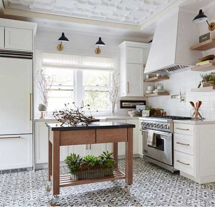
This tile is too busy to my eye, but at least it’s the only strong pattern in this kitchen unless you count the ceiling but at least it’s white. And the pattern in the ceiling does cleverly repeat the pattern in the floor.
Also it’s black and white, giving you options for changing colours.
Via Pinterest
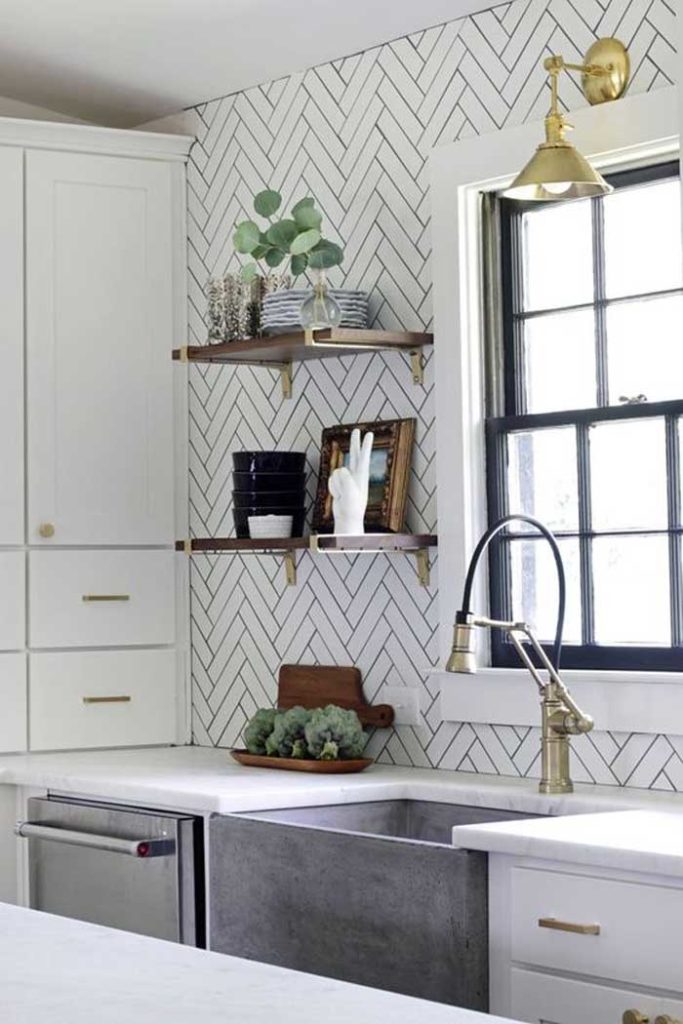
Here’s another pattern that’s beautifully done with a classic subway tile. Lots of interest here.
DON’T try to make a statement or get stuck on stylish
When I was sourcing all these images for this post, I kept reading headlines that said “Make a statement.” “Get this tile for the most stylish kitchen ever.” But no one tells you IF and WHEN you might be making a mistake.
Wondering if Encaustic tile works for YOUR style of home? Read this post first.
Bottom line, here’s my mantra for choosing tile. If you have two options in front of you and there’s one you would call SAFE and the other one you’d consider to be A RISK. Go for the SAFE option.
Trust me, you’ll be happy you did.
Fabulous statements and stylish interiors are created with styling. It’s much easier to change out a pattern in drapery or carpet than tile.
Say it with me again! SAFE IS WAY BETTER THAN RISKY. Way more of my clients cried when they chose the risky option.
If you have a question for my Ask Maria column, email me here.
Related post:
The No Fail Guide to Getting Your Dream Kitchen
What Everyone Should Know about Porcelain Tile
Encaustic Tile: Should you Embrace the Trend
The Right Way and The Wrong Way to Install Porcelain Wood Floors.




If the reader has white cabinets, shouldn’t her subway tile be white and not cream, can you explain.
Hi Rosemary, I’m glad you pointed that out. I should have said white, yes definitley white goes with a white kitchen and cream in a cream kitchen. Thanks for your comment, Maria
I agree, there is nothing like timeless classic subway tile. It makes it easier to accent with colors as trends change. I miss the kitchen we had in our 1920 dutch colonial, our current home’s kitchen is a Cheap 90’s remodel which I am wanting to change to a classis white kitchen. Thqnks zmariq, I love reading your blog.
Maria, I completely support your advice to go with classic timeless tile, and generally speaking I like cleaner, simplerlooks. But I must say I think the reader’s kitchen is beautiful and the tile and marble/quartz ( can’t tell in picture) look beautiful together. I think it’s lovely and if it was my kitchen I’d enjoy it until it went out of style. I realize everyone has different tastes and maybe she doesn’t like it, but I wanted to say I think it’s really pretty (although not classic).
I know your reader wants to change the tile to something more simple and classic like subway tile, but I just wanted to say that I actually LOVE the tile that’s there!!!! It looks amazing with the color of the island. Wow that is seriously a gorgeous kitchen. I wouldn’t stress over it until you decide to refresh your house in maybe 8 or 10 years!
I totally agree! Meanwhile, I might be inclined to add rods at ceiling height with flat style white linen toppers to meet the window trims. It would help to decrease the amount of pattern visually while adding texture.
Such a lovely kitchen!
While I agree with what you have written, I can understand why the contractor is saying it’s a nightmare. It goes to the ceiling, fancy crown molding, gotta take down the hood, don’t want to scratch the new cabinets, drop something and damage the sink, chip the counter….the labor for the tile and the material may be 1000 bucks but the contractor won’t want to be responsible for the damage that may be caused to the other areas beyond drywall. There’s your nightmare right there.
She was correct about it at the first tile being too busy, but she also is introducing a pattern with the rug in addition to the tile and the counter. Maybe get a simpler runner or lose it altogether. She looks like she has nice taste and her neighbors are probably jealous of this kitchen anyway.
I’d say don’t beat yourself up.
Glass tile has its own PITA problems to install, too, BTW.
Haha loved your comment Karine! Makes sense what you’re saying! Maria
Karine, you are so right about the runner.
It’s competing with the tile and making the whole look too busy. She should lose it, or get a solid runner that’s the same color as the wood floor, so it looks almost invisible. That alone would make a huge difference.
I also don’t understand why the tile stops short of the light switches in the first photo. That’s distracting. If she keeps the tile, it should be extended there.
Maybe a white valance or curtains would also cut down on the tile pattern. But the tile is pretty.
After looking at the photos longer, I definitely think white valances that begin at the ceiling would be the perfect solution. It would visually eliminate a lot of the tile, without having to rip it out.
The owner might fall in love with it.
Lol, just as I hit send, a repeat client called regarding her powder room she wants to do now.
She did encaustic tile in her shower from tub conversion and of all the residential busy tiles I’ve seen, hers is my favorite. Everything else in the room is plain, and that tile shines. Even your DO photo, which is my favorite colors together, still bugs me because there is soo much of it, even I would get sick of it. And that orange…luckily I’m not living in that facility and just passing through… IMO, of course.
Just curious…how do you feel about the variety of sizes you can get in subway tile? Do you prefer the classic 3×6 size? Does it depend on the style of the kitchen? I.E…modern vs traditional?
I prefer the look of 3 x 6 tile, but yes in a more modern kitchen it would be perhaps longer or slightly bigger 🙂 Maria
Would love to see some images of “bad” encaustic tile installations. I personally have loved this tile for a long time–since my days decades ago trekking around Europe and staying in cheap hotels–and I love a fair amount of color and pattern. As a compromise with the “timeless” argument which I also agree with, I decided if I had the opportunity I would put encaustic somewhere relatively small and low traffic like a bathroom or laundry room. 🙂
I agree, thanks for your comment. As for bad, they are all over Pinterest, just start searching! Maria
I actually like the kitchen, it looks welcoming and friendly. I do acknowledge though that in a few years time i would most likely be over it. It is a beautiful room, the owner is very lucky. In contrast my kitchen is too plain. Being gloss white, subtle patterned white Ceaserstone bench tops, timber floors and mirror splash back it is crying out for pattern!
I am also drawn to the Californian bathroom. I think what I like about it is that the penny tile in the solid appears masculine and it compliments the feminine style of the pattern on the floor. Always learning so much from you ! Thanks for sharing 🙂
I’ve been curious for a while about the history of subway tiles, specifically in residential applications. I think they’ve been around for a while (maybe since about the turn of the century for subways and other public or industrial spaces) but I don’t remember them being used in kitchens and bathrooms very frequently in the 70’s and 80’s (perhaps also not so much in the 60’s or 90’s). It seems like they’ve been very popular recently. I really like subway titles and I think they could be classic/timeless in terms of their design and simplicity but I also see the possibility that they might come to be associated with the time period that we are in now, at some point in the future. I think it’s really difficult to predict what will seem timeless years from now. I think simple and elegant and function and not drawing to much attention to itself are traits that bode well for the possibility of being truly timeless. . The fact that they have been so popular recent makes me a bit pensive about their future but I can also see why they are so popular. I actually think subway tiles are lovely. I think at the very least in the future subway tiles are unlikely to be hated by people who have them and mocked by everyone else and maybe that’s about as good as you can hope for.
I flip houses for a living so I try to keep up on what buyers want. I’m in a West Coast city where people all seem to want something that’s “different, but not too different.” I can’t count the number of times I’ve heard, “I am sooo tired of subway tile.”
I’ve also heard Millennials reference it when they’re describing spaces they think are too trendy/pretentious: “It was one of those restaurants with lots of reclaimed wood and subway tile.”
I think subway tile can be timeless in an era-correct environment such as a turn-of-the-Century bungalow. But it’s definitely trendy right now and many of the installations are going to look dated fairly soon.
Think about all those oak cabinets that everyone used to install in their kitchens. I bet they thought they were a classic, too.
Hi Jill,
Replace the word subway with WHITE OR CREAM SOLID tile. That’s what I’m talking about.
Sadly, subway tile is only popular on Pinterest and magazines which is why people say they are so ‘tired of subway tile’, because they ARE building or renovating and are looking at a million images and guess which ones make it in magazines?
Subway tile. Or a solid tile. Occasionally you’ll see a creatively done, patterned backsplash or floor but it’s usually hard to find fault with it other than it’s too busy for a FOREVER tile in my opinion.
I forgot to link to this post, I have covered “What’s next after subway tile” https://mariakillam.com/subwaytile/
thanks for your comment!
Maria
Okay, Maira, I was associating subway tile with it’s shape and dementions rather than with a color. I totally agree that solid white (or cream) tile is simple and timeless and something that people would be unlikely to come to dislike/mock/want to rip out in the future. I love white kitchens, white bathrooms, white walls etc (maybe with a marble/marble looking quartz countertop). The top picture of the white kitchen with subway tile is really lovely and classic. I could hardly imagine anyone wanting to rip that out for being dated! It looks like they have some green appointment in the kitchen, which is very fresh and on trend currently. When something replaces the green, the owner will easily be able to swap out appointment and the white tile/white kitchen will be a neutral background for whatever comes next! No regrets!
If I was starting from scratch, I would absolutely do the same colors as that kitchen. I’m not 100% sure I would do the same shape tile, although I can think of several shapes of tiles that I think are much worse choices. I really don’t like the trend of the pencil shaped tile in multicolors (I hope that’s almost over) and it’s a little hard to love the 4 by 4 builder grade tiles that seem to be in every bathroom in every rented apartment – although if they are white, even those are hard to hate. There are also those beveled and otherwise more 3 dimensional variations on the classic subway tile that I think are likely regrettable. I hope in the future you might give us more ideas about possible shapes/dementions for white or cream tile!
I have to admit that I really like the 3rd kitchen with the wall of large, bold colorful Encaustic tile that seems to break all the rules. It might not be my first choice for my own kitchen but would it be great to have a friend who had that in her kitchen, so that I could visit that kitchen a lot! I think this kitchen was very well done with the choice of cabinet color (the while countertops) and even the cabinet hardware. I think with that choice of tile any mistake could have been tragic and it’s a joy to see that whoever designed it, didn’t make any mistakes in the choice of other elements. It’s such a happy space and I think it might have a chance of standing the test of time because it seems to related to a place rather than a time period.
Even though it’s big and bold, I think in some ways the Encaustic tile kitchen is more harmonious than the kitchen with the white subways in a harringbone pattern with the high contract of the black/nearly black grout. For me that’s a lot of pattern and contrast for what it is still at the end of the day subway tile. I think herringbone is supposed to be a classic but I think it might work better on floors than it does on walls. I’d be curious to know how long the owner is happy with this choice. I could see it going either way. Personally I’d rather have a kitchen that involved less risk of not likely later on.
I also think her kitchen is quite lovely. I think her issue may be that there’s TOO much of the tile so instead of it being a highlight, it’s a foundation. I agree with another poster that she may want to take out her rug and replace it with something much more simple. I would enjoy that kitchen for a few years and then decide if it bugs me to replace the tile at that point. I certainly wouldn’t do it now! It may grow on her. In a previous home, I had a white classic kitchen for years and while it was really nice (white cabinets, white subway tile backsplash, marble counters), I also got tired of it after a while. I wanted some color! But I learned that the easiest thing to do is to designate a small tile backsplash area as the ‘highlight’ area and use color there (nothing crazy, currently a modern green that is soft but not boring). When I get sick of it, I’ll replace it. The cost of tearing out existing tile and re-tiling should be less than $1000 for a typical backsplash and I live in San Francisco.
I think anything that doesn’t shout at you is likelier to stand the test of time. I’ve seen original, never updated houses many decades old that are still charming, bathrooms from the fifties with blue or pink sinks and toilets that are still cute. If I had a bathroom with black edged white tile from the thirties, I wouldn’t want to change it. One of the loveliest houses I’ve ever seen had an original kitchen so beautiful that I couldn’t have borne to modernize it–however inconvenient it was, with no dishwasher and narrow counters. My favorite kitchens are the big farm ones, with a huge ancient stove and unfitted furniture. Unfortunately, most real life design is bad, and as soon as people have gotten over the current rage for glass tile or whatever, all the badness starts leering at you from every corner. I’ve been looking at houses in the Cotswolds, and the best ones are those left to be themselves, with modernizations for comfort and convenience that leave the character of the house intact. Some of them look charming on the outside but like a new build inside–horrid. Sorry for rambling on! Steering us toward simplicity is your great gift to the design world–in addition to your color system of course.
Well said Kay, thanks so much for your comment 🙂 Maria
I think the kitchen in question is lovely. As for options.. I do like that the client seems to be open to alternatives as it sounds like budget constraints. Is that tile a smaller square (like 4×4)? You did not mention a dislike on layout or size. If it indeed is that kind of tile I feel this great news! A kitchen with built in cabinets is a concept that is not even 100 years old. Look at old ads from kitchen appliances, floors, and sinks and you will see mostly plain painted walls or square 4*4 in a boring layout and solid color. This leads to the suggestion that you paint the tile. Companies do this or if it was I – Diy. Go with a white that ties to the counter and in this your eyes will pay attention to the pretty cabs or counters instead. To me that look would = timeless. Good luck. You have a great space there!
I think that there are too many competing sculptural elements in the homeowner’s kitchen. Everything from the plants, runner, light fixtures, glass cabinet doors and counter stools all have curves and patterns. I feel that this is what is competing with tile. I wonder if simplifying those elements might help pull the kitchen together and harmonize the space? But in the end, I would recommend finding a contractor that will take down that tile and replace with a simple subway. Yes it will be a huge PITA in cost and time. Right now the homeowner has waited months and spent 50K on a kitchen they hate. Why wait years to change something you hate? In two days of demo, reinstallation and 1K, the owner could have a kitchen they love! And, it will be cheaper than changing out all the other competing elements.
I’m not sure the designer that suggested the tile understood how much the homeowner loved plants!
Christina, i think you have hit the nail on the head! I like Encaustic tile (as my friend and I say about many things, I like it …just not for me) but the photos I like are ones that have more straight clean lines in addition to the pattern. So this is one more vote to take the tile out. The straight lines of the tile with look fantastic with all the curved elements you have in the room. If that isn’t possible right now paint it. There is a kit you can get—Rustoleum Tub and Tile Refinishing Kit –that is made for painting tile that is $25. You will be SO much happier when you don’t have to look at “your mistake” every day
Great article. As a designer, this confirms my strong belief that you should never bully a client into choosing something just because you feel it looks good. We do need to suggest new ideas and outside the box options, but we have to read our clients body language and know when we’ve taken them too far out of their comfort zone. Especially with things like tile – an element not easy to replace. It’s not about our vision, it’s about our clients vision. If their vision is completely not in line with our design philosophy, then don’t take on that client. The bottom line is if they’re not happy with the end result, we won’t get those crucial referrals.
Well said Erica, thanks for your comment!
x
Maria
I have come to believe that builders and craftsmen who overcharge, and the people who hire them, are on their own plane (and it isn’t one built on common sense), and they have to learn the lonnnnnnnng hard ($$) way. My father has a friend who does tile, and yes, we’re 100% subway tile, at a very reasonable price. He bid $750 to tile a small bathroom for a guy in a “fancy” suburb, and guess what the guy did? He chose someone from the “burbs” who charged him $3000 for the same job just b/c he figured it had to be better b/c it was more expensive. I can send you pictures of the tile from my bathroom and kitchen, my parents’ bathroom, and my neighbor’s kitchen and you would know for sure this guy got suckered!
I hope those people are reading your posts, but alas, they probably aren’t! 🙂 🙂 Maybe their spouses are though…there is hope 🙂
Maria, thanks to YOU that I will be using cream subway tile, cream cabinets and soapstone counters with my inherited Saltillo floors. The idea that the back splash must tie in all the colors (as suggested by two designers) just didn’t feel right to me. I’m going for timeless, and mosaic tiles with a mix of glass, stone, metal and various colors, while attractive at first glance, simply felt distracting. Now to decide on the exact cream, the finish (shiny vs crackle) and size! Yikes…so many decisions! I think I hear you saying the longer/larger format subway tiles are not timeless, and I was leaning that way for a bit of an updated look. Mistake in the making?
Hi Martha,
I prefer the look of 3 x 6, but that doesn’t mean it all has to go that way. Keep it a (white or cream) solid whatever size you choose and you’ll be in the ‘timeless’ category.
Thanks for your comment!
Maria
Great article and great advice! What are your thoughts on using a beveled white subway tile bs a plain subway tile? Or on using a white marble subway tile with slight gray color variance between tiles?
Just think white and plain and solid. Whatever it is will then be timeless. Maria
Such great comments everyone!
I appreciate all the suggestions. After we finish a few outdoor projects we will get bids to replace that floral tile with a simple white subway. there is a lot going on visually in my kitchen and I think that’s what is bothering me. I’m planning on replacing the stools with a simple backless style that can fit under the island. While they are very pretty on their own, they compete with the upholstered chairs at my banquette on the other side of my kitchen, and because the dining room is visible from the kitchen it’s like a chair showroom! 14 high back chairs and stools in those areas is just too much.
My advice to anyone doing a total house renovation is to take your time, know your style before beginning the project, and stay away from trends. And if working with a designer, don’t be pressured into styles that aren’t reflective of your taste.
And yes I have a thing for plants! We live in an area that is cloudy, rainy and snowy over 300 days/year and for me plants add life and vitality and quite simply make me happy:)
Great post, Maria. In a kitchen, it’s so easy to change out rugs, window treatments, canisters and accessories to get a fresh new look. But you can’t do that if you’re stuck with busy tile that screams ‘outdated.’ I’m so grateful for your advice in my own home. Timeless does not equal boring!
IMHO, spot on Maria in your advice when choosing tile. That said; I feel your reader’s kitchen is very beautiful however for myself I would much prefer such a pattern in a very small dosage if I were to use it particularly if it is at eye level as know I personally would tire of it quickly. As for the use of subway tile because it can be applied in numerous ways, not to mention its different sizing plus finishes it definitely has my vote due to its versatility! i.e.: Format of offset, grid, herringbone, diagonal offset, basket weave, corridor, solder course, fishlur, argyle, stitch etc.
-Brenda-
P.S.: Something though as aesthetic they may be IYO; I do disagree with you over the use of solid black counter tops as thanks but no thanks after having had black appliances … °Û° .
Oh something I forgot to mention and not to nit-pick but I couldn’t help but notice the electrical outlets and find it somewhat unfortunate that the designer didn’t suggest ones by ‘Bocci’ (or similar) that are almost invisible once installed and/or even an under-the-cabinet mounted bar.
-Brenda-
Do you really think YOUR READERS are rolling our eyes when you suggest white subway tile? 🙂 I love that first picture you posted.
I am convinced subway tile is a classic because the dimensions are so close to the golden mean and naturally pleasing to the eye. Personally, I can’t imagine any other choice. It’s interesting to read that so many people see subway tile as overused or trendy, though.
I’m currently desperately seeking a nice simple bathroom floor tile, without hideous pattern or extreme mixes of color. Advice?
What about using a hex tile for your bathroom floor? If your bathroom has a traditional, classic style, you could do a traditional 1″ white hex with dark grout. It will look like it’s been there forever.
For a more contemporary look, 3″ or 4″ hex tile is a nice choice. For the larger hex pick a grout that doesn’t contrast too much to keep the tile from looking too pattern-y/geometric. If you use a light-colored grout make sure your contractor uses epoxy grout or something similar. It’s more expensive but it is much easier to keep clean.
Hi, Jessica Spanos, I was actually just wondering about the golden mean ratio and subway tiles! It seems like there is some kind of magic with math and the mind where we might never get tired of looking at something that has the golden mean ratio. If subway tiles are either close or on the nose, that would sure seem like a big point in their favor!
It seems like for practical reason your choices in title are mainly rectangles and squares. I think those 4 by 4 inch builder grade square tiles have been done too much and are therefore dating, so that mainly leaves rectangles (subway tiles).
I have to admit that I like those Arabesque shaped tiles, if they are well done (well shaped) and solid white/off white/cream. I think they are more expensive to install, don’t go with absolutely everything and are more of a risk in terms of likely years into the future. Maybe a mix of mainly subways with a small area in Arabesque shaped tiles would be pleasing to me.
@Susie: I’m in the midst of renovating/upgrading my entire home and in one bathroom I opted for a 4″ x 12″ plain subway tile in a shower stall area and used a 12″ x 24″ porcelain tile for the flooring and found both tile scales work very well together without being monotonous or too busy. Also shall mention as this particular bathroom isn’t all that large; I co-ordinated the grout colour with the tile, used the same layout format plus the pattern in the flooring tile has a very subtle strie/dragging effect throughout it that gives it visual texture with a two-tone colour combination that is ‘not’ overwhelming. Hope this makes sense and helps. °Û° -Brenda-
P.S.: To give you an idea re the flooring tile; there is one online at Lowes.com which is somewhat similar to mine. Search: Leonia Silver Porcelain 12″ x 24″ bathroom tile.
I usually am not a fan of pattern at all. But I actually like it in this case. Your blog has definitely given me a perspective I am glad to have gotten, but I still am not convinced everything has to be classic/plain. Especially something that is actually fairly easy to replace, like backsplash tile. There is a tradeoff between getting something fun or something that you love, and getting something that you think will stand the test of time (and which still may not.) But I definitely would confine such things to small areas, not the flooring of a whole house, or bathrooms with many many square feet of tile.
We just bought a house with gorgeous cream cabinets. I want to add subway tile as a backsplash. Is it possible to mix both cream and white tiles? Or is it best to stick with one solid color?
Great idea, find a combination of both! This way you can keep the cream cabinets and add white, however it’s best if your countertop is white too. Maria
picture number one with an all white theme is very depressing looking to me not a good look at all timeless or no timeless picture number three is amazing whoever designed it is very talented
I’m installing a white kitchen and I’m tempted to use dark blue/navy subway tile, and I realize white is a staple but could a navy color work?