When I give the participants in my colour training an in-class exercise, or homework (hey you get your money’s worth with us) I notice that when they select colours to create a colour palette they take the undertone of whatever paint chip/s they have to work with and repeat it.
So if I show a blue green, and they need to select a coordinating colour like a red for example, they choose a blue red over a red with an orange undertone using the blue undertone in the red as a clue.
In my last workshop I figured out what was happening so I thought I’d share it with you as well!
Here’s the difference between choosing a neutral over an actual colour for the walls in your interior or for your clients home:
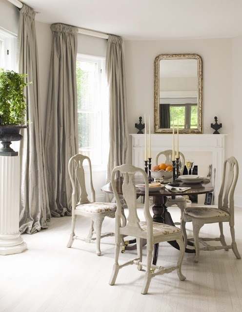
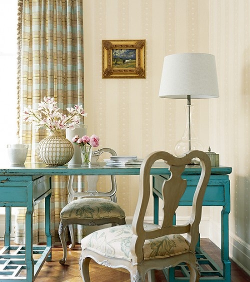
Here we have grey-green drapes that relate to the grey wash on the dining chairs. So the obvious choice for the walls is. . . you guessed it, a grey-green. If you are choosing a neutral for a room, you look around at the existing neutrals to come up with the right one for the space.
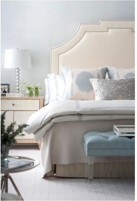
With this bedroom, the choices are blue to pick up on the blue accents, or a pale ivory shade to relate to the headboard. There appears to be a green-grey or taupe coverlet and bedskirt here but they are not as visual as the cream and blue making the blue-grey an obvious choice.
So what about when choosing colour for the walls. What do you need then?
Well first, you need SOMETHING. You absolutely MUST have a starting point.
There isn’t one room in my house where I actually selected a COLOUR that I didn’t have the art, or the fabric/soft furnishings already chosen.
The family room at the time was a blank slate so it was painted greige.
HOT TIP: If you are moving into a new house and you have not bought furniture yet, chose a basic neutral throughout and then once you’ve chosen fabrics and accent colours, re-paint as necessary. It’s way easier to chose a $50 gallon of paint to coordinate with your $3,000 sofa than the other way around.
To actually choose colour, you need:
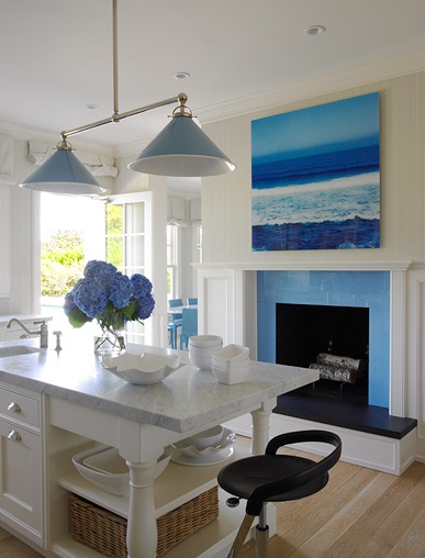
1. A piece of art (above).
I’m guessing the art was first here. It’s such a brilliant blue surround to commit to without a starting point.
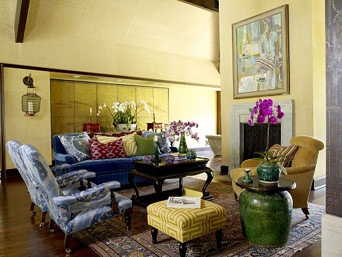
2. Fabric (above).
There is no way this yellow wall colour was chosen without the yellow screen, chair and ottoman.
3. An area rug.
Way easier to start with a patterned rug if that’s the look you want and select fabrics to coordinate than the other way around. There’s nothing that frustrates the salesperson who wants to sell you a carpet more than five coordinating designer fabrics in patterns which make finding the right carpet a veritable needle in a haystack.
4. Drapery.
Another great example of a room clearly decorated around either the drapery fabric (above) or the chair fabric.
Once you have an inspiration point, now you can choose the wall colour. The rule of thumb for choosing colours therefore has little to do with which UNDERTONE the colour happens to be, it becomes more about not making the mistake of choosing the right combination of colours using the clean/dirty rule.
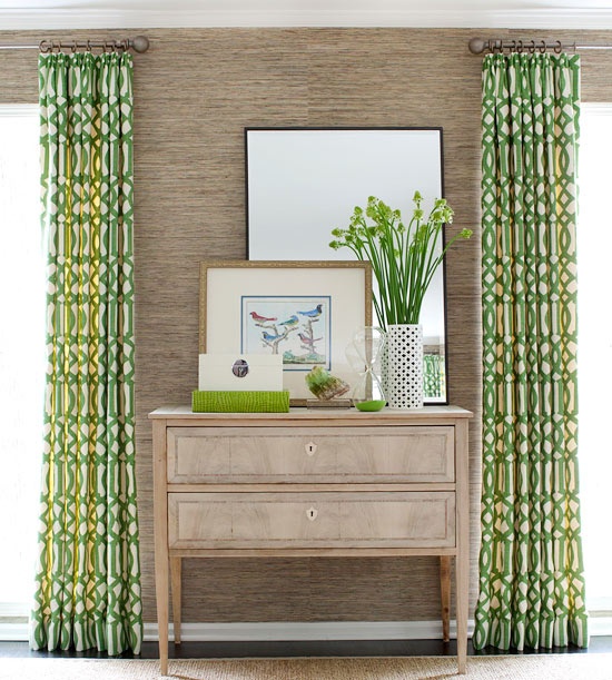
Here, (above) you can see that the grasscloth actually is a muted, dirty green beige in comparison to the kelly green drapery, however the same tones have been repeated in the dresser and the kelly green accents.
It’s the exception to the rule and it once again shows that all greens go together (but you still need to know what you’re doing so it looks pulled together).
So just to recap:
Don’t have any more than two different neutral undertones in a room. Choose a lighter or darker version of the one of them to achieve a harmonious palette.
When choosing colours, keep comparing the colours you are combining to ensure you don’t choose a colour that’s too dirty or too clean.
We do lots of comparing in my Specify Colour with Confidence™ Training because as you will learn, a Certified True Colour Expert™ simply compares colour over and over so that his/her clients end up with the correct colour on the walls or on any surface for that matter. Choosing the right colour/s is about so much more than just wall colour.
Here are two comments from Toronto’s colour training in April:
“I just wanted to extend my sincerest thanks to you for a wonderful and extremely informative workshop. It was such a pleasure to have finally met you and your delightful associate Irene. Your workshop was extremely well planned and you kept my interest for the entire 3 days, not to mention how much fun we all had. I’ve learned so much from you and will definitely use your system to further my career. Thank you so much!” Susan Silverman Designs
“Maria, thank you so much for helping me learn (and be able to explain) how to make fixed elements sing, instead of cry~ your course was one of the best investments I have made in my home staging and decorating business.” Ginny Truyens, Feels Like Home 2 Me Home Staging & Decorating
Which do you find easier to choose? Colour or a neutral?
Related posts:
Do All Greens Go Together?
How I Became a True Expert
6 Ways to Choose the Perfect Neutral Paint Colour
If you would like your house to fill you with happiness when you walk in the door, become a client on-line or in-person.
Download my eBook, How to Choose Paint Colours – It’s All in the Undertones to get my complete step-by-step system on how to get colour to do what you want.
To make sure the undertones in your home are right, get some large samples!
If you would like to learn how to choose colour with confidence, become a True Colour Expert. Fall dates now open for registration.



This is one of your better posts in a long while. Thank you! It is a great tool.
Well right now I am choosing wall colors for all my house. I know I want a color for the entry and living room, but for the kitchen, dinning and family room I want a neutral on the walls. It’s been easier for me to choose the neutral because I know what undertone I want it to have because of my sofa, fireplace, and counters, plus I already have painted furniture and so much color going on, but it’s been so hard to choose the color for the other walls, where I know I want some color and not a neutral. I am getting there, but I had buy so many samples and the guys at Sherwin Williams had being so nice and helpful and have not make me feel bad every time I walked in to have another color sample (I feel a little embarrassed but this time I want to get it right, paint is not cheap and I will be doing all the work too). So in other words, neutral is easier for me to choose than color.
Veronica, I just went through exactly what you are going through. My problem was, I needed help picking a neutral also. Anyway, once that was decided, what about the bathrooms and bedrooms? Those colors, Maria suggested I pick something to harmonize with the travertine floor. It worked out great. But the bedrooms? I used my bedding as inspiration for the master bdrm blue; with the other bdrms, I picked those w/o inspiration and now thinking about repainting!
I know exactly how you are feeling!
I painted my house a few years ago a beige pink and two walls a dark green, and I had no idea of what I was doing, I just wanted some color and to warm up the place. And they are nice colors I am just done with them and now after reading Maria’s blog and e-book I understand a little more of what direction to go but still the color choosing has been difficult.
Thanks for sharing your story I am not alone hehe 😉 having an inspiration like Maria suggests is a good starting point.
I have to say it’s fun to choose colors too it feels good when it works. I hope we both get it right 🙂
I’m commenting on behalf of all your readers who still have NO idea what color to choose. I’m the homeowner that will keep you decorators employed because Im hopeless! I read your posts and am in awe because i just cant see the undertone. That’s why calling in the experts can save so much heartache & frustration. A call to you is on my bucket list as soon as I decide on a new kitchen layout & the whirlpool industry invents a 70″ tub that fits my 60″ space and 6′ hubby.
Debbie, I hear your pain…and hear it from many clients I work with too. Those undertones are not easy for some people to see. As for the whirlpool tub….Well, if you’ve only got 60″ to work with, that’s about it 🙁 On the other hand, if you had more room & to accommodate your tall hubby, you could always go the commercial size they use in hotels 😉 Oh yeah….and a lot of money to buy it. 😉
A hot tub is the answer. I never use our garden tub in the bathroom anymore. And some of the smaller hot tubs (Bullfrog brand) are pretty affordable.
maria,
i have learned so much from your blog. I was just brought in for a color consultation to a home where the owner hasn’t made a definite flooring choice for her dining room but it was going to be different than the adjoining family room wood floors, she wasn’t committed to any of her furniture accept 2 red slipper chairs and a gray area rug with blue undertones. she wanted an open concept feel between her family room, dining room and hallway. she detests green & wanted shades of gray. the art she had were pencil drawings. so I specified grays with blue undertones & she was disappointed. she wanted more color! I felt so confident explaining our need to be neutral for now with so few fixed choices. she totally got it once I gave her my “why”. thank you!
Thanks for a great informative post. Maria I’ve noticed that sometimes a clean/dirty combination of colours will work well in a room if there is what I call an “intermediary” colour such as white between the dirtier and cleaner colours. It’s a bit like a mediator stepping in to separate the two so there are no colour fights. As you pointed out in the last pic, it really helps having the same tones repeated in the dresser and the kelly green accents, but I see the white in the vase & other items playing a part as well.
Would love to hear what you think?
Great question Linda, no it mostly doesn’t work to mix them, I came upon that image and it happened to be the exception to the rule so I thought I’d post it, here’s a pic with lots of white and it’s just wrong: http://pinterest.com/pin/29203097555894541/ Maria
Maria,
Thank you so much for posting the link to the bad pic. As soon as it opened I shuddered at the really horrid combination. Those are the kinds of pictures that make me realize my eye is seeing what you’re talking about! Still, the process of picking colors is slow and painful for me.
Oh boy, thanks for posting that picture. That really is an “off” combination even with the white in between. Hmm back to the drawing board with my theories. :- ). Btw will you pleeeease run some workshops in Australia – I will supply comfy bed, good food, light filled rooms with views to the countryside, large garden with native birds & animals – for as long as you like & all for free! Please?
Yes yes yes! I totally agree: Pick a starting point first. I’ve had color consultations where they want me to pick a color with nothing to relate to…sometimes nothing but the drywall (sheetrock) on the walls, subflooring, nothing else! They wonder why I can’t just come in and pick some “magic” color that’s going to work for their yet-unknown room design. A friend of mine picked a fairly bright yellow for every room in her newly-built house (yikes!) and now wonders what she can get to coordinate with it! Do ya think?!?! Haha! She just couldn’t wait till I got back from out of town, for a color consult. Geesh! Oh well….it does work very nicely with their gorgeous woodwork so maybe……. 😉
Maria, no matter how much you have taught me, I will always learn from you. You are my inspiration.
Great post!
Much love! Susan
Thank You for the reference to choosing the art first — I remember my painting teacher being shocked that many people choose their art to match their sofa!
Truly one of your best posts – so informative with the examples!! I’m realizing that, for me at least, it is much easier to select a room with a muted palette as in the first photo than a room with a riot of color like Cheryl Tieg’s living room. (I think it was done by Martyn Lawrence Bullard?? I have to admit… the guy’s full of himself, but he does have talent!) The neutrals (once I took your workshop, of course!) are easy… it’s getting the right balance of color and pattern that’s trickier.
Maria, I get what you are saying in the pictorial examples, but am confused about your second paragraph. Are you saying blue-green combined with blue-red is bad? And blue-green with orange-red is good? If so, why? Thank you, Maria.
No, neither is bad, what I’m saying is that there is no need to stick to the same ‘undertone’ when choosing colour, it’s about finding the right clean and dirty balance. Maria
I agree with Maria and Lisa…this is one of your best posts and is a perfect example of why I continue to read your blog and use your consulting services. — Thanks for the educational post!
Maria,
GREAT post!
I think a key is knowing where to start (to pick a rug or patterned fabric first)!
I did it the other way when I moved into my last house15 years ago -before I learned about color from Maria ;-).
I’m looking for a new house now and I can’t wait to get a color consultation so my house will look wonderful!
Thanks for another informative post
Maggie
This is the best post that you have done in a while. Super informative and makes me want to print it for future reference.
I love neutral tones so these are some super great tips to keep that but not be so “blah.” Thanks for the inspiration. 🙂
Right on, as usual Maria.
For blank rooms, I most always urge clients to “build the room up” starting with rug. Everything is easier after rug is decided. Then sofa, the fabrics, and paint usually comes last. (although people seem to want the paint decision first, for some reason…) There are nine zillion paint colors that will help it all come together, but first the biggest pieces have to converse!
I agree with everyone else that this is a great post with so much to chew on. Now I just need to reference your posts on grays to see which ones go with which colours. I may finally have to join pinterest to see your choices.
This is one of your post helpful posts. Thanks for the good pictures to illustrate what you are talking about. Very helpful. We went into a furniture store & told them we were there to buy the rug because I learned from you that that was the place to start, even before paint & furniture. The interior designer was so grateful that we were approaching it in the proper order. We bought a sofa from her as well & then she helped us pick the paint for the walls. What a successful day!
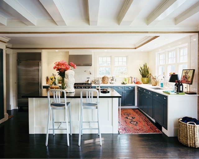
Just an FYI. The stools on the island in the third photo are to tall. There ia no place for your legs. Counterstools would be better. Not Bar stools.
Maybe that’s why they chose an adjustable ehight stool. I think it’s just set too high in the photo.tere
I see the too high stools so often, and frequently comment on it. I’m glad to see I’m not the only one who caught this! And Teresa, it’s not the one with the adjustable stool, it’s the one with the navy cabinet doors and oriental rug runner.
Sorry. I just counted down to the 3rd pic, but I can see the stools in the 5th pic are crazy high as well. Great!!! Something else to drive me nuts.
Just now noticing how beautiful CT’s LR is…I find it peaceful.
Maria, sorry I’m late posting – everybody has probably moved on. But did want to agree with all about how good this post is. It will be ages yet before I can afford a consult and even longer before I can translate a design board into reality, but I think I’ve learned enough from following you that the most important decision I made re the purchase of my new home (1. after buying a house I could afford, 2. with an open floorplan I loved, 3. with tons of light and huge windows which I craved desperately ((the green belt was a serendipity), 4. with a screened-in patio for the cat people which was a must) was 5. picking a house with flooring which, while not my heart’s desire, was workable enough that I could live with it, and, using what I’ve learned from you, be satisfied and even happy with it until I can achieve my dream. I’m having a ball on a quite small budget and it’s so much thanks to you, Maria. And to Debbie, I’d say “congratulations!” The most important thing is to know what you don’t know and when to call in the experts who do know. I know you’re going to have a great end result!