I like painted ceilings, they go a long way to making a room look finished. I don’t specify them a lot though because once you paint one ceiling anything other than white in a house, you really should keep going so that you create flow. Then if you want to change a colour in a room, you have to change the ceiling too. Here are some of my tips for making sure you get your ceilings right:
DO paint the ceiling in the bathroom the same colour as the wall. If the tile in your bath goes right up to the ceiling, you lose the colour at that end of the bathroom because it’s all tile. Therefore, just keep going into the ceiling with the wall colour and it will tie that side of the bathroom in with the colour. In bathrooms I break the rule of every other ceiling in the house needing colour once you’ve done it in here.
DON’T paint heavily stippled ceilings anything but cream or white. There are a few exceptions to this that I have seen, high vaulted ceilings being one, but mostly the eye then get’s drawn to the ceiling which you don’t want with such heavy texture. We all want our ceilings to be flat and devoid of texture these days.
DO cut the colour by 1/2 strength for the ceiling if you want it to be the same colour as the walls (unless it’s a dark colour, or a very pale colour). The same colour on the ceiling (bathrooms are the exception, it’s usually such a tiny baby postage stamp of a ceiling, it’s too much trouble to get another colour and bathrooms are generally well lit anyway) goes darker so if you want the ceiling to look the same as the walls, ask for it half strength of the wall colour.
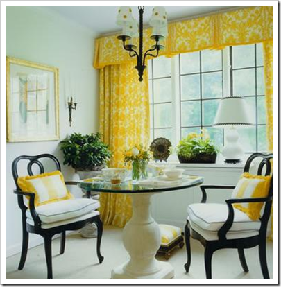
Image source
DON’T specify 1/2 strength of a wall colour that already has a lot of pink in it, going lighter in the same colour might just give you a pinker ceiling than you wanted.
DO pick the colour for the ceiling [below] yourself if you are already starting with a dark, dramatic colour. There isn’t enough paint in a deep based paint can in the first place so it doesn’t work to specify 1/2 strength here because you won’t have enough paint in the can to get the colour you want.
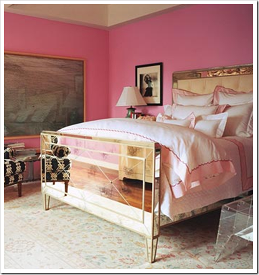
Image from Material Girls Blog
DON’T ask for 1/4 strength for the ceilings. It’s unnecessary to go lighter than 1/2 strength and there’s too much room for the colour to go off in some other direction. If you want it that much lighter, it’s safer to choose the colour yourself.
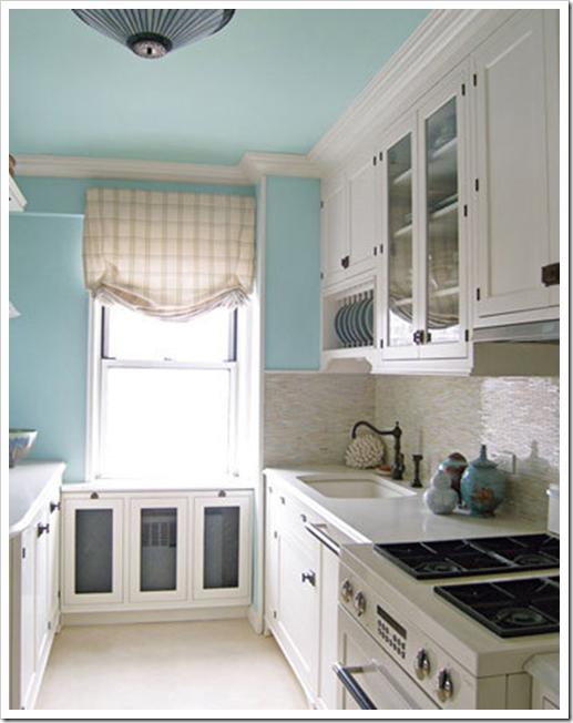
Image source
DO paint a ceiling a pale, pale blue, it will give you the feeling of the sky.
DON’T paint the ceiling a colour if you already have a lot of white in the room and the colour is a fresh one like this (below). It looks fabulous when the colours in the room also relate to the ceilings (above) and in this case it does with the white.
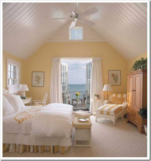
Image source
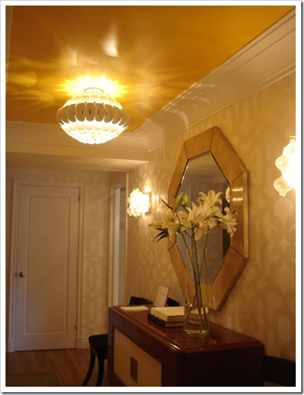
DO paint the ceilings a colour that matches the background of the wallpaper; especially if there is no white in the paper. Your ceilings will look like unpainted plaster otherwise.
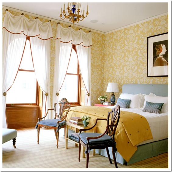
This ceiling should be the same cream as the trim and the pattern. Right now it looks like a cold blue white.
DON’T paint the ceiling a darker colour than the walls unless they are high. It will make the ceiling look heavy and dark, like it’s coming down at you. There are creative exceptions to this of course (like in the first image on this post), but I’m giving you general guidelines here.
DO paint the ceiling in a commercial space a dark colour (but it doesn’t have to be black) pick a colour that relates to what is happening in the space.
DON’T leave the rest of your ceilings white if you paint them a colour in one room. Flow is created by continuing with the rest of the ceilings in your house.
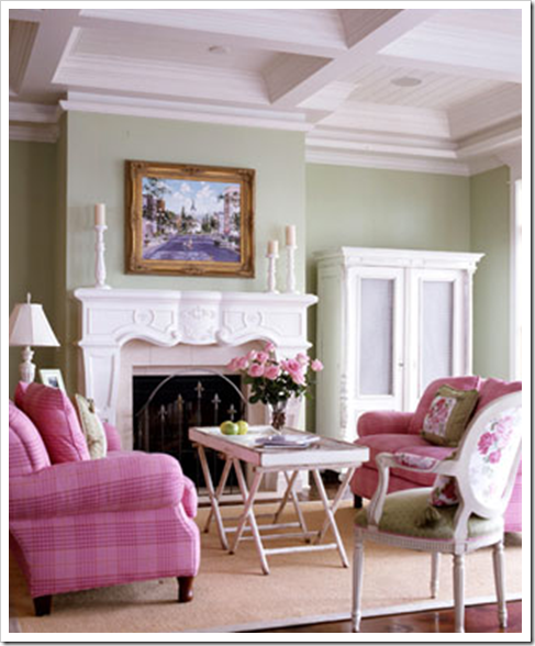 Image source
DON’T leave out your coffered or tray ceilings when painting the walls. They are a great architectural feature that should not be ignored.
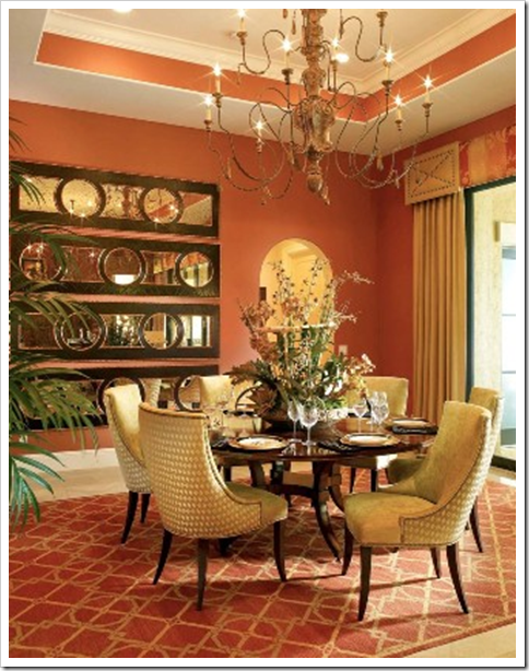 Image source
Donald Kaufman was recently interviewed about painting bedroom ceilings and he said “Consider painting the ceiling the same hue as the walls. When a colour surrounds you it creates a richer atmosphere and in a bedroom you end up looking at the ceiling the most.”
Related posts:
The Colour of Wood vs. Wall Colour; How Important is it Really?
Eggshell is not a Colour; Paint Sheens Defined
Have you made these Decorating Mistakes?
While you’re here, subscribe to this feed so you don’t miss out!


I have a very strong conviction that all ceilings should be white. I've seen colored ceiling and I like it, but I can not help but go with what my mother taught me. Kind of like wearing white shoes after Labor Day.
Great tips, Maria. I never thought about matching wall and ceiling color in a bathroom. I love the idea of a colored ceiling in a white-walled room. It's a great way to bring out color (along with accents) without overwhelming the space
-Naomi@thirteenandsouth
This is a very helpful post! I have recently been drawn to painted ceilings but have no idea how to make them look good on my own. This will help me in the future when I have a home to paint. Thanks!
Such great advice, as always!!
Maria,
Thank you so much for this post! Because I always had my doubts about ceiling colours! No I have the answer! You helped me very will! Thanks again!
Greet
I love this post. I think that painted ceilings can be such a nice element in a room. I went to a showhouse last year, and the walls were BM linen white, the ceilings were Sherwin Williams sea salt, the curtains were sheer linen in the same tone as the ceiling, and the rug had the same green/blue as the ceiling and the curtains, and it was so beautiful.
The walls in my family room are BM Harbour Town (a green) and the ceilings are 1/2 strength. It is amazing how different the color looks on the ceiling – the walls have a yellow undertone (to my eye), but the ceiling seems to have a blue undertone. It all looks fine, but I notice this sometimes.
I am really liking the look of a room that has the wall, ceiling, and trim all painted in the same color, just different finishes. I am also really liking the look of a ceiling that is somewhat glossy!
Good tips here for sure! I did have my two bathroom ceilings painted.. they are small and cozy..one bath is a tomatoey red with a tan ceiling..warm tan..but not obvious…and the other bath we had "wrapped" all in the same color..to me it looks really A-Okay..rest of the ceilings are white… oh well..hope i didn't do a faux pas!! The painter is a professional and suggested the bath ceilings to be done..
Light blue ceilings are my favorite. You just reminded me that I have a light blue paint chip taped to my ceiling in my bedroom that has literally been there for 5 years ! yikes !
I was installing draperies in a 2 story great room today that had coffered ceilings painted dark brown and it really looked good.
Hey Maria! I just posted pics of my craft room in progress. I am starting to love how it's going to turn out and I have definitely seen some of the things you've written about in that room. I'd love for you to check it out!
Maria,
I've seen some remarkable coffered ceilings usually just in white. They'd be beautiful with a pale blue center and white layers. Hmmm could work in my home…design note to iPhone!
Great post Maria!
Bette
Your blog is delish! I'm a colour-lovin' girl myself, so I'm glad I found your blog!
http://girlwhimsy.blogspot.com
Great advice. I'm a big fan of the pale blue ceilings…
I love the ceiling in that first pic!
Very succinct tips Maria – a great read!
Linda. 🙂
Wow. Lots of good info, Maria. I love a pale blue ceiling in the right kind of house. Unfortunately, mine is not that kind! Looking to add some architectural interest though… with panelling. Slowly convincing the in-house carpenter (husband) that it won't be as hard as he thinks!
I'm a firm believer in treating the ceiling like a 5th wall… in fact, I once wrote a post about how we should ignore our ceilings 🙂 In my home, both my bedroom and dining room have colour in the ceiling… and I'm kicking around the idea of taking a 1/2 strength of my dining room colour to the living room ceiling… orange!!
Victoria @ DesignTies
This is definitely WP worthy. So much great info! Another post to save in my CMH file.
I've always toned down the ceilings, but I think I will give Mr. Kaufman's advice a try!
xo
Brooke
Thanks for posting such great info. I had e-mailed you about what color to paint my bedroom ceiling a couple of weeks ago & you suggested white because I was painting the walls blue (BM Quiet Moments). I took your advice & now with my white bedding it looks beautiful! And since I'm trying to achieve better flow with the adjoing rooms, it has worked out great. The other rooms also have white ceilings. Thanks for helping me out.
Thanks Maria, once again a great post full of great information. Love to confirm that what I'm doing is on the right path, especially coming from the colour specialist of the blog world.
Ruthie
maria this is a great post, I've often wondered some of these things… and I often wondered whether people even painted their ceilings at all, and if they did, then why! So you've answered all that now, very interesting to know!>
Such wonderful and well thought information. I just found your blog and am looking forward to learning more!
I love painted ceilings, but I hate actually painting them!! Our living room has a painted ceiling, and our living room will too (if I ever actually get around to working on the DR!!)
Thanks for the great tips about painted ceilings.
Kelly
P.S. Where did you get the orange faux ostrich leather for the ottomans??
Another great post to put in the design files. Painted ceilings make such a great impact, especially when they are sky blue. I love your rules on continutity – and reminder that it's not an easy change up..:-)
Hi Victoria @ Design Ties,
Don't cut the orange 1/2 strength for the ceiling, it's too dark to begin with, here you need to choose the lighter shade yourself.
Maria
so very true. the "fifth wall" is an oft-neglected space that shall no longer be ignored!
Wonderful do's and don'ts, I am keeping a copy for my file…
Last year we painted the ceilings(soft textured ceiling) in the little condo we bought the same as the walls, shaker beige…as my hubby was half done he turned to me and said wow that looks great, really great, your good…lol
In the past I had the basement ceiling painted the same soft cream as the walls and it was wonderful, the client called as the painters were just finished to say thank you I love the look…
Great post, Regards, Carol Ann
What specifically does it mean to cut a color 1/2 strength? How do you do that?
I love every room that you just showed us. I see something and think boy I want to do that but sometimes it is just not my style. There is so much inspiration on the web.
When we moved into our current place, every room had a dark coloured ceiling… say light green on the walls, a darker green above the picture rail and a very dark green on the ceiling. It was interesting to say the least! Have to say I'm for white on ceilings myself – but very cool post all the same 🙂
Thanks Maria 🙂
I've been unsure about my living room ceiling, but the 1st photo you shared of the hallway/foyer sealed the deal for me! Love it!! Now I have to find the perfect orange… THAT might be a challenge!
Victoria @ DesignTies
great do's and donts!
painting a ceiling pale pale blue is one of my favorite things to do if it works in a space. rooms just seem so pretty & airy when you do that.
i really loved that yellow ceiling in the one pic and would never have thought to do that!!! gorgeous!!
i'll be referring back to this one for sure!
ps- a few more of these posts & y ou're going to have to compile them into a book!!!!
really
xoxoxo
Maria, your posts are always so wonderful. I love painted ceilings in the right application and your advice is dead-on, as usual. Thanks for the great info.
These are great tips, some I already incorporate, but some are new to me as well thank you, most helpful!
XX
Victoria
Such a great post with so much valuable info. I would love to paint my own ceilings, but I have a very open house with some very high ceilings, so it would be hard to do (for me anyway as I do most my painting). But, will definitely keep this as a reference. Thanks!
marcie
Hi Design Ties,
The orange/caramel ostrich is from Maxwell.
Maria
Dear Anonymous,
You ask for it 1/2 strength in the paint store and they add exactly 1/2 of the original formula.
Hope this helps,
Maria
Hoes does one deal with smoke detectors?? I have never been able to figure this out. Can you paint one?
Maria-
Thanks bunches for stopping by GirlWhimsy {I'm still smilin' from ear to ear}! I grabbed your button to add to my collection of "whimsical buttons I love".
http://girlwhimsy.blogspot.com
I love this post. I first tried painting my ceilings in a small condo — I painted the walls and the ceilings Donald Kaufman's #19, which is a great blue/gray. I did the same in my new place, which is about 830 square feet. In such a small space, it's critical to paint the ceiling, otherwise, you don't get that wonderful jewel box effect. That's why bathrooms look good with painted ceilings.
A decorator friend told me the perfect sky blue for ceilings is Farrow & Ball's Borrowed Light.
these are all great points – i always paint my ceiling 1/2 or 1/3 but you had some great ideas. love this!!!!
Wow, you pretty much have every angle covered here Maria. Great advice! I love going beyond white for ceilings. I painted my basement playroom a sunny yellow with a beautiful pale blue ceiling (inspired by a clear day at the beach) and it really gives the illusion of a lofty warm space.
I didn't realize that the reason you do 1/2 strength on the ceiling is to make it appear the same colour as the walls. It makes complete sense though, thanks for pointing that out!!
I also love the idea of painting the ceiling the same colour as your wallpaper background. I had that situation come up this week (the ceiling looked unfinished and forgotten). Now I can articulate the "because" to the client! Thx 🙂
Very interesting article. I just have a couple of questions. Since english isn't my motherlanguage i don't understand what means "cut the strenth of a colour" You mean put more water in it? Choose a lighter tone?
And second, if i understood correctly, choosing to paint a ceiling in the living room, for instance it means that you have to paint the ceilings in all rooms? Maybe a different colour?
Thank you and i'm waiting the launch of your e-books!
Thanks for this post. I just have a few questions to clarify your points:
1) At what point do you consider a color dark? In your original post I was think of navy, burgundy, forest green, etc, but in the comments when someone mentioned orange you said that would qualify as dark. So is “dark” anything beyond a light/pastel color (so anything that others might consider medium or dark)?
2) If one has a “dark” color and needs to select the color him/herself, do you suggest going 1 or 2 up on the paint strip? Or another technique?
Many thanks for your wonderful blog!
Marie, I love your design ideas in regards to ceiling colors. We are preparing to paint the interior of our home and are choosing a light yellow on our walls in the great room & kitchen and the cathedral ceilings a pale blue/grey to accent the floor to ceiling stone fireplace. The difficulty we are having is deciding wether or not to carry the pale blue ceilings in the bedrooms & bathrooms that are off of the great room & kitchen. The colors are all shades of blue/grey with the master bedroom being the darkest color Shale Gray. Or do we leave the ceilings in those rooms white? Thank you!
Love the idea of the blue ceilings. Maria
Hellow Maria,
Wonderful article! I didn’t see in the article or the comments anyone mentioning painting the ceiling the same color as the trim rather than the walls. In my house we are going with mixture of blue and gray colors for the bedrooms – e.g. BMoore Quiet Moments. One small room will get a very dark almost charcoal color on the walls. The trim will be an off-white such as White Dove, and I was planning to paint the ceiling in white dove but flat. This is not something you cover in the article – would you advise against matching the ceiling to the trim and going with 50% wall color instead?
I wants beutifull colors for kictins,livingroom,bedroom.ceiling colors.
Rather than refer to “dark” color, it is better to refer to how saturated a color is. That way people who are new to paint color are more likely to understand why a bright Ora nge, for example, might bevtoo “dark” for a ceiling–even at half strength.
Thank you so much for this post! I have a tray ceiling in my bedroom and wasn’t sure how to paint it. Pinning this now!
Hi Maria,
Wondering what your opinion is on paint finish for a ceiling. I’m thinking about painting a dining room ceiling a light blue and was thinking perhaps a semi-gloss for some drama and light reflection. Wondered your opinion?
If your ceiling is absolutely perfect than go for it, the point of a flat finish is to hide imperfections because builders don’t make ceilings perfect in general.
Hi Maria,
After long searching (and much money spent on samples), I finally found the perfect color for my large great room — Pismo Dunes from BM. Unfortunately, I’m now torn over what to do with the overly high and steeply pitched cathedral ceiling.
I’d like to visually lower the ceiling, so my gut tells me to paint it the same color as the walls. The room receives a lot of natural light, and therefore could probably handle it. However, based on your advice regarding painting a ceiling the same color as the walls if it’s deeply saturated, I’m now second guessing myself. Are you familiar with Pismo Dunes? Is it a deeply saturated color? I can’t decide. And if I dilute by half, won’t that defeat my objective of visually lowering the ceiling? I have the painter coming in a couple of days…and I need help!
It’s really hard for me to give you accurate advice without seeing your space. I would give it some colour even if it’s not Pismo Dunes if you’ve decided that white would just look wrong. Maria
Hi Maria,
Could you do an article on painting the ceilings of adjoining rooms, when each room’s walls are a different color?
More specifically… I have an orange DR with a pale turquoise ceiling, turquoise curtains, and we want to paint the adjoining LR (small craftsman rooms separated only by glass pocket doors I keep open) a deeper shade of the same turquoise that’s on the ceiling in the DR, but are at a loss for what to do with the LR ceiling! I’m wondering maybe a pale version of the orange on the walls in the next room? Couch and curtains in the LR are a deep berry purple, rug is carved charcoal. Curtains all over the house are made from vintage sari’s with gold accents. Obviously we love bold colors! (we’re from a tropical climate and now live in Portland, OR) Any help with this ceiling is appreciated, I’m stumped.
Thank you!
I’m thinking about painting all my ceilings a very pale, soft blue. I’d like it to be a barely noticeable blue, but still airy and uplifting. I wonder what Maria and others think of that. The wall colors are green, blue/gray, and pale, soft yellow throughout the house, except for the bathrooms which are a soft white with blue accents. All crown mouldings and trim are semi-gloss white.
Question regarding half strenght colour on the ceiling. Can i mix left over wall paint with equal amount of white eiling paint to achievd the half strength colour ?
I love reading and learning everything you are writing about!
Maria, do you have any posts or suggestions for how to choose a paint color for a tray ceiling?
I don’t think I’ve written that post, but if it’s that complicated it should probably be drywalled over 🙂 Maria