Being able to choose the right undertone or the right colour are important skills gained in my training, but what’s even more powerful is how they transform into better overall decorating and design decisions. Here’s an example.
Since my audience has grown quite a bit because my video about grey hardwood floors went viral this summer, I’ve become even more present to the most powerful lessons inside my two day virtual Specify Colour with Confidence workshops. And I don’t talk about it enough here.
It’s all the ways I can help you become a better decorator.
Recently, I was having a conversation with a friend who is in the process of decorating her living room and she said to me, “It feels wrong to be so fixated on getting my living room looking just right. I mean, look at where I live [she points outside to the stunning view of the lake her home is on] I should just be grateful!”
But here’s the thing, once our survival is handled (and if you’re reading this, than it probably is for YOU), we as human beings seek the next level of well-being. And that is ‘enhancing our surroundings’ and making them more beautiful. And there’s nothing wrong with that.
What’s one thing that will make me a better decorator?
Maybe it’s the room all our guests see, or the room we spend the most time in – well it’s important that it has a look and a feel. And that leads me to one of the most important lessons you need to understand in order to be a good (even great) decorator.
It’s called contrast.
Getting contrast right is such a big piece of decorating AND choosing finishes for bathrooms or kitchens and it’s important to understand how it works.
How contrast works in decorating
Here’s a mini lesson on contrast through an exchange with one of my Instagram followers.
Last week I received this message from a follower on Instagram:
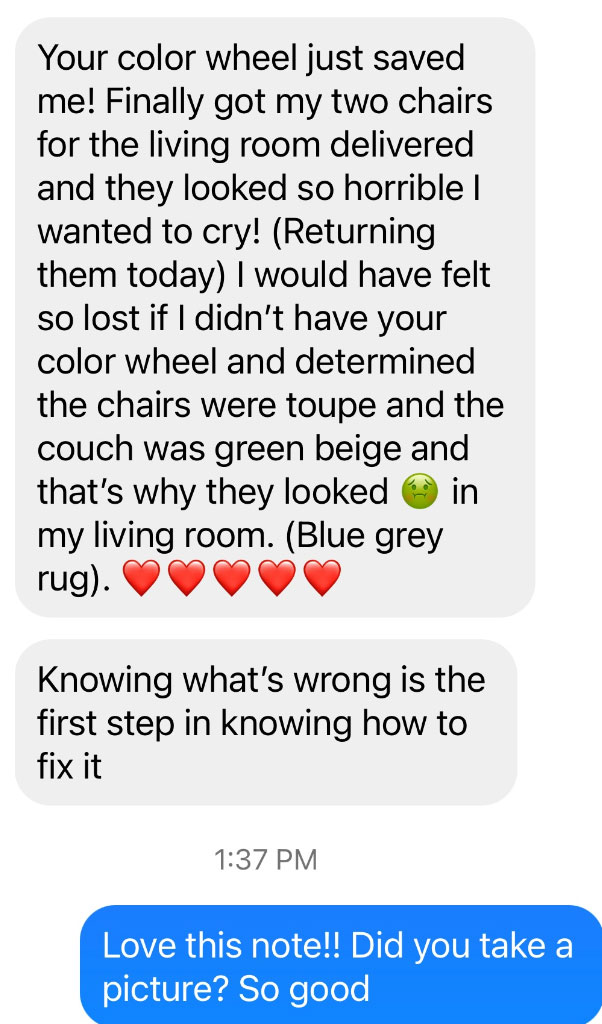
When I asked her about photos, she replied, “I took a few. I packaged [the chairs] up so fast because I hated them so much. And I may be wrong on the undertones – it may be violet grey – but all I know is, they did not look good!”
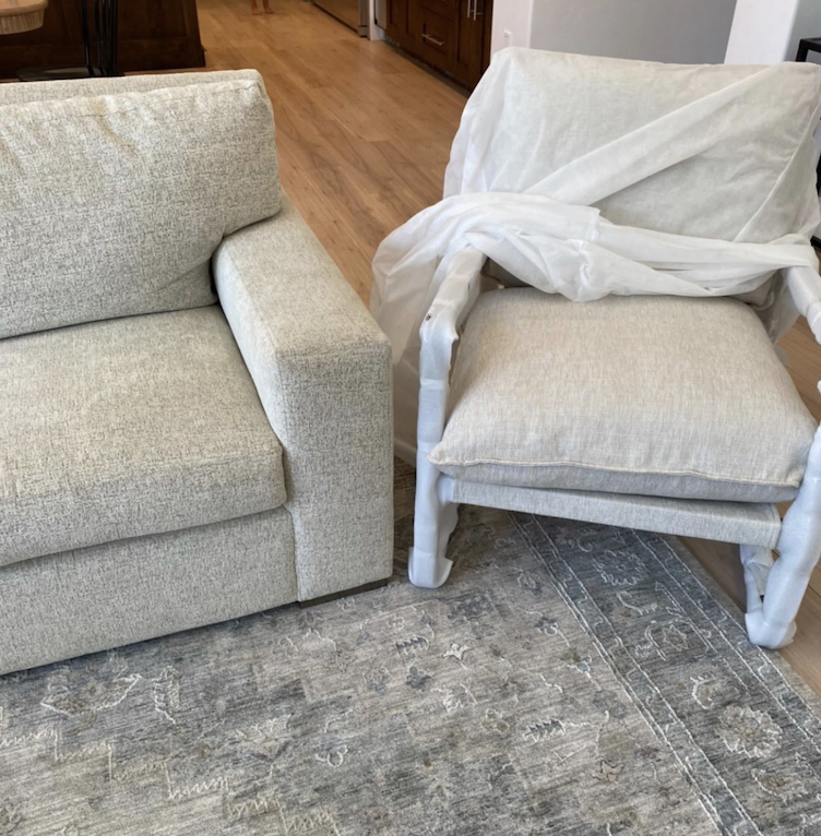
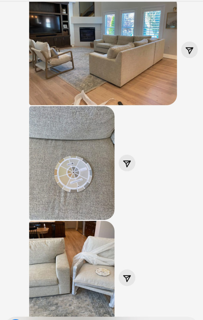
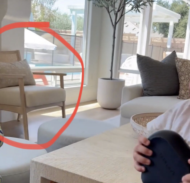
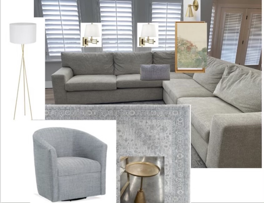
Here are her images:
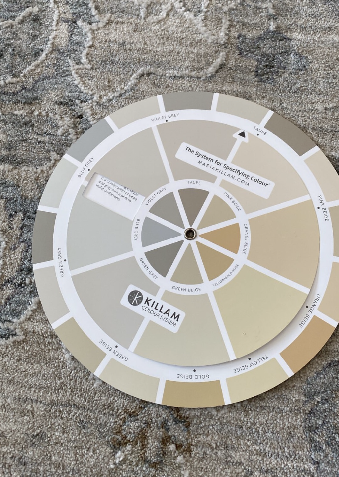
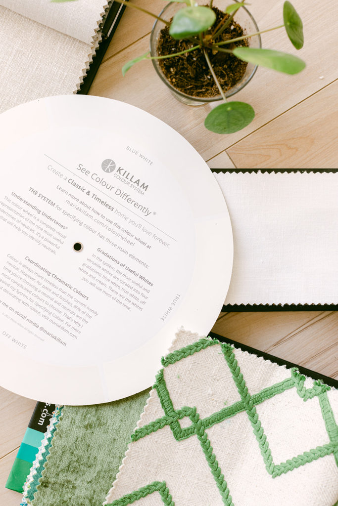
The colour wheel is included in your Killam Colour System box of samples with registration it also comes free with any set of large colour samples here. The individual colour wheel we hope to have back in stock by the middle of November.
When I saw the chair sitting beside the sofa, I realized there was a bigger problem (aside from the fact that the two fabrics indeed had different undertones).
“I’m going to order this one instead,”she added (circled below).
Should I try to match all my neutrals?
Sometimes, we get so stuck on the idea that ‘everything has to be neutral’ that we actually lose sight of the bigger picture.
Would the chair (above) have been any better?
No. Because the issue would still be the same (plus if we’re splitting hairs that chair is pink beige). Even if the chairs were green beige (meaning they are the same undertone as the sofa), because we’re dealing with different fabrics AND because the value is basically still the same, it still would have likely ended up with a look that says, “We tried to match the furniture but we failed.”
By the way, if you aren’t sure what “value” is, don’t worry, I explain this in depth in my two-day workshop. It’s also an important lesson that good decorators need to understand.
Choosing chairs in the same undertone as the sofa, but in different fabric, does not create enough contrast, and therefore will end up looking like a mismatch.
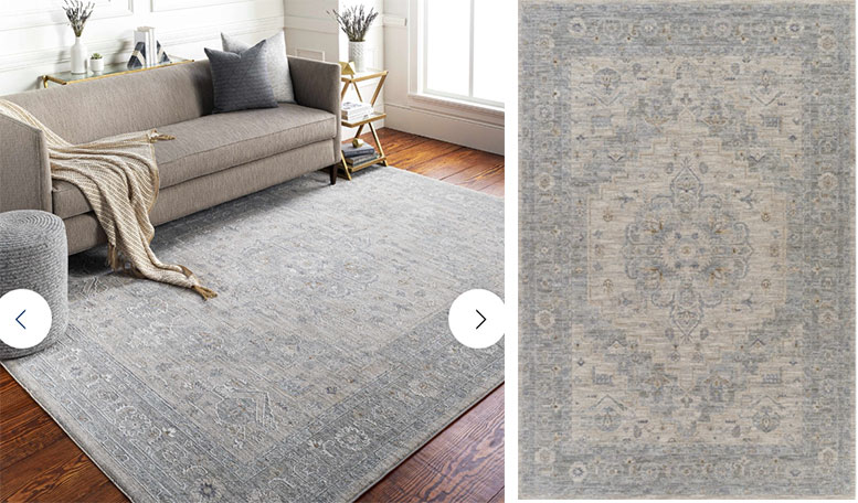
She sent me a close up photo of her rug and you can see that besides the neutral tones in the rug, there’s some blue grey present here too.
The colour wheel is included in your Killam Colour System box of samples with registration it also comes free with any set of large colour samples here. The individual colour wheel we hope to have back in stock by the middle of November.
So before I give you my response, what do YOU think the right answer is? What should she be doing with her living room?
The quick answer?
What she really needs is a blue grey chair to pick up the blue grey in her area rug. But here’s what else I told her…
“So, really you should have all of these items on a mood board. You could even include the original photo from the store where you purchased your sofa. This way you’d know exactly what it’s going to look like BEFORE you click ‘add to cart.’ I explain the exact steps for creating a living room mood board in my Shop Online with Colour Confidence course.”
Mood boards make your room design better
Frankly, I am almost as obsessed with lamps and styling and decorating as I am with getting the colour right. I used to just lament that everyone need to create a mood board first but without a way to teach you, it simply wasn’t powerful advice. And now, I’m so happy to share this resource with you to help you all get your rooms looking SO MUCH BETTER.
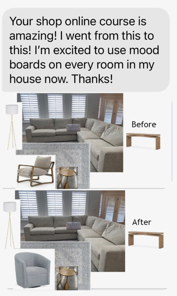
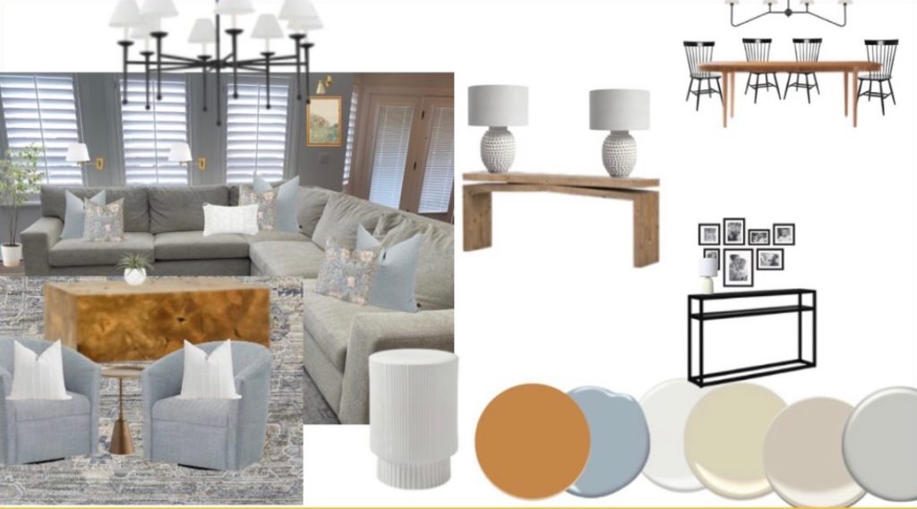
I’m also happy to report that Catherine, being a woman of action, immediately bought the course and a little while later she sent me this:
Contrast is an important distinction in my Killam Colour System for making endless colour choices that come with designing or decorating a home. Understanding contrast helps you make more accurate colour comparisons. It’s also part of the language of colour that I use to give you words to describe what is right and wrong with a particular colour or even a room design.
What you learn in my virtual Specify Colour with Confidence goes way beyond simply choosing paint colours for a wall or precisely identifying the right undertone (because of course, you learn those things too). But it’s also about choosing the right colours for hard finishes, furniture and decor in order to create a cohesive color scheme that flows throughout your home.
After she sent me the above photos I told her to add some swing arm lamps (of course) so she sent me this:
Getting even better now right? Then, a few days later, she sent me the following mood board below. Such a transformation – with some help from my How to Shop Online course. Get immediate access here.
How to become a better decorator
So, I’m curious… are you interested in becoming a better decorator?
Are you tired of settling for boring neutrals over and over again because you can’t commit to colour?
For every few rooms you paint, do you find yourself asking, why did that turn light blue or why does that look pink now?
Do you struggle when it comes to sourcing fabric, furniture, and accessories in the right colors?
Do you wish there was an easier way to coordinate all the whites in kitchens and bathrooms so they look good together?
Are you tired of trying to figure out the right colour for a room based on the amount of sunlight or which direction it faces?
What if you could get your hands on the EXACT steps to take so that you can create a cohesive colour palette in your home? What if you could learn how to pick a cabinet and wall color to harmonize with the hard finishes in about 15 minutes—so you can sell the house? What if choosing colour was fun again?
Colour Made Easy. That’s what you’ll learn from me in two days. You’ll walk away with more authority for choosing colour and more confidence in your decorating. I can promise you that.
Whether you’re a seasoned designer or a new one, you’ll gain experience and confidence with a system that actually works and a valuable niche in colour. And, if you’re a homeowner or colour enthusiast, you’ll improve your overall design skills and know how to move forward with a long-term plan for your home.
50% of these classes are designers and the other half homeowners who want to learn my system along with how to make colour easy for every area of your home.
‘As an education junkie, I’ve taken a lot of classes, both online and IRL, and Maria’s was the absolute BEST! I’ve never had the privilege of participating in such a thoughtful, detail-oriented, and genuinely fun course.
I’m not a professional designer, so I intend to use my knowledge to make our humble new build timeless and lovely.
Now that I have this new superpower, I’m eager to help friends and family avoid the usual pitfalls in selecting finishes.
I also want to send a huge shout out to everyone on Maria’s team. Running a course over Zoom is A LOT more work than most people would expect, and they did it flawlessly.
Maria’s entire business is run with love, humor and professionalism. I’m eager to learn anything they have to teach!!’ A. Wilke
I hope you’ll join me for one of my Virtual Specify Colour with Confidence workshops!


Maria I am on the process of redoing my livingroom which is open to my kitchen remodel. I have received your Shop Online With Color Confidence and color wheel. I love the color yellow and seeing your living room gave me the Confidence to finally add that to my color board. I am in the process of picking out fabrics to recover my existing sofa and chairs. New rug, pillows art, lamps, it is becoming overwhelming. My upholstery guy can’t get to me till first of December so I can take a breath. HOW do you stay so upbeat? I love your posts, they explain so much and humor adds a lot. You are not preachy and superior to us.
Anyway THANKS for helping us home owners that can’t afford to or just want to learn how to make our homes beautiful.
I think her room would have benefitted with colourful cushions and rug with same colours, as it is bland at present. Hopefully, she will add some colour to it, which will be a great improvement. Good luck with it.
Well this was the beginning of the room. Now she’s on the right track and can add more! Maria
Another major problem and one which a mood board may not reveal is incorrect scale. The problem only becomes apparent “after the fact” when that lovely occasional chair finally arrives and has been put in place: it’s comfortable and beautiful to look at except, now that it’s sitting in your spacious family room it looks as lost as a choir singer at a strip club. Love to have your tips on judging scale!
Where can I find this Gray hardwood floor video you speak of?
Check out either https://www.instagram.com/p/CfHhrSRpPSw/ or https://www.tiktok.com/@mariakillam/video/7112143521154370821. Hopefully those links will work for you (sometimes Instagram and Tiktok won’t let you direct link to things. If not, search “gray floors Maria Killam,” and you should be able to find them.
kj–is this the awesome person who comments on Emily Henderson’s blog?
Hi, Sunny! Yes, it is.
I love this post! Catherine did a great job with a some of your expert help, Maria. Finding interesting and size appropriate art is the thorn in my side as well as hanging it correctly. Please help Maria