This week, I’m excited to reveal the third room transformation from my sister-in-law’s home makeover back in January. (You can catch the first two reveals here and here.)
Permission to skip pot lights
And yes, it’s the perfect moment to remind you-once again!-that you absolutely don’t need to fill your renovation or new build with 150 recessed lights. There are smarter, more stylish ways to illuminate your space, and I’ll be diving into all the details in today’s video.
This transformation is my favourite!
There are also so many good nuggets on styling your home, you won’t want to miss a single moment! You never know which one will help you make your home just a little prettier and that’s what it’s all about.
Of all the rooms we tackled, this dining room is my favourite. We took it from a space dominated by chrome, glass, and sharp edges to one that feels fresh, joyful, and-dare I say-like you’ve just stepped into a luxurious New York penthouse. The transformation is dramatic.
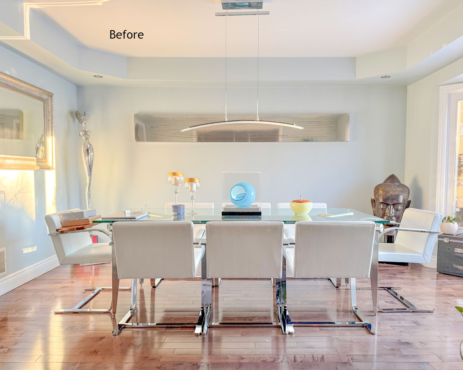
This particular makeover is also an demonstration of high and low decorating because my Sister-in-law did not need a lot of art, but there were a few key pieces (including an area rug) that took this room to the next level!
A hot tip!
And if you’ve got a dining room with a table that is stained and needs refinishing, today’s styling will help you cover it up and give your room new life!
PS. next week I’m revealing all the before and afters of the exterior of our home including the paint colours, stay tuned for a special sale!
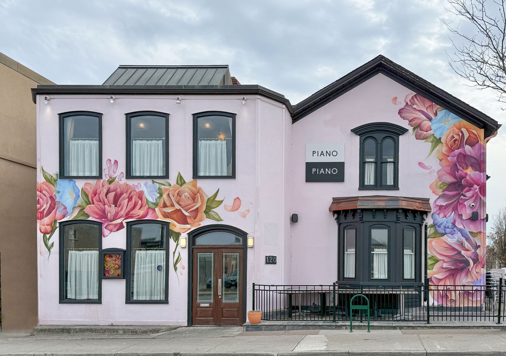
While I was in Toronto I snapped a photo of this super fun exterior. One of the lessons in my Exterior Masterclass is that solid black is not the best with colour. So what would be a better trim colour for this restaurant? Post your answer in the comments:
Related Posts
The Secret to a Memorable Dining Experience
Turn off Your Overhead Lights Forever
An Apartment Styling Makeover for White Walls


I can’t wait to watch this video. It will be my weekend treat to watch!
For the restaurant, I’d do creamy white for the trim, but a soft, springy green/pale lime could look wonderful. I wold say a light orange could also work but the copper is already doing that.
Would it be crazy if the trim color was the darker orange color of the rose painted on the building?
My thought exactly!
I am not usually a fan of glass tables. But, the nighttime shot of the dining room with the lamps turned on!!! The whole room, including the rug under the table are glowing! I’m a very traditional girl, a bit antiquie, but I love this room!
It’s my favourite too!
Hi Maria – Could you share the name of the pale blue paint color in your sister-in-law’s dining room?
It’s BM Summer Shower!
I think creamy white would be an excellent trim color on the building which would provide the contrast needed. On the dining room I am a little confused about the dining table. It looks more like a console table now than a dining table. Most of the items would have to be removed to use it adequately. Maybe I missed something. Also no corded lamps for me unless they go to a wall close by. These lamps are beautiful but I have never seen lamps on a dining table. I’m kind of surprised that you didn’t use a floor lamp in one of the corners. I just recently put a rug under my dining table and it made a lot of difference. It defined the room more and it just makes things more cohesive. I love all the colors that were used to brighten the space. The silver item changed from against the glass is a beautiful piece of decor.
I will use any excuse to stick a lamp somewhere and I’m not the first to do it. I could have added a standing lamp or even a table lamp on the right side of the room but the ONLY place to move that artsy chair in their entire house was right in the other corner which is why I added the lamps on the tables instead. This is a family of four so they don’t get in the way for regular meals and they totally make the room a place you want to hang out and linger. Thanks for your comment! Maria
I thought the dining room table appeared more like a desk an office. I just doesn’t seem like a dining room table to me, but maybe that’s a modern look?
The exterior trim would be nice in an orangey-peach from the flower that would relate well to the copper already there.
The accessory colors look great on the dining table but I just can’t get my head around lamps on a dining table unless they are the battery operated small ones that are so prevalent now.
I think a wine or Burgundy would be effective, to give some contrast.
That was my first thought!
Burgundy would make it the most sophisticated yes!
A lot of the colors in the beautiful flowers in that mural would work on the trim, but I think I would go with a fresh green.
Love the rainbow of colored glass pieces featured in this room… and that looks like Chihuly art on the wall?! Stunning.
(bonus points for the charming kitty photo bomber 🐈)
It does right? I love that piece thanks!
The tangerine color of the pot shown to right of the door.
I would choose a blue on the restaurant trim to bring out the blue from the flowers.
Wow this homeowner has some beautiful art pieces! Very clever to use the art boxes and highlight some of the nicer pieces.
Beautiful lamps, but I just cannot get past visible cords. It looks messy.
The styling of the table would be super annoying to me. I am guessing the table is used very infrequently. A thin console table against the back wall would have worked much better.
There was no room for one, if there was that’s where the lamps would have been.
I’m thinking maybe a burgundy for the trim to pull out some of the tones of the door…?
As for the dining room makeover, I am afraid I don’t care for a number of the changes. It would drive me nuts to have my dining room table covered with objects, especially those that have nothing to do with dining at it. Having a central focal point, sure, but the rest is just clutter. (I like Nicole S.’s suggestion about a console table instead!) I like the coffee nook and moving the silver sculpture item to the corner. However, I’d love to see actual pieces of art on the walls rather than framed items from big box stores– not only in principle, but I readily don’t think they add anything to this space. The big white pieces behind the table under the elongated mirror are just baffling, and the pieces don’t add the missing ‘softness’ that Maria mentions she wanted. What about hanging a larger-scale, abstract woven piece on the left-hand wall instead?
Just a reminder to anyone who is reading this post this is a ONE DAY styling makeover. It went from a room no one ever sat in to a place where you could have coffee sitting in the window with the morning sun pouring in and an inviting space just to hang out/enjoy a meal.
Yes these suggestions are all cherry on the top custom ideas that can happen later but my sister-in-law had a budget and what we did that day, fit the budget.
As for cords buy a cordless light bulb. But I promise it will never be on unless absolutely necessary and you’ll miss out on enjoying the pretty room every time you walk by during winter evenings.
Thanks for your comment.
I love how you decorated this room! The table looks so artsy and chic! The lamps are a perfect complement to the art. For the restaurant, I suggest a darker green, it will pop against the pink exterior.
Green from the leaves…makes the little bit of blue pop and would make the pink Sing!