One question I get a lot during my Specify Colour with Confidence Workshops is about lighting, what it does to colour, how to manage that effectively, etc.
Basically the answer to that question is this: If you notice that the colour you chose went pink beige (or the wrong beige/grey) in the lighting, the possibility that you actually chose the wrong beige is much greater than the light turned the colour into a pink beige. Yes there are times when the light turns a colour into something completely different. However, knowing which undertone is right for the room is 90% of the battle.
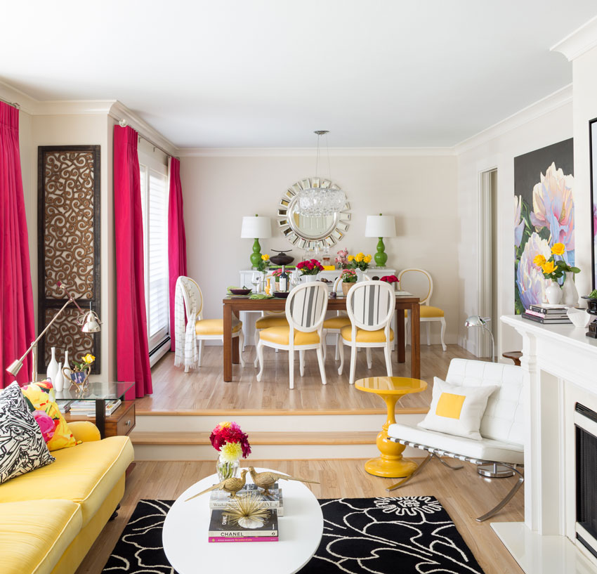
Maria’s Living Room
Here’s the thing. The greige in my living, family room and kitchen (Rice Paper from Cloverdale CA037) in some lights during the summer, in my kitchen it turns pink beige for about two hours in the afternoon.
The reason is the colour of my patio outside is a butterscotch/orange shade and when the sun comes around it reflects into my kitchen walls and turns them pink beige.
This does not bother me because the colour looks right the rest of the time.
And how do you know you’ve chosen the right undertone? By knowing what to look for from doing my colour training in addition to large samples.
Not one designer leaves my course without purchasing them once they realize you can’t choose neutrals without them.
Colours, yes
Complex neutrals? No.
It’s nice to have colours in large samples but you can still choose the right colour without a big sample. With neutrals, it’s virtually impossible.
Back row: Heather Laing, Tannis Redekopp, Greg Bayless, Gigi Watson, Karla Dreyer, Lynda Sammons, Carol-Anne Makeley Front row: Ruth Chancellor, Maria Killam, Lisa Moon, Linda Pritchard, Lisa Loveless
This was one of my classes of new True Colour Experts in Vancouver! We had our first male attend! Another architect (above), this time from Hawaii.
At dinner on Thursday night, I was having a conversation with Tannis who said:
“I am confident in my design decisions, whether it be space planning, flow and function, style, lighting, and so on, but when it came down to color I quite often got that nagging feeling of “I am not sure”, and not having the 100% confidence in my color choices. So when I am in doubt I always go to the experts for advice. That is why I ended up at your workshop, for expert advice, in school we learned “beware of the undertones” but that was it, a simple warning but no explanation. I now have that explanation! I have come away from your workshop with a renewed confidence and understanding of color, and more importantly it’s undertones.” Tannis Redekopp, CID
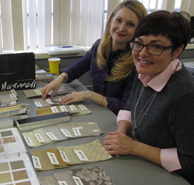
This is Carol-Ann and Linda (above), two designers from La-Z-Boy in Calgary. They gave me this set of coasters in my favourite colour with my True Colour Expert logo inside each one (below).
Maxwell Fabrics (above) once again sponsored all the fabric samples we worked with in class.
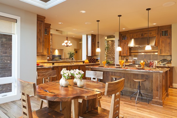
Interior Design by Ruth Chancellor
Heather Laing & Maria Killam
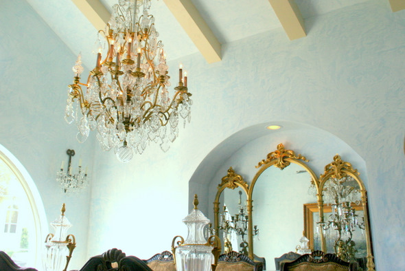
Plaster effect by Lisa Moon, San Antonio Murals
“Can’t thank you enough for such a career-enhancing class!! Best investment I’ve made in God knows how long.” Lisa Moon
Irene Hill, my wonderful design associate, copywriter, in charge of the Universe.
“I found you and Irene to be a thoroughly delightful host and your collective program content provided a life altering view for me. I will miss the daily slide review (I could do that for hours…).” Gigi Watson
Click here to register for upcoming Specify Colour with Confidence classes.
Related posts:
Top 8 Posts by True Colour Experts
Do you Give your Clients exactly What they Want?
The Difference Between an Expert and a Master
If you would like your home to fill you with happiness every time you walk up to the front door, become a client. On-line or In-person.
Download my eBook, How to Choose Paint Colours – It’s All in the Undertones to get my complete step-by-step system on how to get colour to do what you want and to make sure the undertones in your home are right, get some large samples!
If you would like to learn how to choose colour with confidence, become a True Colour Expert.








I would love the blue and green boards
Some darker colors, maybe a black, dark brown and a red? People in the Sedona area are always drawn to more rich and warm colors… maybe something you thinks works best in those southwest style of homes? (The neutrals are most popular given the natural environment, on occasion they do want color too!)
Maria, I wil say again how much I have enjoyed the large set of 50 whites and neutrals which I purchased after training with you.
Here are a few of the blues & greens I think are invaluable in large samples:
Blues: Palladian, Wythe, Woodlawn, Bird’s Egg.
Greens: Guilford, Hancock, Seahaze (magic color),Coastal Fog, & some spa greens like Natural Elements, Inner Balance, Herbal Escape.
And, I love having some of the darker greens which I frequently specify for shutter color.
A large painted sample is just an absolute must for selecting shutter colors so you can tape it up and stand at the street and look.
BM Wedgewood
I always choose colors with the lights off just to get the undertones right using just natural light. Then I see how they look with the clients lights on. With different bulbs in each room, that can really cause havoc with undertones. So, it’s light off when choosing color.
Light mixes with color as if you’re dealing with watercolors – it can be that pronounced. I think part of every consultation should be educating a client how to “adjust” colors by changing interior light: bulbs, shades/covers, etc. It’s not just the amount of light, but temperature (Kelvin). It’s not difficulut – there are on-line graphics showing how light changes depending on Kelvin. I printed one out and show my clients.
Many of my clients are looking for a milky blue/ greens.
Yellow is such a hard color to get right that I think some options for livable light yellows would be a great addition,
I think your suggestions are spot on Maria (although I think 25 is a better number since your last set was 50) and I agree with Ellen’s list. A nice classic indigo or navy blue would be helpful as well as BM Universal Khaki. More “greige” options – both warm and cool.
I want to share an experience with you all, about how light can change undertones: a “mistake” that turned into a learning experience with a happy ending.
As part of a kitchen remodel, I helped a client pick glass subway tiles for her back splash. we found just the right ones. not too green or too blue, or too dark from Anne Sacks. however, she found similar, cheaper, more available one in home depot (her contractor’s idea…). At first they seemed close enough, just a tiny bit greener and a tiny bit darker. Alas, after being installed on the wall, and BEFORE the under cabinet lighting was installed, I got an emergency call…came over, PLEASE, and my heart sank! it did look much greener and darker (glass is extra tricky that way because of the transparency issue). I stood there,not knowing what to do, and suddenly had this idea. we found an LED torch at her home and I held it to shine over the glass back splash tile, and voila! it looked exactly like that Anne Sacks tile we initially chose! – a little cooler (more bluish) and much lighter. we ended up installing cool LED under cabinet lighting, and if you’d like to see what she thinks about her kitchen today, you can read her review here…;) she loves it!
http://veredrosendesign.com/Testimonials.php
I am so glad you are going to do more colors, Maria. Since I’m not a professional, I hope other designers chime in here, who have actually seen great blues & greens on walls. Kristie Barnett are you there?
I would love to see some of the mid tone grays that exhibit the different undertones such as escarpment, stone harbour, silver fox, as well as some of the lighter grays such as barren plain, whitestone. I’m always looking for a very light gray with the least amount of undertone if something like that exists. The gray blues are also very popular. I’m always having a hard time convincing clients that there should be a bit of gray in the screaming blue that they want, such as New Hope Gray, Pilgrim Haze to name a few.
Wow, that jade sweater looks fabulous on you, Maria!
Echoing some others here – more gray blues, more greens. Thanks!
Yay for the token male! It’s about time! 😉 Hahahaha. I vote more blues and greens for sure! I think a gray / greige set would be a big hit as well.
Again, such helpful information. Thank you! I really love Ruth Chancellor’s interior picture–very pleasing to the eye! Is that a Benjamin Moore color she used in that kitchen?
Hi Maria,
Do you ever use Farrow-Ball colours? Their blue/greens are fantastic, so are the neutrals, and they have the colour ‘blackened’ – white with a bit of lamp black which looks so fabulous with our coastal light.
Their high quality clay-based paints are highly pigmented and very nuanced. I highly recommend them, and wouldn’t use anything else myself.
I would love to see how you use Farrow-Ball with your excellent taste!
Happy painting! Susan
THe reason why people think Farrow and Ball have beautiful colours (and I’m sure they are) is because they look lovely on their brochure because they are mostly all muted. It’s when paint companies throw the clean colours in the same brochure that it starts to look messy and not as pretty. Maria
Not a professional, just a serious design oriented amateur. It would be helpful to read/learn about the effects on color of different temperatures of lighting. Choosing between incandescent (warm, daylight, reveal), warm or cool toned fluorescent, LED, ad infinitum, becomes an impossible and expensive challenge! Add to that the effect of various colors and textures of lamp shades, and one has a veritable ‘tossed salad’ to sort out. Choices, choices, choices…
Woo hoo, this is great news Maria! I will be attending the April course and I am excited to add some new colours to my original box (which I love!). Blues: Smoke, Woodlawn Blue, Palladian Blue, Wedgewood, Green: Guilford Green, Grays: Harbor Gray, Silver Fox, Antique Pewter, Gray Horse, Whites: Swiss Coffee, Emira and maybe some browns (people still want them :), maybe even an exterior set would be great. Can’t wait for the course!
Hi Maria! Some blues and greens, and grays would be great. A few yellows would be helpful as well, as they are tricky to specify.
Thanks!
My clients and I really enjoy selecting our neutrals with your large paint samples! My clients just take them out of my hands and start walking around their house looking at the colour in all the different lighting.
I would love to see some of my favourite Benjamin Moore colours in a larger format –
Storm AF 700, Lucerne AF 530, Hush AF 95, Taos Taupe 2111-40, Sea Haze 2137-50, Ballet White OC 9 and Silhouette AF 655.
Thanks Maria!
Our church sanctuary was recently tiled. The tile under the fluorescent lights looks creamy with a yellow undertone. The sanctuary is wide and in the corners it is lit with a warmer light. There the tile looks really pink. The tile looks like it is fading from cream to pinky/ cream. It bothers me.
What a great workshop!
I had a home with a steep pitched red Spanish tile roof (Los Angeles) next to my home (we had almost zero lot lines on the west side). No matter what I had on the walls, the sun bounced the color inside and turned it a weird pinky everything. It was fascinating to watch what happened different times of the day, but it was a pain finding a wall color!
I was very surprised by how much light changes a color..I recently painted my kitchen a gray with green undertones. When the west light hits it, the wall color turns blue! It looks so different on a sunny day then the rest of the walls in the kitchen!!!
Maria’s comment that the butterscotch/orange patio shade sometimes makes her kitchen wall paint look pink may help me solve a problem. I noticed that the brand new “cotton white” Toto sink that I had recently purchased for a small windowless powder room looked “pink” and not bright white. I am going crazy trying to find a compatible laminate counter top for this pink appearing sink.
I initially thought that the halogen 3000 kelvin bulbs were the culprit. But, maybe it is the pale yellow walls in this small windowless powder room that is making the white sink appear a dirty warm pinky white? I have the same color in a well lit bedroom and it is a stunning barely there tranquil vanilla ice cream color that I just adore. Just as Maria says – pale colors only come alive in well lit rooms. But in the powder room, the walls read a definite pale yellow. So maybe the “closed in” space if affecting the sink color somehow? Has anyone else experienced the same issue?
speaking of lights my builder is putting in LED flood/can lights above, but with a warm paint color pallette, should I ask for warm white, regular bluish, or daylight bulbs