While my favourite way to update any space is through styling and decorating, sometimes a partial or full renovation is necessary. However, I try to approach any renovation with two guiding principles. Let’s explore them and how they can be applied to real-life home renovations and updates.
Raise your hand if you’ve seen this home on Pinterest? Likely many of you have. But did you know it belonged to Gwyneth Paltrow?
I saw it listed for sale again a few weeks ago, so I thought it would be fun to analyze the way her house looked before and the way it looks now.
Two questions to ask before any renovation
You already know that my favourite way update any space is simply with styling and decorating. But there are many cases where a partial or full renovation is necessary to achieve the look you are going for.
That being said, there are two guiding principles that are the lens through which I view any project. Whether for myself or for a client:
- What’s the least invasive and wasteful way that this space could look amazing?
- What updates would move the space towards a more timeless look to maximize longevity?
It’s like a puzzle, and because every house is different, it’s endlessly interesting to me to see any room to determine how it could look better without just ripping it all out.
After all, that’s what most people do. I’ll never forget a comment from a designer in one of my live workshops. In my courses, we go through so many rooms and ask ‘What do we need to do to fix this?’, she said “I couldn’t do what you do, I just BLOW IT ALL UP”.
And that’s one approach that works just fine if you have money to burn but even if you did, the bathrooms we just saw last week did not need a complete renovation only moments after the last trend had just been installed.
And let’s be real, most of us don’t have dollar bills to burn. Choosing TIMELESS is, in my experience, the MOST SUSTAINABLE approach to design.
This is why I offer eDesign packages like my Bathroom Refresh and Kitchen Refresh, and why I love to transform spaces with decorating and styling with my Colour Rescue series over on Youtube!
Waste not!
We live in a world where trends drive a heck of a lot of waste.
If more timeless and versatile finishes were thoughtfully installed in the first place, instead of whatever the trend of the week is, we would have a lot less waste.
But what about creativity and personal expression?
Let’s talk about creativity, shall we?
Reimagining a room is incredibly satisfying creatively. However, when we get too creative with constantly installing trendy and then renovating to the next trend, that’s when it gets problematic. I’d much rather create timeless and versatile spaces (boring even!) and be able to redecorate and style them endlessly, than be on the wasteful renovation tread mill.
And some people can afford to reinvent their home just to express their aesthetic interests of the moment.
Gwenyth Paltrow’s house, for example, recently came on the market. And I wanted to share the recent “updates” she installed before it did.
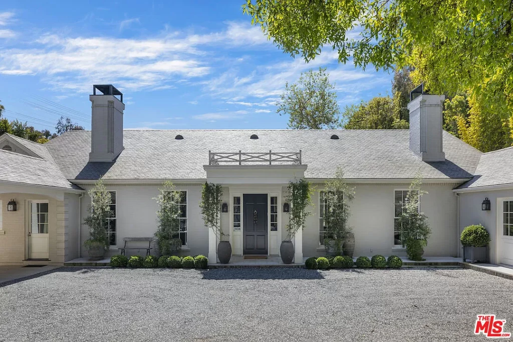
Her pale green grey exterior with pretty symmetrical windows is, BTW, perfectly timeless (below).
Read more: First Rule of Design: Boring Now Equals Timeless Later
And here’s the previous iteration of the kitchen (below) designed by Windsor Smith. Kinda reminds me of a Nancy Meyers’ kitchen.
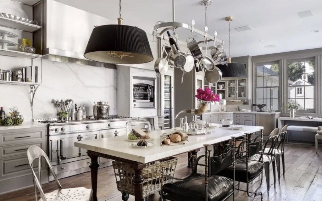
You can tell it was installed in the grey trend, because of the grey cabinets, but otherwise, it’s a pretty and timeless kitchen. The styling gives is personality and charm. Nothing wrong. I would be delighted to have this kitchen.
Now that we are in the warm neutral kitchen trend, a person might have the cabinets and millwork painted a warmer green beige or taupe.
A trendy kitchen update
And here, below, is a more recent “update” of the kitchen. I guess the feeling was that there wasn’t enough black? So let’s replace the perfectly timeless medium brown wood floors?
The interior of the beautiful windows were painted black (of course) and all the lighting and plumbing went black (again, predictable).
The “industrial kitchen” trend of the earthy aughties had us installing large stainless hood fans. In my opinion, there is absolutely nothing wrong with the soft look of the hood fan in the original kitchen even if the newest look for a hood is this hidden plastered look (as seen in the update below).
Notice though, that the “marble look” quartz in the first version, with the fake veining was replaced for a much more natural looking marble.
I’ve been saying this all along, avoid the oversized bold veining look in marble look quartz. They look best in modern spaces.
But at the end of the day, in the first kitchen, there is so much else that is pretty, you hardly notice because it’s not that strong anyway.
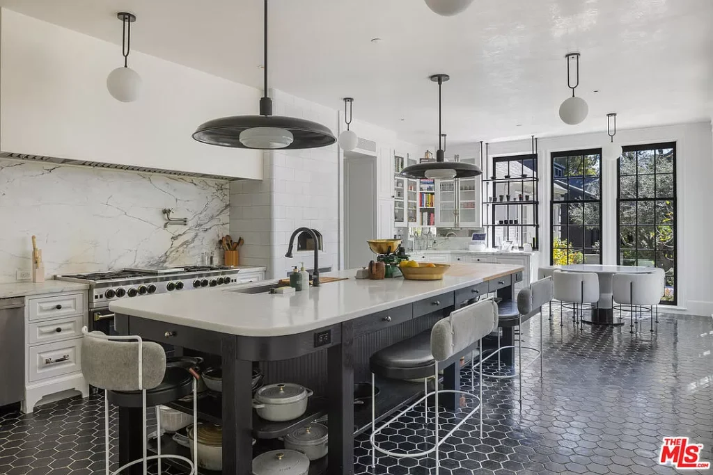
In this second iteration, the charming bakers table, that I think has homey Nancy Meyers vibes, has been replaced with a trendy modern curved black island. Again, simply swapping one look for another, not necessarily an improvement. I do think curves on an island can work in a more modern space, however, I’d call this house overall more traditional.
It looks to me like, “well I’d like to try a more sleek and modern chrome, black and white look. Money is no object. Let’s go!”
I don’t know about you, but I prefer the cozier feel of the first version. It’s more timeless overall and the second black and white kitchen has a more obvious timestamp to the black and white trend.
In general, I do like the 5″ hex floor tile though, it belongs in a traditional house. We could still easily pull this kitchen from the trend by replacing the black lighting and faucets and painting the island.
Changes to the great room
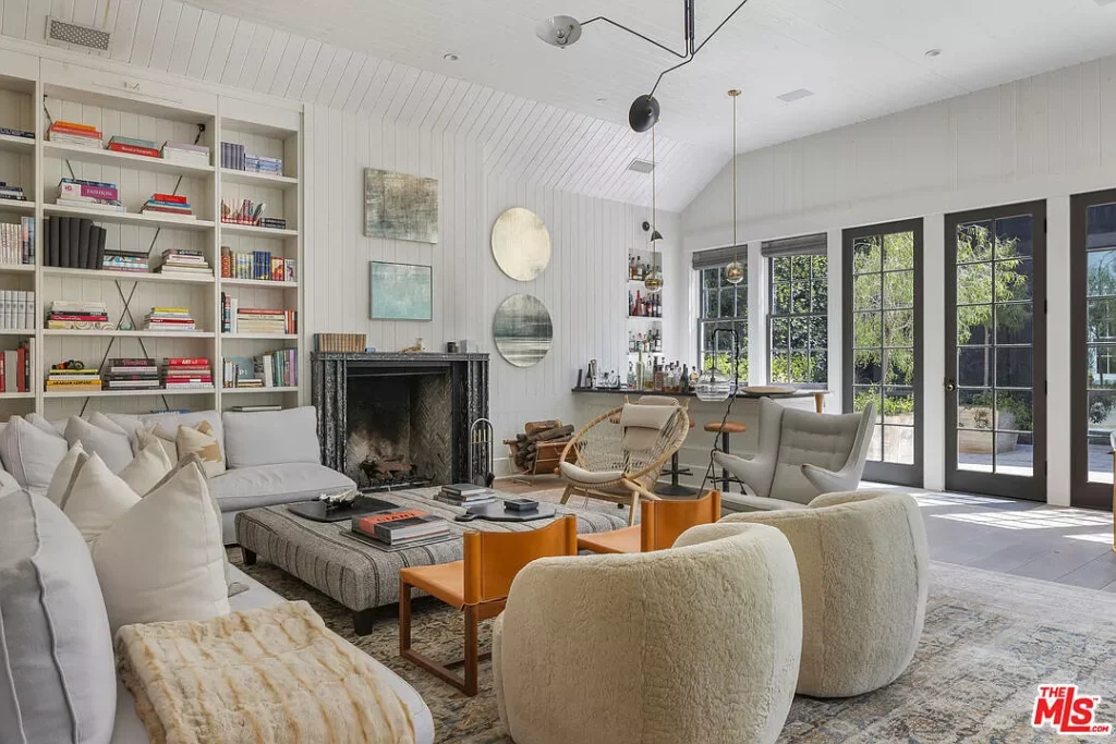
A similar complete overhaul, I assume due to aesthetic restlessness, is going on with the great room. Here’s the earlier version below.
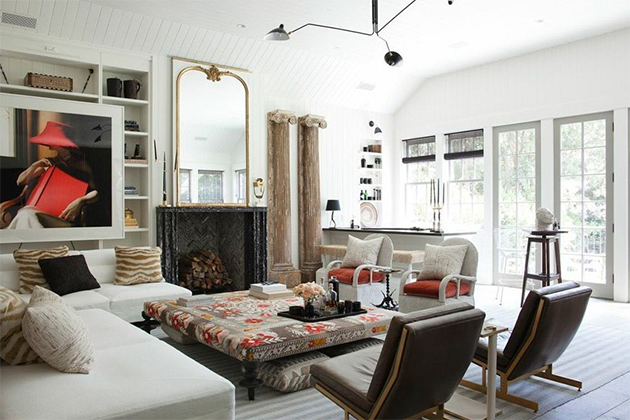
This is a gorgeously decorated and styled room. With just enough black to be elegant. The faux columns manage to be elegant and interesting. It’s tailored and lovely and looks amazing with the large gold mirror.
Below we have the redecorated room. It feels quite a bit more basic to me? Especially the styling surrounding the fireplace. The windows look too heavy in black and the furniture is much more generic. Almost makes me wonder if this is mostly staging for sale actually.
Overall, it’s interesting to analyze the way that the choices were made through the lens of trends etc.
I’d love to hear your thoughts on this update. Which versions do you prefer and why?
If you’d like to learn my system and learn how to make your next renovation or new build as timeless as possible register here for one of my virtual fall workshops.
Register here to become a True Colour Expert.
Related Posts
Adding Colour to Your Black, White and Grey Room


I agree with both rooms’ analysis: that the original is better than the “sell” version.
I just wonder if Paltrow herself had anything to do with it—some of the items moved from the living room could have been kept by her so that no one buying might want her “favorite” whatever…
If she was involved in making the choices, she really doesn’t have the charm/style that is advertised, IMO.
Both of those changes lack warmth and style—they are “current” I guess the best thing you can say—
What about bathrooms—much more $$$ to make a dramatic impact changing out tile—you can do the hardware and lighting fairly easily…
I hate it. 😉
I agree both “before” versions were better. I don’t like all the black in the “after” versions. It looks too heavy. The living room furniture and accessories look very much like staging for sell.
I prefer the original version. The renovated version is completely lacking in personality.
Not a fan of either room, but what really has me puzzled is the two orange chairs directly in front of the two, what looks like, swivel chairs. Very strange. Also, the charcoal they painted the windows doesn’t seem to relate to the rest of the room. Oh well……different strokes…. 😊
I didn’t notice the weird chair placement at first but it really is odd!
lol…I agree! It looks like the designer had a budget and bought too much ‘stuff’ and just Willy nilly’d it.
I love the charm and character in the before pics.
That was the first thing that caught my eye! Why are chairs in front of other chairs? Were they trying to make a decision and hadn’t removed the one of the chair pairs? Is it ‘theatre’ seating? Who knows.
The orange chairs jumped out at me right away. Are they for kids or something?
Ditto on the large picture which appears to be directly in front of the bookcase in the original living room — and what part of it is the picture and what is reflection in the glass?
Same- I was thinking that is a very odd place for another pair of chairs.
Not my taste before or after, but at least the first was interesting. The updated kitchen is just awful. What a waste.
Yes, I agree with many of the comments – the stacked orange chairs in front of the curved boucle tub chairs just looks wrong! I love the original and wouldn’t have changed anything 🙂
The ”after” seems to have the custom upholstered Gwyneth chairs by Goop (30% owned by Paltrow) sold by CB2. She is promoting her line of furniture. It seems strange that the beautiful mirror reminiscent of French design was removed. I agree with previous comments that it all seems to be staged for sale. As to kitchen, the table in the “before”version was beautiful and timeless. Same goes for the floor. Both kitchens have its appeal but I personally prefer the ”before” look.
Wow, they really did butcher those rooms with the updates. I’m so tired of designers trying to fit styles into spaces where they don’t belong!
I agree with you Maria! OMG. The original home was stunning and you felt enveloped in warmth. Her renos were a fail to me.
I like the first version much better. The second version looks messy, and I agree about the chairs. Two chairs behind two other chairs? Also it doesn’t feel grounded. Things look like they are just floating around the room. Another thing is no coziness. The first version is inviting and the second one is not.
The other odd change was the cabinetry style in the kitchen. The cabinet to the left of the stove in the After photo is extremely traditional (even more than the original kitchen), and yet it is juxtaposed with the more contemporary style of the island and furnishings. It looks like the realtor went beyond “staging” and decided to try their hand at designing (badly).
Maria – it lost its charm …
Before was different where it looked well thought out .
I loved how it was …
I much prefer the warmth of the first pictures! It was much more timeless and classic. Just goes to show that expensive doesn’t always mean beautiful. And thank God, because we’re on a budget 😜
Loved this side by side comparison! Thanks! I always like hearing how you would pull back to timeless, or style to correct. And my favorite phrase in this blog was “aesthetic restlessness”. So true, but many don’t have the extra money to consistently change, so I love the emphasis on how to use styling to change, rather than hardscape change. 🙂
I don’t understand the bucket chairs behind the orange chairs in the “updated” living room. What am I missing? The original room is so pretty, except that the columns seemed unrelated to the rest of the room, just dropped in because… ??
The island in the “updated” kitchen looks cheap-ish. The brown wood floors in the original were gorgeous, it hurts they were ripped out.
I like columns, but I’d like to push those columns off the nearest cliff. 😉
Ugh, if this is her Santa Barbara house this is part of the current silliness to cookie cutter black and white out the beautiful soft and welcoming Santa Barbara Style to sell to the follow the trend moneyed crowd. The ugly black and white esthetic looks so out of place in our beautiful town yet everyone is doing it- taking these classic graceful homes and making them edgey. Where is the heart? Santa Barbara and especially graceful Montecito is being taken over by LA folks with that trendy esthetic. It destroys the esthetic that attracted them to move here. They have money to burn. What was a $5milllion house is now $20 million post pandemic, sigh.
I actually like the renovated kitchen. I’d replace all the hanging ball lights and uncomfortable, very modern chairs/stools. The before is very French country and it is lovely but I prefer the closed in island to the table type. I like the hex flooring, as well as the wood. As to the living room, the before is much better. I love the big mirror over the fireplace, the large art and various pieces in the bookcase are interesting and the furniture makes sense. In the second reiteration the bookcase is stacked with books in a contrived way, the painted window frames look too heavy, and what’s with all the different chairs – two camp chairs in front of boucle ones, one wicker, one modern??? Money does not buy taste.
I much prefer the original rooms as they are more elegant and timeless not to mention more cozy.
Ok, but looking at the living rooms— the before photo has clearly been more heavily edited. If you look at the windows that area of the photo has been deeply softened. It makes a big difference, and it doesn’t give a realistic feel of what the rooms are like. I’d be curious to know what kind of editing was done to the photos of the kitchens. Neither before and after look like homes I’d enjoy living in, honestly.
Can you believe they changed the RANGE?! It would be easy to simplify the heavy first kitchen without turning it into the back kitchen of a restaurant, like the second one appears to be…
Yes! An abomination. Love the AGA. The seating at the “after” kitchen island grabbed my attention immediately. The designer who chose those stools should have their credentials pulled. If you have very thin legs you might be able to sit up to the island but then your feet would be on the shelf with the pots. Someone was paid thousands of dollars for some very questionable choices.
The amount of waste created by trying to keep up with the fleeting trends makes me sad. 😢 Learning how to create timeless and classic (in most cases by working with what already exists) makes me happy! Thank you so much for sharing your magic Maria.
Meh.
My conclusion is that I somehow need to become friends with some wealthy people who rip everything out regularly to follow trends. Then I could pick and choose the timeless pieces to rescue and save a tonne of money. Lol!
Maybe Habitat for Humanity has some real showstoppers in their stores there—
Not so much here although Sarasota FL does have some wealthy people…Vick
Neither the befores or the afters of the rooms smack of great design. Your showing us and talking about it was very informative, however.
I think that the previous kitchen and adjoining room is better, cozier, timeless, just better all the way around. Goes to show that newer is not always better. I noticed that the previous range, which was no doubt very expensive, was replaced with another large range, why? The improvement I see is a pot filler, I just had one installed in my new kitchen and love it.
The reno of that kitchen is just tragic.
The original room had so much more warmth and character.
I actually like the revamped kitchen… however, I would have left the window trim white, and I would never have gotten rid of the wood floors! The original kitchen did look a bit cluttered…stove, wall oven thingy, wine fridge…large kitchen but everything crammed into one space. 🤷🏻♀️ BUT the original island was gorgeous! Looks like she copied Shea McGee’s island : ) The original living room was beautiful minus the out of place columns.
I wonder why anyone would plant trees in front of their windows?
I pulled up the listing and I agree that painting the inside of the windows in those two rooms black was plain weird and doesn’t relate to the rest of the house. I also preferred the wood floor. The rest of the home is lovely.
I’d choose the after kitchen, easier to clean and better function with the sink in the island.
Definitely in Gwyneth’s time this house looked much better
The FIRST thing I’d do is rip out your “perfectly timeless wood floors”. YUK. The cleaning alone! She was foolish to put all that white grout, nevertheless, tile is ALWAYS the answer. I guess all you guys love living in a stylized version of your life where you pretend you live in the south of France.
I do not care for either kitchen. Too cold looking and after having several homes with tiled grouted floors. – never again. It’s a never-ending cleaning job. Gwyneth’s kitchen has a science room feel with the pendant lights over the island. Such a colorless space that feels empty and lonely; Plus the echo has to be awful.
I love the big ottoman in the first living room. I’d paint the walls a deeper color – maybe BM Aegean Blue and add millwork to the fireplace and bookcases. Add wood floors. Replace the 2 chairs with orange seats with something else. I do like the black external doors in the current living room. The pillars are awesome – though I just wonder if they could find another place for them. Parts of Gwyneth’s living room remind me of Ikea finds. Or maybe most of it does. :-). Fun discussion.