
From left to right {Lisa Mendes, Chrissi Shields, Libby Langdon and Maria Killam}
When we walked into the restaurant, Libby was already there and when she came around the bar in our direction I thought “I wonder if that’s her”, because she literally sparkled. Is that because she’s on television, I secretly wondered?
And she was just as sparkly and generous all through dinner! It was a really fun evening.
So later, I checked her out on-line and saw this clip of Libby giving advice on the Today Show.
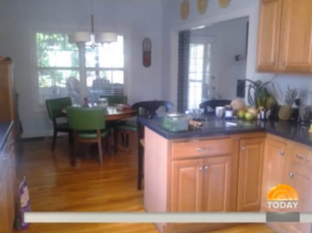
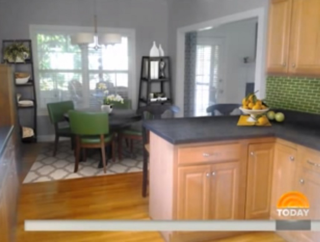
I so loved this kitchen makeover, I had to share it with you!
Instead of drapes, which she acknowledged were certainly on option, she suggested two etageres on either side of the window instead to corral some of the stuff on the countertops.
A new area rug and matching green backsplash and what a wonderful transformation! I can almost forgive the remaining 4″ kick it’s so great ; ) ; )
I have given advice here on choosing backsplash tile for wood stained cabinets and countertops when white or cream is not an option because it’s not repeated in the countertops or tile floor.
But this hit of colour on the kitchen backsplash to repeat the chairs is definitely a wonderful way to update light coloured wood stained cabinets, especially if you’d love to paint them but it’s not happening at the moment.
There’s some skillful photoshopping happening in this photo to show you the possibilities, something I’m still working on, as you know!
I’m in Toronto for one more day, leading my Specify Colour with Confidence™ training! My whirlwind trip to the East will come to an end tomorrow night!
Have a great weekend! xoxo Maria
Related posts:
Best Backsplash Colour for Stained Wood Cabinets
What do Ruffles and Backsplash Tile Have in Common?
Selecting Your Kitchen or Bath Backsplash; Accent Tile or Not?
If you would like your home to fill you with happiness when you walk in the door, become a client. Online or In-person.
To get your exterior colours right, download my How to Choose Exterior Colours with Confidence webinar and get my go-to list of colours.
Download my eBook, How to Choose Paint Colours – It’s All in the Undertones to get my complete step-by-step system on how to get colour to do what you want.
To make sure the undertones in your home are right, get some large samples!
And, if you would like to learn how to choose colour with confidence, become a True Colour Expert











Hey Maria, what a fun night we had. Libby is certainly an amazing person but then so are you!
Thanks for having me on your blog today!,
Lisa Mende
What is an etageres ?? Weird word I’m off to google this!
Trust me, I had to look at the spelling 3 times to make sure I had it right myself 🙂
Hello Anita,
Etageres is the French word (Canadian word as well so it seems !) for Shelves. Reading the blog from Toulouse in France, I find myself looking in the dictionary for words almost every time !!
Thanks Maria for your wonderful blog which taught me a lot and is always inspiring. I must confess however, that I am not into green backsplach !
Etagères is french for shelves!
I agree, how great to re decorate on screen before buying or moving anything! All the very best learning how to photoshop Maria, I can’t wait to see you using this skill!!
Haha, well I highly doubt I’ll ever be able to turn a room into what the above photo is, I’ll be happy if I can add flames to a fireplace that doesn’t have any or remove things that shouldn’t be in the picture 🙂
Maria
Maria, I have that four inch section of countertop that goes up the wall, too. I’d love to do a subway tile backsplash, but always felt that it would look odd with that extra strip of countertop along the wall. In the makeover above, I see that Libby went ahead with the backsplash anyway. Would you have suggested that?
I normally would not have recommended different coloured tile to go on top of the 4″ kick (if you have it and don’t want to remove it then I would usually paint that area the wall colour or continue with the same colour although black would be too heavy) but in this case I think it relates so well to the green chairs in the room, it works. I would certainly try to remove it if possible for the best look! Maria
Thank you for your reply. : )
Always learning with you!! What a treat.
The green backsplash does not make MY toes wiggle, but the lessons learned are worth noting. (Agree with you, white is always best :-), if for no other reason, who wants to live in a construction zone when they change it again in 5 years?)
The shelves give solidity to the space that I did not expect. And that the symmetry is also asymmetrical, (different styles) gives motion and keeps it from being staid.
How fun!
Wait, I’m confused. Did Libby put in the etegares or did you Photoshop them in?
I’ve seen Libby on shows before. She does great work.
Oh no, those were all Libby’s suggestions! I loved the idea as I would have probably just suggested drapery! Thanks for your comment Mary! Maria
My countertop guy told me that not having the 4″ kick makes it much more likely that water will get down behind the cabinets and do damage once the grout starts to dry & get older. Since we couldn’t do a backsplash at this time, we went ahead with the kick, and can always pull it out later when we do a backsplash.
Beth, the 4″ kick was to cover any gaps between the wall & the countertop if your wall isn’t straight. Naturally a tiled backsplash would do the same thing. And adding a bead of caulk between the counter & the tile prevents water from getting behind the tile or countertop. You should never apply grout where 2 different surfaces meet. Your countertop guy obviously doesn’t know how to install tile.
I have the same chairs around my dining table! I love the green backsplash with the light wood. So cheerful yet classic.
I’m not as crazy about the black counters with the brown table. White would relate more nicely to the rug and brighten the space. But I understand she’s going for quick fixes.
Sounds like a really fun evening you had Maria!
I love the make overs, —only thing I would do differently would have been to have the back splash be gray subway tile to continue the wall color. I don’t see green referenced anywhere in the fixed finishes….but …..ooops, the chairs.
Still think gray subway would be better. Or black.
I think that a white backsplash would relate to the moldings and not look so bad, but I like the green also. It would look better if the shelf units matched.
I agree that the shelf units should match since there are so many different elements already in the entire area. I can’t see the point in having two different etageres. Sometimes using items that are symmetrical helps the eye to read them as one item. It creates a balance that keeps you from looking back and forth from one to the other.