It seems that neutrals are warming up. Here’s how decorate your living room for fall by injecting some brown – and still feel modern and fresh!
For some time now, there’s been talk about browns and warmer neutrals coming back to replace gray. Last week, when someone asked if I would write a post about taupe because Sherwin Williams recently claimed one as their colour of the year I responded:
“When my readers or clients start asking me for Taupe, that’s when I’ll know it’s real. And not just someone in the marketing department declaring ‘Well we can’t keep talking about gray or white cause that’s old, so let’s talk about taupe’.”
And if someone from Sherwin Williams is reading this, I am totally willing to be wrong. And as soon as my readers start asking me for mid-tone earthy taupe, you’ll be the first to read about it here.
Currently, in my e-Design consultations, we are specifying taupe when it’s found in fixed elements.
And that’s it.
Just to be clear, there is NOTHING wrong with taupe, however the current NEWS in paint colours in North America is white-on-white or cream-on-cream trim AND walls.
By the way, if you have Travertine and enough light, this might be the answer for you! I wrote a post about this in April 2015, here 18 months BEFORE it became trendy (below).
Related post: When White Walls are the ONLY Solution.
Speaking of taupe, at the end of this post you’ll see a picture of our meeting room in Seal Beach. Taupe was a very bad choice for this room, post your guess what we would choose instead in the comments below and I’ll give you the answer in a few days.
I had a fabulous designer who flew all the way from New Zealand to attend my course! She said the Tuscan brown Trend never came to New Zealand. I hope a guest post from her is coming my way very soon! Anyone else reading this blog from New Zealand, please let us know if that is your experience too!
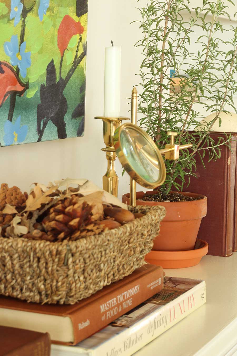
How to decorate for fall using brown
Okay back to the point of this post, when Terreeia and I arrived at the home of Brooke and Steve Giannetti in Ojai last Monday night to stay in their guest house (I know, lucky me :), that’s when I saw brown from an entirely new perspective.
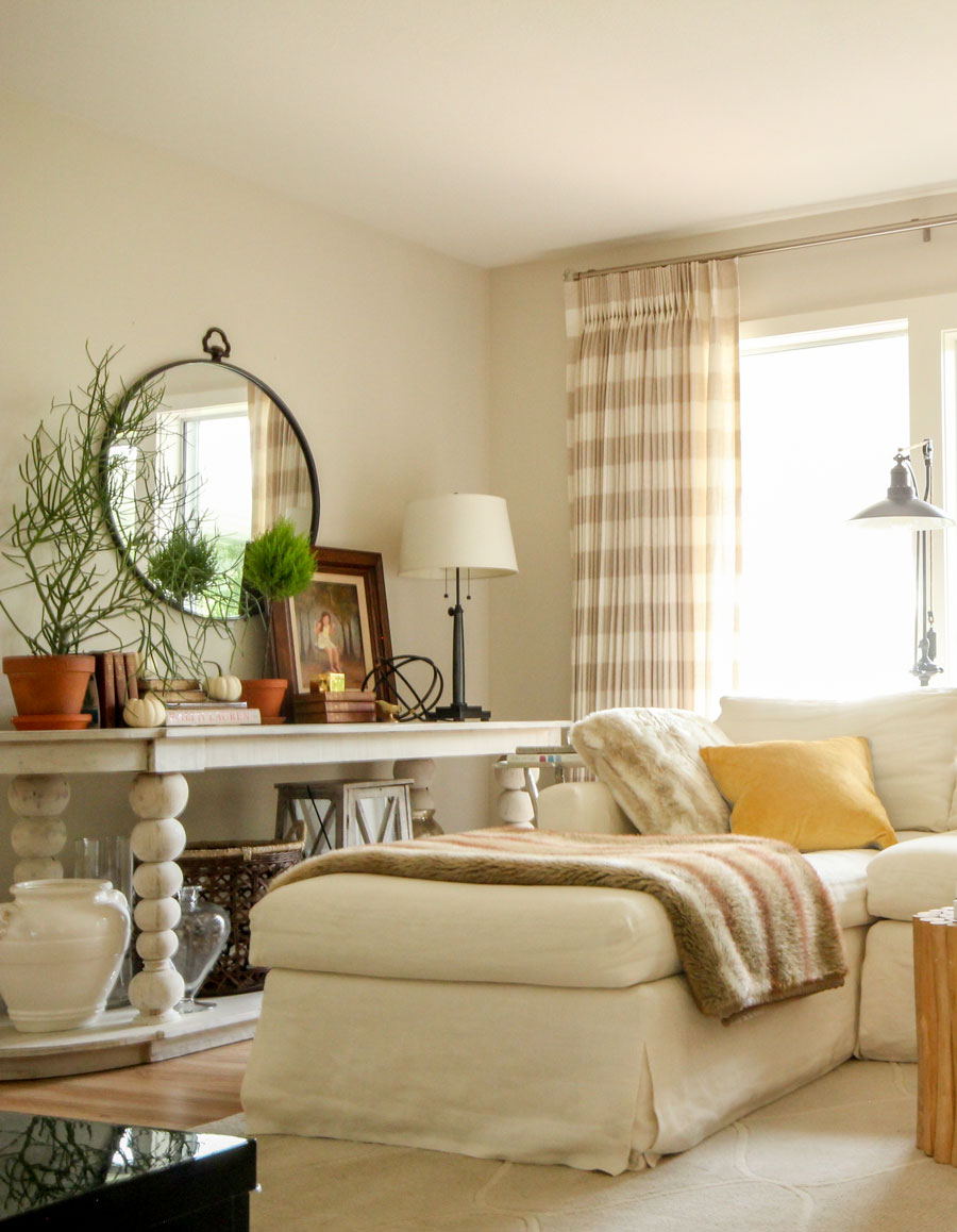
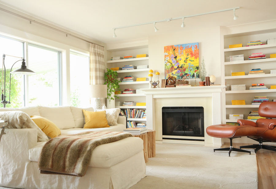
I’ll talk more about their house in another post but here’s how I transformed my family room from Summer to Fall this past weekend!
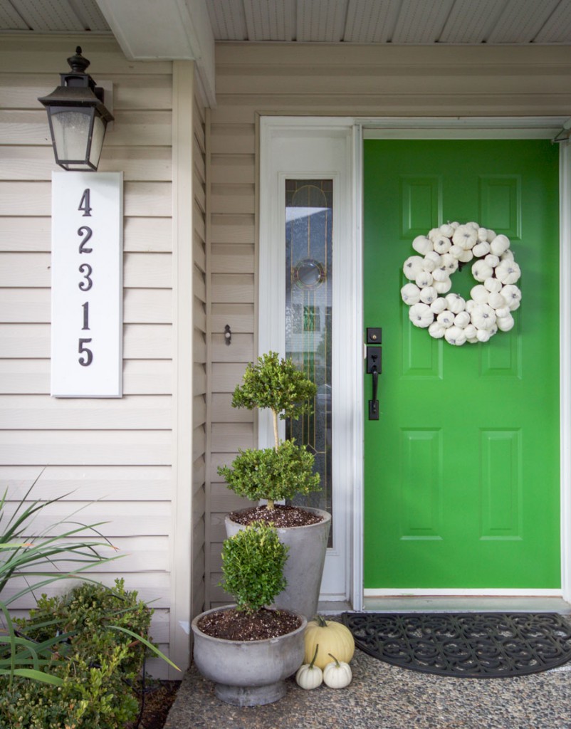
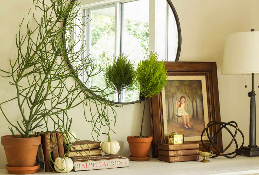
The plants in my pots were seriously scraggly from the summer. I ripped them all out and replaced them with boxwood. I would have dearly loved rounder shrubs (I’m talking about the shorter one) but these were the choices I had.
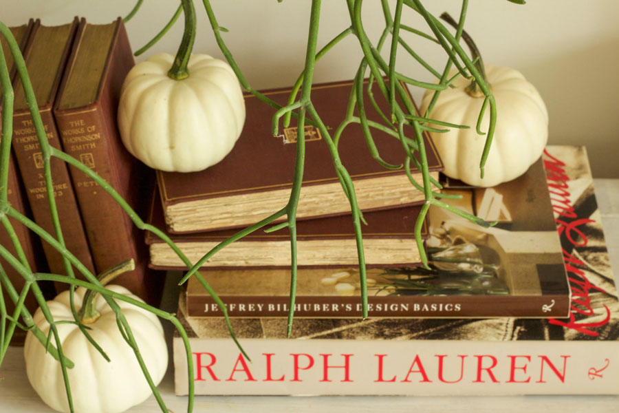
The wreath are white fabric wrapped faux pumpkins from HomeSense.
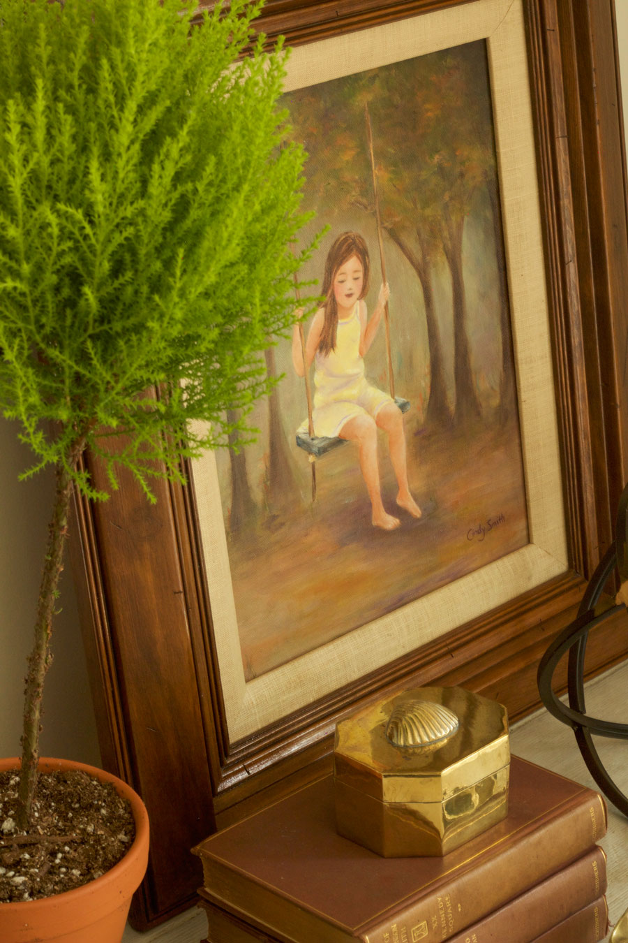
I found this girl on a swing by a local artist in my little town, Cindy Smith (couldn’t find any contact info).
I loved the chunky brown frame and the sweet smile on her face.
I’ve had this brown round mirror (below) in my garage for months. I just bought it when I saw it, without a plan on where it would go. I was so happy with how it looked here. Nice to have a fresh new vignette.
I rustled up a brown wicker basket from another room in the house and placed it underneath the console.
I still have the same gold beige and cognac faux fur throw from the Pottery Barn. My yellow throw pillows are new.
Related post: My Family Room in Style at Home (in Summer colours)
I loved this messy pencil cactus I found from the nursery this weekend. It reminded me of California.
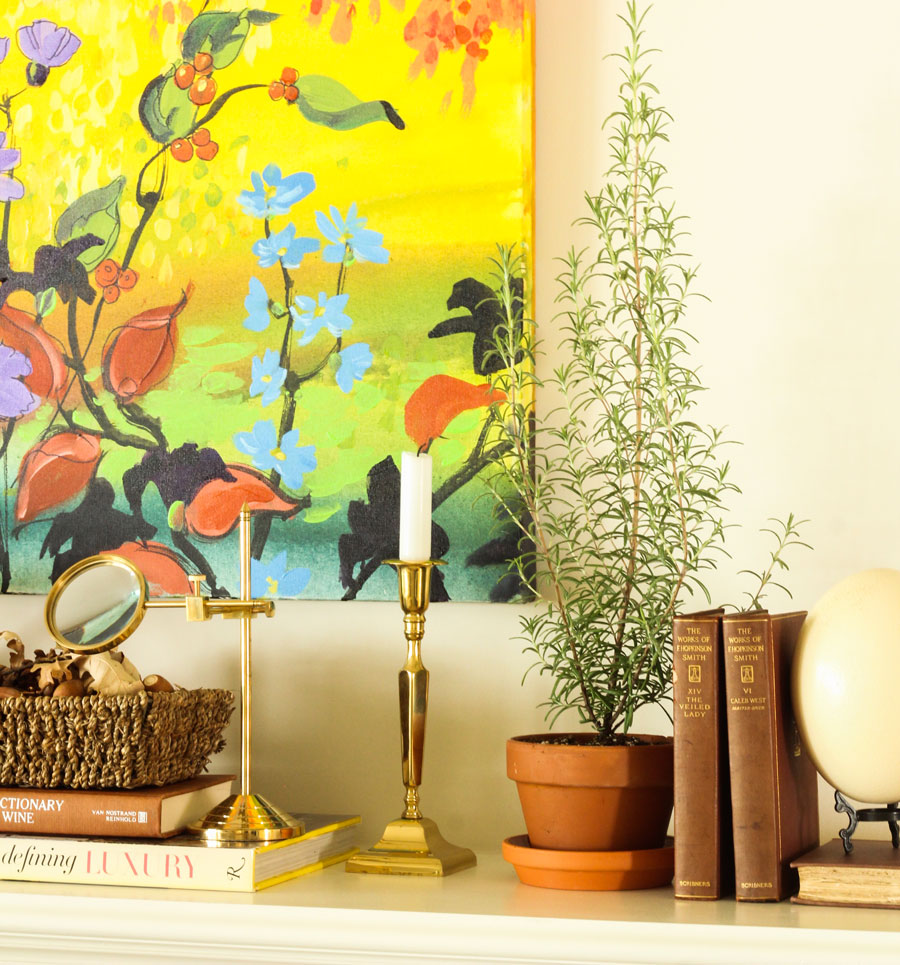
The collection of old books I found from one of my regular haunts 10 minutes from where I live. There were 16, I bought them all.
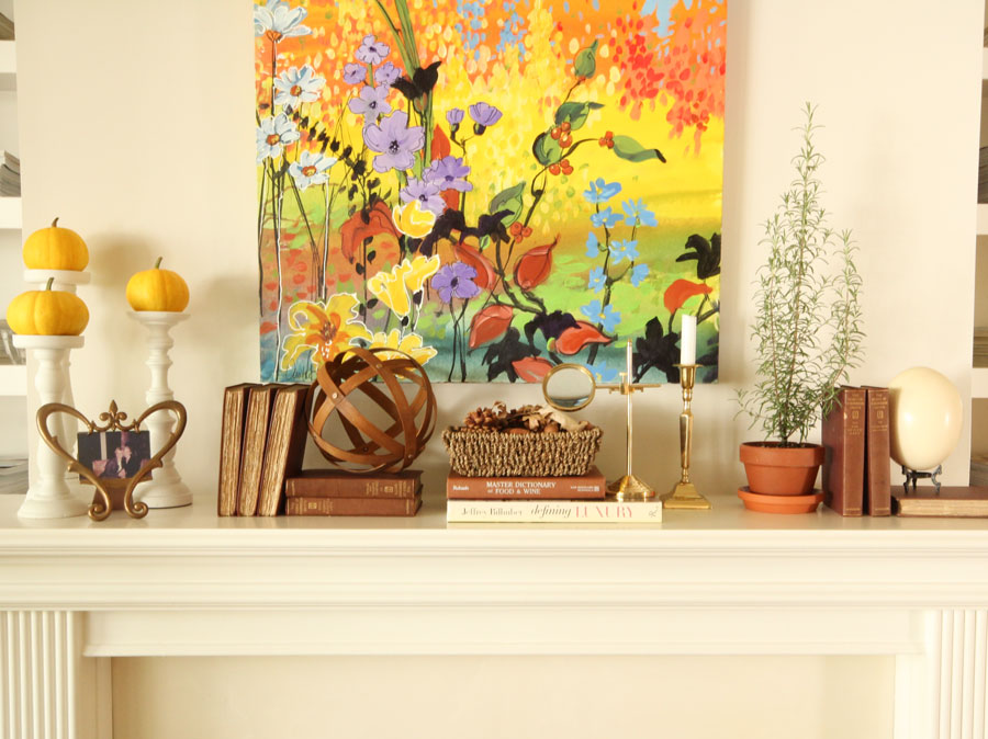
I also added them to the fireplace mantle in this room. I love how they relate to my cognac coloured Eames chair and ottoman.
I would also add brown cushions to the sofa but I didn’t have them for this picture.
And if you have a brown sofa, add cream throw pillows instead.
Related post: How to Inject Fresh Into your Earth Toned House
My happy and colourful art still works because the terracotta shade is repeated in the leaves. I also found some miniature yellow pumpkins that matched this room.
My fall diet plan.
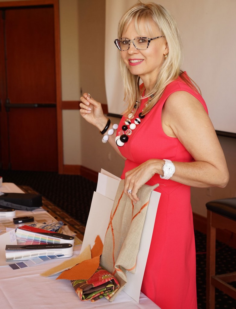
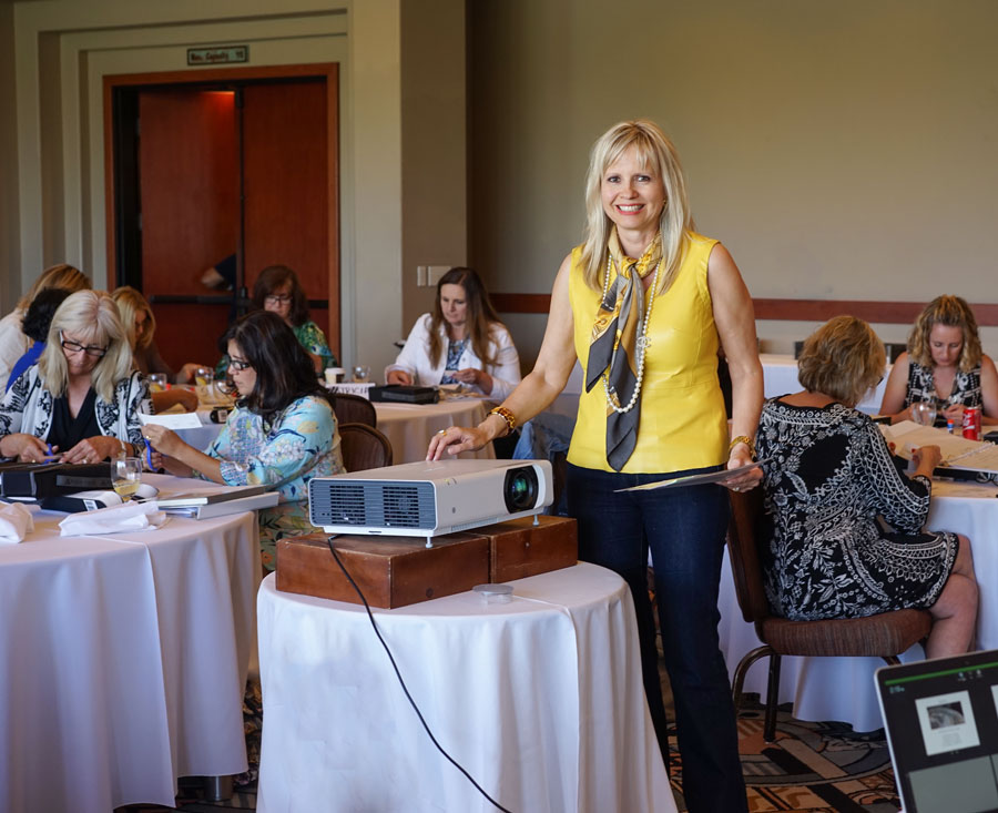
My course in Seal Beach just outside of LA was awesome! Here I am in a coral dress, which by-the-way FITS ME, hooray! Pictures taken by Melissa Bolinger a True Colour Expert and Photographer from Seattle.
I had photos taken for my new website this summer, I flew out my creative director and her photographer and after I saw them, well that was it, I was so cranky. My sister Elizabeth called me a week later and said “Here’s the cleanse we’re doing next” I said “I’m in!!”
After I lost 10 pounds, I had new pictures taken. Terreeia said “What?? After all that time, money and effort, you’re not using any of those pictures?
I said “Honey, you can’t look at the creative process like that! Just like in the movies where they’ll create entire sets that get scrapped in the end, it works the same here, haha.
Nothing like pictures for my website for some serious motivation.
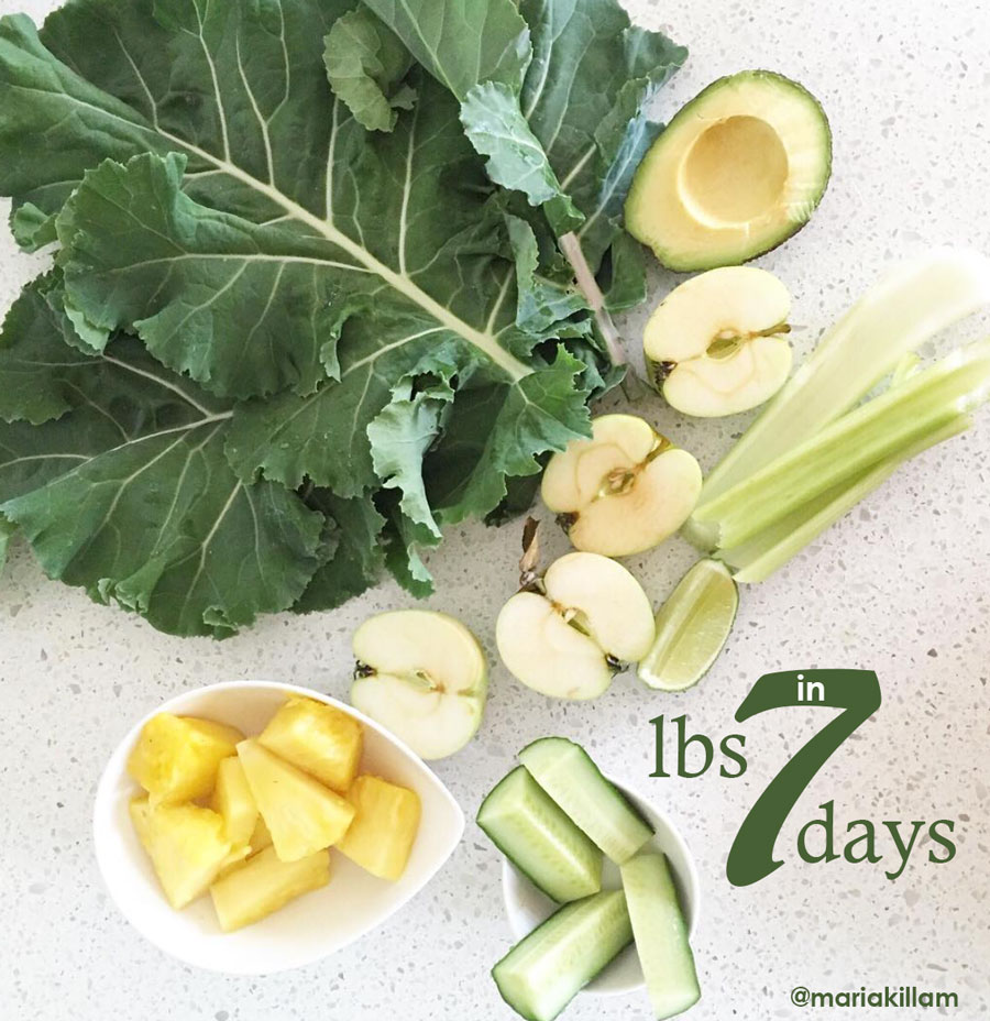
I mentioned the green juice cleanse called 7 pounds in 7 days a few weeks ago in August.
I lost 10 pounds in 12 days and Terreeia did two 10 day rounds! She now sleeps through the night (she would wake up with aches and pains every night) and she has more energy than she’s had in a long time, she lost a bunch of weight too but Terreeia has low thyroid so it’s hard for her, she has to eat like a supermodel to be skinny!
The other thing that made this cleanse so great is that it re-sets your tastebuds. I’m not a big sugar freak but I had not been very good about what I was putting in my mouth in the last few years. Plus we travel so much and one thing I realized is that I can’t eat like I’m on vacation every time we go out of town on business!
At our dinner on Thursday night in LA, I sat next to a beautiful, hollywood thin designer and asked her what her best stay-slim tip was and she said “See that bread basket? NEVER touch it”.
So don’t do this without the intention of re-setting the way you eat. It won’t work if you don’t consciously start eating like someone who is 10 pounds slimmer. But I’ll tell you from experience, it’s way more motivating to eat skinny when you have such instant results.
You can download the app on your phone which alerts you every time it’s time to have a new juice.
You drink 5 juices every day and each one includes two apples so now is the time! It’s apple season! Here’s the info.
Make sure you watch all the coaching videos in the app and also watch this documentary where he talks about 8 people who’s health was completely transformed by juicing for 28 days!
Join me for a live colour workshop.
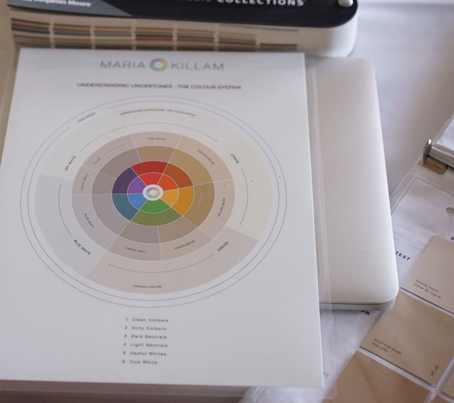
Okay so back to my LA course, here’s my new colour wheel!
My Understanding Undertones™ colour wheel.
Day 1 is the day your relationship to undertones in neutrals is transformed!
Speaking of taupe, see the wall colour in this room? Well it’s a mid-tone taupe very close to BM Ranchwood.
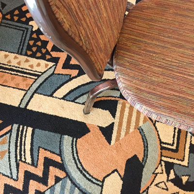
See the carpet and chairs in this meeting room, below? Every time I have a class, we always evaluate whether the colours in the room work or not.
I’m the colour consultant and everyone else acts like a strata committee in the room.
The taupe in this room looked green for the better part of the day. We all thought it was green beige until we matched the colour.
And because my system works so well, out of the first 50 Core Collection, the new colour was there. And we also talked about the light in the room and how to handle that conversation in consultations.
Can you guess what we chose to work with this? (Below)
Wall colour should RELATE to the undertones in the room. If you go through the 9 undertones of neutrals, which one is the one that jumps out here? Post your answer below and I’ll come back in a few days and post the colour we chose.
Also what’s the era of this colour combination? When was this carpet likely installed?
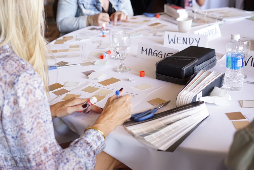
Here is my fabulous LA class!
Beth Lester has been following me since 2011 and here is what she said after the course:
I have struggled for several years trying to decide if I needed to attend Maria’s live training, as I have read her blogs and ebooks since 2011, attended her online classes and have used her large boards for color consultations since she started producing them. But as she was coming to my backyard in the Los Angeles area, I decided it was time to invest in her further detailed training on using color.
Even with all my years of experience in interior decorating, I often feel uncertain in selecting color, especially where there are less obvious undertones.
The live training opened my eyes to how much more proficient I can be and need to be, showing me how I can build my confidence and competence.
Maria’s system is truly brilliant, and I highly recommend her training if you are or plan to be working in the design world. Beth Lester, Interior Decorator, Colour Consultant, Home Stager.
Maria Killam in Seal Beach | Specify Colour with Confidence
Register here if you’d like to transform the way you see colour!
Here’s what the course includes:
Three days of live, in-person training by Maria Killam
Your own complete and extensive work book filled with useful cheat sheets
Business forms you’ll need for your business and information you can refer back to as you build experience and train your eye
Paint colour fan decks (Value $55)
Certification as a True Colour Expert™
A $350 photography tip you’ll start using immediately
Catered lunch, coffee, soft drinks and snacks each day
An on-line training webinar for exterior: How to Choose Exterior Colours with Confidence (a $297 value)
Access to a Private Graduates only Facebook page where you’ll never be alone again
Both my eBooks





I was so blessed to attend Maria’s Specify Color with Confidence course! I have followed her for three years and wanted to meet her and be a member of the class. Every day was an event in itself. First of all both Maria and Tereeia are so personable I felt like I already knew them. Starting with day one I felt comfortable and open to new learning ideas. I have been an interior designer for many years but was never comfortable when it came to color. With Maria’s teaching it opens your eyes as to seeing color and the undertones. It is not an immediate fix but an ongoing training. Comparing colors is the trick. I will continually refer back to her books and train my eyes to see color the right way plus I will know why colors work together.
If you are on the fence as to whether you should take her course, take it from me it so worth while and life changing!
Lucy Haines Interiors
Orange-beige
I can’t believe I’m the first responder and I have no color confidence, but I’ll take a shot. If I were picking a paint color based on the carpeting (I think that is what you asked?), I would pick a gray with a blue undertone to modernize the rug, maybe something like BM Stonington Gray or even a bit darker. If I wanted to go more towards beiges, I would pick a cooler beige and pick up on the yellowish color in the rug, but still not going too far against the cooler colors. Is grant beige (BM) a cooler beige? Maybe something like that. Rust in the room would match, but pretty dark and I don’t like rust walls.
Regarding your house, I love all the nature decor. Would you say that is a trend as well (maybe you wrote about it)…I find myself gravitating to succulents and plants these days, botanical-ish prints and I can’t get enough of rocks strewn by my plants that I picked up on the beach in grays and cooler stone colors. It is all refreshing and calming at the same time!
I can’t wait to hear the real answer! I’m a perfectionist, but I think I’ll probably fail this test! 🙂
Never mind, I see others above me. Yes, I see the red oak walls, so maybe an orange-ish beige is right. But…I hate the woodwork, so I would probably paint it and stick with my colors that work well with the rug. 🙂
Maria, you look awesome in that dress!! Color, fit, style, everything! Gorgeous!! I’m off to try that juice…..
Amen! I agree she looks fabulous!
No doubt I will be wrong, but the undertone looks pinky to me. IMO, the room needs to be seriously lightened up– it is so dreary. With the carpet and chairs, you could pull out the lightest blue for the walls.
I hope you will do a post on the Gianettis home very soon!
orange beige
Hi Maria
Love your family room..my question is if so still enjoy your sofa chaise and what make. I am updating my own family room and considering this option. I have a similar layout as you. Thank you!
Ive learned so much from your blog along with the many comments.
10 pound loss! Looks good on ya!
Robin
Thanks Robin, it’s from Restoration 🙂
peach
1960-1980
I can look at a photo on three different computers/devices and a color will look different on every one, but on this device, it looks orange-beige.
And who is the artist or what is the name of the piece of the art over the fireplace, Maria?! Amazing!
http://bluedotartstudio.com
BM gentle gray 1626
Big breath, not a designer: orange-beige. Somehow jumped to a different page, so this answer there is going to look very strange.
You look fabulous Maria.. can’t wait to meet you in Tampa! Thinking orange/ beige undertone leaning more to the yellow side. BM 1044
Orange beige is the undertone that jumps out to me.
PS. What was the better wall color for the hotel bathroom wall that you showed us a couple of weeks ago?
I will post those bathrooms soon, I photoshopped a few different options!!
Hi Maria. Although colour and interior design is a hobby of mine rather than a business, I don’t think New Zealand completely missed the Tuscan Brown trend. I’m not sure we ever called it that though. We have such an eclectic mix of things but in spite of that I’ve really noticed a big shift from muddier beiges and browns to cleaner colours, whites and greys.
The last hotel we stayed in in Queenstown (amazing gorgeous destination…come and visit everyone!) was all beiges browns and (ironically) greys. Very muted and warm and earthy tones. For a while the trendy kitchen and bathroom cabinetry was expresso brown, and you still see it in some new homes but less so than before I think. New builds (especially spec builds by building developers rather than architects) used to be a lot earthier in their exteriors whereas now we’re seeing much more grey, white and cleaner cladding colours with lots of grey window joinery. There’s also been a big move in interior colours and accessories from muddier to cleaner. Even earthier finishes are cleaner somehow. So maybe not the tuscan brown trend quite the same as you’ve experienced it, but definitely that muddier to cleaner colour shift.
The favourite interior colour here forever has been Resene “tea” or variations of it – it’s considered the unofficial “goes with anything” colour. It’s the one colour that I find hardest to put in your undertone system so one day if I make it to one of your courses I’ll bring it with me! At a pinch I’d put it in the taupe category in lighter strengths and in the *just* pink beige category in full strength. Happy to be proved wrong though! It almost looks like a browny cream – the perfect colour in my sister’s house and she has pink beige carpet, couch and blue accents. While Tea is still super popular, we’re seeing the whites, pale greys and lots of black being used more and more.
You know, Maria, you just need to come here and see for yourself…and do a course or two while you’re here 🙂
Another vote for orange beige here…
And: I have a pencil cactus too! FYI for safety (if yours didn’t come with instructions). Use care if you handle the sap of that plant. The sap is caustic – causes chemical burns – and it’s latex based, so doesn’t wash off easily, and hard to know if you got it all off.
Wow they didn’t tell me that, thanks for the heads up! x Maria
I’d go with the blue gray for the walls. I think the carpet dates to the late 1990’s
BM Horizon or BM Pale Smoke
My guess is the undertone may be orange-beige and carpet installed circa 1998. Would you incorporate a cream wall color with blue gray undertone? Looking forward to hearing your expertise, Maria.
In reply to Nicola, I have Resene Tea Eighth in my Australian home. Resene make the most gorgeous colours by the way! In most of my home the walls appear to be a green beige and other areas the colour is more of a true taupe. I spend a lot of time in NZ and agree there was not much of a Tuscan Brown trend it was more the colours of nature muddied and greyed.
Hi Alison. Thanks 🙂 I so agree it can look green beige. I don’t know how it does it! When I compare my colour samples I’m sure it’s a taupe. Must be the light and the colours around it.
Wow…you were all over with this post.
I love your Fall decorating. Very tasteful. Very less-is-more. It’s perfect!
I’ve never done a cleanse. I lost some weight this past year & started working out. I’m down to what I weighed in high school. Turns out if you don’t eat anything that tastes good & exercise, you lose weight. Lol…easy peasy.
As far as your seminar room, it looks like it’s from the late 80’s or early 90’s to me. And since I can’t do a nuetral wall, I’d pick a dark smokey blue. It would pull out the blue in the carpet & would work with the wood trim.
orange beige
The tuscan brown trend certainly made it to Australia. Lucky NZ for missing out!
Orange beige. I’m excited I guessed it before I read any of the comments! Just hope it’s right
Maria, you look great! Love you in that color!
I wish I could think of a way to freshen up that room with the wall color, but to go with a cool crisp color like pale blue would be too much color with no relief. If white were used it wouldn’t relate to anything else, so I’ll have to say a light greige.
A little lighter version of the lightest color in the rug is my vote! The white in the rug seems to have butterscotch undertones, but I think an orange-beige would look a little cloying. So– more of a white than a beige. I’d also paint the ugly skinny brown trim with the same color. You look great, Maria!
On my computer screen the dominant colour reads as a peach (red + yellow with a hint of blue) so I too shall go with it as having an orange-beige undertone (red + yellow = orange). As for a colour choice on the walls it would depend upon the lighting in the room accented with a darker trim. Last but not least, re the era of the carpeting because it consists of a blue-gray (once referred to as dusty-blue … ☺) my guess is mid 60’s – early 1970’s. -Brenda-
P.S: Congrats on your weight loss, Maria!
Oops, that should have read ‘slate or dusty-blue’. -Brenda-
On the orange beige train!
Also, I’m attending your course in New Jersey in November. I can’t tell you how excited I am for the hands-on workshop, gaining confidence for color consultations, meeting and working with other designers (sometimes I feel like I’m on an island) and meeting you! See you in NJ!
From your previous post, I researched and purchased the 7 lbs in 7 days – and I lost 10 pounds in 7 days! After day 3, I started waking up refreshed and bright-eyed. I loved the way my head and my gut felt. You’re right, you have to start eating like a person 10 pounds lighter if you want to keep the momentum (and not gain it all back).
I can’t wait to see how you saw brown from a new perspective.
I am so jealous that you had the chance to see Patina Farm in the flesh! I have been salivating over that heaven on earth forever now. Brooke & Steve have the most wonderful eye and design esthetic. His creations are all rediculously perfect!
Sincerely,
Natasha Kalita
I have been looking for a contemporary painting to go with variations of my colors – aqua, coral and yellow. You have the painting or print I need! Where did you find it? Please send information, please, so this hunt can end.
Although I am a former designer I have received a wonderful education from you. I have been following you since you began this adventure. I have also downloaded your books. I can’t get enough of your vast knowledge!
Here is the site http://bluedotartstudio.com
We chose the only orange beige which can be found in my Core Collection! So many of you were right, I’m so impressed 🙂
My readers are so smart!
Maria
Well if we’re smart its because you taught us well! Tho I cant speak for everyone I never even thought
about undertones til I started reading your blog!! I’ve learned more about color from you and your ebooks than anywhere. I hope you never quit educating us about color!!
Hey Maria you look outstanding!!
Coral is your new yellow. :))