


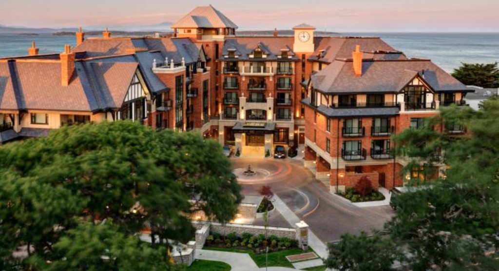
{Oak Bay Beach Hotel}
Recently I received a comment from a reader saying it would be great if I would write an occasional post about earth tones because she preferred them over the current white/black/grey colours that are popular and trendy right now.
Well, dear reader, the opportunity presented itself this weekend.
It’s my Terreeia’s birthday and we arrived yesterday, here at the Oak Bay Beach Hotel in Victoria to celebrate.
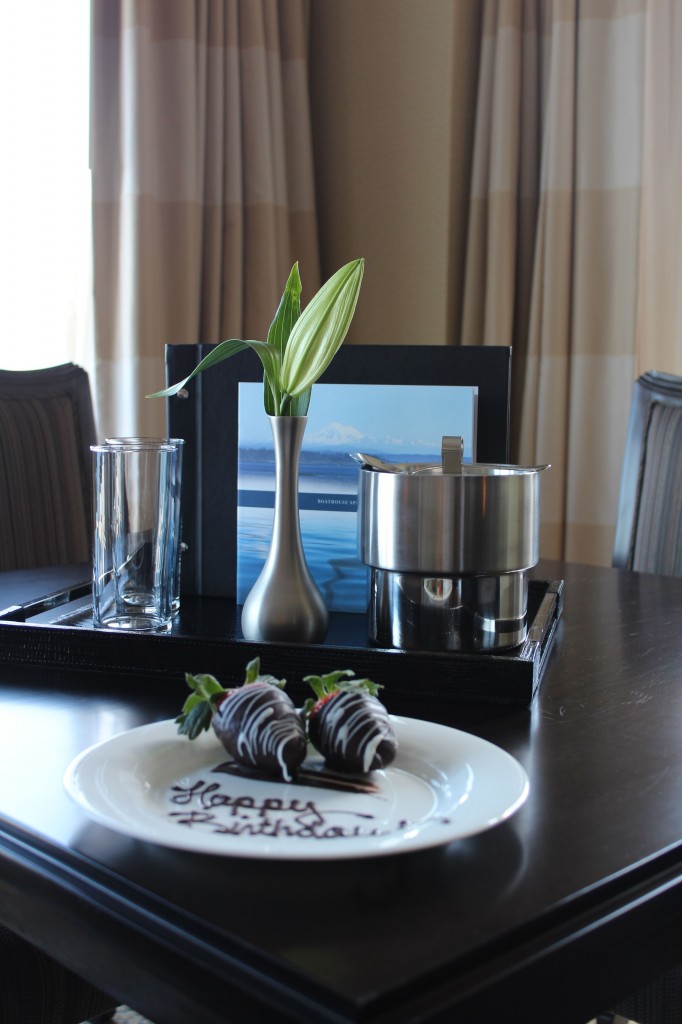
We loved the added touch of the chocolate dipped strawberries waiting for us in our room.
This hotel has been a fixture in Oak Bay 80 years and recently was almost completely torn down and re-built, the new hotel is only 1 1/2 years old.
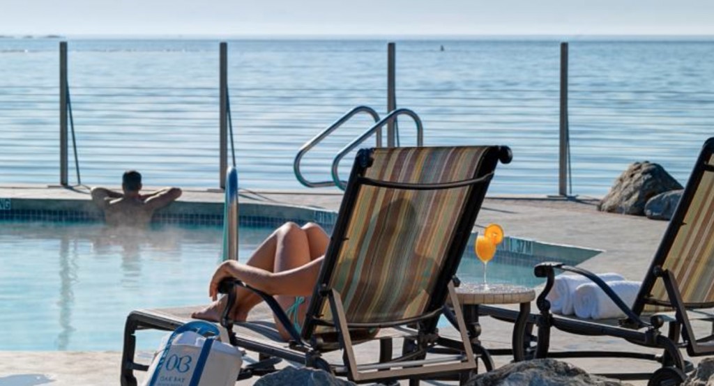
It has a fabulous spa which I will experience on Saturday morning along with hot mineral pools to enjoy right on the edge of the ocean. We were in the hot tub so long yesterday we felt a little dizzy when we stumbled out and back to our room.
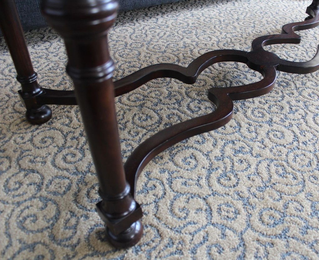
We obviously can’t sit by the pool like this (below) right now, it’s way too cold. But the pools are open 24 hours for guests which is kind of cool, literally, haha.
{Oak Bay Beach Hotel}
The room we are in is decorated in yellow beige, golds, blue greys and browns. However, because of the manor-house, tudor inspired architecture and decor, it doesn’t feel dated.
That’s what happens when you decorate true to the architectural style.
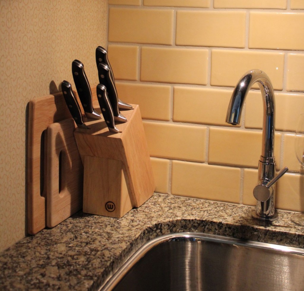
Of course I highly approved of the subway tile backsplash but not the colour. The yellow tile which should have been chosen to coordinate with the green granite, matched the wallpaper instead.
I get a lot of questions asking if hardwood should relate to tiles or wall-to-wall carpeting. Unless your hardwood is a very strong colour, you can basically treat it like denim. But your tile should relate to the connecting carpet like it does here.
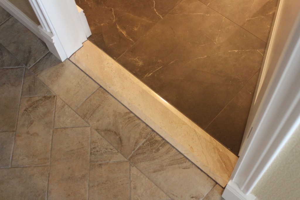
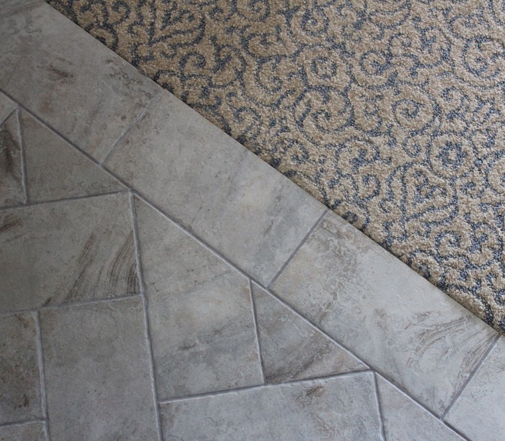
The tile in the entry and the adjoining bathroom is a perfect example of getting too creative. They were both nice enough but either one would have been perfect, two wildly different colours and sizes were unnecessary in such a small space.
The countertop in the bathroom was crema marfil and so was the transition strip which did not relate to either of the tiles. I just want to be clear, overall, everything was very nicely done, I’m just splitting hairs here on the tiles for your benefit.
I liked the herringbone installation of the entry tile and the 2″ creme marfil accent tiles in the bathroom floor. But choosing one or the other would have made the space feel bigger and more connected.
At least in this scenario they did not clash. I have seen way too many connecting tiles which were clearly chosen in an attempt to coordinate and of course did not, which is why I’m not a a big fan of porcelain tile in general. If you’re interested in seeing the tile I do like, there’s lots of examples on my Tile I like Pinterest Boards.
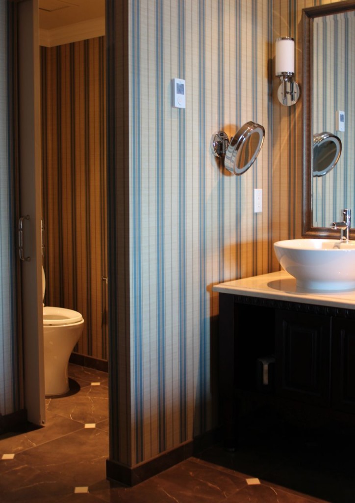
The striped wallpaper was lovely as well and does coordinate perfectly with the finishes in the bathroom. Which in actual fact is rare when it comes to hotel bathrooms.
I like bowl sinks in powder rooms but find that they take up too much usable counter space when they are used in regular bathrooms. In a hotel though, no one needs to worry too much about that.
So there you go, a post about earth tones, hooray! Who prefers earthy over the current fresh trend?
Related posts:
How to Coordinate New Tile with Old Tile
Don’t Fight with the Boss of your House
How Important is the Colour of Wood vs. Wall Colour
Download my eBook, How to Choose Paint Colours – It’s All in the Undertones to get my complete step-by-step system on how to get colour to do what you want and to make sure the undertones in your home are right, get some large samples!
If you would like to learn how to choose colour with confidence, become a True Colour Expert.

What a lovely hotel! We just got back from Florida, and the condo my in-laws were staying in had a lot of tile going on. Especially in the guest bath. Also, some of the tile had a yellow undertone and some had a pink undertone in the same bath. I thought to myself – Maria would say that’s a no-no-! Enjoy your week end!
Happy birthday, Terreeia! What a beautiful place to celebrate! Maria, I always learn something from each of your posts! Examples ARE always the best way to learn!
Happy Birthday, Terreeia! A getaway is a nice way to celebrate.
Maria, does Terreeia care when you critique the decor of where you are? I was just wondering if she understands why you do this. ( to teach us) or does she tell you to just let it go?
I forgot to thank you for the examples of earthtones. I never see them anymore. Done right, they can be lovely.
This is my favorite line in the post:
“I just want to be clear, overall, everything was very nicely done, I’m just splitting hairs here on the tiles for your benefit.”
I love that you find things to criticize for my benefit. I love conflict. I love that you can find it anywhere. Thank you 🙂
Penelope
Penelope, you make me smile.
The exterior looks nice.
What a beautiful spot!! I hope you have a wonderful weekend. That bathroom is so classically gorgeous! I still am a fan of earth tones, but balanced with cool relief.
Wonderfully said. I, too, like earth tones, but appreciate some ‘cool relief’. Happy birthday, Terreeia. Have a lovely weekend!
So glad you can get away and relax with Terreeia.
HAPPY BIRTHDAY TERREEIA!
Have been picking finishes for our new home that is under construction and finally feel that I know what I’m doing thanks to you Maria:)
I like your blog. I truly do.
But I HAVE to mention this.
Why aren’t people more conscious of making sure the toilet seat is down when taking a picture of the bathroom.
I’m feeling you. I can totally see the oversight here, but i recently saw on another blog multiple bathroom pics showing toilets with not just the lids up, but the seats!! People! As outstanding as THAT entire post was, all I really remember are those toilet seats.
I am really enjoying THIS post however and would love to see more on following the architecture of one’s home, especially for those of us with older ones.
Oops! I forgot to say, HAPPY BIRTHDAY TERREEIA!
YEs, the LID,
I agree!
Mary in Ohio
Just shut the lid. It is put on to shut and please particularly before taking a picture. Not feng shue – not sure of spelling
I do like earth tones because they connect to the outdoors. In our case, we live on property with lots of woods around us. We have earth tones, predominantly pale gold, brown stones with gold undertones, some ivy green upholstery, a touch of leather, rich Persian rugs. These colors and textures make us feel connected to our surroundings. Yes, I decorated about 2002, but certainly can’t afford to do it again for awhile.
Interesting post, Maria, hope you are enjoying your weekend. I have become critical of hotel decorating, too, now that I have learned so much from your blog. And recently I entered a friend’s newly decorated kitchen and when I saw the countertops and backsplash, in my mind I was shouting, “No! No!” But, of course, I said, “What a pretty kitchen!”
Thank you Maria! I was struggling to be happy with all of the earth toned fixed elements in my home until I bought your e-book and all of your large paint samples. The transformation using yellow beige and blue grey has been wonderful, and connects our interior to the spectacular views from our little hilltop in Wisconsin. I couldn’t have done this without you!
A very happy weekend to you both.
The Oak Bay Beach Hotel was my old stompin’ grounds:) There was a pub inside called The Snug and it was old english in every sense with low ceilings and dark, dark wood. The new Snug is lovely but definitely doesn’t have the atmosphere of the old one.
I teach in Oak Bay on Saturdays now and drive by the hotel a couple of times on my route. I’ll think of you both enjoying a lovely weekend!
Happy Birthday, Terreeia!
Happy birthday Terreeia ! Nicely stated Penelope, I look for those lines and love them. In three short months, I am absorbing a lot. Not a huge fan of earth tones, unless they are done RIGHT. The hotel looks beautiful, enjoy your weekend, Maria !
Ellen
still like earth tones myself for myself, just saying
a lot of clients want earth tones here in Calgary so I work with them all the time, not many grey cold looks wanted yet…
we have lots of grey fabrics for those that ask, that was a problem last year, I had 1… x
oh sorry, Happy Happy Birthday Terreeia, have a wonderful weekend! xxx
happy happy! thnx for sharing ! and….no i have NEVER liked earth tones…not ever!! i remember 15-20 (?) years seeing some luxury model homes and thinking ICK!! this looks like the Mediterranean of years ago…..isnt that was “Tuscan” is anyway? i am not in love with gray either but have always loved ( and worn) fresh clear colors…highly saturated ones best..lots of white..wood floors
Happy Birthday Terreeia!!!!!
Chocolate covered strawberries, what a nice touch.
You are right, Maria. Earth tones have to be done right. As you said if it is in period styling, it works. You have to be so careful in 2014 to use the current earth tones to keep it current. Thanks to you we are kept in the loop.
x
I love earth tones! I love the architectural style also. However, I don’t like the granite but not sure I would have chosen yellow subway tile either, and I would have also used only one floor tile, I love the entryway tile, and the carpet, the bathroom is too dark for me.
Question though, I have medium stained oak and tile throughout my house with earth tones and accents of red and gold and a medium french blue. But my bedroom and master bath is so light filled, which is beautiful, I have right now white walls, white tub, sinks, and blue accents, so I was thinking for the walls white tile, but for the bathroom floor a white background with swirls of brown and grey that coordinates with the blue. The tile there will not touch the brown in the hallway but the rug will which I will need to replace. Would you go with a multi-color rug to coordinate with the tile in the bathroom and the hallway?
Thanks!
Big thanks Maria for talking about earth tones, since I’m assuming you were responding to my request! I live in the Midwest, and agree with the comment about them relating to the landscape colors outside. Also, we have lots of wood tones in our houses, and I think picking up the warm tones works better than trying to ignore them. I don’t feel comfortable when some of my clients ask for grays just because they’re trendy. In most cases, I think earthy would work better with what they have in their homes already. To me, it’s like wearing a color that doesn’t compliment your own coloring just because you saw it in VOGUE or whatever. I recently worked with a young professional guy who lives in a loft in a hip, desirable location, and he wanted me to warm it up since the finishes were black and gray, with lots of bare concrete. It felt cold to him. But, it was a challenge to get it right since I felt I was working against the building. Would love to hear more discussion about this issue in future. Frankly, I’m less concerned with being “current”, and am more interested in creating a classic, comfortable look that works well with each specific space.
What a perfectly lovely way to celebrate. There’s always a place for ‘earth tones’ at some time or place. I recently did a powder room addition, creating it out of useless space at one end of my office/studio. I love it! After much trial and tribulation and wringing of hands over my decision of what ‘grey’ to paint the wall beneath the chair rail, I have discovered my favourite neutral, that could also be considered, (although technically grey) an earth-tone because of it’s ‘brown undertones’ – BM ‘Chelsea Grey’ OC168. But, mostly because it goes perfectly with BM Cloud White CC40 – which is almost always my palette throughout my house and my recommendation for clients – classic and you cannot go wrong with this as your canvas. Right?
Is there a lesson in roof color here too? I love the exterior combination. Maria, I’m sorry that you didn’t mention the wall color or draperies, which we get a glimpse of in the second pic- love them. The bathroom looks dated, I had creme marfil in my 1998 condo. It appears that the bathroom was a carryover from an earlier remodel, hence being dated and not coordinating with the rest of the suite. Oh sorry to be negative, that kitchen granite is dreadful. Have a great weekend!
Happy Birthday, Terreeia! I remember meeting you at the Toronto TCE training in 2012. You worked the background but I had this feeling that there was a lot more to you than Maria let on. You seemed very smart and adept yet didn’t take the spotlight but left that to Maria. I had always wanted to say that and now I did! Anyway, I hope you have a wonderful weekend!!! It seems like a lovely place. I agree the style of a place dictates a lot of what should be done, and that earthtones have their place even though they have never been my personal favorite. Best to both of you! Jennifer
I’m also a lover of earth tones but I think we sometimes forget that the earth changes from season to season. I’m totally into the yellow green of new leaves in the spring, the happy yellow of the grapefruit on the tree outside my living room in the spring and summer and the golden yellow of the aspens in fall in my picture above the couch, and green undertone greys work right in. Think considering the architectural style of your home is also so very important and I too would like to see more on this. I relish my dark-framed big windows, some with mullions and some with sliders, and my one arch and the vaulted ceiling in the LR/DR (office) that give my home a Spanish/Mediterranean look and I’m happy with everything I’ve done so far. My big issue is coming up with tile flooring throughout my open floorplan that is in keeping with the style of my house, works with my colors throughout (including my kitchen) and yet is a classic that will still look right for the house years down the road, no matter what the current trends. Got more visual insights and “learning” from today’s post so thanks for that, Maria.
Happy Birthday, Terreeia! Hope those Texas-sized chocolate-dipped strawberries are the first of many sweetly delicious blessings for your “new year”.
Happy Birthday, Terreeia from waay over the other side on the east coast!
And Maria, congratulations on your inclusion in the top home design blogs competition listing on the Apartment Therapy website. I look forward to seeing the final results which they promise in a few days. I think your approach is very unique in its focus on colour and undertones. Keep up the good work!
The best line you ever used was “ugly costs the same as pretty” and I’ve remembered that countless times (and quoted it to my husband)-it has saved time and dollars. That line came to mind with some of the decor shortcomings you pointed out above. Imagine the $$$ that could be saved annually if industry and homeowners would pay attention to this particular Maria rule!
Nice details here on the earth tones. I am continually amazed how many hotel bathrooms completely disregard the undertones of beiges or have backsplashes which bear no relation to the counter. Clearly I need to start staying in nicer hotels. Haha!
I hardly ever disagree with you on anything, but I actually have the opposite opinion on bowl or vessel sinks for small bathrooms. I know, not at all the subject of the post. Sorry 😉 When a vessel sink is tapered narrower at the bottom, it actually gives you more counter space than an under-mount sink. The diameter of the sink is so much smaller where it hits the counter than the upper opening of the sink. The one in the photo is probably about 18″ diameter, but by it being a vessel sink, they are only losing maybe a 10″ diameter circle of counter space. It is easy to sit a toothbrush & toothpaste, or a razor or makeup in that extra bit of counter space by the sink while you’re working at the counter. I also like that the vessel sink preserves the space underneath the counter for storage so you can have a drawer notched to get past the plumbing. Perfect size for toiletries.
Okay, back down off my soapbox. Looks like you two had a lovely trip!
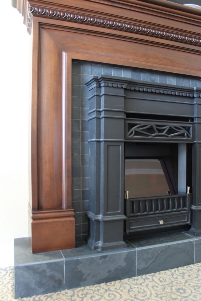
Not a fan of earth tones – have seen them for way too many years… 20-30??? However, I like what they did with the fireplace combining what appears to be blue-grey with a cinnamon colour wood. That combination gives us a fresh version of earth tones plus the new fresh grey tones that brings it into 2014 & beyond. Thanks for all the pics. Nice to get the inside sneak peak at some of these hotels.
I have to agree with Susan, the new hotel just doesn’t have the same atmospher as the original hotel had. We also feel the new hotel over powers the residential neighbourhood. While the new hotel is huge it has not been able to match the grenduer of the original hotel. Just our opinion.
Happy Birthday Terreeia!
Have a great weekend you two!
Mary in Ohio
Happy birthday Terreeia! Enjoy your visit to my beautiful city. Hope you enjoyed the “snow” today!
Wow what a beautiful hotel. I have always loved earthy tones. I’m just amazed at the the people talking about the toilet lid being open? It’s the colours in hotel we are talking not whether the toilet seat is up or down.
Happy Birthday Terreeia! Great post Maria. I enjoyed seeing the beauty and the room for improvement.
Happy Birthday Terreeia! I wish you two lived closer. Love to celebrate with a glass of wine! Hope you enjoyed your little vacation.
I was glad to see the warm/cool neutral mix in the photo of the fireplace. We have a new house with concrete floors similar in tone to those tiles and I can’t see doing gray/gray/gray, esp. in the Pacific NW! I’m really struggling with a wall color to warm it up in the right way (and to complement wood tones in windows, furniture.) I think the issue is similar to what Diane described above. Any ideas or even things to avoid?
Thank you, Maria, for discussing and showing earth tones for those of us in houses with Venetian gold granite where the domineering heavy gold tone is front and center in the kitchen. We, too, would love to freshen up our rooms without tearing out granite and tile. I’ve read your post on updating from the Tuscan brown trend, but we moved in to a house for a few years only with Venetian gold granite that is making lightening and brightening tricky, especially sine the “white” cabinets are really blue-white. I hadn’t read your undertones book until after buying the house! If I only knew then what I know now….