I’m sharing my best designer secret for updating old kitchen cabinets. If you are planning to paint your existing, dated oak kitchen cabinets, this design hack will make your kitchen cabinets look modern and current.

This question has not been covered on the blog so when Sherry sent it in, I decided it would be a good post! Here’s her question:
I love your blog! We are in the process of updating our kitchen. The cabinets will be white and a new countertop/island will be installed. We are now empty nesters and the huge refrigerator will be downsized.
After looking at many online photos and touring new homes in the area I noted that none had wood valances over the sink. Are they dated, or just another cost savings to builders to omit them?
There is only one cabinet on the left side so I feel it ties it to the rest of the cabinets. Also, there are two other raised cabinets and if I remove the valance it might look unbalanced. If it matters, we have a very wooded lot to view from the kitchen window. Help!
This is a really good question and it brings up a couple of common issues to be aware of, if you are planning to update your kitchen by painting your existing cabinets.
First of all, technically, yes, wood valances over kitchen windows are dated.
However, Sherry is right, in this case it DOES connect the lonely cabinet on the right to the rest, and it DOES repeat the raised cabinetry above the stove and the fridge. So in this case, I might keep it UNLESS she is starting from scratch with all new cabinetry.
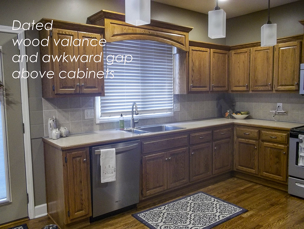
Here’s an image of her kitchen.
Sherry’s kitchen, you can see how lonely the one cabinet on the right would be without the valance.
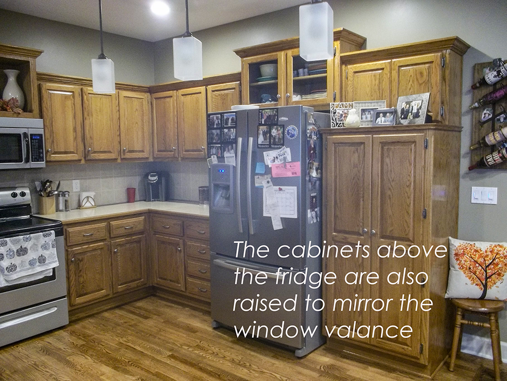
The other side of Sherry’s kitchen has cabinets that relate to the valance
My Designer Secret for Updating Old Kitchen Cabinets
Painting her cabinets some kind of white (depending on what she installs for a countertop and backsplash) will be a lovely update, but it will just look like a painted builder grade wood kitchen unless she takes it to the next level with a simple update, closing in the space above the cabinets.
You’ll notice that the awkward dust collecting gap above the cabinets is the feature that always gives away a builder grade kitchen.
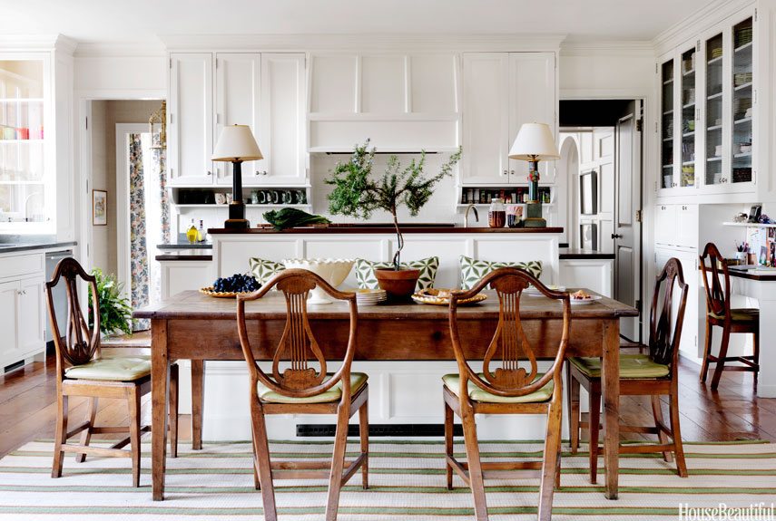
You’ll never see that space between the cabinets and the ceiling in a current high end custom kitchen like the one below.
Connie Newberry in House Beautiful
Fortunately, it’s a relatively simple fix that can be done when you paint your cabinets. You can create the illusion of current cabinetry by boxing in the gap between the cabinets and the ceiling and adding some decorative molding to create a custom look that relates to the style of your cabinets.
Close the gap above the kitchen cabinetry.
I always recommend this to my eDesign clients when they are updating their kitchens, it just makes such a big difference.
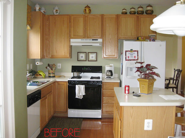
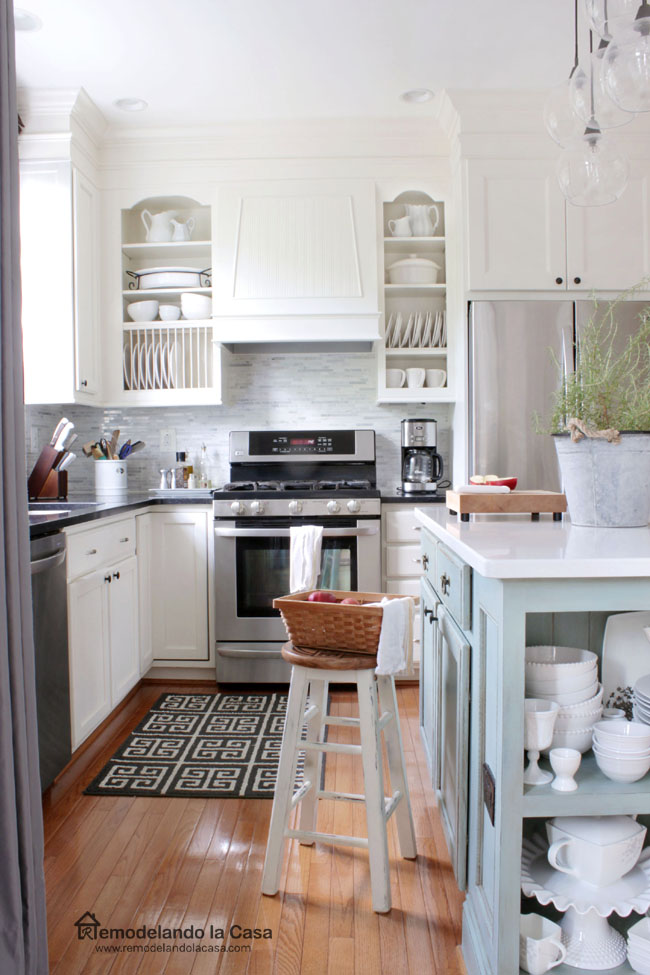
Here’s a stunning before and after over at Remodelacasa complete with a walk through of how it was done.
Kitchen Before from Remodelacasa
And the gorgeous after photo below.
Stunning transformation by closing the gap above the cabinets from Remodelacasa
In the process of closing the gap above the cabinets, they also designed a lovely custom hood fan which I highly recommend. I just put one in my kitchen and I love it, you can see it here. Those above the stove microwave fans are just never pretty.
It’s clever the way they removed the doors from the cabinets directly flanking the hood fan.
And the other important improvement to notice here is the way they installed a deeper box over the fridge to properly match up with it and closed it in so it looks more like a custom kitchen. Refrigerators that stick out and don’t fit are never a good look. Little details like this can make all the difference.
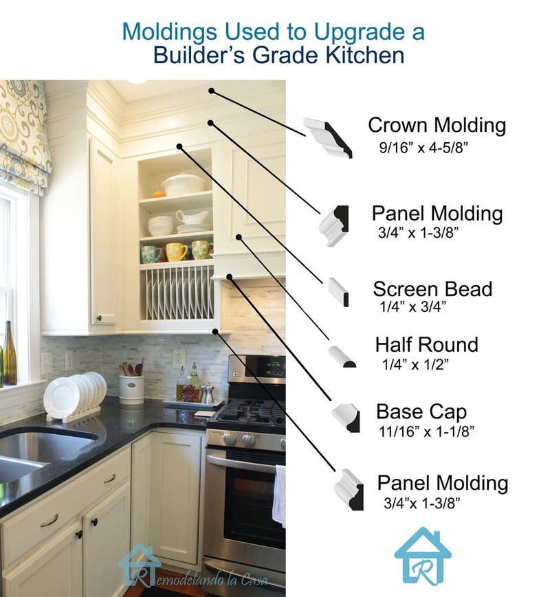
Use the right crown molding to update your kitchen cabinets.
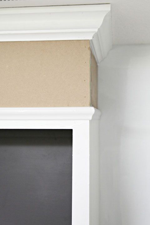
The trick is to add the right molding to relate to your cabinets. Crown molding is usually a good idea, but since the gap is fairly large in Shelly’s kitchen, I recommend that she break up the faux soffit with a few strips of molding so it doesn’t look like a blank box.
Here is a breakdown of the different moldings used in the above kitchen below.
If you search, there’s a few DIY bloggers that have done the same thing to their cabinets.
For Sherry’s kitchen, installing a custom hood fan to resemble her wood valance and boxing everything up to the top before painting would be a dramatic transformation.
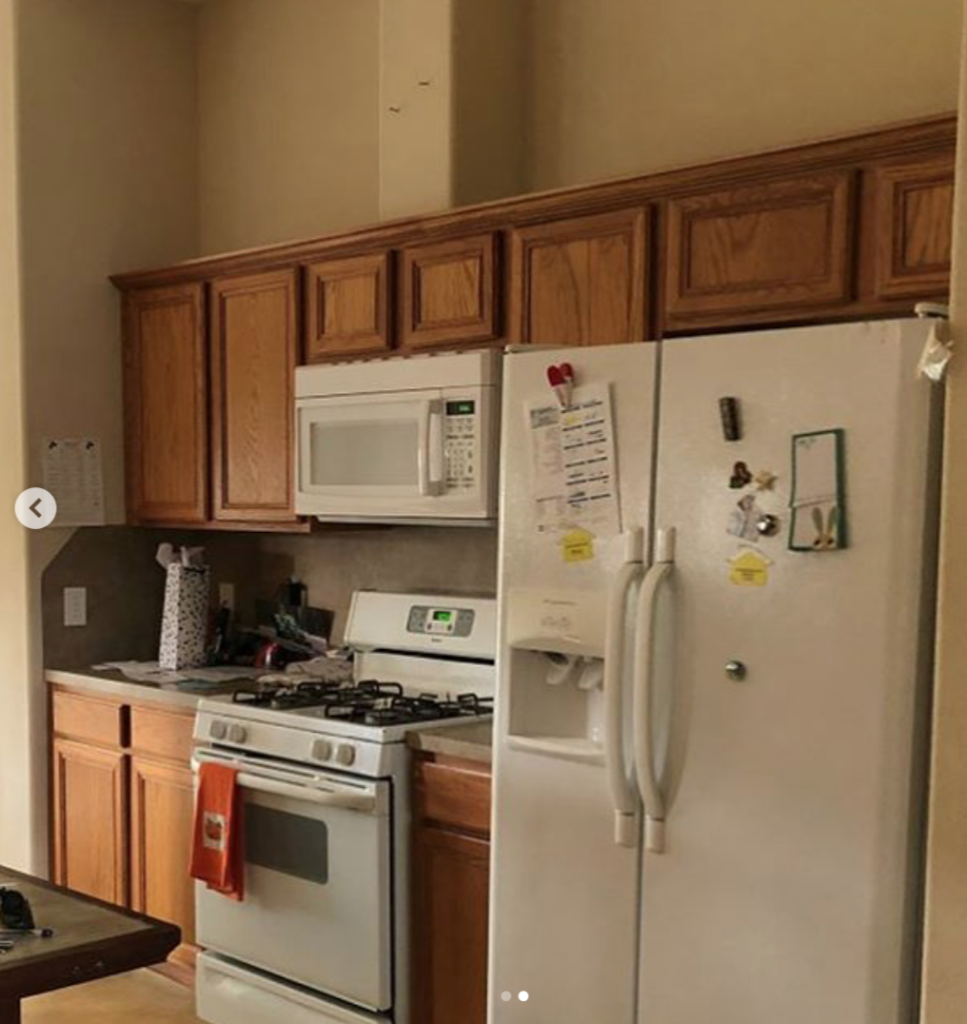
Recently, I saw this dramatic cabinet makeover that I posted on my Instagram:
Before
Given the cabinets in this kitchen were so low, adding the shelving made it look so much less like the space was being covered! Brilliant!
Kitchen Cabinet Gap After {image via Shanty Chic}
Okay so over to you my lovelies and back to Sherry’s kitchen, I’m on the fence about keeping her valance now, what do you think? Yay or nay? If she covers up the gap above her cabinets, maybe she could remove the valance?
Let me know what you think!
Remember, I’m always sharing colour tips and design makeovers over on Instagram, follow me here!
If you are planning on a kitchen remodel and want to make sure to get your colours and finishes right along with other important tips and suggestions you can use our popular Create a Classic Kitchen eDesign consultation here.
Related posts:
How to Avoid the 5 Most Common Kitchen Mistakes
Ask Maria: Will my White Kitchen be Cold?
‘Interesting’ to Classic Kitchen Counter and Backsplash Makeover







We have 9′ ceiling and are remodeling our kitchen. I can’t decide if I should do a two-stack cabinet or a false soffit that boxes in the top part? Also, I did notice on Houzz that the bespoke English kitchens don’t go to the ceiling. Its intentional to leave even a small gap in most of the English kitchens I saw. But, I agree these look builder grade. You don’t think she should get rid of the wood sink valance and replace it with a custom Roman shade? Perhaps remove the lonely cabinet to the left also and do some open shelving? That part looks dated but paint would improve it 100%. Good question! And the bones of this kitchen would benefit from a fresh paint job?
It depends upon how tall your existing cabinets are. According to my cabinet builder, if your current cabinets are 42″ high, the additional cabinet will only be 12″ max, with the interior smaller than that. It won’t be very useful. If your cabinets are shorter than 42″, a double stack is an option. But keep in mind that that top cabinet it going to be really high and difficult to reach. You will need a ladder every time you want to access it.
I did a two stack in my kitchen. The top ones were glass front and is where I stored pretty dishes
I didn’t use everyday. It not only gave me more storage but looked more custom. I took mine to the ceiling, as the gap is just a dust collector. Hope this might help you in your renovation, Stacy.
I agree Sherry should remove the valance (very dated) and the small, lonely cupboard to the left of the sink. Installing open shelving will give her a nice display area.
Why do some contractors step cupboards? It always looks weird and prevents one from adding crown mouldings as a finishing touch.
Two stack cabinets with glass front are what I want to do with mine with lighting to show off pretty stuff that I won’t have to dust/de-grease.
Painting the walls AFTER the cabinets! Trust me, the paint is not as dark and dingy as the photo came out! Thanks for your reply, that’s a vote for ‘remove valance’.
I voted and gave you a heart of course, never forget the hearts- but you’re at 38 now!!
I would close the gap and remove the valance. No paint can make it look not dated, imho. But it raises another question – if the cabinets are not white, and if there is crown molding around the room, not only above the cabinets, then what colour would you recommend for the crown molding, Maria?
a) The cabinet colour all around the room?
b) White as the rest of the trim, including above the cabinets? White for the crown molding only, and cabinet colour for the boxing and molding that cover the gap?
c) Cabinet colour above the cabinets and white everywhere else in the room?
Oooh awesome question about the paint colors between moulding and cabinet. Can’t wait to see what the answer is.
Where the cabinets meet the ceiling, their crown should be the same as the cabinets. So, if you have navy cabinets, their crown should be navy. The rest of the crown around the room is the same as the other trim and just dies into the cabinet crown. If the cabinets do not go all the way to the ceiling, their crown is still the same as the cabinets, but the ceiling crown above them is the same as the rest of the wall trim in the room.
Thank you Kristin 🙂
Maria, you’re 33 in the Modenus list, not 53 as you state in the blog. Thought you’d like to know.
You’re now at 33 on the List! Yay!
No! to the very dated wood valance. As you said, it will simply be a painted very dated wood valance if it’s kept.
Another option which also provides more storage is to move the existing cabinets UP (for me, the undulating top line on the current cabinets also looks dated). She can add a classic backsplash and open shelving below for easy access and additional storage. I used open shelving below cabinets when updating a condo galley kitchen and, visually, it really lightened things up.
Nancy, I like that idea very much.
Moving up! You’re now at 26 ??
You have moved up to 21 Maria.
Remove sink valance and higher cabinets above stove and fridge. Kitchen will appear and feel more open and less heavy. Replace stove cabinet with a modern hood fan. Consider a counter depth fridge amd have an open cabinet (same height as other cabinetry) and add decorative items. May I suggest an internet search on open refrigerator cabinets to get ideas. Personally, I would seriously give thought to open shelves near sink. That would add the illusion of space and the window would be less boxy. How fortunate homeowner is to have a view of a wooded lot. I would want to accent that area of the kitchen and enhance it to make it more inviting.
I think the 3 cabinet sections that bump up – sink, fridge, stove – should all be removed as they really date the kitchen. Since the fridge is being replaced then they can build the space to make it look more built-in. The cabinet to the right of the fridge is very dated and it would be worth considering having a new pantry with slide out shelving. Filling in the space above the existing cabinets and painting the cabinets white will lift the space. Someone suggested a Roman blind at the sink and it would add another note of freshness. All the best to Sherry. Cathy
Voted! Now your number 20! Looking forward to meeting you in Dallas!
You’re 19th. now, and we can do it….vote for Maria. She has given us so much advice on this blog, please support her.
It looks like there’s a light inside the valance. If so, I would keep the valance and square it off to match the rest of the cabinet design.
Voted, your at #16
I just voted….found you at #16!
Great post. I would lose the valence and use a Roman shade. Voted. You are now at 13.
Remove the valence and the bumped up cabinets whether or not the gap is closed up. These ones look cheap and dated. And get a counter depth refrigerator! That fridge sticking out is a major eyesore. It would look nicer to close up the gap, but if the budget didn’t allow for that, maybe it could be boxed in similar to the last picture you show. I’m also wondering if the cabinets were placed too low, or are the ceilings higher than 8′. The gap above the cabinets looks larger than what you’d expect with 8′ ceilings. Maybe the cabinets could move up a bit. I used to think just plain old soffits were so dated, but I’ve decided they are a much more finished look than empty dust collecting spaces filled with display stuff.
I didn’t notice it until you pointed it out, but you are right. The space above the cabinets looks like it is more than 12″, which is about what the measurement would be if the ceilings were 8′. I am guessing that the ceilings are 9′, and that the builder chose to bump-up the valance and the cabinets above the stove and refrigerator as an inexpensive way to fill some of that empty space. A 2′ soffit might overwhelm the existing cabinets. The ideal choice might be to do a “double stack”, adding additional 24″ height cabinets to the ones that are already there. Or, she could do 18″ high cabinets with a 6″ high soffit, which would cost a little less.
Linda, I agree completely with you that the space above her cabinets can not be solved with a simple trimmed out valance – it would look too big. With all due respect, I do have to disagree with Maria’s comment above that “You’ll never see that space between the cabinets and the ceiling in a current high end custom kitchen” My neighbor just redid her kitchen to the tune of 150K and it does not go the to ceiling except on the pantry wall area – and it is STUNNING.
I believe the design should depend on your space, ceiling height, layout of the space and most importantly the “feel” you desire for your kitchen. Just study some of the Masters kitchens – Christopher Peacock, DeVol, Tom Howley, Jeffrey Dungan, McAlpine House to name a few. Some go to the ceiling and some don’t. Those that do go to the ceiling often have breaks in the banks of upper cabinets for a beautiful range hood or open shelving – so it doesn’t start to feel overwhelming. Some are more polished and some are more relaxed and “English” looking. Some have ceiling treatments that helps to fill the space. There are sooooo many options to consider and it is not a one-size fits all.
One thing I think would help her feel better after the paint job is I do think she should invest in FULL OVERLAY doors in a style she likes to update the look prior to paint. AND professional sprayed finish is the only way to go for an upscale look – unless you are Minnie Peters and Andrew Ryan and you can pull of a hand painted look for an authentic historic feel. I dont mind the valance I think it ties in the cabinets to the left of the sink…Id for sure invest in a cabinet depth refrigerator (love my kitchen aid) – anyway it does take a lot of planning and creative thinking – good luck sherry!
Hello,
The ceilings are 9′. We had a large family and the mega refrigerator was a must, but looked better when the island was still there. The island left when the floors were refinished. A smaller island and refrigerator are coming! Thanks for your comments.
Wow. I love that. I never thought about boxing in the cabinets. What a difference.
What do you do if your cabinets are in a kitchen that has a sloping roof, so some cabinets have less space between the top and the ceiling, and some have a great distance?
I agree that boxing the top, removing the ‘up’ cabinets, and the valance would make a big difference. I also agree that shelves on the left side would solve the problem of the lonely cabinet. Sherry, I hope you will send an after photo because it is gong to look fantastic!
PS Maria you are now #11
Those befores and afters are great.
What I wonder about is kitchens with vaulted ceilings. While those are uncommon in most houses, where I live in the mountains you might see it in rustic houses. There just isn’t any way to avoid space on top of the cabinets when the ceiling is so high.
Actually, I’m laughing at my own comment. I live in a rental in the mountains. I just turned around and looked at my own kitchen, and sure enough, it has a vaulted ceiling with a lot of angles and a window up there that shows the sky.
Definitely no way to close in the uppers here. 😉
Lorri, I live in the Phoenix area and we also have a vaulted ceiling.
On the long wall, the ceiling is 10′ high and the adjacent wall rises from 10′ to 12.5′. Currently, we have 42″ cabinets and even they look short. We will be putting in new cabinets and trying to figure out what to do. One idea is to go to the ceiling on the 10′ wall and on the vaulted side build out the wall and drywall the space from 10′ to the ceiling. Then, those cabinets look built-in as they will stop at 10. It’s a big gamble, though, so waiting to see the 3D drawings.
The ceiling in my rental kitchen ranges from 2 feet above the cabinets to over 20 feet!!! :O
And there’s a window set into the vault that shows the sky and trees.
Lori, my ceilings are 17’ as well! No way to close them in, however, when I redesigned the kitchen I added more height with glass doors, so that is where my crystal vases live. I need a ladder or tall friend lol
I have the same issue. My kitchen has 12′ ceilings. My cabinets are already tall (42″). I cannot reach the top shelf without a stool. There is ~36″ between the top of my cabinets and the ceiling. It wouldn’t make sense to close all that off, and it isn’t practical storage space either. I actually have one section with only a 9′ ceiling, so we could box that up to the ceiling, but the rest would be open. I’m not sure if that would look strange, though. We upgraded our island so it doesn’t look builder grade anymore, but we’re not wanting to spend much updating cabinetry besides painting it.
We have a hip roof, so when our kitchen was redone the only way to raise the ceiling was to have it sloped and angled. Our cabinets, and the subway tile, go up to the original ceiling line. The ceiling itself, with its two skylights, is a major feature of the kitchen, and is painted a light sunny yellow (BM Soleil!) to contrast with the white of the walls, cabinet, and tile. When everything looks intentional, and cabinets to the ceiling are an obvious impossibility, the issue of the gap raised in this post doesn’t apply, IMO.
Yes, Kay, I was thinking the same. If it looks intentional, it’s fine.
After thinking about this further, I believe all of the six houses I’ve rented here in the mountains have had vaulted ceilings in the kitchens.
There is a floor plan from a local builder with a kitchen that not only has a vaulted ceiling, but also a giant window with French doors right in the kitchen. It is glorious. There are no upper cabinets except a couple on one side and a corner cabinet for either an oven or storage. I love this floor plan and the way the vaulted ceiling with the giant window looks in this kitchen. But as you said, it looks intentional and that makes all the difference.
Also . . .
Kay, your kitchen sounds wonderful. A yellow vaulted ceiling with white walls, cabinets, and tile? That’s a dream come true. 🙂
remove the valance for sure, in my opinion! you are now #8!!!
Great article, Maria, with some good ideas for updating kitchen cabinets. I love the idea of extending the cabinets out over the refrigerator. I’m wondering if a solution to the lone cabinet would be to use your idea of extending the cabinets to the ceiling, then extending the crown molding and build out a small dropped area with some lighting between the cabinets? I don’t know if I can attach a pic, but hopefully I explained it well enough for you to picture it. In addition, taking off the cabinet doors and creating open shelves would help. What do you think?
By the way, I just voted for you, and you were number 13!
~Cheryl
Hooray, I’m moving up, I didn’t realize that votes moved me up, haha! Thanks so much for your votes everyone! xoxo
I’d remove the valence. Remove the solo cabinet and put floating shelves. Would really brighten up the kitchen!
My thought also!
Maria,
The Modenus Top 100 site is confusing. Initially I went to 53 and voted for it, even though it was associated with antiques. Then I started to read your comments and someone said you had a lot more votes than the individual that I voted for. So I went back and found you listed with no votes near the end of the website. I voted for you, but that didn’t seem right since the comment said you had a lot of votes. So I went back again and found you on the first page. And I voted for you – again. So anyone that is voting for Maria, be advised. Look for Maria’s logo.
As far as the valance over the window goes, it looks really heavy to me. If the client leaves everything as is and paints all her cabinets white, I think it won’t look as heavy. But if she decides to box in the area above the cabinets, I think the box will connect the one lonely cabinet to the rest and the valance could come down.
One other solution would be to take down both the valance and the lonely cupboard and install a few shelves to the left of the window. It might be a simpler solution, if she didn’t’ want to paint the cupboards.
Maria what a wondeful post that I didn’t realize had not been covered! Install boxes as you suggest, Maria, above most of the cabinets, but then, Sylvia that is exactly what I was going to say; remove the valance and install shelves to the one side. Maria good luck with all the voting!! I will keep watch each day and vote!
I would definitely cover the gap above all of the cabinets and remove the wood valence. I would also consider a fabric valence with a pop of color that would be repeated else where in the kitchen, or maybe a roman shade (eliminate the blinds). Once she downsizes her refrigerator (I recommend a counter depth one) that side of the kitchen will look more seamless and custom. Can’t wait to get on a flight to Dallas tomorrow for your Specify Colour with Confidence training! It’s something I’m finally doing after years of following your blog. 🙂
Hi Maria I love how you showed using various moldings to build up and enclose the space above the cabinets. I am contemplating painting my hickory cabinets to update and brighten up my kitchen. The kitchen is open and the cabinets don’t reach the ceiling due to cathedral ceilings. I don’t think bringing the cabinets to meet the ceiling applies. Would you paint the wall above the cabinets the same color to add height to the cabinets and trick the eye? You were #8 when I voted!!
Hi Maria,
I got my vote in!
I would remove the valance over the window & replace the lonely cabinet on the left with open shelves. Then box in the space above the remaining cabinets.
I hope Sherry sends in “After” pics.
When she says “the cabinets will be white”, does that mean she is getting new cabinets or painting the old ones?
And what is this about an island. There is not enough space for an island.
And she needs to move the microwave to that pantry cabinet.
The stack look of cabinets with glass doors and lighting on the tops of existing cabinets is a very smart look. It answers the question of what to do with displayables. She needs to remove the elevated cabinets and make them one level.
Once she takes the cabinets to the ceiling, she can then decide to have the glass door cabinets across the sink or just use crown molding that follows the contours of the lone cabinet, around the sink and to the rest of the cabinets.
And the remodel picture you shared with the open cabinets beside the stove…..I don’t think she cooks much, because those dishes will be greasy and filthy frequently and will need to be washed often.
Hi Kathi, you make a good point about dirty dishes, ANY upper shelving will certainly not keep the dishes clean, everything I have on mine is mostly decorative except my coffee mugs which are used daily, everything else is washed before it is used. Given the transformation of that kitchen, I think ANYONE would put up with a greasy dish that needs to be washed before it’s used! Thanks for your comment! Maria
It’s clever that she is storing plates and coffee cups on the lower open shelving since they probably get used and washed every day! The jugs higher up would need to be washed more often than if they were stored in closed cupboards, but I guess she decided that enjoying them every day was worth the trouble.
This is a great post, and the comments with other suggestions are very interesting.
A lot does depend on the height of the gap. If it is large enough for a smaller set of cabs, she could have them installed, remove the valance and matching decorative cap, fill in any gaps, add molding, etc. Shelves that high, such as we saw in one photo, would be terrible dust catchers. High cabs with windows serve as a great place to store decorative and seldom-used objects and keep them visible and clean. Stacked closed cabs all the way to the ceiling give a kitchen a closed-in look. If the lonely cab were removed and shelves built, I think it would still look odd and lonely unless similar shelving were substituted for another cab or two, to give a symmetrical look.
And now for my pet peeve. Placing the microwave over the stove looks absolutely hideous. I understand that many people use their microwave ovens a lot and don’t know where else to put them, but a cab resting on the counter would provide a much more attractive, and accessible, nook. Or if you have an island of some size, have a cupboard built in and wired to house the appliance. The microwave over the stove looks like a builder idea that caught on. Unless you’re at least six feet tall, isn’t a microwave oven at that height rather difficult to use and clean? In my area nearly every kitchen I look at online—even brand new ones built at great expense—have this awful feature. Maria, I know you don’t recommend this for kitchens, and none of the beautiful kitchens you feature have it, but would you please talk about how dreadful an idea this is?
I agree with you Kay but it is a 2 in 1, fan and microwave so it makes the appliances cheaper overall. Thanks for your comment! xo
I’ve had 2 micro-hoods and they aren’t attractive, but practical in a tiny, pantry-less kitchen with little counter space! I didn’t mind it so much there, but my current kitchen has more space and I’m trying to figure out where I can put a microwave instead of over the stove…maybe the pantry? Anyway, I’m less than 5’5″ and can use and clean the microhood fine; my kids have more trouble but that’s probably a good thing. It’s a case of (as in so many things in builder-grade homes) convenience over looks.
I have a microwave hood, installed by the previous owners who built the house. The bad thing about it is that it is lower than a regular hood. The distance from the grates (gas stove) to the bottom of the microwave is only 15 inches. I cannot put a really big, tall stockpot on my stove, and I like to do a lot of soups and cooking from scratch. Also the hood vents back into the room, up above the microwave, not the to the outdoors. (Not sure that is possible in a 2 story house?) So it is mostly an annoying noise maker than I have used about 3 times in 15 years.
I have an important safety consideration to add to Kay’s comment about microwaves placed over over cooktops. Unfortunately, I am a bit of a johnny-come-lately to this post, and it is unlikely to be read by more than a few.
My niece had a very bad burn on her forearm, requiring skin grafting, from spilling hot liquid as she removed it from such a microwave (and, BTW, she is just under 6′ tall). She was told by the burn center, where she underwent months-long treatment, that this is a known–and avoidable–risk of microwaves placed above cooktops, or otherwise above counter level. They see burn injuries due to this misguided placement frequently.
No matter the convenience or cost, this modern kitchen trend should be a complete no-go.
Very good point, Jen! Thank you for sharing that.
I guess I am in the minority, but I like how the valance ties in with the other cabinets and the practical layout. I think it would look very nice painted white. I guess I am old enough to remember when soffits were “out” and the gap doesn’t bother me, or it could be filled in with more cabinetry if you need storage for seldom used items. A custom range hood to match would be a nice touch and the existing box could possibly be used to mount the fan. I do like existing the pendant lights and flooring.
She should ditch the valance 100%!!!! The builder added those flourishes to attempt to glamorize the kitchen and it doesn’t work. Your suggestion is what I always advise clients. Running cabinetry to the ceiling makes the entire room feel cleaner, taller and planned.
Maria voted best wishes
Love the transformation. I wonder…how would you handle this if the kitchen is in a cottage with beams across the ceiling? We want to gut the kitchen in our beach house but the house is post and beam. the ceilings are standard height but beams run across the ceiling so the cabinets float on the walls. I can provide a photo if you like.
Same situation in the house we are building—cabinets are a foot below the 9 ft ceiling to accommodate the wood beams. I love how the beams look, so decided it was worth configuring it this way.
Maria, or rather Sherry–I totally agree that painting cabinets often is a great improvement. In this case it looks like it will take a lot of labor and expense. You will replace a fridge that will no longer fill the space! It will look off and something will need to be done about it. You are adding an island anyway? You will already be spending a lot of money, this doesn’t seem like a simple “lets paint the cabinets” cost saving idea. Cabinet painting is not that easy and personally I would have it professionally done at whatever cost your local market dictates. The extra moldings needed to make the soffit look good are not that cheaply installed either, and although a great fix it will look like a fix–the inspiration photo looks like that to me. Removing the lone cabinet is a good idea that may require a wall fix up. I would add up all the money it would take to make the kitchen updated enough to suit you. Take all that money you would spend on this idea and redo the kitchen the right way by removing the cabinets entirely. You already plan to replace the countertop which is a major expense anyway. You can get medium quality cabinets installed properly to look fabulous and it may not be that much extra at all!
Nancy I agree with what you are saying .
Why not just take out the cabinets and do it right.
It will end up looking better every thing will look new and not remodeled .
I’d definitely get a bid for that both ways …
Nancy
Nancy, Brilliant comment. That’s exactly what I thought.
Seems like a lot of cash to come up with something to make the kitchen work – halfway.
I’m an interior designer and I always recommend hiring someone to paint the cabinets professionally. We’ve had ours done and the cost was $5,000. In this case, it’d be better to hold off and do a complete redo. The wood grain is going to show through – texturally, so there is also that to keep in mind. I’d love to know the price difference between the 2 options.
Bet it will be gorgeous when finished though – such a great space to work in.
I am (amongst other things) a cabinet painter. There are products that professional painters can use to fill the wood grain so that the surface is smooth. Yes, that will add to the cost, but it is definitely worth doing if one can’t afford to completely redo a kitchen with new cabinets.
I, too, agree with you Nancy! A client hired me to select a cabinet color, counter top and floor tile to update her 1980’s kitchen. After providing her with a few estimates to “update” I also provided her with an estimate to “replace” her cabinets. No matter how much she invested in “updating” the look of her cabinets, they would still be rundown-1980’s-old-builder grade cabinets. SOMETIMES, it is not worth adding more money to run down kitchen cabinets. (SAME goes for adding an expensive solid surface counter top!)
I agree that something needs to be addeded to the soffit area and with that said the sink valance should go then. Budget is going to be the big question on how to proceed. Also, with adding in upper cabinets over the existing you have to match the overlay of the door and the door style which can cost more then just buying new uppers. However, you can add upper boxes, less the doors, and have it as an open display area. If cost permits, add in lighting. Then build up as Maria suggested, in the remaining area to the ceiling. By at the fridge, add in 2 tall side panels and a 24” depth box, same height as the current upper cabinet so you can reuse the doors on the new deeper box. Then raise the new box up to meet the level of the other upper cabinets and perhaps make wine storage or open shelf area in the space between the refrigerator and upper box. Just my take on how to use all the soffit area with Maria’s idea to build it up which does update the kitchen.
Ooh, you have some fantastic examples here of how people have handled their less than awesome upper cabinets!! Seriously some fresh ideas I have not even seen before.
I relate to Sherry as I had a very similar kitchen/cabinet configuration except ours already went up to the ceiling… We chose to paint the cabinets white, remove the valance, AND the one lonely cabinet to the left of the valance. Then we replaced the lonely cabinet with two open shelves for cookbooks, plants, and a colorful framed painting at the top. It’s so beautiful, balances the uppers elsewhere, and adds much needed life and warmth to our kitchen. Good luck Sherry! It can turn out great, I promise!
Wow so many good suggestions! I guess what it boils down to is her budget. It looks like her ceilings are 8ft. IMHO putting in a soffit above the cabinets with a nice crown moulding could more inexpensively update her look! That also would solve the valance over the window because the gap would be closed. She could put a glass door on the small cabinet on the left to make it look more up to date. I hate refrigerators that stick out beyond the cabinets because I also have one but a counter depth was not an option because I had a family of 4 and needed the extra space. If she is am empty nester she can now solve that problem. Hope we get to see her reveal!
I too voted for you and with your following you should win hands down!
Enjoy your new group and safe travels!
I love this idea and have been considering it for my kitchen…however, is it possible to do this if your cabinets are not the same heights? My corner cabinets and end cabinets are 6″ higher than the rest. It was the builder trying to make the kitchen look more custom. They all have crown moulding already.
Fantastic post, Maria, with visuals and practical considerations for DIY or a professional renovation.
Just voted and you were in the #2 spot… We all need to remember to vote every day and lift Maria to the top where she belongs!
This is Sherry! Thank you for all the helpful feedback. I can’t wait to read it all. I left out some of our plans on my original question, so here is some additional info –
1. The ceilings are 9 foot. Yes, we do realize the gap is a problem above the cabinets and plan to box them in, or add trim.
There is very little wall in the kitchen and we may just paint the remaining walls the same white as the cabinets.
2. The microwave will be moved from above stove and placed in a cabinet beside the refrigerator.
3 The old 2′ x 5′ island was removed, but it fit just fine. We plan on installing a slightly smaller one.
4 This weekend we cooked for 10 people, so this is a working kitchen. The table extends and there is small dining room with
another table.
5. I have personally painted all the oak in the house white and this is the last room. Hidden hinges will be installed on the
kitchen cabinets before painting.
6. The look I’m going for is light quartz counter tops with an island painted or stained to coordinate, but not match.
Again, thank you for taking the time to help me solve my kitchen issues. Have a great week!
We also have redone a similar kitchen. The crown was extended around the entire room. It ties the lone cabinet to the left of my sink in with the rest of the kitchen. Since you are replacing the refrigerator choose one that is counter depth so it doesn’t stick out. We had a cabinet maker then close up the top and put a tall narrow cabinet to the side so the refrigerator seems built in. If it is in the budget you can get an integrated refrigerator and they put cabinet doors on it so it just looks like cabinetry.
The best microwave I have ever had is mounted under counter. If you can afford to give up a drawer space it is very unobtrusive and easier too since you just lift the hot item up to the counter. That way you don’t loose any counter space and can put in an attractive and more efficient vent above the stove.
What would one suggest for a contemporary kitchen (modern slab doors) ? The heavy traditional crown would not do…
Take both the valance and the cupboard to the left away! I love a mix of open shelves and ceiling height cabinets!
When my vent/microwave broke, just days before I left for a trip, I had a contractor replace it with another.
I also had to put in a new AC unit that week.
There was no time to get creative. And they aren’t expensive.
My kitchen is small, with little counter space and no real options. It IS bulky (and has an annoying off center logo!) but I was glad to have it, since when we got home, a hurricane hit and my son and his family moved in for 11 months.
We really used that m’wave!
I’m am a widow, don’t cook much anymore but do use my m’wave a lot.
Recently, the double ovens have broken and need replacing. They’re an unusually tight fit with no wiggle room. So when/if I decide to remodel, I’ll rethink it. For now, though, I’ll live with it.
That valance has to go. Sorry.
Valance must go. It looks like she has enough room to add cabinets above her current ones. They could have glass doors with lights.
The soffit will be substantial in this space.
I agree with boxing in the upper spaces. What about removing the balance and single cabinet, replacing the cabinet with open shelves with possibly a plate rack?
Valance not balance!
I love what you did with these kitchen cabinets. I also have the kind that does not go to the ceiling. I’m about to have mine painted white. I don’t think I could afford the molding but I really do like them. If I had a smart phone (still have a flip but plan to get smart phone) I’d send you photos of mine. My ceilings are pretty high and I think that is why the cabinets did not get installed or made to go all the way up. I do kind of country/western décor and I have a few things like chickens and white buckets above my cabinets but I am not sure if I should. Don’t want it to look dated.
I love both ideas that you have done here.
I vote remove the valance, but I wouldn’t stop there. Remove the single left cabinet and replace with open shelving. Remove the stove bump up and replace with hood. Remove the fridge and fridge bump up. Slide the far left pantry over to the current fridge spot. Put new counter-depth cabinet on far left and box it in. Paint it all white 🙂
Counter-depth fridge, not cabinet.
Maria, you are #2! Top 3 get awesome prizes! Readers and fans, remember to vote EVERY DAY until Nov. 2 to thank Maria for our stunning colors that she has inspired!
I would look at the cost of adding the soffit, moulding and painting the cabinets vs getting all new cabinets. If the cost is too great to go new, one option would be to have small upper cabinets built and then have custom doors made to cover both the bottom & upper cabinet. Or have glass doors and lights for the uppers. The frig and pantry cabinets need fixing. The small cabinet on top of the pantry should be the same depth as the panty and the cabinet above the frig also should be same depth as the frig. Voted. You were number 2!!
I would like some creative advice about the area above my kitchen cabinets because I have a vaulted ceiling. Thanks!
Hi Maria-
Very informative post. I have vaulted ceilings and am planning a kitchen remodel. One side is very high and the cabinets are high up but could not possibly reach the ceiling and one side the cabinets hit the ceiling but at an angle because of the vaulted ceiling. What are your recommendations for dealing with a vaulted ceiling when it is not feasible to go all the way to the ceiling?
I am wondering the same thing.
Personally I hated open shelves. They might look nice but too much work to keep dusted and clean especially in a working kitchen. We put in a cabinet with glass door and glass shelves, painted it a pretty color and store everyday white dishes so it looks nice but stays clean.
Wonderful post! When I saw that painted kitchen my first thought was “No way those could be the same cabinets.” I think that’s a nice valence once boxed up to the ceiling.So much better than the wavy cut out which is so common. The other option would be to extend the cabinet to the left down to the counter as a stand-alone. I have the microwave over the stove. I paid $2k for a very nice one and I love it. The height works except for cleaning, which I hire out anyway. The lower grade microwave fan combinations are horrible; ugly with bad fans. The higher grades have lovely lights for cooking, effective fans vented to the exterior, and they are pretty. They function as a second oven as well as a microwave.
I favor Sherry removing the valance and taking the cabinets up with the technique you suggested. It might also look great to take tile from the back splash up to the ceiling behind the sink. Just a thought…:)
this was a brilliant post. I think maybe a lot of us think if we just paint our kitchen white it will look wonderful. But we forget about things like soffits and molding, balance and going all the way to the ceiling.
Personally, it’s not the valance I mind or the gap to the ceiling. The valance is there because her window is apparently higher than the top part of the cabinets therefore, it would look awkward without one. But, I think the real problem is that the actual cabinet doors look dated even if painted white because of their skirtings. Therefore, I would rather go for a more minimal approach and replace the cabinet doors with some plain ones. I would also remove the cabinet doors over the fridge altogether to create some open shelving like the shelving over the microwaves. Basically, I would opt for a more European styled kitchen with no skirtings that make it look overly styled.
That’s an awful big gap above the cabinets. You’d have to be careful around the design otherwise it will look “soffit-heavy” and out of balance.
What do I do with a gap of just 3″??
It is ridiculous and a total dust and grease catcher!
I agree that most of the time the cabinets look best doing all the way up, but I’ve seen gorgeous kitchens that don’t. For example, https://www.homebunch.com/family-home-fabulous-white-kitchen/. I based my new build kitchen on that photo and couldn’t be happier! We used BM Pale Oak rather than yellow, and dark wood beams rather than coffers, but other than that it’s pretty much a clone. People all but gasp when they see it!
Your faithful reader (and sharer!),
Pat
Is there an after of Sherry’s finished kitchen remodel?
I did not receive any unfortunately. Maria
I would love some advice if you have it! I just purchased my first home that im going to flip and live in for a few years. Its a 1970’s split level, and we’re going with a MCM/Scandi vibe. The kitchen cabinets are set low, builder grade style.. but they already have a drywall “box” over the top. I dont know what its called, but it looks exactly like a finished version of the stage when you just box it in. I love how it looks and flows in the after pics with the trim, but im not sure that style of trim is an option for the more modern direction were going. Im so curious if you might have any trim style suggestions, or even know what the name of that box thing above the cabinets is called!
I got tired of reading the responses and just wanted to know what paint is recommended for classic 1992 honey oak cabinets.
Thank you.
Sarah
the paint that goes with your countertops or your flooring. Unfortunately there is no magical paint colour that goes with everything, Maria
IF this were my kitchen, I would remove the valance, but leave the cabinet to the left of the window. I would purchase a 3/4″ panel for the left side of the refrigerator. I would have a new box built for the cabinet above the refrigerator, making it the same height as the top of all the other cabinets. This cabinet I would have no doors on, using it as display space. I would have a new cabinet box built for the top half of the pantry that was as deep as the bottom of the pantry and re-use the upper doors on the new upper box. I would have a new hood built that is a more modern style, the microwave can go elsewhere. (Not a fan of micro/hoods) I would cap all of the cabinets with a nice crown that matches any crown in the rest of the house. IMHO – the gap above these cabinets is too tall to be boxed in. If I could replace all of the upper cabinets, I would most certainly go with taller cabinets and take them to the ceiling.