Today I was in a lovely client’s home out in White Rock. She was upholstering an Edwardian Settee and matching chair and wanted to make sure she was on the right track with the colours and fabrics she had chosen. And she needed wall colour for most of the house. By the time I got to her bathroom I decided this would be a great house to show on my blog so she graciously let me take some photographs.
First up, the creative art project in her bathroom:
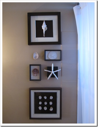
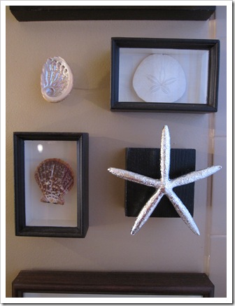
Above the toilet right next to the shower was this fabulous arrangement of shadow boxes with shells. The box on the top, the shell is glued to the black matting without the glass because the shell is large and wouldn’t have fit otherwise. The bottom shells are inside the shadow box with the glass on top.
I loved the way she took a silver plated one and attached it to a square painted piece of wood (on a peg) to add dimension. And of course the lone shell attached to the wall without a frame, very cool.
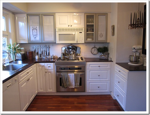
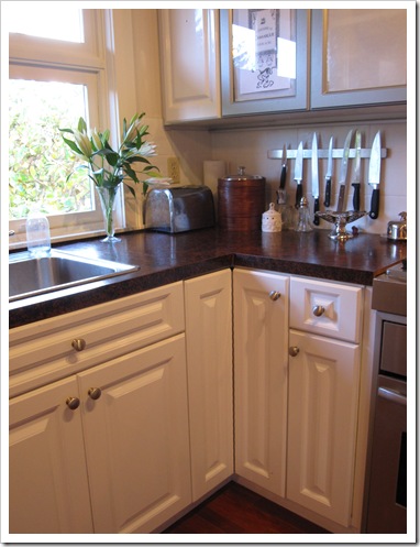
This is her kitchen. I love the way she’s styled the countertops, and she’s faux finished them to they coordinate with the mahogany floors.
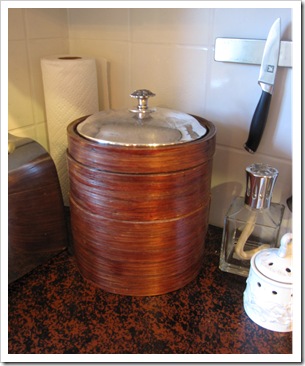
In the corner you can see rice steamers which she has stained a mahogany colour and popped a silver lid on the top (from an old broken glass casserole dish).
She painted her countertops black and sponge painted them in an orangy/red tone to tie in the floor. Since her cabinets were whiter than they should be, I suggested in the next round of painting (painted countertops really need to be re-done every year) she add more black because it would work better with the ultra white cabinets.
I also recommended that the silver frames be painted black. There’s white paper on them because she’s coming up with something creative to cover them because on the left side she has food not white dishes in them. I love this vignette!
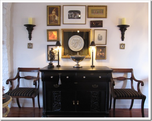
Another lovely vignette with Regency style chairs in her living room, it takes a creative person to hang artwork like that, and I love the tiny silhouettes underneath the sconces.
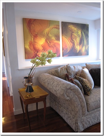
She specifically bought this large rolled arm sofa because its so cozy to snuggle up and read (no TV in this room).
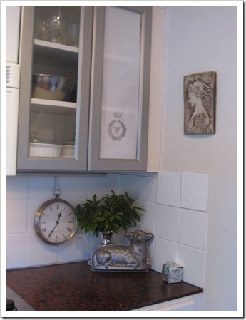
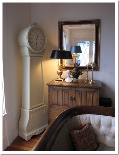
See the clock? It was originally from Wallmart but she paid $40 for it at a garage sale. It was oak and she painted it. Brilliant!
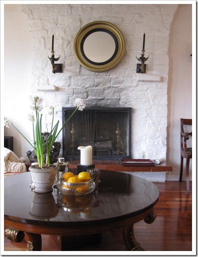 Above Photos by Maria Killam
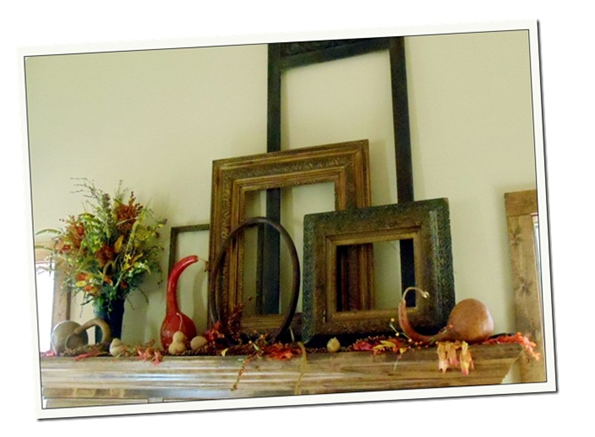
Please join my linky party if you have an inspired (and inexpensive) art project on your blog or for this week you could include a post about YOUR placeholder and what you envision to replace it when you find the right piece. Next week I might post your idea or your artwork! If you are an artist, please include a post from your blog with the price. And link back to this post so everyone’s inspired ideas get read!
This preview will disappear when the widget is displayed on your site.
For best results, use HTML mode to edit this section of the post.
If you would like your home to fill you with happiness every time you walk in, contact me for on-line or in-person decorating and colour.
Related posts:
Week #5; Cheap Placeholder Art (Plus my Dining Chairs are Done!)
What is Beauty? 3 Ways to Know
Home of Artist Cassandra Shaw
New to this Blog? Click here ; Subscribe to my free Monthly Newsletter; Become a True Colour Expert










Thank you, Maria, for sharing this beautiful home.
Teresa
I loved the way she took a silver plated one and attached it to a square painted piece of wood (on a peg) to add dimension. And of course the lone shell attached to the wall without a frame, very cool.
Love this house. She's a fine decorator.
I never would've noticed the tiny pictures under the sconces . . the huge white clock that's painted? Totally brilliant looks antique -y and cool.
Ooooh what fun touches to her house! Ooooh and I totally love her fireplace too:-)
Hi Maria, I was just thinking how cool those two grey framed cabinet doors were in the kitchen and in the next section you said you wanted them painted black! he!he! Shows how much I know!
Maria,
Great to have clients who are not afraid of color and embrace change. Fun fun!
Bette
Lovely home! She has a great eye! I am really jonesing for that fireplace…adorable!
I once fell for a great Monterrey colonial that had wonderful mahogany counter tops in the kitchen. That is a trend that should make a return. I love the painted rock for the fireplace. It takes guts, but it works.
Best,
Liz
I really did enjoy her home. She's so creative! Love the paintings above her reading spot.
http://40daysof.wordpress.com/2010/11/17/easily-influenced/
Hi Maria, Thanks for you kind comment about me..You are just too sweet! I'm so glad you liked the frames..I knew, just as soon as we'd finished that you were going to like it.
I LOVE those displayed shells and the lovely home! Great photos too. I will have to think about place holders..does an old couch work–Ha! Just kidding…
xo
Donna @ Comin' Home
PS. I love how creative she was to get everything to coordinate with the faux finishes! What a smart idea!
She is quite creative! Love the little silhouettes under the sconces!
Thanks for sharing this lovely home. The wall art in the bathroom is just what I have been looking for.
Jane (artfully graced)
How lucky to find a client with such taste, it must be a pleasure to work with her.
She has a beautiful home. I love the grandfather clock idea. It looks perfect where she placed it!
xoxo
Lila Ferraro
Thank you for sharing Maria! This is timely, I want to do some sort of sea shell theme for our new bathroom, so that gives me some ideas.
Love your client's home! My favorite is the mirror over the fireplace. So fun to see all of the details you pointed out there! Posted a link of my fantasy art, but my place holder is just my purpley gray wall.
I finally tackled my big blank wall over the weekend !
Maria,
Many of my clients are on a tight budget and don't have extra money to spend on "art." I always go on a hunt for collections in their home (sometimes in the basement or drawers)so that we can come up with some creative displays on their walls. The blog entry I linked has some ideas for doing just that.
I frequently save your pictures for inspiration (I don't have a blog or anything) and add your blog name to the file name. Now you have added it to the name of your file and it's so much easier & quicker to save. Thanks!
I really enjoy all your posts…there are real-take away-pieces of advice–thanks for your words of wisdom, to those of us in the business.
Lucky you – you really do have such great clients! I love that lamb mold in the kitchen, my Mom has one and every year a chocolate reindeer cake at Christmas with a maraschino cherry nose and at Easter a fresh White Coconut lamb. – Lovely!
pve
That has two good examples of how to hang lots of small art pieces without leaving the wall looking like it has broken out in art-pox.
The bathroom cluster:
Notice how the central group occupies the same amount of space as the two framed pieces. Your mind will "see" the frame that is not there.
The buffet area:
The tiny pieces make the sconces bigger because they continue the line down to the chair. Without them, the sconces would be floating too high for the rest of the arrangement.
None of the pieces over and on the buffet is large enough to balance it. As a group, inside an invisible frame as wide as the buffet, they are great.
This is my FIRST time here and I'm falling in LOVE! You have a gorgeous blog! Congratulations.
I've started my blog not too long ago, if you can, please take a look… today, I am posting about a $68 mil house that OPRAH might buy. 🙂
xo
Luciane at HomeBunch.com
what a creative and lovely home. I particularly liek the way the utilitarian objects are treated as accessories (ie the rice steamer) and made to participate in the decor. really nice – thanks for sharing this!
Your client's home is beautiful 🙂 Love the shell artwork in the bathroom, and what a fantastic deal on the clock! Wow!
Kelly
People buying up stuff, or following a trend, and making it their own! That's what it’s all about, Maria – just like in my game of fashion and style. Love what your client did with the ex-Walmart clock. Brilliant 🙂
As for bathroom art, this is a *must* in our home. I literally cannot feel comfortable in a bathroom unless there is beautiful art hanging up on the walls. Call me weird but I find it very soothing. Besides everyone needs to relax in the loo!
Maria, I had a quiet moment this morning and decided to re-read this post. I just can't get over how beautiful this woman's home is and that she made do so frugally and creatively. It really inspired me! You must know how much that painted kitchen counter has got me thinking. I didn't really have a vision for how good a countertop that you paint yourself could look. Now I have the inspiration to consider going a step further than just plain solid paint. It looks like she's used some kind of glossy top coat. I think I've seen that at Home Depot. This January is when we are going to start painting the house and I will be repainting my bathroom counters the forest green we were talking about. Of course, things are really looking up at work for dear hubby. He may just buy new counter tops. He is VERY determined to help me re-do things and our new couch is proof of that. Makes me think of one of your previous posts on hubbies, decorating and budgets. I think that he might even be open to the idea of painting the pine wainscoting in the living room. I think if he sees what I can do in the bathroom, he'll let me paint the WOOD in the living room. If that isn't love 'man' style, I don't know what is. :o)
Have a great weekend!
xo
Donna @ Comin' Home
I am in love with the bathroom art. It is simple yet very sophisticated. I love that it has personality and not off of a shelf!
Lacy