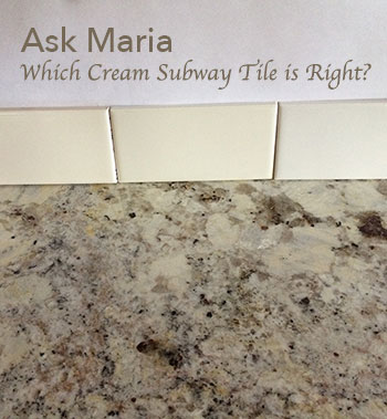
One of my lovely readers emailed this great question about cream subway tile that I thought would be so useful for many of us.
Also, note that her kitchen countertop is pristine and she even left a decorative jar in the photo when she snapped it for me.
If you have an Ask Maria question, please clean up the room, it’ll have a higher chance of appearing on my blog. I am very protective of my readers and I don’t want anyone to criticize any more than necessary!
Okay so here’s the question:
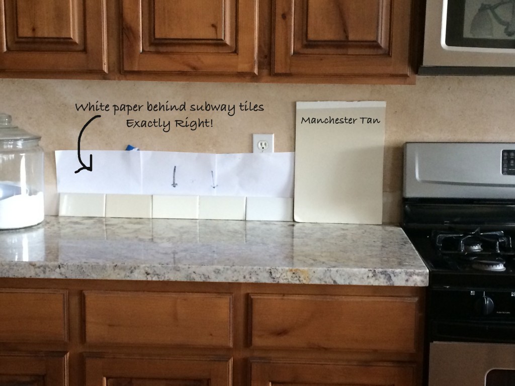
“[I’m] having trouble choosing cream subway tile for my backsplash. Most of them are too dark. I prefer the lightest one, but I’m worried it will look too grey. I had a designer tell me to go with the cream one from Daltile (second in from the right) but I’m still uneasy because she didn’t give me the ‘because.’ The wall colour is Manchester Tan.”
So first, this is exactly the right way to determine whether the backsplash you have chosen is the correct colour.
The tiles are propped up in the EXACT position that they will be when installed with white paper behind them which prevents you from making a decision based on comparing to an old colour. If you laid the tiles down on the countertop, you’re basically blind to seeing the minute differences in undertones.
The reason why you’re having such a hard time choosing is because all of them look like possible contenders for your backsplash (which of course you know).
And I agree that you should go with the lightest one because we want your backsplash to be cream, not beige or yellow.
If your backsplash is too yellow or beige, now you must concern yourself with coordinating the wall colour with it and then you’re kind of stuck with that colour.
The one your designer suggested looks like it could be an option as is the one on the right which appears to be the lightest. It looks grey because you’re currently comparing to the rest.
First, eliminate the three on the left, then go back to the store and get two more of the ones on the right so that you end up with three each.
Then, line them up against the backsplash exactly as you’ve shown here WITHOUT comparing to the others, and your choice will become obvious.
You AND your designer must be able to immediately see that your colour choice is the right one. Without big enough samples, it’s just your best guess. Your best guess could be right, however there is always the small chance that it might not be exactly perfect. There are enough examples of colour choices gone wrong in any magazine or website that you’ll know that what I’m saying is right.
It’s why I don’t go anywhere without taking my large painted colour boards. Once you know the colour palette you are choosing for your house, you can take the boards everywhere with you to choose carpet, tiles, fabrics, without having to schlep samples endlessly back and forth.
Also, if you were matching backsplash tile to your wall colour, you would do it the same way but instead of placing white paper behind your backsplash, you would prop your samples against your large colour board instead. If you had a countertop without any cream, usually you’d have to choose a backsplash tile that would relate to the wall colour (as well as your countertops) if your cabinets were a wood stain like this example we’re talking about.
So much about getting colour right is about HOLDING samples in the right place, where they will be when installed or painted. Tweet That!
Here’s what one of my True Colour Experts™ said about the large colour boards:
“The large [boards] are simply essential to selecting the perfect colour. Because undertones are so important and can appear to change, you cannot know the nuances of colour without seeing it in a larger format. Before using them, I had clients go back and forth trying to find something they liked, or trying to see the undertone I was pointing out. With the large [colour boards] they are able to immediately say ‘yes or no”, thus making my job so much easier and giving my clients exactly what they want! “Jil McDonald, Interior Designer, Jil Sonia Interiors
Have a great week everyone! xo Maria
PS. If you have a question for Ask Maria, clean up your room, take a photo without flash in as much natural daylight as possible and email me here.
FOLLOW UP TO THIS POST IS BELOW:
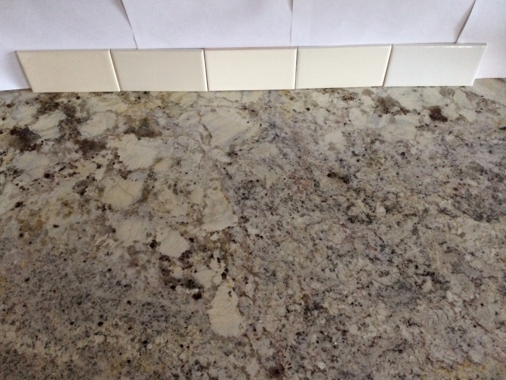
My reader with the great question about cream subway tile followed my advice and this was her email to me today:
“Thank you Maria! Narrowing down the choices and having 3 sample tiles did the trick. here is a picture if you would like to use it as a follow-up. We are going with the lighter cream tile which is not the tile we currently have ordered (yikes). But would much rather pay a restocking fee than have the wrong tile!
Thanks again!”


Great post! Learn so much when it is explained so well.
Wish I had known about using color boards when we replaced our carpet two years ago. I was driving myself and my husband crazy with all the carpet samples I was bringing home to see how they went with our wall color. I didn’t want anything with a pink undertone. After 2 months and lots of samples finally found a color that I thought would work.
Excellent example and explanation. Thank you Maria (and reader!)
She has many things to consider. The brown of her cabinets, the Manchester Tan of her walls and also her busy counter top. It is so hard to see the shades in her counter top on the computer. It sounds like she is pretty savvy on how to make the best choice thanks to Maria’s blogs and instructions.
Have a wonderful time with your new class. I only wish I could be there!
Your timing for this couldn’t be more perfect!! We just ordered our granite counter top this week and were looking at CREAM tiles yesterday for the backsplash. Thanks for the tips about putting the white paper behind them – that will help a lot in the future for deciding ALL my colours.
Poo…I picked the wrong one.
As Maria points out when saying one looks gray because it’s next to the others, it’s critical to look at each color separately, since every color is influenced by its neighbors. (Channeling Josef Albers here.) : )
This goes for paint too. Or any finish.
And look at the samples in different lights too, artificial and natural.
Great practical advice on choosing tile Maria! I agree with you that the lightest one gives more flexibility with paint down the road, and it works well with her current colour. It also would look the best behind her stainless stove.
I have learnt a lot to be careful when doing colour coordination. Thanks Maria
May I add that the white behind the samples should be larger. I have always found that the less things our eyes have to take in the easier the design choice becomes. The old trick of taking a black sheet of paper with a square cut out of the middle to look at a selection is still valid.
Also take the tiles to another spot in the kitchen.
If you have under cabinet lights turn them on. Look at the tiles in both day time and night.
Thanks Maria great Blog.
Sure wish you were my neighbor, I would have you over every day
Great advice. I kept thinking there were too many tiles side by side to make a choice.
I always wonder how you’re able to specify color via the internet. The monitor color calibrations can be so different from computer to computer.
That info was SO helpful as I’m planning my kitchen in new home construction. I’ve been agonizing about the “hard” surfaces in kitchen and open-plan family room – counters, backsplash and fireplace. I’m partial to soft warm/cream whites but want to keep it as neutral as possible, with no stark, sterile white. My style is Transitional
Well, poop…I actually prefer the 2nd from the left. I like that it matches her wall color and I like how it looks with her countertop. Think it would blend better.
Great information here. Congratulations to the owner for selecting non busy tiles to begin with! She’s well on her way to good design. Excellent explanation Maria. Lots of tips to help the rest of us when making selections in other situations. What about grout, Maria? I certainly am not suggesting any contrast type of grout, but would a very slight shading of the grout help or hurt if the reader wanted to “tweak” the tile to make it whiter or creamier?
Oh, Maria….I meant to add my thank you to the post above. I recently purchased your e book. Learning a lot.
Thanks for the great article, Maria! Like Katy (above), I also would love to hear your opinion and advice as selecting grout color.
(I personally drove myself “crazy” testing different grout colors on tile sample boards when I was doing my own backsplash project. I think I was experiencing some sort of phenomenon where you see the complement of a color on an adjacent surface ( I forget what the term for that is) as well as the conflict of “undertones.” ) Actually, that problem is what led me to find your site; I had googled something about color theory and tiles landed on your site–so it was a blessing in disguise. I’ve learned so much from you, and your book.
Thanks again.
ah, good point. grout can change everything…
What is the name of countertop design and color chosen in these pictures? I love it, I’m remodeling our kitchen, and hope it’s available here.
Thanks!
Perfect choice. Would love to know the name/maker and color of the selected tile.n it looks like it might be a contender for my kitchen backsplash.
Tiffany and KJ, the counter top is white springs granite and the tile is daltile 0100 3×6. To be honest wish I would have read Maria’s blog before the granite was installed as it is busy. I don’t hate it but I don’t love it either. So I’m trying to do all other choices as calm and classic as possible for the rest of the renovation. The grout I’m choosing is mapei white (it is a close match to the tile). Tile will be set with tight grout lines. Wish me luck it turns out. Now if we can get Maria to do a post on what knobs and drawer pulls she would pick for a stained cabinet kitchen:) I just read her post on knobs and drawer pulls for a white kitchen and loved it but not sure how it transfers to a brown kitchen.
So which of the tiles in the original picture did you end up choosing? And what was the name of it?
The tile to the very right. daltile 0100
Is it the one with the arrow pointing to t in the first picture?
Hi Maria, wanted to know your opinion on glass subway tiles? Yeah or nah? White cabinets with white Quartz, was wondering about white glass tiles? Thanks!
white glass is usually blue, so just make sure you are happy with that.
Thank you so much for posting my comment Maria!
Thank you so much for making this process easy to understand. I am hoping to redo my kitchen next year and it will be on a tight budget so your teaching sessions are beyond valuable for me.
Thank you again 🙂
Great post, thank you! Your posts are always so helpful!
Maria,
What are your thoughts about the glazed/crackled subway tile options? I am considering a creamy, vanilla subway tile which is glazed with a crackled finish and has variations in texture. Are these too trendy? And what are your thoughts about marble subway tile?
I like them both, as long as you install them with the correct finishes. the crackle I would call french country and I’m not a fan of marble that’s too busy but that’s just me. Hope that helps, Maria
Maria,
Thank you for your reply!
My kitchen is large and I have cream glazed cabinets (probably a mistake based on what I’ve read from your articles concerning kitchen trends) and white macaubas quartzite. The quartzite looks more blue/gray than white. The kitchen floors are 60 year old golden oak hardwood with walnut pegs. I want to pick a backsplash that won’t make the kitchen feel as if there is too much going on.
Any chance you can share what brand or where to get the cream options of subway tile?! Thank you!
I have the same backsplash and countertop. However, my cabinets and floor are honey oak. Resanding the floor because it needs it and thought to re-stain to flow better into the family room (it is dark). Also, we are thinking of painting the cabinets but having a hard time deciding what color will bring these together. Can you please give me some ideas?