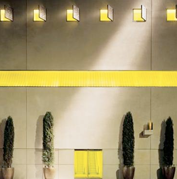
Photo from Hudson Hotel Site
This is the entrance of the Hudson Hotel in New York! Notice, there is no sign on the front!
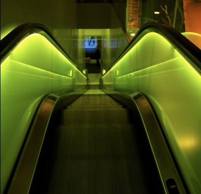
Photo by Maria Killam
Here is the escalator going up to the hotel. The lighting in this hotel is extraordinary! You must check it out if you love lighting. It reminds me of The Matrix!
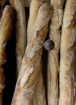
This morning we had breakfast at Le Pain Quotidien. It’s a very cool Belgian inspired-communal-table-place to eat. The food is wonderful!
Looking up at the colourful quilt-like tapestries (and because we were at the table talking about colour and design), I was reminded about the way I used to specify colour!
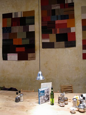
I used to think I wasn’t doing my job unless the house looked like that quilt!
I think because a Colour Expert has ‘colour’ in their job description, more than one of us think it’s all about saturated colour when really our job is fundamentally about selecting the perfect colour which sometimes means the perfect neutral. Strong colour throughout any interior needs colourful furniture and artwork to really pull it off so every space needs the right mix of both!
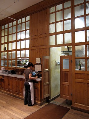
This is the entrance to the kitchen inside the restaurant!
Hope you all have a great weekend!
Need help choosing the right neutral or colour? My How to Choose Paint Colours: It’s all in the Undertones ebook takes the hundreds of choices down to 9 neutral undertones along with list of all my other go-to best grays, broken down into 3 undertones, green, blue and purple. The beige undertones of pink, yellow, green, gold, orange and taupe along with the best greens and blues.
My bonus book of colours is worth the price of the ebook alone but you will also get my system of understanding undertones so you can stop making mistakes when sourcing tile, carpet, countertops, etc.
If you would like to transform the way you see colour, become a True Colour Expert.
Related posts:
How a smart Colour choice can Save you Money
What colour are your Towels? How to see upcoming Colour Trends
New to this Blog? Click here ; Subscribe to my Monthly Newsletter.
While you’re here, subscribe to this feed so you don’t miss out!


Just found your blog and I'm already gleaning so much knowledge from it, from blogging tips to color selection. THANK YOU! I'll definitely be back.
I agree! Neutrals need to be as carefully selected as saturated colors are!! It sometimes takes even MORE expertise when choosing neutrals.
Yum. Sounds like a yummy restaurant! I can never get enough bread 🙂
Maria, I bet you had the best time. The hotel looks so fabulous. Love the exterior, like a private retreat!!
Come and Look at my latest news!!
Karena
Art by Karena
Maria, you are hanging out in my NYC neighborhood. I live on 60th and Amsterdam. Love Le Pain. Great food! Sorry to not meet you while visiting New York. Hope to the next time around. Have a great but soggy weekend.
ok…that "neutral" looking bread has my mouth watering.
…now what were you saying?
Oh, we love Le pain… it's one of the best all time cafe/bakeries in town! When we lived with our young daughter in the city the one on Madison and 86th was the fist to open and we became friends with the Belgian owners, very lovely and warm people. Once I ask him about the walls and gorgeous finish and the spareness of it and he told me he likes the idea of concentrating on the food and making this the decoration of the place. I loved this! The quilts are new to me, they look wonderful. Wholesome as the rest!
We have enjoyed this place ever since. There is one in the ABC store too, among many more by now, might be the one you've been to!
Enjoy your stay!
XX Victoria
Are you free for a coffee?
[email protected]
mmmmm bread.
Maria-
I know that you will have a wonderful time in NY, the city that never sleeps! I am remiss in not connecting with you to hook up for some le pain or le drink!
Please go to Bemelman's bar in the Carlyle Hotel- I think you would love the mural there if you have not already seen it.
Enjoy a colorful stay, even on this wet and gray weekend, I know you will find many rainbows!!
pve
that first photo of the exterior of the hudson hotel is absolutely stunning. im not a photography expert or anything but the composition, the colors, the shapes, it's all just gorgeous.
Neutrals can bring balance to a colour scheme and often is the medium which gives the colour clarity and punch.
I'll have to keep Le Pain in mind for when I go to NYC – not that I go very often. I love the bank of frosted glass windows as the entrance to the kitchen.
Mmmmm, I would love to go to Le Pain!
My towels are white ( I love to bleach ) because I think they are fresh looking!
Have fun in NY!
xx
Mmmmm, I would love to go to Le Pain!
My towels are white ( I love to bleach ) because I think they are fresh looking!
Have fun in NY!
xx
Loved the look of this hotel and stayed there a few years ago. The interior was fabulous but they didn't back it up with comfortable beds and good service. I hope they have improved. Would love to try Le bain next time. Have the best weeknd.
Always a great lesson to learn, less is more 🙂
Wonderful post! Don't blow away this weekend!! Can't wait to see what you have in store for us when you come back!! Safe, FUN trip!!!
Hudson Hotel – pretty sure I went there to pee once. Not right on that spot though.
What a beautiful hotel. Hope you had a wonderful visit in NYC.
xo,
cristin
Just had a silly thought, colour design is like making the perfect soup, you have to just the right mix to make it delicious.Hey, I said it was silly.
The woodwork on the entrance to the kitchen is beautiful. I wanted to reach through the screen and touch it.
I long to visit NY…thanks for giving me another glimpse. One day!
Wow…just stayed at Hudson in January and am returning this week (Arch Digest Home Show)! Tweeted about that fab interplay of dark and light in that lobby and isn't that electric Kool-Aid elevator ride fun??
Let me know if you're ever in DC or NYC for colour or design-related business…could show you the colorful doors of a Alexandria and Old Town!
Thanx also for the great blogging tips..should get mine off the ground next month if I can stop procrastinating ; )
Cheers!
That hotel look so cool. The restaurant even better. I'm so tickled that you have sent us a blog post from the big Apple!
Oh, those escalators are divine. What an inspiring use of light and colour…
Maria,
Great snaps. Hotels and restaurants have the greatest freedom for design, budgets and resources. Stunning energy display draws us into the experience.
Neutrals are a balancing color which allow us to have more color or texture in a space depending on what we use the space for.
Bette
Ah yes! I love to say 'god may be in the details but he's also in the mix'.!! Enjoy your week. Marija
Thats an interesting looking entrance NO SIGN?? Very sharp post.
This is my first visit. Nice
yvonne
We stayed at The Hudson a few years ago and loved it (even wrote a review about it here: http://tinyurl.com/NYChudson). The decor is fun and different…we really enjoyed ourselves.
We also love how the Kimpton Hotel Group has decorated their hotels. We find the decor so interesting that we try to stay in as many different properties as we can. When we have a trip to make, we also check for a Kimpton before we book a room. 🙂
Maria, So happy that you are once again in my favorite city on earth. Since we were there last Spring, I've been hoping to get back there this Spring. But we've decided to go to Santa Fe instead. Will send you pictures soon as I am really wanting to get started on the redecoration of our family area and I definitely need your expertise in choosing just the right colours.
Have an extraordinary time in the City and a safe trip home.
xoxo
Victoria
You are right the Hudson Hotel is the best lite place around. Did you have a drink in the bar? I always feel like I'm in the bar scene from Star Wars when I'm there.
Were you here this weekend? In this crazy storm? Hope not-NYC is much more fun with the power on.
You sure captured some lovely color while in New York. I know the whole gray/yellow thing is big now but I've always loved it. Seeing the hotel exterior was inspiring. Ditto for that cool escalator!
Maria the photo of that escalator is AMAZING!!! it is beautiful.. 🙂 you did an awesome job..