I have secretly always thought that the emphasis placed on the basic ‘rules’ of colour theory were completely overrated. When I worked at Benjamin Moore at the retail level, [many years ago] and colour theory students would come in looking for help on a ‘complementary’ colour combination or an ‘analogous’ colour combination, it always occurred to me as a useless exercise. “I guess the way I pick colour is different from other people”, I thought.
When I taught colour theory at a local community college, I spent exactly 10 minutes in the first class distinguishing these combinations (and that was the end of the lesson).
I have always told my students that it is definitely important to understand the theory behind the combinations; when you are specifying colour, you need to know that blue is the opposite of orange (complementary) and that yellow and green (analogous) are beside each other on the colour wheel, but I have never once specified colours saying to myself “I think I’m going to specify an analogous colour combination”.
Then a couple weeks ago, one of my designer friends in Calgary, Carol Ann told me about a book she wrote about here in her blog. So I ordered it on-line and it just arrived yesterday! This book, written by a fellow Canadian, Colour Designer Janice Lindsay, called All About Colour, is fabulous, (and here it is in writing, and she said it best:
“No one, and I mean no one, uses theory to design their colours. If they do, they are amateurs.Colour theory explains how colour is organized. It is excellent for labeling what has been done. It gives us terminology for describing colour palettes.
I might tell you that here we have an analogous colour scheme, hues from neighbouring or similar colour groups, and this is a complementary one. Over here, we have gone for a monochromatic or a single-colour approach. And to really impress you, I might draw your attention to some split complementaries. Well lah-di-dah. You might think I design according to rules of colour theory. I can only categorize them—after the fact.
The funny thing about colour theory is how interesting it seems and how useless it is.
People in the know about colour seem to think it is important, if they sang its praises, I hummed along. But the truth is that I never really understood how I was supposed to use it. I put colours together by feel.” Janice Lindsay
So my lovelies, put your mind at ease if you have done a colour theory course and barely remember what the rules are, or if you worry that you should be using them and don’t. That is exactly how I have always chosen colours as well–by feel.
As long as you understand the colour wheel, you don’t need to be that concerned with the ‘theory’ behind the combinations. After all, we don’t use that language with clients either.
And of course taking into consideration that clean and dirty colours should only be included on the same palette if you intended it to happen. In other words, these are guidelines to follow and understand in general, unless you want to break the rules. However, as I always say to my students, at least you will know when you are breaking the rules instead of installing colours in a space that clearly do not work!
Related Posts:
What Everyone should know about Beige
Clean vs. Dirty Colours
Three Ways to Describe Colour


I do relate to this a lot. It is so important to know the rules…to be able to break them. The same goes for Interior design and even more for Photography (another passion of mine). Well said, Maria!
Well put; it's definately a gut response for me. I normally don't like primary, high chroma colours though.
* Hi, Maria~ Coming here is always SO fun AND informative!
… ANNND, what was said near the end reminds me of my MOM (a stickler on "good/proper ettiquette", thank heavens!) when, as a young child, I asked her why "good etiquette" was so necessary to LEARN. Her simple answer was "because there will be times when you need to BREAK THE "RULES", and I want you to KNOW you're breaking them, and WHY"! So, your point works in MANY situations…
I really enjoyed this read~~~ many thanks!
Linda in AZ *
I think it's worthwhile knowing rules to break them. And if you are new to colour the rules are a starting point.
Hi Maria, I agree with the sediments above, it's important to know the rules before breaking them! I think knowing the history is a must.
i nver would have thought to put these colors together. yum!!!
well said – when you know, you just know! picking colors, or anything, is such an emotional thing for me 🙂
Thanks Maria – did you notice I took your advice..:-)
another great read. sometimes we get so hung up on theory and technicals, we forget practical!
Vitania
"The funny thing about colour theory is how interesting it seems and how useless it is.”
O.M.G YES! Color theory is just that, theory. Two-dimensional theory ta boot. It has so little to do with coloring 3D environments for humans to live and function. "Useless" is a good word to use.
I think the fact that you now don't think consciously about the rules is the proof that they have now become a part of you.
This book sounds fantastic. I'm off to buy it.
xo
Brooke
When reading your post, immediately the practise of Feng Shui came to mind. It too can be more about 'feeling' than 'theory'.
Though I only dabble in it, I was amazed when I walked thru my home the number FS elements it had without conscious choice.
-Brenda-
Oh Maria I am so happy you are enjoying the book…it's amazing ah…I am emailing Janice this morning to let her know that my little blog on her book is doing what I wanted it to do…get people to order it and read it…
When talking to you about colour it was great to know I wasn't the only one that did not use the theory part…(I thought it was just me) Love you, Love your blog…Carol Ann
I just finished my email to Janice and I am on her website…the pictures are brilliant, check it out…http://www.janicelindsay.com
I'm only at white and I'm blown away…
Carol Ann xx
so funny, I laughed out loud…your right you can tell what I do by what furniture I pick!
oh and I was going through her website and saw the pictures you pulled, duh… you already found the website, I should have known! slow a little slow I am…
Carol Ann xx lol lol
I have forgotten my color theory from college. Now I don't feel so bad! Great post!
I would definitely agree with most of the comments here. Once one knows the rules, they know how to bend or break them. When dealing with a client, I imagine a designer wouldn't be dropping terminology such as this. I myself would be more apt to explain with how the colours would work together, what feelings they would bring out in whoever was in the room. Great post Maria, keep'em coming! :o)
great post Maria. I think a lot of aspects of design are similar… it's good to know the rules & theories but in general you don't create a room thinking "this will be harmonious", etc.
xoxo,
lauren
Oh, I am terrible with theories… I go by my well trusted gutt feeling and usually can explain my way out…
A couple of basic rule and the ones in my head left from art school, mixed with my long line of broken rules!
Lovely post! Great book!
XX
Victoria
I know colour and can "see" undertones whether blue or yellow! Remember years ago the "color draping" to see what colors one wears best? Well, I was one of "those" consultants. I just "know" what goes and what doesn't. It is nice to understand the color wheel but I'm with you, don't get hung up on it!
Blessings…
Love, the rule… Break the rules!! that is a good path to discover. Great pictures and lovely designs
Grafittis, Street Art and Me
Couldn't agree more!!! Color is intuitive. Now more than ever in these free-wheeling eclectic interiors!
I do love balance at times. I think that is worth considering.
Awesome post !!!! I work more in chroma values rather than colour rules and it's all chosen by…FEEL !
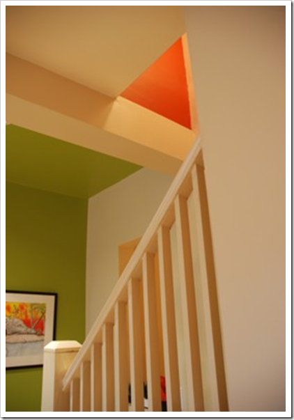
Just enjoying an older post. I LOVE the colours in the first photo. I could look at that picture for hours. I could hang it on my wall and never get tired of it. It would make a lovely abstract painting.
Isn’t it more about color value. When I see a perfectly dressed woman, like Julie Andrews in person, I analyze their color combos. It comes down to value. Of course, the fact that her jewelery was real also made a difference.