The difference between the architecture in America vs. Europe is that you can always tell which era the buildings are from [here] and it was no different at the Harrison Hot Springs Hotel this weekend!
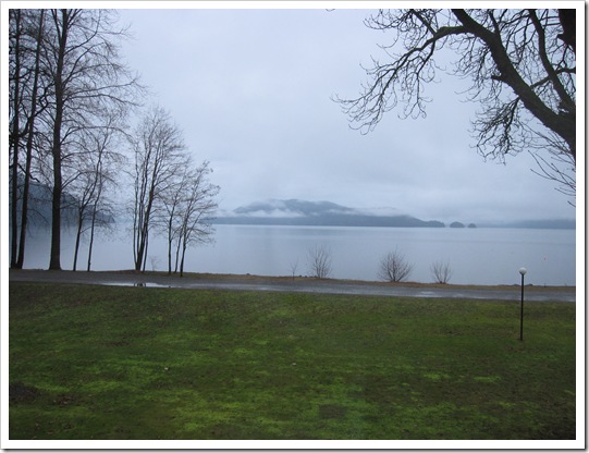
This is the lake view outside our hotel room. What made it extra pretty was all the moss which remained a fresh spring green even though it’s January! Being in the colour business, and especially because I write this blog, I find I am even more affected by colour everywhere I go!
You can tell this addition was put on in the 80’s because of the green windows and flashing. How much more timeless this would look if it was black instead (below).
In my colour courses I like to have students define decorating styles (like modern, traditional, countrified) using only colour.

This way, (for example) as a colour consultant/designer, if you are asked for a palette of ‘French Country’ colours (above) you would know what they are.
Walking into our room, with the burgundy drapes, fuscia bedskirt (not shown) and striped duvet and valance, I felt like I was inside a circus tent! Yet another perfect example of how colour instantly creates a feeling.
What made this hotel great though,was the spa and the Hot Springs outdoor pools and we had a great meal in the Copper Room Restaurant on Saturday night!
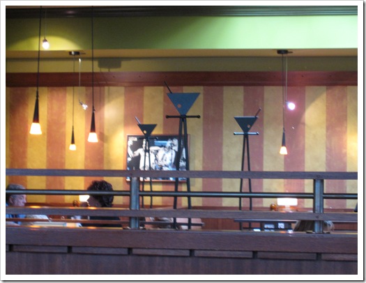
The carnival theme continued when we stopped into Milestones for lunch on the way home! There were 2 different shades of orange, yellow, green, and a striped accent wall along with striped carpeting! This time I’m sure the theme was intentional!
There is a reason why decorating guidelines say to limit your colours to 3 or 4 shades maximum! Unless a busy, playful space is what you are going for! I’m guessing they are going for a younger demographic with this colour scheme!
On Friday night my sister Anita organized a fundraiser for Haiti. She is currently participating in the Self Expression & Leadership Course through Landmark Education which is a 3 month program where you create a project that makes a difference in your community!
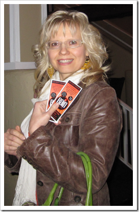
Jennifer Searcy & Anita Junttila
Anita, along with her good friend Jennifer (above) held a pub night in Abbotsford at the Rain Bar & Grill, sold tickets and accepted donations for a silent auction! They raised almost $3,500 and the event was sold out!!
So that’s my recap of this weekend! I’m off to watch the Grammy’s now!
If you would like to transform the way you see colour, become a True Colour Expert.
Related posts:
The Secret to having the Life that you Want
If you are new to this blog, click here to see the Best of Colour Me Happy.
While you’re here, subscribe to this feed so you don’t miss out!


If only the hotel knew who they had as a guest….! Kudos to your sister for her fundraising event.
Hello Maria, lovely Greet sent me here. I can understand that she visit your fab blog often! (I just read your 10 tips about blogging. Very informative indeed!) Seems you had a fun & productive weekend. Happy new week! Monika.
Your sister sounds like a lovely lady and the 3 or 4 colour rule is to be follow or else one ends up with an headache and believe me I know of what I speak.
Warm regards,
Simone
Hats off to your sister for producing a successful event. I'm sure it meant a lot for her to have you there supporting her work.
I love that you and your sister spread lovely colours
so happily here and there. Congrats to your sister for taking that course and for giving.
I do hope you left your card with the Hotel Manager (Person).
pve
I love it how you visit a venue and assess their colour choices – so funny! your sister did so well! congrats to her!
Did look like a circus! So wonderful that your sister is involved in something so meaningful. Awesome that you support her! Sisters are the best.
Ruthie
Wow, very distracting colors they have going on. I'm surprised that being known for their spa they haven't done something a little more relaxing and subtle. The only good thing about traveling and staying in a hotel is that you really only use the room for sleeping; you're usually out and about doing what you traveled for. So, I guess you don't really have to look at the decor for too long!
Oh, those windows with black trim, too bad you weren't on the design team for the hotel, to save them from the green!
If I lived in Vancouver I'd take your colour theory course, eventhough I took it already, because the one I took didn't include colour palettes for decorating styles – so important to know.
Is it possible to write a post about it?
You and Anita look fabulous! I think you look designer-ish 🙂 – love the combination of brown leather jacket, cream scarf and a punch of colour with the green handbag. Very nice!
You & your sister look like you could be twins. You're both adorable!
I love the 3 or 4 colour rule! Your sister rocks as you do too!
how simple…..color can dictate a style/era. so true maria and that never occurred to me. (slap to the forehead)
ps; love your bag, mine is the same color and i get so many compliments!
debra
Couldn't agree more!
What a contrast between the second and third images–third wins for me.
Happy Monday.
Yikes, that carnival theme makes me cringe.
However the Landmark Education program is a good one and how great of you to help out.
Even without color, though, buildings are identifiable in terms of construction date.
Those rowhouses were built in around 1905. I can't tell for sure from the pic, but the black framed windows look like replacements and not the original wood frames.