Have you ever looked at a darker or lighter colour on a strip of colours from a fan deck and thought “That doesn’t look right’. Well, you were probably correct. To choose colours accurately, you need to rely on your colour trained eye (or your colour designer) to find a colour in the deck that complements the one you want. If you just go up or down the strip of colours in the fan deck, you might end up with a bad colour combination (no such thing as a bad colour, just lots of bad combinations).
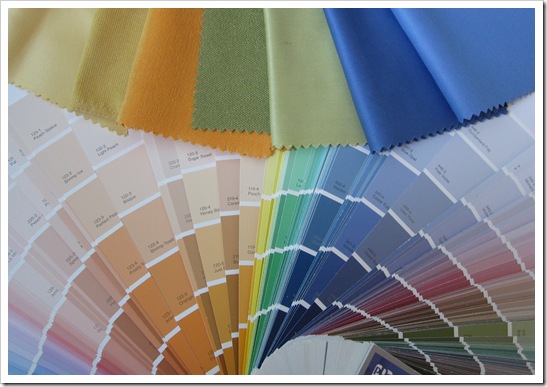 Photo by Maria Killam
In the summer I was hired for a short-term contract to help compile a fan deck for a large paint company. Pat Verlodt (below right), who has been in the colour industry for over 40 years, was in charge of the project. She also contributes to this colour blog. Denise Turner (below left) from ColorTurners in California was also part of our team!
The colour chips from the current deck are cut and pasted on bigger white strips of paper (below). Then we fill in the blanks. . . how? With a stack of competitors fan decks. The reason it’s done this way is that it’s way too cost prohibitive to just take a bunch of saturated (dark colours) and commission the lab to come up with a bunch of let-downs (a gradation of lighter colours). So instead we simply look through fan decks to find the closest one that we think works and that’s how a new fan deck is born.
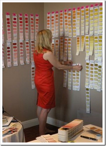
Then we start at the top of the colour wheel with the cleanest colours and tape them up from left to right all over the conference room. See the reds? Well we definitely don’t need all the lightest shades of bright pinks that you would end up with if you just had one red chip on each strip so some of them have 2 or 3.
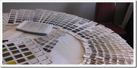
Next I got the task of arranging all the neutral/muddy colours so that they could go up on the wall underneath the rest. It was after I had done this job that I was told “Welcome to the Team” Whew, I guess that means I can keep my day job of being a colourist and teaching it too 🙂
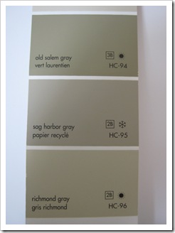
There are many times during consultations where I have pulled out a colour one shade darker (in the same strip) and my client and I have both said ewwww. Now you know why you don’t like it. Because it was simply the best available colour at the time. The perfect lighter or darker shade for you or your client is not necessarily on the same strip. Sometimes, it’s not even in the fan deck. Ever tried in vain to find a colour for your client to match her bedspread and it wasn’t there? Well there are lots of holes for the right neutrals in many fan decks (for example), so if you can’t find it, it’s because it’s probably not in that deck.

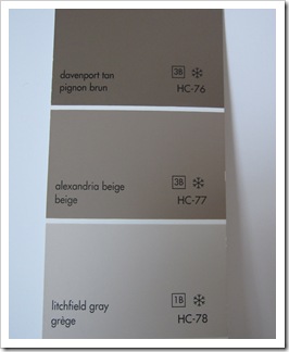
See the lightest shade on this row, HC-78? Well it has a purple undertone so is it a let-down of Alexandria Beige? No. It’s comparing one colour chip to another that will give you the combination you want NOT just going up or down on the strip. I have had this conversation so many times with clients, it’s why you are getting this tutorial here on my blog today.
If you want to learn to ‘See Colour like a Pro’ Check out my True Colour Expert Training where you will not only develop the confidence to start ‘trusting your eye on seeing undertones of colour’, you will learn what elements make a room work in addition to the ability to select the right colours for you or your clients space to ‘pull your space together’. Click here for more details.
And if you are a decorator, designer, stager or a creative person considering starting your own design business? Colour is the foundation to be successful. If you would like to have a conversation with me to find out if this course is right for you, email me with your phone number.
Download my eBook, It’s All in the Undertones. If you have a computer, you can download my book!
If you would like your home to fill you with happiness every time you walk in, contact me.
To make sure the undertones in your home are right, get some large samples!
If you would like to learn to how choose the right colours for your home or for your clients, become a True Colour Expert.
Related posts:
Colour is Context
Insider Secrets to Seeing Colour like a Pro
Are your Colours Married?
New to this Blog? Click here ; Subscribe to my free Monthly Newsletter; Become a True Colour Expert




Fantastic post! I love these posts with teachable lessons in them. I even have my BM fandeck here to follow along with.
I read all your posts, but I love these that have a "take-home lesson."
Great info to share, Maria. Color is tricky business, isn't it? I appreciate the teachable moment, and I'll be using your explanation as I work with my color clients. Thanks for sharing!
It's nice to see the thought process behind all those colors.
You are truly one of the leaders in color. Great post Maria. I love your originality.
There are too many colors! This is a very helpful post…
Wishing you a wonderful Thanksgiving holiday ~~
xoxo Laura
Having worked for one of the largest printing companies in the world, I know what you are talking about.
When I first looked at the title of today's post (I looked quickly and I am already tired of getting ready for cooking–but looking forward to it!), I thought you wrote "Fan Ducks."
Feel free to call anytime.
Keep smiling!
What a fantastic lesson. Mystery solved. Now I know what to say to clients who want lighter or darker. I feel like if i miss a post of yours I've missed a day of school! Thanks so much.
Fascinating!!! I never really thought about how the fan decks come to fruition. I think I thought they were computer generated or some scientific code. I did, however, know that I didn't think the colors were always the right gradual gradation. Thanks so much for sharing, now I know:)
Well this is kind of weird, because just yesterday I did a color consultation with a client and recommended Sandy Hook Gray HC 108 for her bonus room. Her husband felt it might be too dark for him, so I then suggested Sag Harbor Gray HC 95. They were quite confused with the historic palette strips for the reasons you explained!
Maria,
Fan decks should be called "color guides" because color is in the eye of the beholder especially a trained eye.
In one on my classes during school, which was intro to the colors in art, my instructor stated that I was the only student she had ever had that got colors correct every time. She stated intuitive colorist were extremely valuable in color careers. She was correct because as I assist clients with colors they're always pleased with the results.
I use my fan decks (several different ones) all the time. For fabric, make-up, paint, plant selections etc. The lessons for color are invaluable Thanks!
Have a great weekend!
Bette
Fantastic post! I'm intrigued by this "new" information, but now everything makes sense. Thank you for being such a good educator on so many interesting topics. I would love to get in on one of your courses–any chance Minneapolis, MN is on the horizon? I'm a Canadian girl, born and raised, but have lived here for the past 3 years. Would love to meet a fellow Canadian and take your class!
Oh my. I really thought the colors were graduated properly. I'm going to read this post over and over again until I get it, because I'm still somewhat confused … 🙂
I love color . . . bright ones:-) Lol this was a good post to read. I hope to someday hone my creative skills and be an interior decorator, but until then I will just practice in my own home.
Have a lovely Thanksgiving!
Wow, this post is pretty intensive so much that I may have to reread due to screaming kids in the background. Can't believe you are coming to Atlanta in February! I'm definitely going to make every attempt to be in that class!!
You really know you stuff, thanks for teaching us. My powder room is split pea and I love it.
this post was a perfect example on utilizing the wisdom of a color expert!
loved this lesson maria
debra
Ahaha moment ….. I am finally getting colour….thanks to you Maria, great teaching post. Love the link also, this also helped alot.
Carolyn
Australia
Some clients (here in the U.S. – happy Thanksgiving) get thrown because Ben Moore's Preview deck is mathematically accurate – each color a percentage of the darkest color – but Classic isn't. Some Classic strips are graduated but you can't count on it.
Wow, now this is an eye opener.. Omg, now i understand why things never have looked right on the strips. Thank you so much for sharing this with us. I learned a lot today!
Thank you. I knew there was something strange about some of the colors in fan decks.
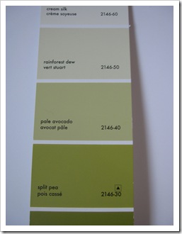
See 2147-30 Jalapeno Pepper? If you were looking for one shade darker than dill pickle but you didn’t like what you see? Keep looking and COMPARE to find one that you like.
You can also take the shortcut of asking for more pigment than the Dill Pickle formula calls for. Test it, of course, but 25% or more of the recommended quantity almost always gets it. Trying to nudge it with less than 25% may change the shade, but don't count on seeing it.
To get that elusive one shade lighter, ask for less pigment.
I quite agree, Lazy Gardens.
I’m a big fan of custom color, so if I don’t see exactly what I’m looking for right away when I look at a few of the decks I use, I either take something that *is* the color I want to the paint store and have them match it, or request a stock color to be made darker or lighter as you’ve described when value is the only variable I want to change.
Unfortunately, not all colors do well with this treatment, and I’ve seen some that at 25% still look almost exactly the same as the color chip, or turn some really strange shade even at 75%. It would be great to have some better idea of how to predict which ones will work with these kinds of adjustments – and which will change completely, if that’s possible.
I’ll also take a color that is close to what works and simply have it adjusted to where I want it by adding complementary or analagous, etc. colors as needed. This is one place where knowing your “formula” color wheel combinations well can really pay off big time. Tiny additions of tint can shift things just perfectly, and add a lot of subtle depth and richness to the final color that may be lacking in the one you start with.
These approaches probably aren’t very useful for the typical color consultation, but are absolutely essential tools in the toolbox of a good interior designer doing a complete design project who wants a truly high end result. I don’t care how many decks one has, the really most perfect colors for many projects are simply not always made by *anyone*, and you can drive yourself nuts trying to find them.
Hi Lazy Gardens,
All those are possibilities in the paint store but you have to buy at least a quart of paint to see what the colour actually is. My point was that you can simply keep looking for a better shade in either direction by comparing. That might be obvious to some and less obvious to others.
Thanks for your comment,
Maria
So much useful information. The world needs more of it, and you've got it right!
Thank you so much!
xo
Luciane at HomeBunch.com
Fantastic educational post. Thank you, Maria!
I think the Pratt and Lambert deck is a great example of colors on a strip that are quite unrelated.
Your tips are very useful and from now on I'm a follower of you. I've linked to your blog and will go on reading your so interesting and instructive posts!!!
Nice info. Thanks for sharing. Just found your blog and love it.
Maria, I've been looking for a chance to comment on this post. The title certainly got my attention. Can you believe that before I met you I wasn't even sure what a 'fan deck' was? Picture me re-reading your guidelines for a phone consultation an hour before and realizing I needed a fan deck. Picture me racing down the country roads (takes 30 mins. to get to town) and trying to think who might have one. Imagine me screeching to a halt at a little country hardware store in my Dodge Neon and trying to get the slow moving country boys to consider letting me buy their fan deck. You would have thought I was asking for the keys to the store! Thank goodness for Home Depot!
It was quite an education to use one with you. Just trying to find matching colors to my kitchen counter and my gold chair showed me just how limited a fan deck's colors can be. Novice that I am, I was certain that not all of the colors on a strip went together. But your post explains the whole mystery now.
The fan deck I used that day now holds a place of honor in a shelf over my desk. It is a promise of room transformations yet to come. :o)
This post was such an education! Thanks for explaining all of this to me. :o)
Donna @ Comin' Home
I'm enjoying seeing the French names that aren't just translations of the English colors and wondering why….
Once again so very informative Maria. Again I have featured you in my monthly Feng Shui Newsletter.
Thanks
Vicki
Hobart
Tasmania
I love love love reading your color blog. Where were you when I was in design school or attempted my design business. I have a good eye for color in terms of what blends and whether it has too much yellow, blue undertones, etc. I am so fascinated by color and while I personally am a white person (I'm always afraid I will get bored with a color) I enjoy reading and learning from your blog. I do always caution people that you really need to put it on a wall before you paint it and look at it in the day, afternoon, and evening to see if it's what you really like. The other thing I notice is that people always pick the darker shade not understanding that the lighter ones on the deck are sometimes the color they really want because it's hard to tell until it's painted. I'm always learning something new and just love reading your posts.
I just found your blog and I love it! Helping people with color is one of my favorite things. Thanks for the education!
Dana http://www.vintagescout.com
I'm just coming up for air after logging on at 1:00 this afternoon – it's now 8:30 pm! Wow – there's so much to take in. Today my friend & I were debating colors of tile, wpaper, partitions, etc. in a bathroom renovation at our church. One of the presch teachers overheard us and recommended your site. Thanks Cathy and thank you Maria. Were you listening in on our discussion of "muddy" greens? I'll never look at a color wheel again. DCZ
This really solved my problem, thank you!.
Thanks so much, Maria. I’m a faux finisher (need to come up with a better job title, since “faux” sounds so out-dated, but it’ll do for now), and your advice is invaluable. I’ve also realized how critical color selection is when choosing a glaze color (a color that will get thinned to a certain transparency and then applied over a base color for a specialty effect). When colors are thinned, any subtle undertones are highlighted even further, and you’d better make sure you made the right choice!
Thanks for explaining the creation of the humble fan deck. Very helpful!
Very interesting! I always wondered why there were so many weird jumps and gaps on some of those strips! Especially with BM which seems to generally have practically every shade of every hue under the sun. And why some companies’ chips and strips don’t seem to have any relationship to one another at all, like the P&L mentioned above. I love P&L paint quality, but their decks are such a PITA I pretty much quit using them.
Glad I read this post! In the BM Historic Colors deck there is Lenox Tan on the same strip as Shaker Beige. Does Lenox Tan have a pink undertone like Shaker Beige? It seems to be such a popular color yet it’s not in your e-book. Would this color work well with orangey wood floors and very tall walls / high ceilings throughout a foyer which opens into the the family room that also has high ceilings? It gets a lot of light. I started painting it Sandy Brown but it almost seems too light and it changes a lot with different lighting, doesn’t even look like the same color on different walls! Thanks!!
No Lenox Tan is not as pink, I’ve seen it look quite green. You’ll have to try it, it’s tricky painting very tall walls, there’s so much surface for light to play with. Maria
Hi Maria, thank you for your enlightening blogs, I’ve learned so much from you. I’ve been agonizing over my fan decks, but still can’t find a version of Van Courtland Blue that would be a bit lighter (an LRV of 34-35 or so), and a bit grayer. The Van Courtland Blue is beautiful, but just a little too blue for the room. I’ve even thought of putting an overlay of a thinned down true gray with a higher LRV over it. Do you have any suggestions for me?