It’s time to recap another year in review. 2016 where did you go? It was a busy year with more Specify Colour with Confidence events than ever, my new website under construction and some interesting trends to unpack.
At the beginning of the year, I got out my crystal ball and made my trend forecast predictions for 2016 (watch for my predictions for 2017 coming soon!). What do you think? Did you see some of these this year?
Maria Killam’s Trend Forecast for 2016
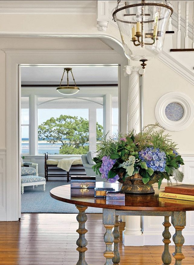
Simply white woodwork via Homebunch
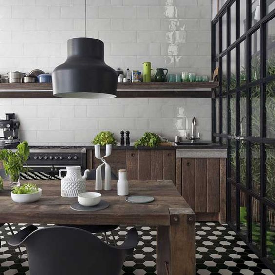
My design assistant Tricia mulled over the appeal and pitfalls of the encaustic patterned tile trend with us.
Encaustic Tiles: Should You Embrace the Trend?
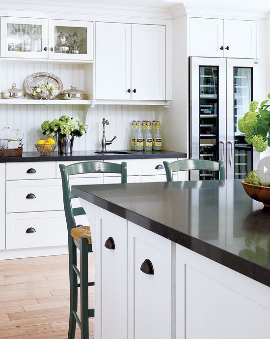
This year my biggest project was for my lovely client Crystal who wanted to overhaul her house that was built in the Tuscan trend and in no way reflected her family’s fun and youthful style. I shared with you the two steal worthy classic white kitchen designs we were considering.
Two Classic White Kitchens To Copy
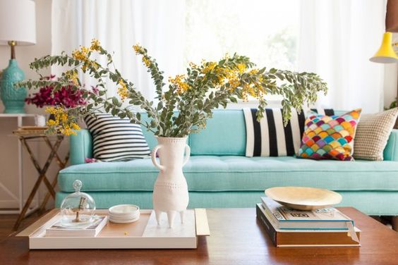
Then, I gave you all permission to buy your next sofa in your favorite colour instead of whatever the current safe neutral (currently gray) is that everyone is buying (you’re welcome).
Why a Colourful Sofa is as Timeless as Subway Tile
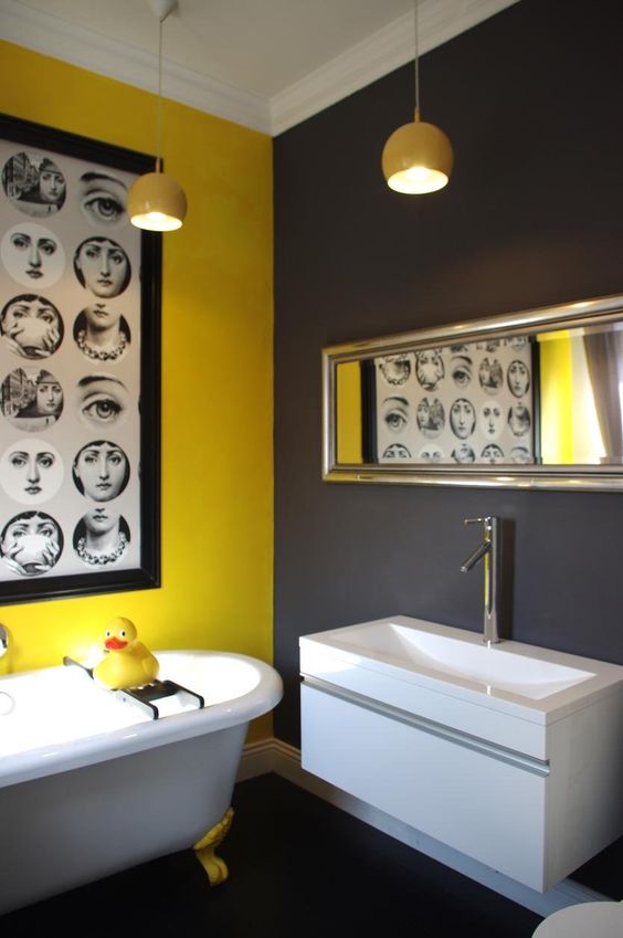
And I couldn’t resist this important design pitfall intervention (really someone had to do it ).
It’s a Charcoal Tile Intervention (Don’t Miss This One)
You all know that ‘How to get the right advice’ is a message I am passionate about. Here’s an essential post for anyone planning a renovation project.
How to Save Money (While Renovating) With a Second Opinion
And I shared how I helped this client sell her house in 24 hours. A little good advice goes a long way!
Sell Your Classic House in 24 Hours Flat
Here she is with her handy husband who did all the renovations himself.
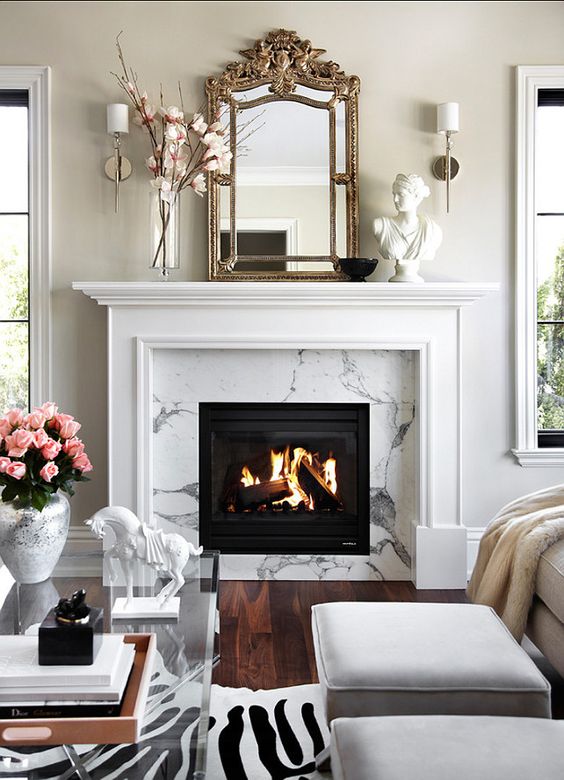
This Ask Maria question really resonated with many of you. How to make sure your fireplace relates well to your new kitchen is a question that comes up a lot in our eDesign consultations.
Ask Maria: Is my Fireplace too Earthy for a White Kitchen?
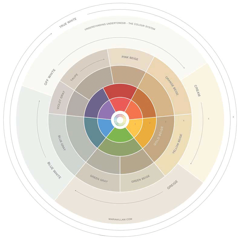
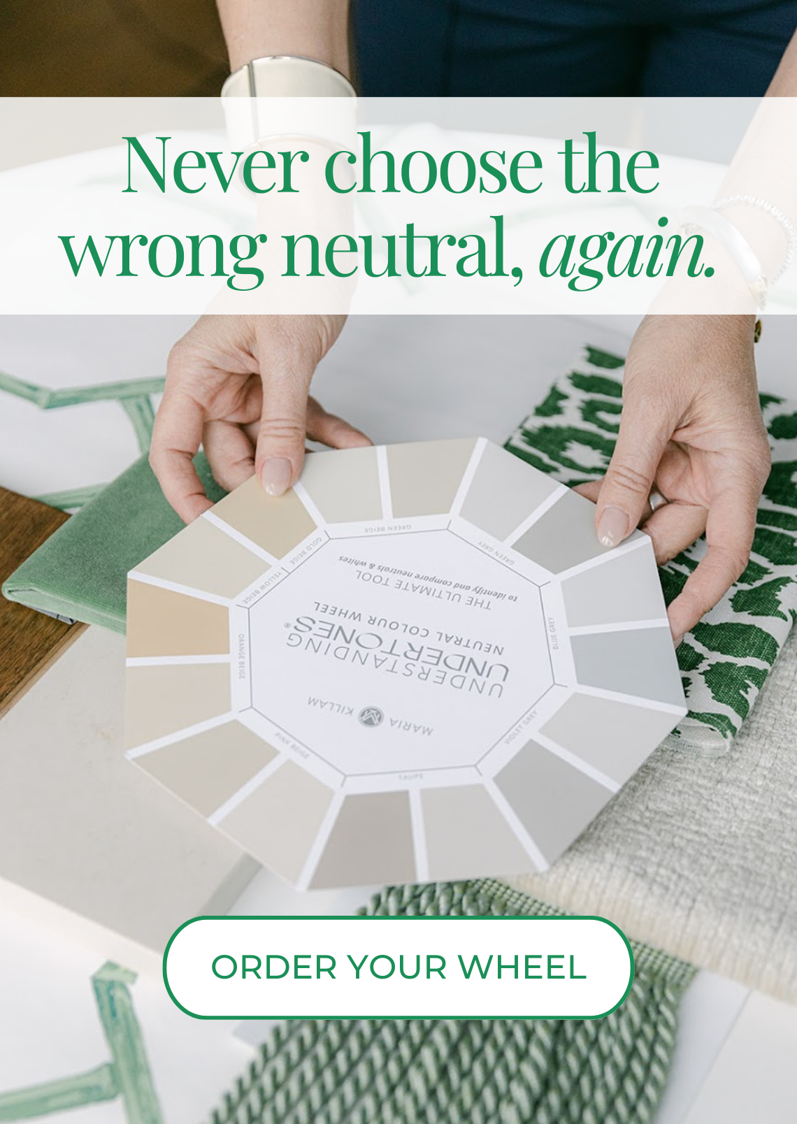
And my new Undertstanding Undertones Colour Wheel was launched this year! We are working to create one that will be available for purchase soon due to popular demand!
Introducing the Understanding Undertones® Colour Wheel
In September, I had a wonderful time in Paris for Maison & Objet and got an exciting preview of the trends that are coming in 2017. I shared some of my favorites here:
Is Black the New Grey? Trends for 2018 from Maison & Objet
White was a hot topic all year. This post unpacked some of the issues involved in working with cream and white in your home.
When to Break the Rules Around Choosing White (or Cream)
And we wrapped up the year with the annual Holiday tour of my house. Here it is again if you missed it a couple weeks ago!
My new website is finally up, hooray! It’s taken an entire year and we are still working out the glitches that are bound to happen with such a big site but I’m really excited that it’s finally here.
I’ll tell you all about it in an upcoming post.
Earlier this year I told you about a juice cleanse I did, where I lost 10 pounds. Well what started that whole thing was seeing the new photos of me I had taken for the new site. In the summer, I flew my creative director and her photographer out for the photo shoot and when I saw them, I scrapped them all and went on the cleanse.
I have not been an easy client and I’ll be the first to admit it. Eight years of curating photos for blog posts makes me extremely picky about how everything looks (including me obviously , haha)
Terreeia knows whenever something new comes into the house or we have to repair anything, the first question I ask is “How does it look?”
Being committed to pretty is not an easy task!
So let me know what you think my lovelies!
Related posts:
Read the last 7 years of best post round-ups here: 2009, 2010, 2011, 2012, 2013, 2014, 2015
Make something Ugly Almost Disappear with Disney’s Go Away Green








Hi Maria,
Love your new website. And you look great!!! Your predictions for last year were right on target. I can’t wait to hear what you have to say about 2017. I hope you and Terreeia had a great time in Palm Desert! Happy New Year to you both!
Hey Maria,
The only issue is that the pop up subscribe button keeps coming up and I have to click back and it takes me to the beginning of the post. However, this is on my phone. I always read your posts on my phone. Looks great! ?
This happens to me too on the computer.
Beautiful! – one request, the old site opened links in new windows, this one opens links in the current window, so we have to decide whether to follow a link now and plan to come back if/when we get around to it, or to go ahead and read the current post then scroll up again & remember which link interested us. You asked, so I’d say “make the links open in a new window” — keeps us readers reading that way.
Love it! Very pretty. : ) Your photos are darling. Can’t wait for your new predictions.
I follow your sister on instagram and I have lost 8 lbs juicing just once per day. The xmas cookies were a great hazard! She rocks. Someday I will take your course, saving for it. Your ebooks have been such a help and I am putting your color boards on my valentine’s list because my hints were missed for xmas and who needs candy?
How about a post on tuxedo painted kitchen cabinets? I haven’t seen you mention it unless I missed it and I am toying with white top and navy bottoms but I don’t make a move until it is Maria approved.
Thank you for your blog! xo
PS Sorry, yes your posts were spot on. Your kitchen in particular was an inspiration and I started to see kelly green everywhere. The fairy lights, that post also was something I have been noticing. I left my white lights up around a few windows and in cold, dark winter it does help!
I absolutely HATE the new font.
The rest of the website looks great, but that new font, with random vowels being bigger than other letter… no, I cannot read that.
It’s making me feel carsick to try to get through the waviness of the font, to the point that I couldn’t manage to finish reading your post all the way to the end, and I couldn’t get through reading the comments either (to see if other people have already complained about the font).
I love your new layout and colors. But if the font doesn’t change sadly I’m unsubscribing.
Hi Ishtar, Please send me a screen shot of what you’re seeing, it might be a browser problem! Thanks so much for letting me know! Maria
I wondered where you had disappeared to, and on searching, your new website opened. A lovely surprise.
I find some of the photos of you a bit washed out, but it is an improvement on earlier photos. I note this is a trend in photography, see Testino and Geddes, so Maria you are in the company of Royals. I also find the green font harder to read. I hasten to add these are my quibbles.
It has been a privelidge to have, through your blog, watch you achieve such success in building your business. The website is the icing on the cake.Best wishes for continuing success,
I noticed that it is very difficult and almost impossible to read the comments on my Samsung Galaxy phone because of the way they are displayed. Every time someone replies to a previous post (like a sub-comment under the first comment), the words get shoved over to the right half of my screen, leaving the left half blank . And then if someone replies to the second sub-comment, with a third sub-comment, most of the words are off my screen to the right. And I can’t scroll over to read them. At this point, 85% of the left side of my screen is blank. I did not have this problem in the old website.
Maria, I’m having the same issue on my Samsung phone. Looked at your site on an iPad, and some of the text is cut off like above the brush photo. Love the color wheel animation. Know this kind of thing takes a lot of work and there are always things to fix, so bravo for getting this up and running!
I also find the green font difficult to read, maybe not enough contrast against the white? Not terrible though. Otherwise, I think it’s great. The pop up only pops up once for me (on my iPad), so it’s not a problem.
Hope you’re having a sunny stay in California!
By the way, was the 10 pound loss long lasting? I always think of those as crash diets.
Thanks for the great advice in 2016…will be using your tenets in 2017 with a new house and a new rental (that’s currently dilapidated).
Susie
Hi Maria,
I love your new site, it is beautiful. I have not experienced any of the above issues, except that it is true that your links don’t open new tabs. (If it is helpful for you to know, I am an Apple user and I typically use Chrome as my server.)
It was fun to be brought down memory lane today with Colour Me Happy’s highlights of 2016. I so appreciate the quality of information you share. As a blogger in hiatus, I know how much heart and time goes into each post.
xo
Maria, love the new look for your blog! Congrats and I know you’re so happy to finally be live with it! I also want to add my vote to make links open in new tabs. I know I’ve found a fabulous new blog when I have like 20 tabs open of different posts I *need* to read, which is what happened with I first found yours. Keep up the great work!!
Beautiful site, Maria! I haven’t dug in and looked around too much as of yet, but on first glance it looks great. Just a quick note, check your date on the San Francisco workshop. On the bar to the right, it shows up as May 24th to 24th. Could just be my computer…
Congrats again!
Maria, Is this the format that you will use from now on? I love the pictures and the subject. It all looks so professional. I think what we all love about you is the fact that you are so down to earth and you feel like oue best friend. Hopefully with the formality of your new website that won’t change! I also love reading other comments so hope that will not change. (you can see that I have a problelm with change) lol.
The only thing on this post that I find hard is to read the green wording. Maybe it is my eyesight. Otherwise I applaud you for all of your hard work and determination to be a leader with recognition. You are already a leader in the sight of all your students! We love you!
Hi Lucy, thanks for your comment about the green, I will have my web guy make it darker.
As for me, I’m still the same! I’m still not a fancy, luxury designer, my mission in life is still to make average homes (just like mine) beautiful and colourful!
I think all the new format websites really elevate the look of anyones brand and I am very happy with the way mine turned out although a little concerned that you think it might change me!! Definitely no!
xoxo
Maria
I like the new look of the site (I liked the old look too, though). This one’s more elegant, the old one was more happy. But I very much miss the “newer post”, “older post” buttons. Or maybe they are somewhere, only I can’t see them.
Ditto! -Brenda-
Hi Maria,
Hope you’re enjoying your winter vacation with your family.
Your new website is perfect. I’m not having any problems. Will you be adding more new pictures of yourself? I kinda miss the one of you sitting on the floor. I always thought that was a cute picture.
Now that you’ve listed all of your top posts, I feel the need to go back & re-read them. That will keep me busy for awhile. Lol. It’s certainly obvious how hard you work.
Just piping in that I’ve not experienced any issues w/ the new website. Font is easy to read and pictures are loading, etc.
.
For those wanting links to open in new tabs (my preference for sure!) if you right click the link, you can then select “open in new tab.”
.
The one thing missing that I’m used to seeing is a silly little thing – the number of comments. When you get to the end of the post, it shows the comments (and they’re lining up for me nicely, but I’m on laptop computer using firefox) but it doesn’t show how many comments. What an odd thing to miss on a website.
Happy 2017 everybody!
Love the new website, dahling! Fabulous…like you! xo
As far as “Christmas ending on 1/1”, please don’t forget that Epiphany (or the 12th day of Christmas) is January 6 and is celebrated the 1st Sunday after that, so, no, for many many hundreds of millions of people Christmas actually isn’t over on 1/1.
And to tease you a little bit, Christams may be over for bloggers and their decorating on 12/25 but some people celebrate Christmas for the religious reasons not just for the decor.
Your new site is wonderful Maria and you did an amazing job on 2016! Your projects were absolutely beautiful. Can’t wait for your prediction for 2017. Happy new year!
The new look is so CLEAN!!! I love it.
In other news, I want the table that’s shown in the first photo!
Hy Maria ,
Don’t Forgot to give up to date