When I saw this Ask Maria question, I immediately thought of Jeffrey Bilhuber’s recent spread in House Beautiful Magazine. The answer to your question today lovely reader, is inspired by my favourite decorator.
Here’s the question:
I recently moved with my husband into our first house! I have been so excited to make it our own, but I have gotten our living room stuck in a rut! I am a sucker for Oriental rugs, and found this one on craigslist for a bargain price. Even though it isn’t perfectly my style, I thought I could make it work because.
Now I’ve found that I am working everything around this rug, and not sure I love the way it is turning out! I feel like it is just lacking anything special, and definitely not sure about the wall color (which is maybe making the room have a weird beachy feel?)! The sofa is an old ikea couch from our last apartment, and I purchased a new slipcover for it so it could have a few more years of life before being replaced. The coffee table and console table are new, and not going anywhere. Please help to give me some direction! Any ideas would be greatly appreciated!
First things first, I love your area rug. Sure it could be a geometric because that might feel more modern but the colours are fresh and pink is the most current colour out there at the moment.
I fell madly in love with Suzanne Kasher’s La Cornue peony coloured range which debuted at the KBIS show last week. I wasn’t there but here it is on Instagram. When pink has made it’s way to a $10,000 range, you know it’s hot.
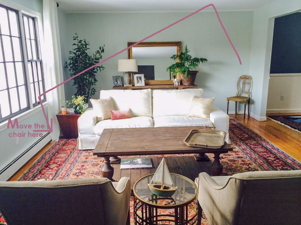
What’s missing in your living room is colour! Big time! That area rug cannot sit quietly in the background while the rest of your decorating remains neutral. If you wanted a neutral room, your area rug should have been seagrass. Your living room does feel beachy right now but when you add the colours from your rug, it will work with the colour you have now. Or you could paint it pink!
Since you bought the rug, I think your instincts are right, so keep going with some colour!
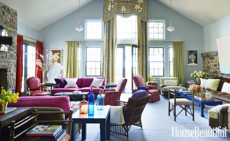
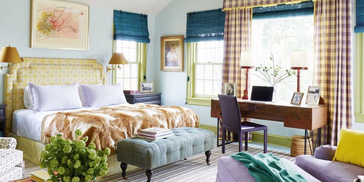
Look how much colour is in this room decorated by Jeffrey Bilhuber (below). You can see that the blue walls are the same colour as the carpet and provide a cool and airy envelope for all the colour.
And see the little corner chair that’s just floating in the middle of the room (below), move your antique chair into the room (above), it looks lonely in the corner.
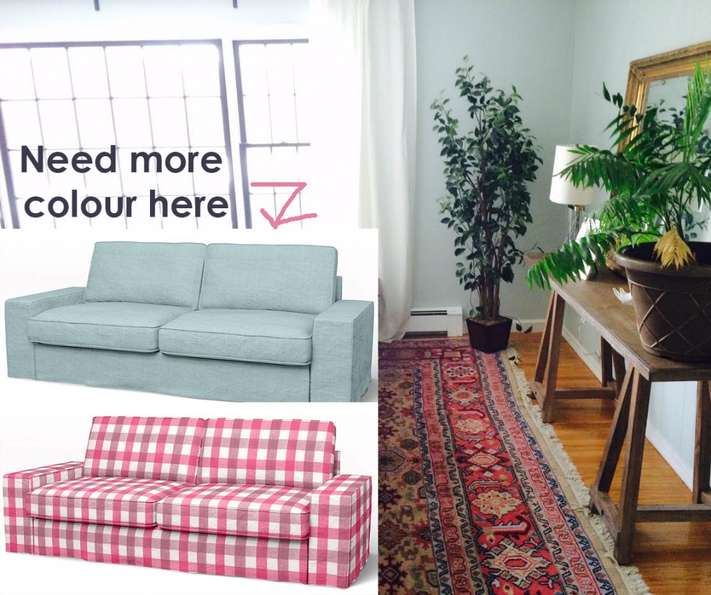
I recommend new slipcovers from Bemz (the company that makes slipcovers for IKEA furniture) that pick up the colour of your rug. Here are two colours by Designers Guild that would work in your living room.
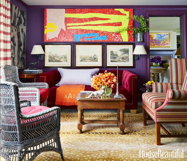
Since the wall behind your sofa is the first thing you see when you walk into the living room, it needs art that is large and colourful (below):
The chairs on the other side of your sofa are too small to work alongside your sofa and coffee table. The easiest way to solve this problem would be to buy a second sofa and slipcover it in the same fabric as the first one.
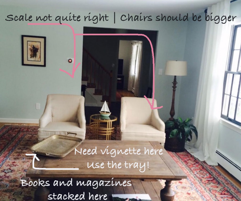
Your coffee table is already sporting a tray that just needs to be stacked with books, candles and flowers. Here’s a few inspiration photos to help:
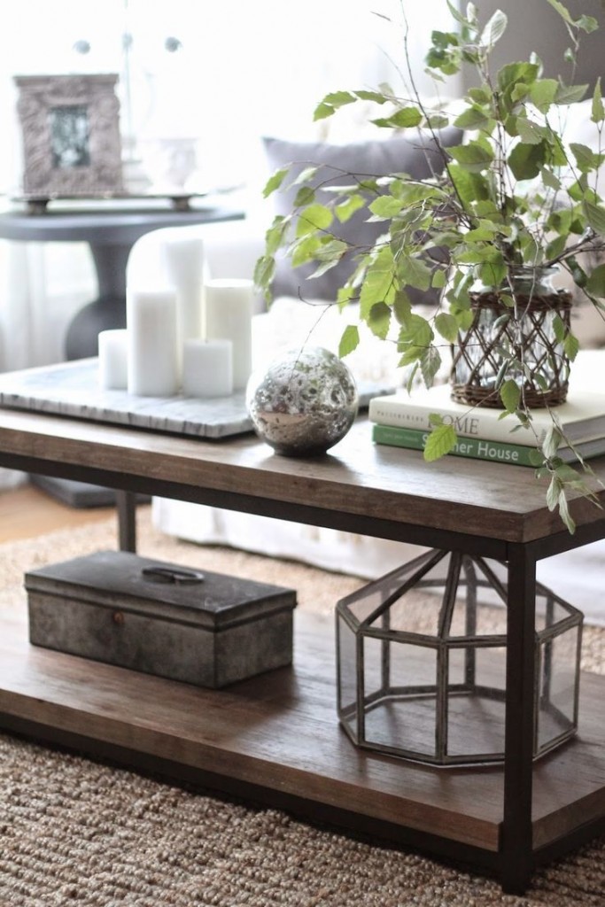
via pinterest
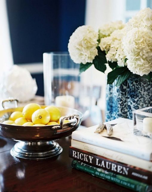
via pinterest
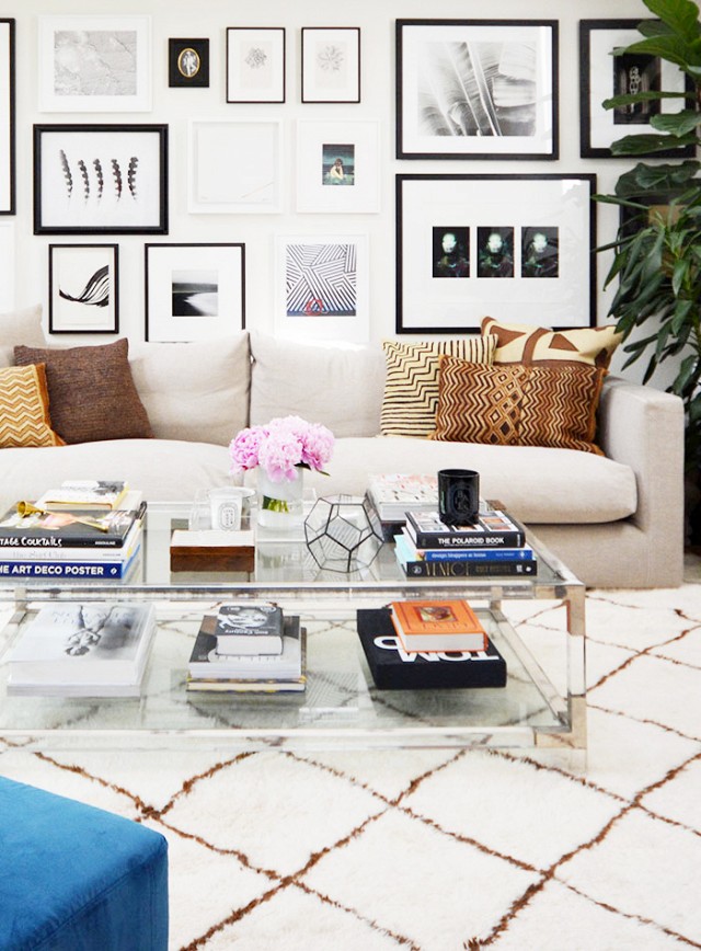
If switching out your slipcovers is really not in your budget then you could introduce some colourful pillows instead (below), but make sure you repeat these colours on the coffee table and with lamps at the back of the room!
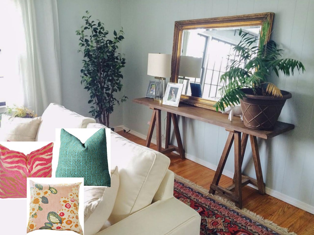
Pink, Green, Patterned pillows
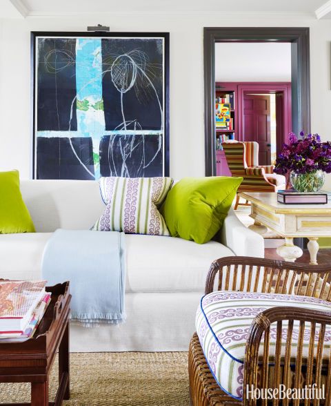
This white sofa provides some relief from all the colour in this house but it’s not far, you can see the purple walls in the adjoining room
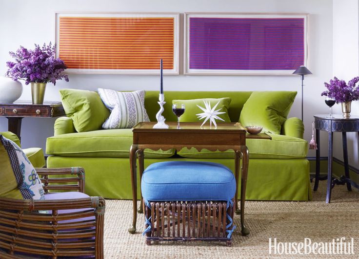
When I first saw this photo, I thought they were two windows with two different coloured blinds in them. It wasn’t until I read the article that I found out that they are paintings by Dan Walsh. This green sofa (above) makes me want to switch out my yellow one I love it so much!
Jeffrey does it again. If you want to see more of his work, I have an entire Pinterest page dedicated to his rooms, see them here. You’ll notice that you can’t tell which trend was hot in Jeffrey’s rooms. Browns and greys are used when appropriate. And that, my lovelies is what makes a space feel timeless.
Notice when you combine colours that you don’t need to worry about the undertone. If you choose a yellow green (like the sofa above) and you want to add a blue to the colour scheme, you don’t need to look for a warmer blue (which would be more turquoise) it’s about combining clean and dirty colours properly.
In my Specify Colour with Confidence™ courses coming up this Spring, I’ll have you working with paint colour chips in 5 exercises so you’ll learn how to get it right. And then I’ll send you home with 2 pages full of colour combinations so that you can practice, practice, practice until you get it right.
One of the biggest mistakes most people make when decorating with colour, and it might be one reason so many people are afraid of colour is because it’s so much easier to be offended by a colour combination gone wrong than if you just chose the wrong neutral.
Here’s what Julie Kay a designer from Grand Rapids said:
“Before Maria’s course my business was very mediocre and what you call the run of mill design consulting. After I took Maria’s class in Chicago it has went from the average “Joe” to “WowZa” in less than 6 months.Whenever I go into a client’s home and show them the no-fail process Maria taught us, they are in awe and very impressed how quickly the correct color can be selected.Not only are they impressed at time of selection they are thrilled after completion of the project. It gives me “Joy” to be able to share Maria’s System with my clients. When I have made them Happy, I am Happy!I can’t say enough about my new found treasures…Maria’s Color Boards along with her personal training and books. Treasures indeed.”
Confidence comes from knowing. There’s no other way to get it.
If you have a room that’s bothering you, send me a photo here. Clean it up to be considered and take it in natural light with no flash (flash kills the ability to see the colour accurately).
Related posts:



Another terrific post. I find I keep saying that, cause you just keep knocking it out of the ball park!
This is very timely also – I am wrestling with pulling together a living room, myself! Am trying to grasp texture and layering, and your post points out some great info on that, as well as color.
Am going to go back and re-read, read again, and absorb.
🙂
Great post, Maria! I took your class in 2014 and loved every minute. I would love to purchase your new exercises and color combinations you now send home with your students. Please let me know!!
HI Mariann, you have all but one (that’s new), email me for details 🙂
Maria, I am wowed by your skills in photoshop!
Gotta learn how to do that!!!!
Great material here.
P.
I’m so glad you posted this! I decorate eclectic because it feels more “artistic” than contrived and really helps me with my decorating budget. I don’t usually associate this as Maria’s style, but this post has really shown me her versatility as a designer! I really love her advice especially the pillow choices! I love the antique rug and it gives her room more distinction and personality.
Maria, hopefully your advice will be taken as the space I am sure will be transformed into one that she will love … ☺. -Brenda-
It is so helpful seeing items you recommend right ‘on’ her photos. I also love the carpet. Good ideas to make the room come to life. Some of the houseplants are also out of proportion. Sometimes setting a tree or planter on a stool or other riser, or even placing it in a taller pot can help. Replacing her glass lamp with something larger and more colorful is an idea I think you mentioned. It’s a great room with many possibilities.
Agreed! Styling can camouflage a lot! Great suggestions thanks Joyce! Maria
Thank you for this post, Maria. As I sit here, cuddled by the fire in the middle of the east coast snowstorm, I was delighted to see a new post from you in my “in box”! It always brightens my day to read your informative posts — you have such a knack for analyzing design- good and bad– and explaining why it works or doesn’t and how to improve,etc!
I have a couple of questions for you– if the original poster can’t afford to replace her arm chairs yet (since she just bought a house after all) could she add visual “weight” to counter balance the sofa by adding colorful pillows, adding another, more substantial end table with a lamp , and maybe some larger artwork on the wall behind, or would that not help at all for what you are talking my about?
I do like the color on the walls with the rug as I have always liked a blue and coral pink color combination– somewhere I read last year this was going to on trend color combination. What do think, Maria?
Yes for sure! Thanks for adding those suggestions Phyllis! Maria
I loved this post Maria. So colourful and fun. I have an almost identical antique rug, similar colours- it is Persian, and nearly 100 years old. You can put anything next to it and it looks amazing! I may take your advice above and pull out the pink which I have never done, and maybe a bit of the blue. It is fun to build a room around one key item. I would love to see any ‘after’ photos from this post.
It’s hard to find something original to say…the previous comments say it all. Your advice rocks! I do hope your reader chooses to implement some, if not all, of the suggestions. And…your tips and photos are a help to me as well! I’ve been giving my living room the side eye quite a bit over the past weeks. It’s definitely time for a freshening up!
Great post! Personally I think that the neutral sofa is fine. I suggest adding deep blue throw pillows to the sofa to give some visual weight and tie in with the navy tones in the rug and adjoining room. I would also try to repeat the color of the chairs in another throw pillow, or perhaps a throw, on the sofa, along with the existing soft pink one. Then I would switch the cream pillows to the chairs to ‘beef them up’, and throw in a smaller one with navy blues, the wall color and pinks, or purchase new ones with a cream background and those colors.
If the chairs were placed at an angle, turning towards each other, they would also use more space and better balance the sofa.
The blue option is also great! Thanks for your helpful suggestions! Maria
I sometimes skip articles from other blogs or websites , but I always click on yours. And each time I come back learning more. I looove your posts. They are packed so full of information !!! And great suggestions !
You rock Maria, Great suggestions & diagrams. Also want to add that if she buys a painting for her back wall it should also relate to the colors in the room to make it more cohesive. Hope she is estatic with all of the suggestions and your help.
When I took my first look at the photo, I thought, “Wow! That’s a pretty room.”
Then I read your post to discover the room belonged to a reader asking for help. First…I didn’t think the room looked beachy. I thought it was fabulous & full of personality. I love the rug so much…I can’t even tell you. All she needs is to take it to the next level with accessories. Pillows, art, & a bigger lamp for the console table. I see a trip to Homegoods in her future.
This room is so good already!
What a lovely rug and indeed room, it isn’t far off being beautiful just a few tweaks! Yes there are some suggestions one can make about scale and proportion however we are missing some vital information in your question. You say the room feels too beachy, but you do not tell us how you want it to feel. The room could go in many directions but until you figure out the mood or atmosphere or style you wish for it to have, it will just be each of us imposing our own tastes upon you 🙂 No?
Love this post because one of my pet peeves is when there is a colorful rug in a room and the rest of the room is completely neutral. It’s like you are supposed to pretend all that color on the floor isn’t happening. I always wonder why the person didn’t go with a neutral rug in the first place.
Hello all.
1. I agree with Maria that more color is totally needed particularly the jewel tones in the rug. The wall color could be the coral, peachy pink or sapphire in the rug. If the room is well lit they Can also be off white like sofa. 2. The next room has indigo walls ( DR?) which I would repeat with pillows on white sofa
3. The rug clearly has a lot of pattern so I would NOT ADD too much additional pattern I think that SOLID velvet pillows in the deep CORAL, the deep blue and PINK would look smashing against the white sofa and gray chairs.
4. I would just remove the tiny side chair. Then to SAVE MONEY you could put an upholstered bench under the Windows rather than an expensive sofa or love seat.
5. To bring the white DRAPES into the mix I would totally add a jewel toned BAND on the inside and bottom edges.
6. Agree w Maria, create a gallery wall behind sofa using the mirror with colorful art. Also on opposite wall the one small framed art looks lonely by itself
7. Finally buy a floor lamp for the back right corner to balance the height of the plant and add LIGHT to the room.
Sorry comment so long but I felt inspired….hope these are good ideas!!
I just have to post a comment about Bilhubers rooms. I just have to say that His COLOR SCHEMES confuse me. There’s just way too much going on for my taste. They certainly BREAK ANY COLOR RULE to limit the number of colors from 2-4! He uses between 5-7 colors in each of these spaces!!
First Room: he uses pale and medium Violet, yellow, light blue, indigo, green window casements and a turquoise throw
Second room: there’s light blue, pink Violet, red ( bad w pink Violet IMHO), cobalt blue, a purple chair. Worse yet did anybody notice that the DRAPES on one wall are orangey RED, while those on the big wall are CITRON GREEN! Seriously?
Third room: there’s plum, orange, yellow, bluish red, medium blue. Then he uses golden brown and pale bluish gray as neutrals.
Whoa, sorry, I just don’t get it. It looks like a crayon box threw up all over the room.
Maria, one last observation: your design ethsetic seems so completely different than Bilhubers. You seem to use ALOT OF NEUTRALS to counter balance saturated and clean colors. I would think that Tobi Fairley, Eileen Boyd, Sarah Richardson or Stephen Gambrel would be more up your ally.
Hi Betsy,
I agree that he uses more colour than I would but I think it works for his style and I appreciate how he does it. What I really love about Jeffrey’s work is the way he styles a room. I have styled many of my rooms by studying his books.
Thanks for your comments Betsy!! xo Maria
I love reading all the comments. Design is so subjective & personal. Some folks like a lot of color or pattern & some don’t. And that’s okay.
At the end of the day…it’s your home. Do what YOU like. And if it’s not turning out how you thought it would, then contact Maria.
Maria, I love your ideas for this room! Her rug is gorgeous and the wall color is perfect! She just needs a few more pieces and it will be magnificent! I love these posts, they’re so helpful.
Maria, I wonder if your Ask Maria questioner has come down off Cloud 9 yet. She must be ecstatic with the wonderful and easily doable advice you’ve given her and, as usual, it’s a teachable moment for the rest of us who get to learn from the post and even participate in the “class” with our own suggestions to which you give feedback. Win-win again.
Jeffrey uses way too many colors for me but I love his exuberance and abandon when he does it. A yellow green couch was in my plans once I rehomed my pale yellow queen sleeper sofa that was too wide, too deep and too low and only sat on by humans once since I moved and by three white cats the rest of the time. Got the opportunity sooner than expected and was amazed at how my narrow LR opened up without a couch so nixed another one. Thinking outside the box led me to move an antique oak 6′ drop-leaf table I’d bought for a song (to use in a laundry room project – LOL – which wasn’t working out) to the couch wall and, with repositioning of two low fat club chairs near my 8′ wide window, the eye is drawn immediately from the front door across the room to the always lush grapefruit tree and the greenbelt beyond it. HOWEVER, the resin Adirondack chair I’m using for a place marker reading chair at the entrance to the LR looks quite cool with one of my plush yellow green kitty throws, so I think there’s going to be a prominent green place to sit in my LR after all.
Thanks always for the lessons and the inspiration.
Sandy C and Maria, I’m wondering who this mysterious “Ask Maria” poster is since I haven’t seen any comments by her in this thread. Hope she’s reading all these great ideas. Once she executes some of these elements I would love to see an AFTER PHOTO! Re: Bilhuber, I will study his styling Maria. But I still don’t get using two contrasting colors on drapery in the same room. I have never seen that! Haha
I’ve seen it-using the two contrasting colors on drapery in the same room. Actually I’ve seen it twice(if not to count this month’s House Beautiful))
The first one was pictured in one of the books of Susanna Salk-oh how gorgeous these drapes looked! I still remember the picture so vividly..strong pink and lemon-yellow, I think. I fell in love. Of course the windows themselves were grand and magnificent, which helped..
The second time was in a much more modest rental townhouse of one of my friends. She’s in creative profession (fashion), and she’s really fearless, very much into color, and doesn’t give a damn. So the strangest things she mixes just work somehow..
I love these series, looking forward to posts like this one.
FYI: my reason for such excessive posting: the northeast coastal giant snowstorm. Cabin fever in New York. LOL
Hi everybody,
I am the mysterious poster whose living room you have been discussing! Thank you all so much for your ideas- I am in the process of coming up with a plan to give my room a little bit more pizzaz! I promise I will send in update pictures once I have made some changes
-Amanda
I’m so thrilled to finally see COLOR in rooms again! It seemed for so long that everything was neutral – I had to stop looking at Architectural Digest for awhile there because everything was so neutral and sterile. Thankfully AD has warmed up the last few years. Neutral done right can be really pretty, but if done as a way to avoid color can be boring.
The first large colorful room,looks like a furniture store. That’s the problem with overly large rooms.
LOVE the carpet, so cheerful and interesting.
Love all the color! Bye bye shades of gray (don’t come back)