One of my readers recently asked if I ever come to Victoria as she wanted to hire me to evaluate whether her newly installed kitchen cabinets needed to be re-sprayed (an expensive proposition) because she was convinced the wrong white had been chosen.
So this weekend in between helping my mom with her house, I was able to make a house call while I was here!
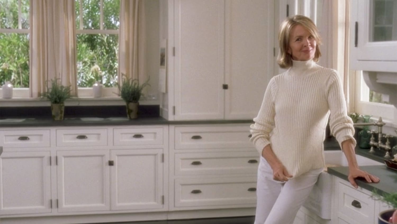
The style of her kitchen was very much like the most copied kitchen of all time from Something’s Gotta Give.
The countertops are fabulous [Antiqued Cambrian Granite] and the floor is marmoleum. Currently the colour of the cabinets are Benjamin Moore’s Mascarpone from their new Affinity line.
When the cabinets were delivered the night before the installation and she saw them piled up in the dining room, she immediately noticed that they seemed to have a green undertone. At that point she would have sent them back to be re-painted but the next morning the cabinet company and the designer assured her that she was ‘guaranteed’ to love them once they were installed.
The designer went on to say that every white has an undertone and this one was no different. However the paint colour was simply not matched correctly (Cabinet manufacturers don’t use Benjamin Moore paint to spray cabinets).
Kitchen photos by Maria Killam
Whites are perceived as tricky because Benjamin Moore alone (in the Cdn deck) has 140 different whites. However there are a select few whites that don’t have an undertone (that can be perceived), and the undertones of white, creams and beige must be compared to others before you can be satisfied that the you have the right one.
The casings are all Cloud White, so you can see the difference (between the drawers) in the shading of the 2 whites although I’m sure the green undertone is lost in the photo.
When she asked what I thought of her floor I said that it had a blue undertone, and I liked that it relates to the countertop and the wall colour [BM Piedmont Grey].

Image source
The kitchen from Something’s Gotta Give (above) also had a dark floor although it was espresso brown.
When I pointed out that the marmoleum had a blue undertone she said “Thank you! Everyone around me (the cabinet company, the designer) kept saying, the cabinets are green because of the wall colour and the floor is gray not blue”. (If you’ve been reading this blog you already know that all grays have an undertone).

Here’s the farmhouse sink from the movie, just like my client’s (below).
I don’t know if you can see the green undertone in this image (compared to the sink) but I thought I’d include it just in case! I love the leaded glass in the upper cabinets (below).
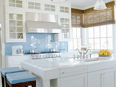
The next step in finishing this kitchen will be choosing the backsplash tile, as well as window coverings. She asked if woven woods (like in this kitchen below) would work and I agreed and suggested a 5 x 8 bound sisal rug in the same tones as the blind to add some warmth.
So what was my advice?
In my experience, there are two kinds of clients.
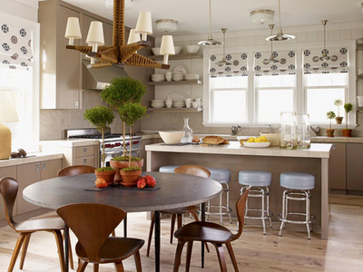
One who is highly affected by colour and especially the varying undertones and how they relate to each other (many of you read this blog and send me emails) and the second client who could read this post, add some pots filled with rosemary, a topiary (below), some artwork, window coverings and an area rug and not notice it again.
Image source
I am most like the former (obviously it’s what I do) and after the first 10 minutes of discussion I concluded that my client is just like me.
She will not be happy with her (brand new) kitchen until it’s the right colour, which in this case is Cloud White as that is already the trim colour. As I outlined in my post 5 steps to a kitchen you will love, in general, white goes with black and cream looks the best with brown.
Colour creates a feeling and when it’s good it’s very, very good and when it’s not exactly right, (for some of us) it can take the joy right out of a brand new kitchen!
Need help choosing the right white? My White is Complicated: A Decorators Guide to Choosing the Right White eBook will help you get your whites right for your cabinets, trim, ceilings, and walls. This eBook also includes my Bonus book of Whites which will take the guesswork out of your decisions.
You’ll need them both if you have an entire house of whites and neutrals/colours to choose, get them here.
We would love to help you choose colours, select the right combination of hard finishes or create a plan to pull your room together. You can find our fabulous email consultation packages here.
If you would like to transform the way you see colour, become a True Colour Expert.
Related posts:
5 Steps to a Kitchen you will Love
What Everyone should know About Gray
10 Ways to save money now by Creating a Focal Point
If you are new to this blog, click here to see the Best of Colour Me Happy
While you’re here, subscribe to this feed so you don’t miss out!


Very insightful point, that if something is troubling you heavily right after it's been installed, it's likely to go on being an eyesore and an annoyance every time you're in the room.
I really hope your client is delighted with the final look of her lovely new kitchen.
Oh I hope she finds her happy kitchen!
I must be odd….I don't need matchy matchy, or even close, when it comes to cabinets…
Beautiful. All.
Does this mean she is re painting her brand new cabinets? Yikes! I have to add: I may not be the perfectionist that you are but let me tell you if my expensive new cabinets arrived and they weren't the perfect colour . . somebody'd get hurt . . .
Uhm….why not repaint the Cloud White???? Wouldn't that be an easier/cheaper fix?
Just looking at the pictures, I think it's very pretty. What color did you recommend she use?
Gorgeous kitchen. How lucky she is to have you stop by! Great post and love to hear your point of view!
Ruthie
Dear Anonymous & Elizabeth,
Cloud White is the answer (because her trim is already that colour) but she wants it lacquered not simply brushed and THAT is the expensive piece.
Maria
What a timely post! And a big THANK YOU for identiyfing the movie connection.
My kitchen is white with white with black stone floor and a unusual benchtop. Its been annoying us for the past 3yrs since we moved in without knowing why since its finished to highest standard finish in everything. I can see that the floor doesnt work with a coffee carpet & the benchtop is out of sync.
Now to review your other post, view the movie set & figure out how I can fix my kitchen without a major overhaul if I can help it.
Away I go. BTW if you're in Sydney Australia next week maybe you drop by and we can discuss it?
Sigh, I totally sympathize with your client. In our new house the painters got the white (wall colour) wrong, and it drives me crazy! Honestly whenever I walk into the room it jumps out at me that something is not right/off! Though I have a few friends who think I am slightly neurotic 🙂 over my whites! It truly is amazing how some people are very colour sensitive and those tiny subtleties jump out at them (for the good or the bad), whereas other people cannot detect them. In any case, glad your client found a designer who got what she was seeing and feeling and could help her get the kitchen she was after!
Karla Amadatsu
Kerrisdale Design
blog.kerrisdaledesign.com
Great tutorial.
White! White is a complicated colour indeed (like all actually). There is only one white, or maybe two, I don't like: white hospital and white fridge . As the name suggests, they're too cold.
Cloud white is very nice. It melts really well with other surroundings.
I haven't forgotten to send you the colour reference regarding your previous blog post (coconut colour). I'm trying to get you a colour sample and send it you to Canada… lets see if i can.
I definitely learned this lesson the hard way (client's kitchen cabinets' paint color just didn't look quite right with the trim color). If only I would have known you back then!
I just heard a talk by Kathryn Ireland. She has a professional color expert select the colors she uses in her projects. Money well spent!
xo
Brooke
So glad you were able to come to her rescue. Her kitchen is gorgeous and she will be happy as a lark when she makes the color correction. If you are ever in Atlanta…
Thank you Maria for your kind comment on my blog. I always appreciate you stopping by. I was just reading this post (via subscription) on white. I agree on the green undertone situation. Was wondering if all those pine trees out the window were also casting some green on the cabinets. I tried using the exact wall colors from my kitchen in Az. (with all the same lighting and surfaces) on my walls here in Ky. It looked very different all because of the greenery here vs. desert neutrals coming in through the windows in Az. Didn't someone say "it's all in the lighting."
xo Lisa
Man, do I feel bad for that lady! Her "designer" should pick up the tab for the re-paint for telling her she would love the cabinets once they were installed! I am like you, I would not be happy until it was right..but your suggestion with the pots of herbs, window and floor coverings was a great solution…
Can you please tell me what marmoleum is? I have never heard of that product..it is prevelant where you are? I work for several builders and have not seen marmoleum in the selections rooms…
Happy Monday!
Maria,
I can feel her pain..and I can see that the cabs are just not the right White. Your Photos do show that they are just off, and I'm sure in person, even more. What a big mistake her designer made on a very major part of the budget.
Great post Maria!
Side Note: Why was the cloud white not used in the first place?
Joy
Excellent point about "white with black" vs "cream with brown", Maria. I have a "white" kitchen that's actually very buttery because the floors are a golden brown wood and the countertops are beige/grey speckles with a yellow undertone. Nine years later, I still LOVE the color of my cabinets. A friend who saw our remodelled kitchen early on decided to paint her kitchen white too but chose a very stark, bright white (she had white tile countertops and a creamy linoleum floor and golden brown wood furniture in the same room). Every time I visited her, the kitchen bothered me but I never said anything because she was happy. She did mention often that she thought her kitchen looked "cheap" as in poor quality construction. I think a better paint color would have taken care of that.
This reminds me a little bit when we were painting our first house, I had two colorist come to our house because I just didnt; feel comfortable with the selections from the first. Your gut is usually correct. Lovely kitchen though.
What a great post. I hope your client gets everything sorted to her satisfaction.
I feel silly asking but what is the difference between laquered & brushed on painted cabinets?
I love reading your posts because I always learn something. I appreciate all your great information.
Thank you, thank you!
I agree with you and a wrong color or undertone will spoil my joy to have a new kitchen. Too bad she did not have you as a designer from the beginning!
Maria,
Great example of what can happen at the end of a job. The circumstances have to be the same when selecting, placing and installing these materials together.
You can't have it the same because different seasons, time of day and even tempertature influence the outcome. It's all
good and that's what so fun about helping people learn and enjoy great design and personal satisfaction.
Great job Maria
Bette
great informative post! thanks!
When you stop by my house ( also on the island) you will just be coming for coffee, since my cabinets are not painted. I always have very strong feelings about colour combinations and have a good colour memory. Quite often, as is the case with my small foyer, I am not happy with a colour which everyone else says is fine. Speaking of colour-I hate the new grey and yellow trend. I think charcoal and orange are better but still not my favourite. To me grey+yellow = enormous yuck. What do you think?
Isn't that just gut wrenching to have to redo the color, but to look at it every day and know that you spent $$$$ for a color that you're not happy with would be so frustrating!!!! It is a BEAUTIFUL kitchen though!!!
Dear Fiendess, I can't say yellow and gray are bad because that involves one of my favourite colours, plus there are so many different grays that would make that combo look fab!
Those of you that commenting re: the green trees adding green to the colour– as I didn't have the Affinity deck with me I couldn't check if that was the case and it very well could be. Or the cabinet co. might have tinted it wrong as I did hold up other whites and saw the green in comparison.
I'll keep you posted!
Maria
although it is hard to see the little undertone distinctions between the whites on the photos (and everyone has a different computer screen calibration on top of that), as a designer i do know what it’s like when the colour is even a hair off from what it was intended to be! enough to drive any perfectionist crazy! ~ those kitchens are beautiful btw.
What a gorgeous kitchen. I hope the homeowner gets them re-lacquered in the right colour – at no charge.
I had to do a search to find out what marmoleum is – what a great product.
For the rest of us here that will, at some point in our life, get a new kitchen, how do we interview a colourist to ensure we get one like you Maria? Having you fly across the country for a colour consultation isn't always an option. 🙂
Mary & Marlo,
So sorry I should have said 'sprayed' not 'lacquered', which suggests she wants them in high gloss–NOT.
My mistake!
Maria
Definitely, tell the designer that you are sensitive to color, and it needs to be redone. Paint companies are not always exact in their measurements when they mix the paint, and in white, a small error can cause a bad result. while repainting may seem like a large undertaking right now, you will be so glad later.
I had my designer reorder carpet because the carpet that was delivered to my home did not match the sample. I am very sensitive to color, and the carpet was supposed to have a gold cast, not a taupe cast. A professional will handle it in stride. My designer donated the rejected carpet to charity.
So, if your designer balks, tell her—at least it's not a houseful of carpet!
My first job as a colorist I ad to match findings for intimate apparel and you can imagine how many shades of white needed to be compatible to get to the final undergarment. Here's to a happy compatible ending, I feel for her! Still it looks to be a wonderful kitchen. I love the floors.
pve
I'm just the same way – if something is off, I'll focus on it nonstop, even if the regular person doesn't notice. It will drive me crazy until I fix it!
Do you think that the BM paint color changed slightly when it was made into the lacquer for the cabinets (rather than, say, a flat latex used for the walls)?
Oh how right you are! Color does affect us–even subliminally.
Oh I hate that for her. I am the same way, it would drive me crazy!
Maria,
On a totally different topic, I just wanted to thank you for inspiring me to go ahead and try to put together a blog. I love yours so much that I hope I can do 15% as well as you have done! Since it is a "blog in progress", I knew that you would never find it to see that I have thanked you publicly on there. Your blog on the "10 Things To Remember When Creating a Blog" was certainly very helpful to me as I am nowhere near a computer genius.
Thanks, again!
jantankerousNOT.blogspot.com
Maria,
I just wanted to take a minute to thank you for your blog. I've been coming in and reading from time to time since Gloria posted your blog on her site. Now we're in the process of picking colours for our rooms and it made me realize how important someone like you really is in the process! It's nice to know you will occasionally come to Victoria, as that's where I am and now that I've tried once on my own I will certainly be hiring someone for the "real thing" (when it's my own house and not just a rental I'm painting, that is).
Thank you for the kitchen posts too. I am considering painting my kitchen cabinets. I think my kitchen is a bit of a lost cause though. Ugly flooring, cream melamine cabinets with oak trim, and wood countertops. But I might just pick a white and paint all the cabinets and trim white. Haven't decided yet. I think I must be in the second group you described that doesn't really notice subtle colour differences though. It only occurred to me after I was finished painting my dining room/hall that it might clash with our laminate flooring, but even if it does I don't really notice.
Anyway, I don't comment much as I have a toddler and often read blogs on our iPod which is hard to comment from, but since I'm in the midst of all this now and using your blog a lot for reference, I thought I'd come by and say thank you for the great blog. =)
Update on the question whether the green trees were causing the cream to go green. My client has advised me that the paint was indeed not an exact match to "marscapone" which is where the green comes from (not the trees)!
The cabinet company initially told her that it wouldn't be an exact match but obviously when working with 'whites' this is totally unacceptable.
A lesson for anyone building a white kitchen!!
How lucky was she that you were able to stop by and give her your honest opinion. 🙂 But, WOW, what a drag to go through that much trouble to fix something that wasn't done right in the 1st place. I have to say, gorgeous kitchen, LOVE the counter tops and floor.
They said it might not be an exact match? Is that for every color in white for all cabinets? Or is it a if they don't use BM products doesn't match kind of thing? Dye lots in the industry can be very tricky, but paint??? If it's mixed right shouldn't it be right (realizing that the type of finish does change the look)?
As always, you are brilliant my dear. Keep up the great work. xo
Hi Maria!
Let me tell you, if that were happened I would be crazy!!! With nervous ticks and the whole shabang!!!
As you know I recently changed my kichen counter top and backsplash, and my plans are to replace the cabinets, and my idea was to make the maple. But since the it thing would be make the white I'm not sure what to do because my granite is giallo Vicenza. I rather make them maple as I previously told you or the lightest cream available in the materials used here in Ecuador. And advise on that?
By the way I was planning put turqoise lamp and re uppolstering the chairs in the same colour!
As always congrats on your fabouls blog!!!
very insightful and lovely collection of photos
I am currently having my cabinets sprayed this color so I hope they come out okay.
Do you happen to know where she got her glass knobs from?
Hi Liz,
I'm sorry I don't know where she got them from.
Hi Diana,
I would go with Ivory white with that granite.
Maria
Hi Maria, I love your style and taste. Why do so many great designers live in Canada (is it the water 🙂 🙂
Anyways, I found this sight while researching white kitchens and hoping you may have a minute to give your recommendations. I am going to put in new granite counter tops in my kitchen. The cabinets are white so I plan on keeping them and my floors are a lighter wood. I want to keep it really light and neutral (my kitchen opens into my family room. I don't want any browns (most of my furniture is dark brown) Unfortunately I don't get much natural light. I seem to be gravitating toward the gray family. And I really like the glass subway tile for the backsplash (a very light gray with a possible blue undertone) I guess my ? is what color granite and BS would you recommend that is in that family and would look good with my cabinets and floors.
Thanks in advance for your help and amazing gift for decor 🙂 🙂
Heather
Hi Heather,
I don't know the names of granite off the top of my head but I prefer the look of caesarstone or silestone (less blotchy). If you are gravitating toward gray why don't you go with a gray/charcoal countertop. then that would work with your glass subway tile backsplash). I like subway tile, keep it simple, otherwise it'll date first.
Maria
I love the marmoleum floor. Would that color be the #5710 Diamond?
Gina
Lovely, lovely kitchen. Looks nice without a blacksplash.