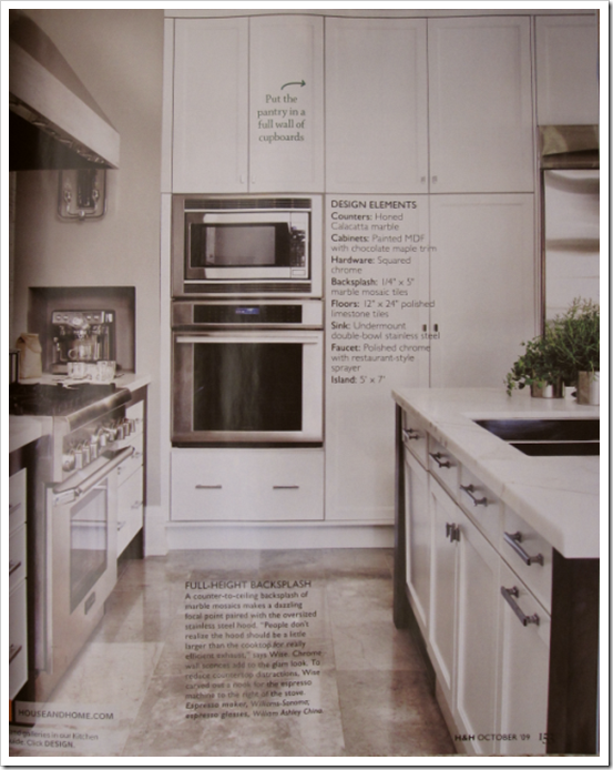
I just received my latest House & Home Magazine which featured white kitchens and I just loved this one, so I had to show it to you! And I’m joining the party at Hooked on Houses this Friday as well!

You all know how I feel about accent tiles, I think if you’re going to use a mosaic tile (for example) you should ‘go big or go home’ like they’ve done here. And of course eliminating the upper cabinets also gives a kitchen such a fabulous, clean, chic look!
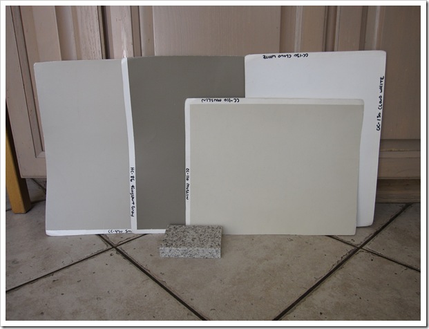
I was at a consultation this week to choose colours for a kitchen in Richmond. My client was renovating the entire kitchen (to get rid of the pink oak) but keeping the 12 x 12 tile because there was so much of it in the room, it carried into the great room and large adjoining sunroom/dining room.
So after going through about 20 granite samples that she had carried home, we ended up with a Caesarstone that picked up the same tones in the floor. In my opinion, selecting kitchen finishes is just like any other decorating project, it looks the best when all the finishes relate to one another, like they are married (because they are!) just like the kitchen I’ve just featured here.
Then we chose BM cc-110 for the cabinets (see how nice it looks with the floor?), HC-86 for the island, cc-130 Cloud white was her existing trim (including a large expanse of shutters, so it was staying) and CC-490 Smoky Taupe for the walls.
Varying shades of grays are certainly coming up in many of my consultations these days. Is gray the new brown or what do you think?
Related Posts:
White Kitchen Cabinets
The Best Trim Colours—NOT Cloud White
Selecting your Kitchen or Bath Backsplash—Accent Tile or NOT
5 Questions to consider when selecting a new colour for your Kitchen










I have pink oak cabinets…lucky me. I want to paint them white to hold me over until we can renovate. But I'm concerned about picking a white paint that will work with my white subway tile backsplash. Should I have the paint store color-match a white tile?
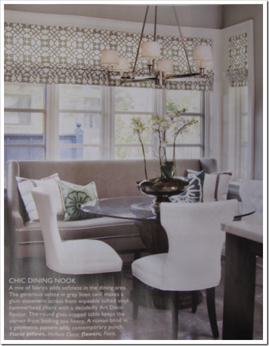
The breakfast nook is fab! I love that couch in there!
We have white with white appliances, dark gray laminate tops. Oak floor. I'm always looking for the decline of stainless. Not having stainless makes me feel so out of style.
Oooh, love your blog! So colorful! After agonizing over paint colors, I fell in love with a spread in HB about neutrals and grays. So yes, I think that grays are the new neutral. I used Alexandria Beige for my living room and will use a lighter shade for the kitchen. Looking at Bennington Gray, but will consider Smoky Taupe too.
Love that dining nook and I'm sooo jealous of a whole wall of pantry storage!
I think grey is the new cottage white. Look at how popular Swedish and Belgian furniture and design have become. Makes sense that it would follow into the kitchen. Your choices for your consult client look like they'll work perfectly. (of course!)
I LOVE grey. Every room in our house that I've painted over the last few years, I've painted a shade of grey.
The white kitchen is really nice. I love kitchen walls that are tiled all the way up to the ceiling. I'd love to do that in our kitchen when we install the new backsplash, but it won't work because of the upper cabinets.
Your client's pinky oak cabinets look exactly the same as our kitchen cabinets. Ick 🙁 They'll look much better once they're painted!!
Kelly
Hi Mary,
If you take some basic whites, cloud white, mountain peak white and ivory white (or the equivalent in another paint deck) and paint them up on 11 x 17 samples and then take your subway tile and hold it up against the white, it will be obvious what your cabinet colour should be!
Maria
LOVE this kitchen. That tile behind the stove is incredible. I agree…go big or go home!!
I love all the shades of grey – maybe they are the new brown, but whatever… I think they are gorgeous. xv
Beautiful kitchen! I would normally resist the idea of any shade of gray in the cabinet, as it is so 'in' now that it feels somewhat trendy, but I like your thought that there is a wide range of tones that can be considered in the 'white' range, so a light gray kitchen is really a type of a white kitchen (which I love).
Maria,
I love that kitchen corner with the combination of the bench and the chairs!
Here in Belgium , we do that a lot!
And yes I do have admit that also in Belgium you see the white-gray tones coming in! A few years ago everyone used the brown, cappucino colours from Flamant or Farrow & Ball!
Greet
That island is sexy ! In the south we called those cabinets "pickled" I bet she is thrilled to be getting those painted.
there's something very nice about this kitchen: it's not quite contemporary nor classic. the design, colour and materials make a very interesting combination. i like it very much.
I also love a white kitchen…I prefer contemporary kitchen with clean lines and strong materials. This one reads modern, luxurious with great style
Lovely. I'm in love with the breakfast nook! Those window treatments amazing! Does it say how makes it? I kinda looks like something Windsor Smith would have in her fabric line. Let me know if it says!
Oh Beautiful! I am gearing up for a Kitchen remodel, I bought marble subway tiles that will be installed from counter to ceiling. Cabinets will be Aesthetic White from SW, we've done all the trim/built-ins in this and I love the way it changes from grey to taupe throughout the day-it is never dull or boring very rich and not yellow or blue.
This style will last. I painted my son's room grey and a hall bath dark flat grey to warm up the white everything else: looks luxurious. Great post.
Tara
I fantasise about painting my oak cabinets daily. The pink trim around my windows and the pink kitchen door makes me crazy. My pink countertops are giving me hives. Don't get me started on my floor. I will lock myself in my kitchen one day and just start painting everything white.
gray is certainly showing up more and more these days, i'm discovering, too. I did a gray kitchen about a year ago, and it has a very sophisticated vibe. it will be interesting to see if this trend dates itself or keeps that "classic" look.
i love seeing what other designers bring to consultations. I lug my architectural color chip box, order larger chips for them, and then advise the clients to buy 4 oz pots of selected colors for boards. but it sure would be nice to have them on-site. did you have all those boards pre-painted, or was this a second visit?
gray all the way! I kinda think of gray as the new beige.
anyway I especially love it in the eating nook.
Hi Rachel,
I have 50 – 75 painted samples and I carry about 40 with me at any given time (depending on what colours people seem to be looking for) for example, I can't remember the last time I specified a rich butterscotch colour like Richmond Gold or a strong yellow like Roasted Sesame (7 years ago–before brown became so popular– it was constant).
It is virtually impossible to choose colour (in my opinion) accurately, any other way.
I highly recommend starting your own collection!
Maria
Oh my gosh – I love love love the breakfast nook. That settee is fabulous. I hope you have a great weekend!
Yeah, want to eat breakafast there too!
Just got that issue, have not had time to crack it open yet…looking forward to seeing that kitchen, love the backsplash behind the stove…
Regards, Carol Ann
Love the new greys; however was 'grey' not popular a number of years ago? -Brenda-
great suggestion, Maria. its funny how regional tastes vary. at least when i was living back east, i got requests for Richmond Gold-esque colors quite often. You're so right, selecting colors in tiny little chips is virtually impossible. I find the 4×6 chips are better, but certainly, the bigger sheets are the way to go.