Every year, I go to High Point Market, the furnishing-industry-only tradeshow that showcases and forecasts upcoming trends in home decor. It’s one of my favourite shows to visit because it means I can tell you all about what’s coming to a decor store near you, and then hear from you about whether you’re going to put it in your own home.
I was part of a trends panel for attendees at this one, and one of the other panelists, Cindy Hodnett with Furniture Today, said that right now, “everything goes.” She was referring specifically to colour, but it seems true overall when you look at the home decor trends for 2016. Let’s start with this chair that might be a living creature, shall we? It’s not for everyone but it was the trendiest item I saw that screamed…
TEXTURE IS IN!
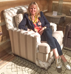
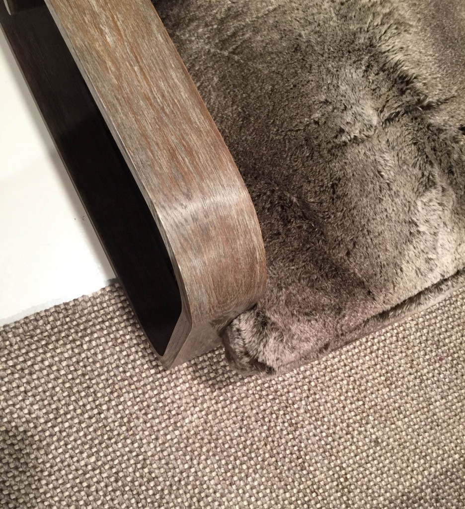
Clearly, texture was really big this market, including lots of faux fur. I kept running my hand against the furniture. What do you think of the chairs above and below: cozy and comfortable to relax in, or vacuuming nightmare? At the very least, it coordinates well with the natural fibre rug:
FLORAL IS BACK!
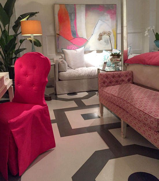
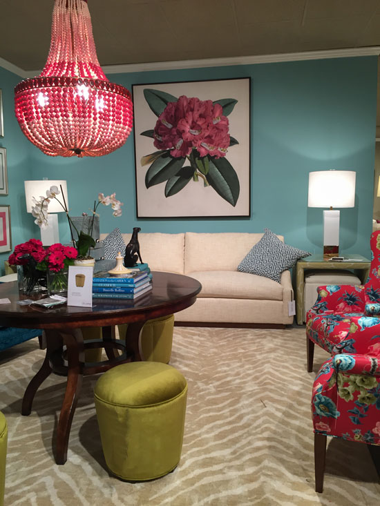
Gorgeous colour at C.R. Laine, below. I love the gold beige zebra patterned rug, which always works with hot pink. And see the florals on the chair?
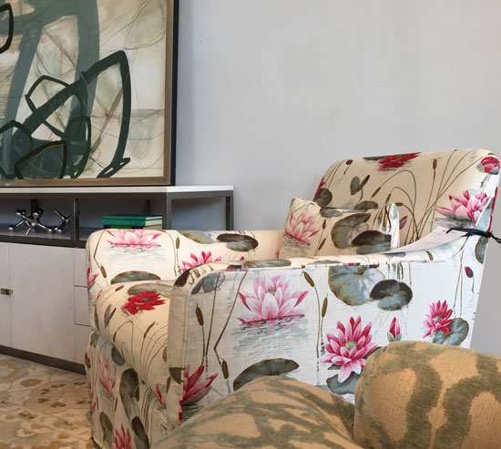
Florals, including dark florals (remember florals with a black background from the 80s?), are back. Of course, they’re reinterpreted so that we’ll love them again! What do you think? I was drawn to the lily pad pattern on this chair at Wesley Hall:
DRAMATIC COLOUR IS BACK!
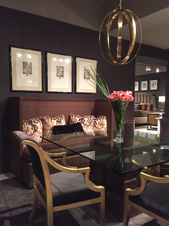
Just like I’ve been talking about black tile being trendy, it also translates to wall colours. Painting a room black might sound like it’d be a cave, but it can be glamorous, modern, and sophisticated. Just look at this dining room:

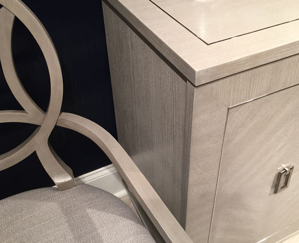
She said that shiny details like this inlaid silver border pick up the light and create further contrast in a room with dark navy walls, like this one:
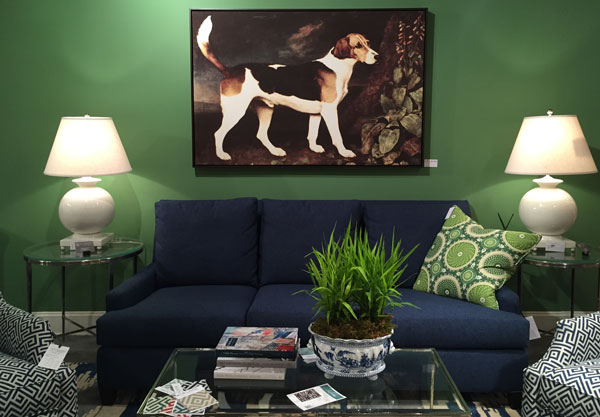
Look at these green walls with the navy blue sofa! It’s such a bold, statement-making colour combination. And of course, I’m always a sucker for a cute face, fun artwork:
BLUE IS IN!
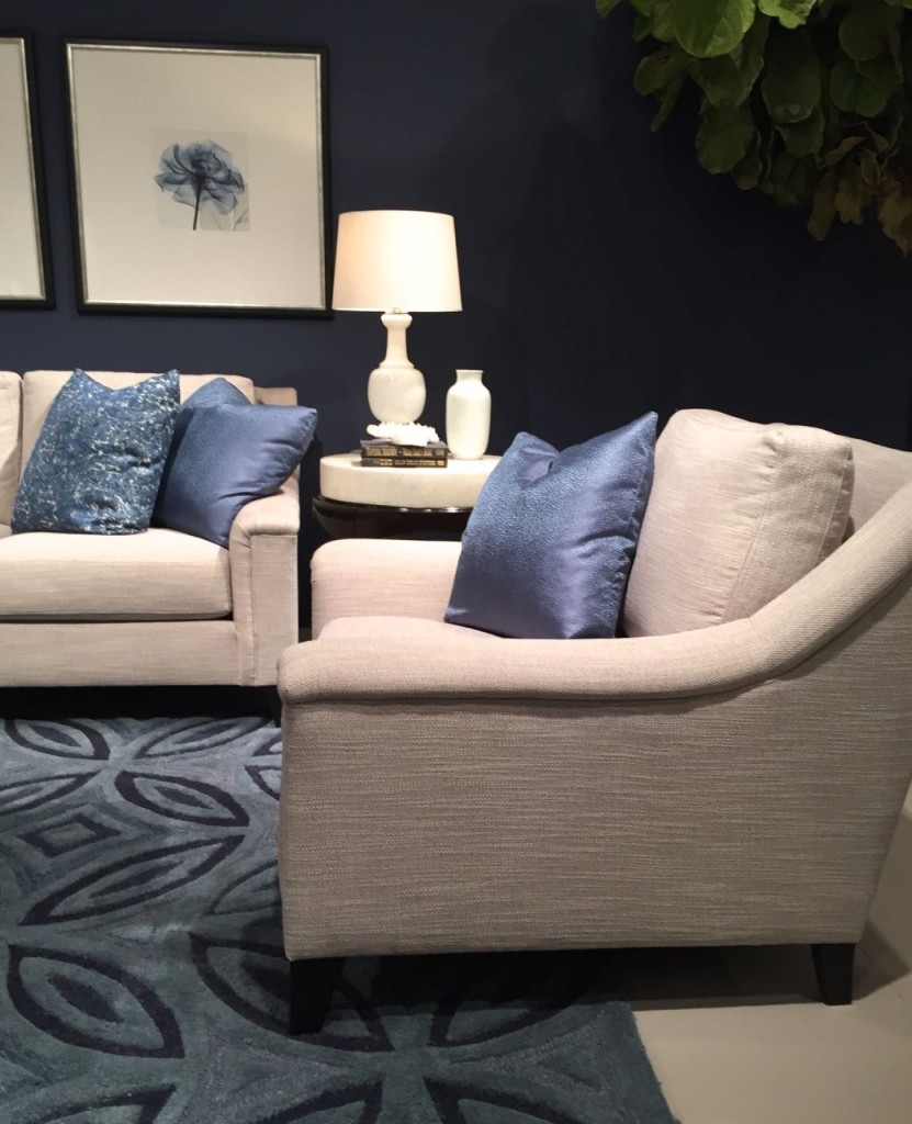
Blue was the big colour story this market. Navy is a best seller right now, as are indigo and denim shades. We’ve been decorating with turquoise for a long time now, so all these stronger shades of blue seem fresh and new. These dark blue walls are just as dramatic as black, don’t you think?
PINK IS IN!
Pink is always a favourite, and there were many different shades of it on display at High Point. There was even some … gasp … pink beige.
I saw lots of pastel pink! I especially loved this pink room at Century Furniture:
Getting soft pink (not pink beige) right is hard because it goes bubble gum pink really fast!
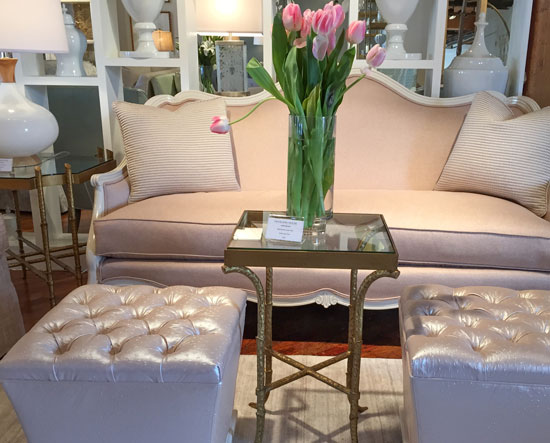
Here are some pearlized pink ottomans at Highland House. Stephanie at Bernhardt said pearlized finishes are in because they are shiny and again work well with dark walls.
And yes, there was lots of pink beige in upholstery and even painted case goods here. It’s warm and people and drawn to it for sure, so I do like to say (once in a while so you don’t want to kick your sofa) that this is not a bad colour; it’s just bad when combined with the wrong colours. Who can remember what those are?
Here are some stronger pinks at Lillian August:
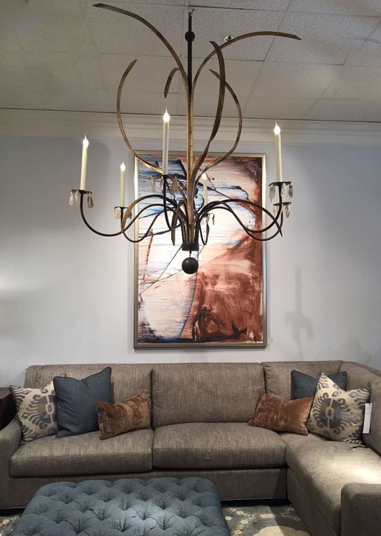
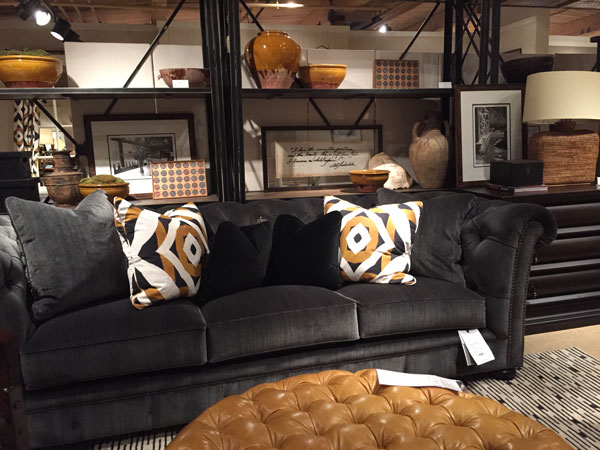
Here’s another sofa in dark taupe at Wesley Hall. This whimsical chandelier looks like it’s from a Dr. Seuss story. Could it fit in at your house?
GOLD IS IN!
Of course this is not NEWS anymore but it is for a lot of people who are still getting used to the idea of gold being back again in hardware and faucets.
Copper is here as well but it doesn’t go with everything so it will always be on the fringe.
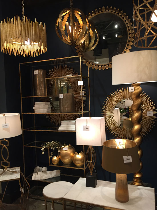
I saw a fair bit of this gold colour, below, which was big in the Tuscan brown trend. This time around, mix it with white and new pattern so it doesn’t feel dated:
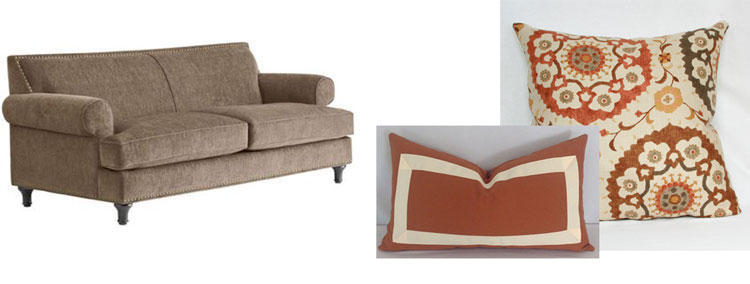
I recently had this conversation with a client who had hired me to help her refresh her living room. She had rusty-coloured accents and lamented that it felt old, but the colour was in her area rug and ottoman so she couldn’t change it. The solution? You regular readers already know it’s throw pillows.
I know I go on endlessly about throw pillows, but if your living room feels old and the colours can’t be changed, incorporate some new and trendy fabrics to completely refresh the space.
Add another cream pillow to this vignette below and your living room will feel new again!
So those are the trends from High Point this time around: texture, floral, drama, and colour, colour, colour. But I want to know what YOU think.
Did you see any of these trends coming? Which ones will you be incorporating into your home?
And before you walk over and kick your couch and get angry at your lamp (Thanks Mona Delia for that sound byte : ) just remember, this post is for your entertainment only, we all seem to be fascinated by what’s coming next.
There are many ways to re-fresh your space and make it feel new without spending a fortune. Accessories are a big one! Stay tuned for another post coming soon where I’ll be showing you a lot of gorgeous vignettes at market to inspire you to create some for your own home!
Related posts:
Maria’s Favourite Trends from Fall 2014 High Point Market



Maria, Always love your posts! I get so inspired. I do love color but probably will not do much pink other than throw pillows and accessories.
That chair is so ridiculous it makes me laugh. Once I bought hair on hide chairs for a client and she said that everyone that sat there said the hair ended up on their hide. We finally shaved them and they were expensive chairs.
Glad to see so much blue. I am working with a client who wants ultra modern furniture with chrome everywhere. They love navy blue and at first I thought navy is a traditional color but I am pulling it through the house anyway using grey and lavender. It is turning out nice and they like it. (of course a lot of white too)
Love, love, love your posts. Such inspiration!
Hi Maria, I love it when you go to HPM. I feel like I went with you but didn’t have to deal with sore feet from inappropriate shoes.
And pink beige does not work with yellow. I know this from dealing with my own pink beige issues.
YAY!!! color!!! I am thrilled and hopefully for me I won’t have to run into all white rooms and all Gray/Grey rooms for much longer.
2 years ago I had a living room chair covered in pink, and let me tell ya, I had a heck of a time finding pink fabric.
Glad to see the floral fabric too!!
Best news!
Looks like fun! Love the pinks. Not on board with the fur chair.
Thanks Maria
For sharing your findings with us.
For me, I probably wont be doing any florals but if my clients like it bery much then I might indulge in delivering something that is not too loud in terms of the pattern –
love color. Love the Navy walls with the shiny light colored furniture. Lots of texture. Wouldnt mind accenting with a bit of gold to give a glam vibe.
Currently working on a clients home, where I can apply a few of these trends that you have mentioned.
Thanks again for sharing your findings at the market.
Have a great rest of the week.
I’m Cherie from Kentucky. I really enjoyed this post, thank you. It’s such fun to know about the trends and then to watch for them to appear in the stores and online.
I have to tell you, Maria, I was selecting two carpets over the weekend, and I kept thinking, “What would Maria pick? How would she make this decision? What have I learned from her?” I have to say, I think I did well in my choices, and I have you to thank!
Hooray, thanks for sharing that with me! I love contributing to my readers finding the RIGHT colours 🙂
Oh My Goodness, Maria!! Be careful that furry chair looks like it’s going to eat you, hahaha!
Glad to hear that texture and fur are upcoming trends. I sell a lot of faux fur throw blankets for my online blanket boutique.
I adore bright pink and love that it’s popular right now. My only problem is that I live in a house with 3 males (hubby & 2 sons) and NONE of them want a bright pink chair, ottoman or anything around. Any suggestions?
Darlene
http://www.BundleMeBaby.etsy.com
LOVE the natural fibre area carpet and the focus on texture but as far as the chair goes, my knee jerk reaction was ‘how many Teddy Bear Gerbils did it take to create it?’ …. ☺ It is definitely a thumbs-down for me. That said, I’m happy to learn that dramatic blues are forecasted for 2016 (Navy I just used in a Spare Bedroom and Indigo in the Master, both paired with grays) and gold in fixtures and hardware is gaining a come back in various tones and finishes. Hip hip hooray!!!!!!! -Brenda-
Maria, hope you don’t mind me adding a tip for those who plan to do their own painting as I have found the following very helpful when using such colours as Navy or Indigo which are deep base colours. For LATEX (water-base) PAINT ONLY ON DRYWALL; ensure that you use a tinted (latex) ‘primer’ OR make your own by: separating the required amount of paint and add one part water to it. (In other words: mix 2 parts paint to 1 part water.) The latter formula is what I use mostly which looks horrible when applied (gives a watercolour streaky effect) but I guaranty it will give you a beautiful finish without shadows once the final/top coat of paint is applied. -Brenda-
Thank you for such a wonderful report from HPM. I did a color prediction and I said blush pink would be big this year. I am thinking of navy for a room in my home. The floral is one I probably won’t get on board, but that is just me. I love real flowers and paintings of flowers, just not in fabrics. Fun post to read, I will be sharing this one for my FB readers to read!!
Kathysue
Thank you for the post and I feel excited that we are ‘on trend’ with our new home construction. I found your blog and have read every post and purchased both eBooks – your help has been invaluable!
I chose what I liked, with minimal thought of what is current but our house is clad in Hardie Evening Blue siding with white trim and grey stone.
I just sent my final paint selections to the painter and while most if our interior will be SW Requisite Gray, I chose SW Naval for our office, SW Upward in our coffered ceiling and SW Tradewind for our master bath. Clearly I like blue and would have chosen it regardless, but it’s nice to feel I’ve chosen well.
DH refused an all white kitchen, so we are having blue pearl counters with white cabinets and blue/gray glass subway tile. I couldn’t convert him ;).
Our entire first floor is medium toned hand scraped hickory.
Thank you for helping me makes informed decisions – the tile people tried to force travertine and other beige tile on me and I asked (politely) for white or gray. I definitely got strange looks. The owner asked me if I was building our house in New York because no one asks for gray and EVERYONE loves his travertine. Pink beige is definitely still alive in central Pennsylvania.
Thank you again for your help!
I’m wearing “pinky-beige” pants (Chico’s) right now. franki
Love all these photos. The black and navy walls are stunning in the right homes. The fur chair looks soooooo cozy but I think my cat would be in it 24/7 adding his own fur to the mix!
So the home i put together in the ’80’s would actually be back in style. Floral sofa, lots of blue accents,, deep blue dining room w silk screen floral wallpaper above wainscoting…..I always liked that home..
Hi Maria – love your gold sneakers! Details, please??
Thanks Thea, They are Nine West! THE most comfortable shoes I’ve worn at High Point, I will have them on again in the Fall that’s for sure!
Such a fun post! The trend I’ve put in my house is the color black. I painted my dining room black and I loved it so much I painted my bedroom the same color. We’re getting ready to install the black bathroom tile floors and we have black countertops.
I love all shades of blues. On the second floor of my house I am using a lot of periwinkle blue (Olympic Kimono). Goes great with black and white.
I love floral print fabric and would like to do some patterned curtains in a bedroom or two.
Hi there
My dining room and living room are a long retangular room. I have incorporated brown furniture with lots of bright primary colours (pictures, pillows etc., ) and it works. The floor is a rich high gloss rust/brown with a touch of mahogany. The walls however are a boring beige/taupe. Could I paint the entire room a pale white/pink to accent the floors? Would this brighten the entire room or should I go with a rich navy or black unless this will make the room appear smaller which I don’t want.
Michelle
Thanks Maria, it’s so much fun to hear what the new trends are, especially when some of them are things already loved. I just finished painting my guest room a medium dark grayish blue. It definitely reads blue, but has just enough gray in it to be soft. Still a bit dramatic though. It’ll be paired with white in antique furniture and bedding. The live flowers will be in shiny gold vases. Just love the combo of multi colored (including lots of pink) flowers set against gold. No furry chairs for me, but lots of other texture will be used, as in natural seagrass area rug and ruffled linen. I’m also working on my first plaster 3D ceiling design in the corners of the ceiling! Small but pretty. Wish me luck:)
My two cents – I’m still loving the turquoise/teal trend in both home decor and fashion so I hope it sticks around. Mixing varying shades of blue can be very pretty and fresh. I’ve always liked navy, especially mixed with lots of white. It’s interesting to me that they are showing that gold beige zebra rug with a mahogany wood table. I feel better about my oriental rug in my mahogany dining room which has gold-beige in it as well.
The kelly green walls are not appealing at all and the furry chair would be a real dust catcher – not good for allergies. Love your choice of throw pillows. Thanks so much for sharing all of these photos.
Love to see what’s new. I’ll take the furry chair. The pink won’t be appearing. Wonderful mix of things, ahhh something for everyone. Thank you for sharing.
Not liking the dark rooms, guess I like things open, and fresh, more light, light light for me.
Fond of navy but not for walls, love light pink in places and have just painted a closet/study alcove in it, was hard to find the right pink though. took 3 tries then mixing myself. May do the powder room in it next. 🙂
Like fur, but way easier to keep as throws. love the rug.
May be bad, but I have given up on selecting a metal, have both in different picture frames, accents etc. and pretty much mix fairly freely, I like mixing platinum and gold in my jewellery too, all started with my omega watch in stainless with gold accents. 😉
Thanks for a fun post…I love the colorful walls and fresh florals, but am I the only one who thinks the whimsical chandelier would be beloved by spiders?
Haha, OMG Sandy I did not think of that but so true, especially if it’s up high, hard to manage!
Hmm. Looks to me like the 1980’s have returned in full force. I feel like I’m looking through the pages of shelter magazines from that era. The majority of these trends are ones I won’t embrace. At least mauve doesn’t seem to have been resurrected. Ugh! I still cringe when I think about all that dark cherry wood or golden oak that got paired with mauve. Talk about a battle of the undertones.
Aww! I’m waiting patiently for my custom kitchen cherry cabinets and corian mauve counterops, backsplash and floors to come back in style. Fingers crossed! My shoulders are sore from cringing!!!
^ This.
^ This. (referring to SDC’s post)
I’m all ready for an Indigo master bedroom!
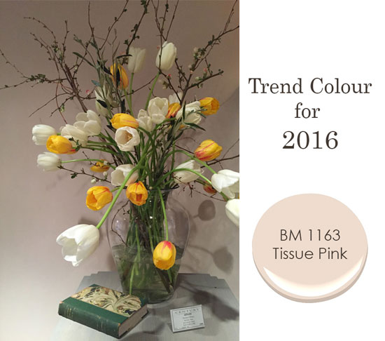
Please please don’t bring back pinky beige people! Ugh. I don’t mind a very pale pink but that Tissue Pink reminds of the ugly tile in all those old pink bathrooms. No thank you.
I do love the blues though and strolling through Target the other day noticed how much navy/indigo and tan there was.
Fur, cowhide and various faux textures have been big for a long time here in California.
I loved your pics of the trends from high point. That green room is great. It’s hard to get a bold green room the right shade. I loved Cate Blanchet’s living room in Blue Jasmine so much. I agree with you about the artwork in the green room.
I love the deep green walls and the pale pink. What BM colour would you guess is closest to that green wall with the blue couch?
Thank you for sharing, Maria. Those chairs: The first one is a nightmare! Straggly fur(and on the arms no less) would be a nightmare to keep neat and clean! The faux(better be!) fur by Bernhardt would be ideal in a den or for a reading nook. Love that color is making a splash after all the gray we’ve been inundated with!
I just can’t with the gold. Garish and something I would expect to find in every bath from The Sopranos. We all know, thanks to you, that white subway tile is timeless. Do you have a pick for timeless hardware and faucets? Have always been and will always be a brushed nickle girl. The chair is scary and begging to be torn apart by a cat or dog. Blue is always a favorite and agree with a previous post about combing different shades.
Check out the picture Sandy posted from a Paris JCrew store. Great mixture of metals- the gold chandelier made it edgy and fab- definitely not Sopranos. I would like to go with a mixture of metals but a bit nervous about how to pull it off. Like mixing jewellry – seems you need an anchor pieces that has the mix that you can tee off from. Maria- we need one of your great posts on this!
Thanks for the update. Glad to see some “new” colors making an appearance and am loving all the gold metal.
Haha! That is a great soundbite from Mona!!! The chandelier is from Low Country Lighting, but it must be a new intro if it’s not up on their website. Great post! xoxo
Great post! I just specified BM 1163 Tissue Pink in a master bathroom. I love the color.
Did you? How fun! I love how soft it is too!
What a great post! You nailed the trends I saw!
You’re right on trend with your shiny gold shoes! Cute!
Please share who has these mythical black background florals. I have been looking for the right one for almost 2 years! Thanks
Sorry Nicole, I did not see them myself, someone else did when we were having a conversation about florals being on trend in general. Sorry I can’t help. Maria
Try Sanderson’s (UK company) – they are well known for their floral fabrics -and others. Very nice quality too.
I seem to have anticipated the pink trend completely by accident. I’m painting my dining room a dusky yet soft pink that I plan to offset with deep brown wainscoting and a warm white for trim so that it doesn’t go bubble-gum on me. At least, I hope that works. 🙂
Blue is my favorite so I’m always happy to see it in any form. I’m also a fan of florals in small to medium doses.
Hi Maria, Thanks for sharing what you saw! It was nice to meet you at the Kravet party. Looks like you had a great trip!
I have two navy blue sofas on their way to me! Plus the fabric has texture – I would describe it as a tweed.
Great article, I always love hearing about what’s new – and for my business – it’s vital! Love the Navy and Hot Pink, especially combined with the brushed gold. How divine!!
Hi Maria,
Thank you for the highlights of the upcoming trends.
When I first viewed the following design of the jcrew store in Paris, I love how “everything goes”. But I could not explain to myself why it works. Large elements such as the sofa and the rug do not seem to relate to anything but yet overall it is beautiful. Do you have any thoughts why this works ?
http://photos.cntraveler.com/2015/03/06/54f9eb666450ad091fda519d_jcrew-paris-interior.jpg
Learning more from you over time 🙂
Sandy
Looks collected and personal not studied. Mod with a nod to the classics-very Paris indeed.
I love the trend to navy. I have used turquoise for years and love it but navy is a nice change. Torn on bright pink, but live the soft pink!
Thanks for taking and sharing such good notes. It is great to see a preview of the decorating trends. I love the gold hanging light fixture on the top left of the gold picture. I have a bedroom where they would look great over bedside chests.
I am delighted by your news re: trends from High Point! Your post is much appreciated. Recent decor decisions that felt risky, now feel point on. My house is a challenge with a relatively open floor plan but low light throughout most of the day. White, pale neutrals, light colors just died. Finally, I jumped and went with mid-tone COLOR. We’re so pleased with the outcome. Btw, SW Haven (green) appears similar to the green in CR Laine.
Very informative post Maria. I can’t say I like all, but the soft pink grew on me lately – it is definitely not a pink beige, it is greyish. I still shiver at those florals – not ready to go back yet.
Thanks for the trend update! Excellent presentation. I have been on board with the navy/indigo trend since it’s not new. As Maria knows I painted all 25 exterior windows BM Hale Navy two years ago and then redecorated my LR/ DRs in navy, white and linen w/red accents. Wish I had an office/library to paint navy. One dramatic room is fun. But a dark colored wall obviously needs alota white furniture…no brown wood to make it work. I do like some florals…mostly silhouette (white flowers on a colored ground). No floral sofas or chairs is a RULE of mine ( made that mistake once). Flowers best in the garden, a vase or on pillows!! Love antique gold and brass, not shiny which is too similar to 80s lacquered brass. I want the BEAGLE painting. I have a beagle. Haha. Oh, for pale pink lovers I used BM OC-75 Pristine once with success. It’s a warm barely there blush pink.
Maria, just wondering if you have suggestions for pale pinks, a bit deeper than OC-75 Pristine. Your go-to color list does not include pink. I also thought it might come back into vogue since like yellow it pairs perfectly w grays!
Wild about the artwork shown at CR Laine – the Beagle and the Botanical. Any ideas where to source them?? Thanks, Maria – really great post!!
No but I would just call the CR Laine showroom and ask them! Maria
Maria: So fun to see you at Market! Great recap! I loved all the texture I saw. Not too crazy about that fuzzy chair but I know a few clients that would be!
See you next time!
Love that you posted a nice pink. It IS SO HARD to pick the right one that looks good in the daylight and at night in lower light conditions. Yay on the navy blue!
I have been waiting for florals to come back! With geometric patterns filling homes and color back in favor, floral accents seem logical to add color and soften lines.
Maria, this is refreshing and looks exciting. Got start thing on how I am going to change my living room deco.
About 15 years ago I had soft greyed pink walls in my north facing office – took the edge off the dark corporate furniture. Definitely not bubble gum or sweet and the graphic artwork was key to making it work. It was such a flattering, “feel good” color. Miss it. Loved the reaction from the men I worked with! Amazing how color invokes so much feeling. Staff love picking out a color for their office – more impact than a raise!
I don’t mind florals in accessories. But I bought floral upholstery years ago and tired of it so quickly. It wouldn’t wear out so I could justify replacing! Next they’ll bring plaid back! 🙂
Personally, not into the black, navy, or fuzzy furniture. Like pink, florals, and gold accents. I’m pretty traditional, so trends don’t influence me much. But, I appreciate your reports since my clients may be into other things. Better to know what’s going on.
O my goodness, how did I miss this earlier?! On behalf of everyone at B E R N H A R D T, thank you so much, Maria, for including several of our new ideas and directions in this fabulous trends projection.
Our Bernhardt makers are always thinking a year or two ahead, what are we being drawn to, what might others be drawn to—next. It’s so lovely to project, and design, and then find that people—including design authorities like yourself—do find some new creativity and comfort in what we present.
Again, thank you so much. For your insightful blog and books, and for including us here. All the best, and keep creating!
a lot of these trends don’t sit with actual sales and construction going on today. A lot of these looks appear to be fads or ‘contrarian’ designs. I can’t see the fur chairs and black walls having any staying power after a year or two.
Gold is making a come back but not in actual metal form. Its part of the bigger trend of painted metallic over common materials like wood and pottery. Nobody is running out to replace their faucets with ’90s brass fixtures. New gold finds its way into the home as warm nickel finishes. But Chrome is still king outselling everything combined 2:1.
Blue is new! Blue is going to be the new neutral to replace or sit along side with grey. I wouldn’t be surprised if every designer house has a blue room by the end of ’16 if they don’t already.
Loving the navy! Just hung navy and white Ikat curtains in my living room and love them. Using gold and white accents to complete the look. Guess I was trending and didn’t even know it
Yay! Ive had a pink centerpiece on my coffee table since spring! And my sofa is already neutral with some black and white pillows. Guess I will be “in” now. Love the contrast of the Navy and the lighter furniture pieces.! But, not sure if I would be brave enough to try it on my own walls. I love knowing what the trends are even if I dont follow them completely.
Thanks for giving us the report, Maria. I’m bummed that I didn’t get to go to the last High Point market, but thrilled to find your coverage of it — almost as good as having been there.
great wrap up of fall market!
Thanks for the trend info! I love whats going on in design right now- from the dramatic colors to the faux fur, it all sets a fun mood in the home. Your pics and info are very inspiring!
I’m loving these trends! I see some luscious pinks that I am absolutely crushing on these days
Love all the texture, and terrified of the florals LOL! Just not a floral gal, but texture? YES PLEASE!
Loved your post and insight! You may have already discovered this but the Lowcountry chandelier is from http://www.lowcountryoriginals.net
LOVE their interpretations of my part of the country come alive in beautiful lighting!
Hi Maria,
Thanks for sharing this great post and what the upcoming trends will be from High Point. I’m located in Australia and navy and blues are always on trend, and we are finally able to get great shades of blue in fabrics and accessories. I hope that we can open up a little more to the use of vibrant and playful colour, esp the pinks and the drama of bolder colour! I would definitely love to inject all of these trends into upcoming projects.
Ps love your posts and hope to attend High Point in the coming years.
I LOVE the floral. I also have a navy blue couch so this will be exciting.
I love this! Golds, Drama + Florals… everything I’m about!!!! 😉
I can’t get enough Gold in my life! Great list!
I didn’t realize until rereading now, but the C.R. Laine picture must have given me the idea for my dining room light, which I found here in Gibsons, and just put a down payment on.