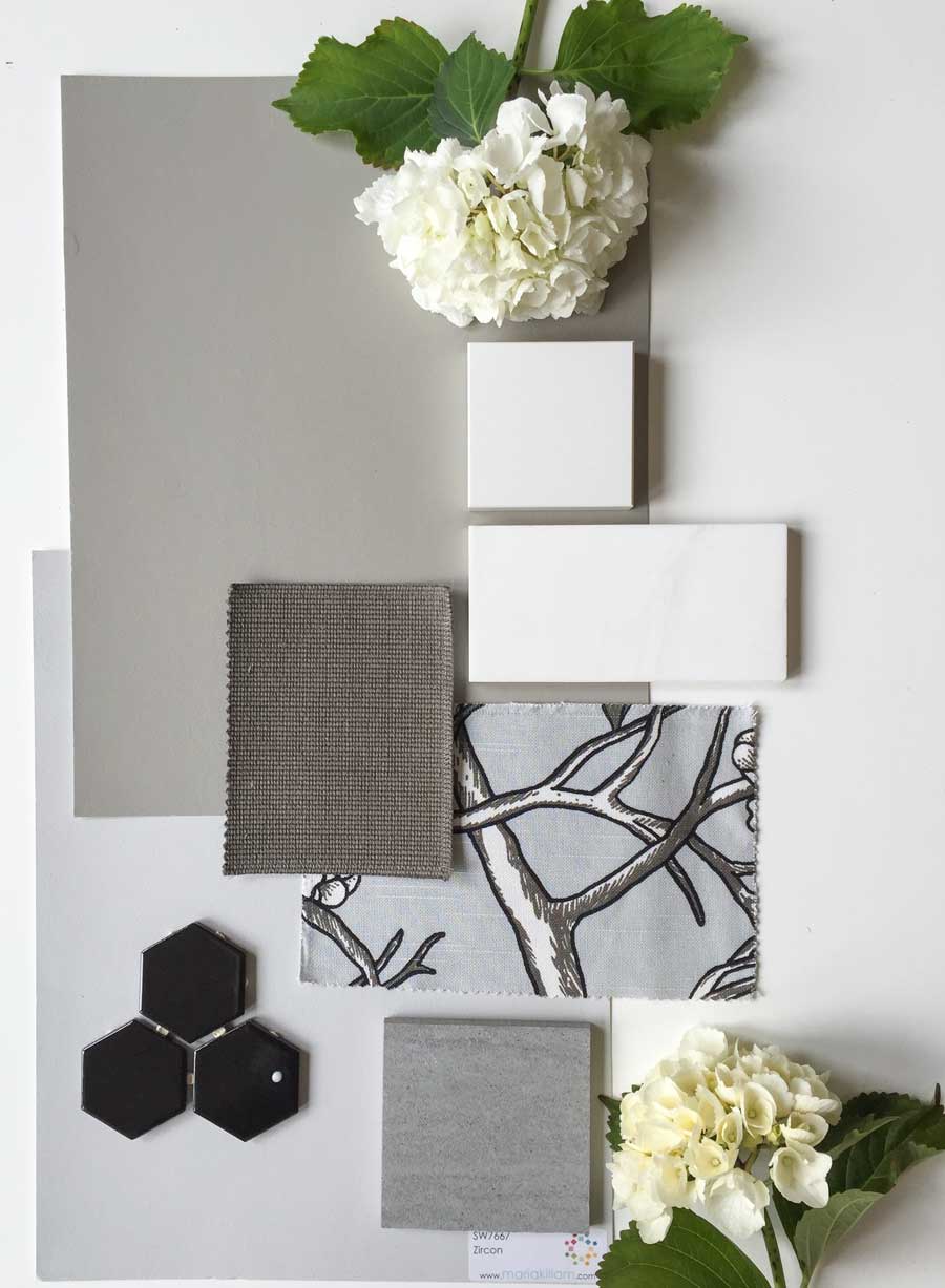
There’s a conversation out in the colour trend world that colour is moving back to browns and warmer grey tones in the realm of mushroom or driftwood, and cocoas and caramels.
First, it’s important for you to understand that colour trends move slowly for people who are not in the industry. So that means brown is not coming back anytime soon. I haven’t specified anything remotely close to brown for any of my clients for years.
Photos by Maria Killam
I agree that finishes overall are warm. But I don’t think it’s a newsflash to say they are ‘getting warmer’.
If we’re going to say that, then it’s probably safe to say they have been ‘warm’ since the beginning of the grey trend, which started in the West Coast in 2009.
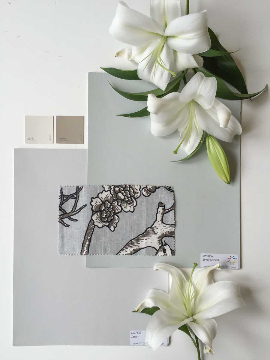
It’s not like the tile or designer fabric showrooms have been filled with tiles in battleship grey (blue grey) and now they’re not.
Tile stores have always been filled with earthy tiles and that has not changed. In fact it’s unfortunate for many an unsuspecting consumer that they still carry boatloads of earthy tile.
So stop saying “Warm and brown is coming back”, it’s been here all along and it’s still a professionals job to pick through it and find the timeless and classic tile.
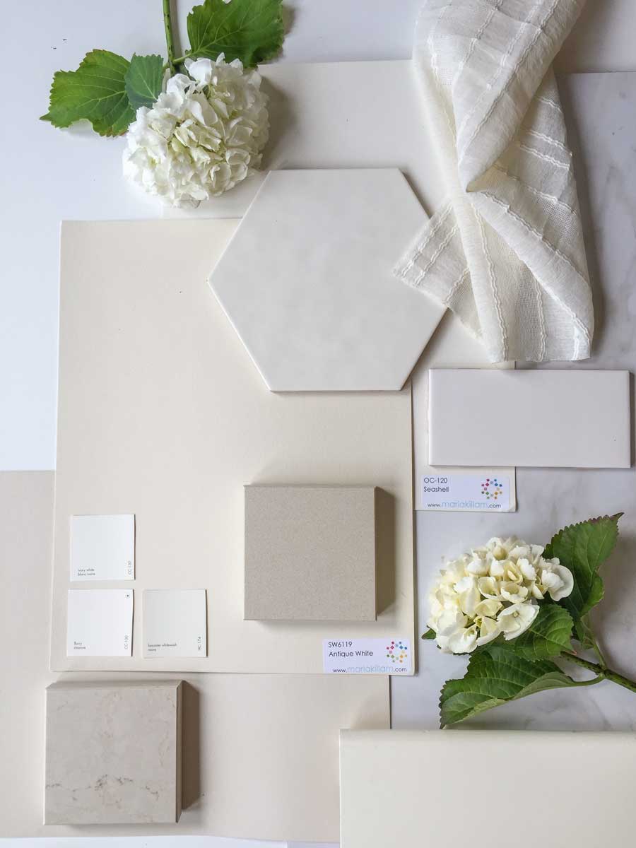
And speaking of warm finishes, is cream, bad? (above)
Absolutely not.
There’s nothing wrong with being on the warmer end of the white spectrum, you can still achieve a fresh look and feel using cream.
In fact from now on, when I say white, I mean cream.
When I say cream, I mean true white.
When I say white, I mean off-white,
When I say off-white, I mean true white.
When I say blue-white I mean white.
I think you get the picture.
What this means is that, unless I say otherwise, when I’m talking about white, I am talking about the continuum of white from blue-white, to true white, to off-white to cream.
If this doesn’t make sense to you, then you might want to read my White is Complicated; A Decorators Guide to Choosing the Right White eBook. I promise you won’t get bored and the world of whites will suddenly get simplified for you.
And for those of you who know exactly what I mean, your days of ‘experimenting with whites’ will be over.
You don’t need to have seen every single white in existence before you get some mastery over choosing or specifying white, or off-white or cream.
And I’m still reading this advice in magazines and on-line by colour experts everywhere:
“Paste a group of the colour chips you are considering on the wall and move them around during the day. The undertones will reveal themselves, then you can simply eliminate the ones that aren’t working”.
That this kind of advice is still being written in resources designed to help the consumer choose colour, makes me worry that I will be close to dead before my Understanding Undertones™ colour system becomes mainstream.
First, standard colour chips are not useful at all for testing. But even if you did have three or six or nine large colour samples lined up beside each other, you would simply be comparing each one over and over without the training that my True Colour Experts get in my 3 day event.
A trained and experienced colour expert can compare colour and tell you what you’re seeing, only then, is comparing colour the right way to choose. Slapping them up on a wall and even worse on top of your existing paint colour is NOT useful AT ALL.
Instead of being able to make an accurate decision, you’ll either be waiting for one of them to propose, or you might say:
“I like the one on the right, it’s warmer than the rest of them.”
It’s common to think that the ‘warm’ neutral is the right one but what if you were looking at a blue grey and a blue/green (more turquoise) grey? Because the greener one is warmer you might chose that one.
But the colours in the room were blue grey which means that the greener one would be wrong. In this case, the ‘warm’ choice would be the wrong one.
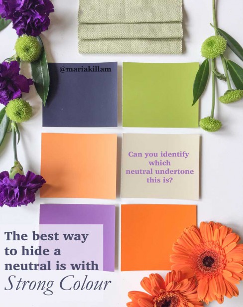
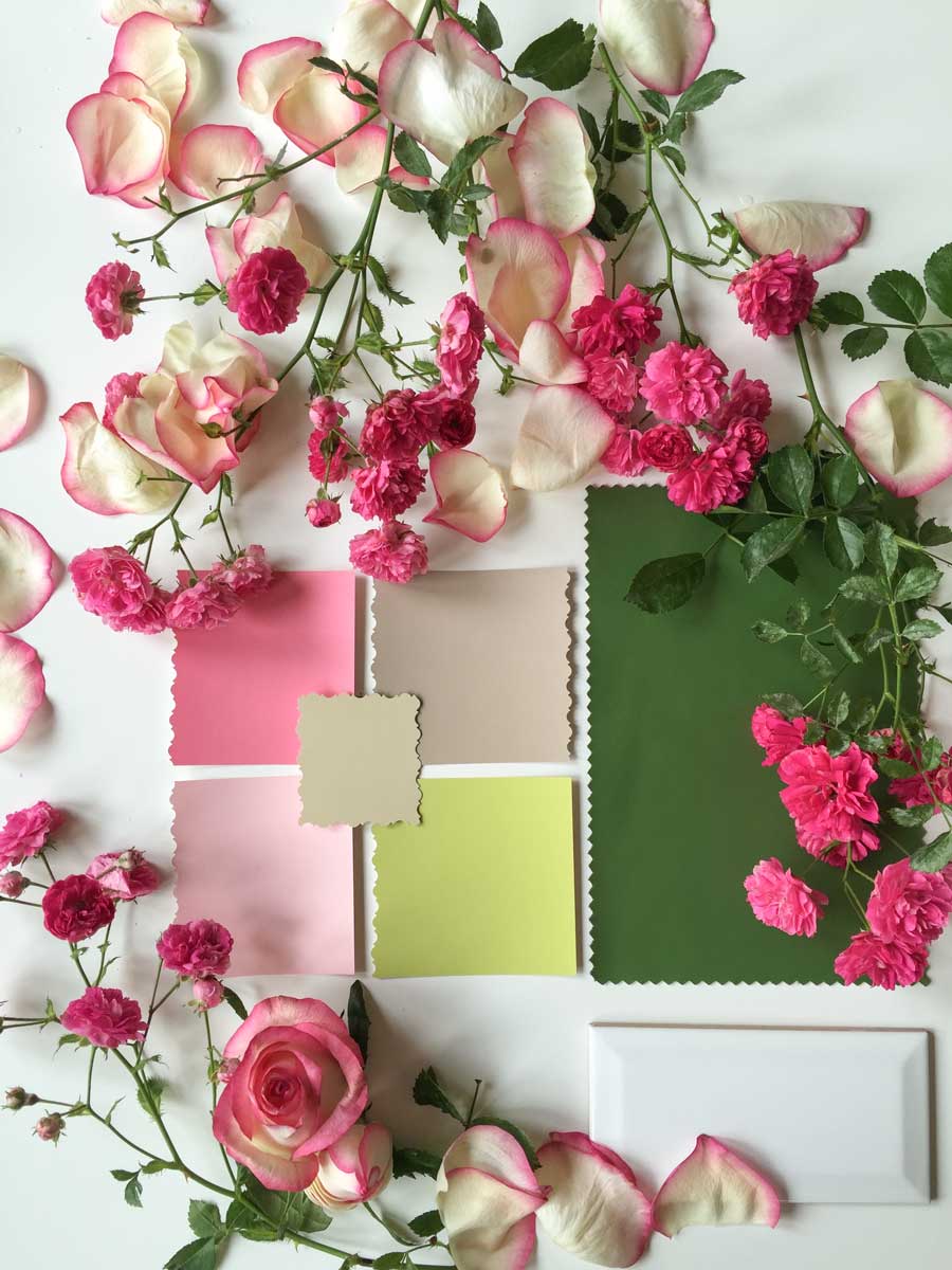
Or if you stick a bunch of paint chips up and you mix neutrals with colour (above), you will not see the undertone in the neutral because you will be visually comparing it with saturated colour that will overwhelm the neutral.
Then when you choose that neutral and paint your walls, you might end up with a yellow undertone when really you needed a green one. Can you tell me with absolute certainty, which undertone that neutral is (above)? Well neither can I.
Or you might be looking at a collection of 5 paint chips and be thinking. . .
“I like the one on the left, it’s the prettiest one”
What if you have 5 chips up on the wall but one (two in this case, above) is cleaner than the other? You choose the clean one because it looks the best.
Why does it look the best?
Because cleaner paint colours usually make the more muted, dirty colours look ugly.
But what if all the colours in the room related to the dirty colour which means you should have chosen the neutral instead of the prettier colour?
Then you’d have made the wrong decision, again.
Also, anytime you have neutral paint chips on a clean wall colour, they would all look bad and your decision to eliminate all five would have nothing to do with undertones, it would have to do with the fact that they all looked not as awesome because they were sitting on top of a clean colour.
Besides neutral undertones, clean and dirty is a huge distinction my students get when they finish the course. Recently a graduate sent me this email right after she attended my event:
“I went into a friend’s house last night who has a very colorful house…I mean walls painted green and cabinets painted grey and pinks and all kinds of colors. It was done a by a well known designer here in town and for the first time I saw it totally differently. I realized she used a pink/violet grey for the cabinets which looked horrible with the bright clean green walls because they were dirty (clean and dirty). I would never have been able to understand why I didn’t like it until I had your training. It was suddenly so clear and I was SOOOO grateful.”
Or you might have have 4 colour chips up and you might be thinking:
“I like the one in the middle because it’s lighter than the rest”
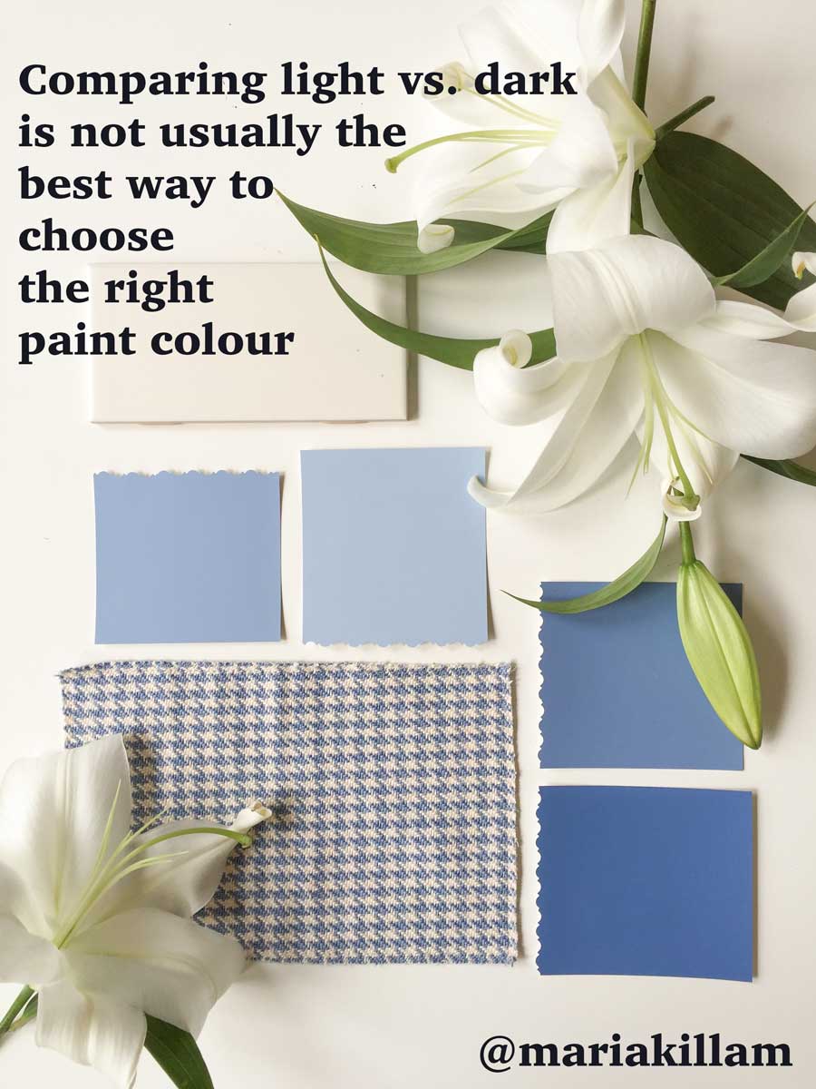
The consumer often makes colour decisions based on lighter or darker. Does this mean it’s the correct colour decision?
No.
I was once in the home of a very sweet couple in their 70’s who were repainting their home. In fact, while the wife was going to travel overseas to visit her relatives, her husband was going to paint the house. So nice right?
We had chosen a very pale, creamy colour for the house. However, because I was choosing colours with my large colour samples , she was able to see that the colour that was slightly deeper really looked amazing with her new sofa (we had the fabric, the sofa was in the shop being manufactured). So at the last minute right before we finished the consultation, she said “Let’s paint the living room the deeper colour”.
Later that summer, when she had arrived home to her freshly painted house, she called me and said she loved the living room colour so much, she wished she had had the courage to go for it in the whole house.
So choosing a colour based on light and dark is not accurate either.
What I teach in my Specify Colour with Confidence™ courses is the future of understanding colour. What I teach is not a religion or a theory that only some people can grasp or understand. It is a proven system that anyone can learn unless they are colourblind.
In the future, if you don’t understand how neutral undertones work, you won’t be able to get a job in any field related to colour.
In the future, this training will be in design school.
But right now, understanding neutral undertones lives mostly inside of ‘what you don’t know that you don’t know’.
Designers can still get away with saying things like the following at home and garden shows in a city near you:
“Colour is hard. All you can do is test it and hope that you get it right”.
This was declared just a couple years ago on a main stage by a celebrity designer. The sad thing about this is that most people would hear that and think ‘Well if she said it, it must be true’.
So stop reading fluffy advice that is not helpful at all. Learn my system, and get your colours right from paint colours to hard finishes to fabrics.
All the resources to help you are here.
My How to Choose Paint Colours It’s all in the Undertones eBook is here. My Choosing White ebook is here. You’ll need them both, they are very distinct.
If you need help you can get it via an email consultation here for exterior and interior.
And if you want to catapult your career this year, find yourself at one of my events here.
I’m off to Montreal with my Sister Elizabeth! Can’t wait! Follow my adventures everywhere on Instagram.
Related posts:
Do you Choose Finishes Based on Light vs. Dark?
The Difference Between an Experienced Colourist and a Novice



Maria, I just love reading your posts and even though I am reasonably new to your colour theory I find that I look at colours so differently now to how I used to. As I drive along I notice houses whose colours look good and also the ones that make me cringe and now I know the reasons why. I feel I have learnt so much from your posts and from reading your ebook twice over. Thank you and enjoy your time with your sister in Montreal.
You have described my current dilemma with my blue-gray stucco on my house. Thanks for the timely post!
Maria,
So many people have no idea that the spectrum of whites is huge, and they don’t know that cream is in that spectrum. Our small church has been renovating a building, and when it came to paint, the aesthetics committee wanted a blue ceiling. One powerful voice influenced many others that the ceiling should be white, so we had it painted the yellowy ivory of the walls in a lighter intensity, and put the blue on the wall behind the altar. We have polished brass candlesticks and crosses, and all the trim is painted Chantilly lace. So this powerful voice accused me of disregarding the decision to paint the ceiling white. He had meant (unknown to me) ceiling white paint, and although I explained about whites, there is no room in his head for any other white than ceiling white.
Other people tell me how beautiful it looks.
Is there someone I can hire here locally who can be my helper? I am very limited with understanding how all the colors work, even though I have purchased your e-books and read them repeatedly . . . I still don’t get it “real time.” It’s all intellectual, and hard for me to apply/execute. Suburban Philly area.
Maria, This comment prompts me to suggest that you keep a state by state record of your class attendees.
Even if they are not in it full time ( like me), I would have LOVED to help this lady out, but she lives to far from me.
I hope you’ll think about this.
xo, Paula
Seconded! I have long thought that there should be a directory of the True Colour Experts.
YES, yes, yes….Maria, please do a directory of True Color Experts!!! It would even be a great networking piece for us as well, great thought Paula!
YES, yes, yes….Maria, please do a directory! It would even be a great networking piece for us as well, great thought Paula!
Is it still “okay” to paint one bedroom wall a dark colour, and the three other walls a lighter version of that colour.
We have no headboard and thought of painting the wall behind the bed a darker gray.
I’d love to hear Maria’s take on this, but in my world, it can be a useful tool. I use accent walls when there is a reason: number one being, to make a headboard or bedding/lamps stand out; or two, if you want a jolt of color that would be too dark or bold for the entire room. Realize that wherever you put strong color, it wants to become a focal point. So place it logically. Also, accent walls work best on symmetrical areas, rather than on walls that have funny angles or a room that is cut up with such angles – which they tended to do in some 90s houses. What I don’t like is painting an ‘accent wall’ in nearly every room, just because you are too chicken to paint all 4 walls. It becomes choppy.
NO Wonder I keep recommending you to designers…Follow Maria’s Blog and go to her course, comes out of my mouth at least once a day to designers both young and old! Have a great day Maria!
In the June issue of Southern Living, inside cover ad from Sherwin Williams, the lead line reads: “There are no rules when it comes to color….”
REALLY? Just as there are no rules when it comes to landscaping, dentistry, nutrition, etc., etc., etc. ?
Ok, so just go at it willy-nilly and “pick your favorite colors”, throw them onto whatever, in whatever fashion you think. This is precisely why almost every house in North America needs to be staged and corrected for sale purposes.
Take heed people–Rules Matter. Listen to Maria.
Ok, correction: Systems Matter!
Isn’t that nuts? Maybe they are trying to say “there are many ways a room can be beautiful” – which is something I often tell clients. But that’s not the same as “colors don’t matter, there are no rules.” There aren’t many rules if your whole house is white… but how many houses can say that?
‘There are no rules when it comes to color’ means that once you fully know the rules, you can break them!
Love reading the blog and have the ebook. Wanting to get the color “right” and “classic” and not having a class nearby, I also did a consult approximately 3 years ago for new farmhouse barn construction. Given that the color selections made definitely have a warm and “brown” tone to them, (BM Northampton Putty and Elmira White) it’s seems the new interior is already dated, and I probably need to try to come up with another budget to do another consult, and hire painters.
I always loved warm grays, and greiges, and taupe, and mushroom, and driftwood, and caramel, and cream..
(chocolate sounds yummy too!)
It was a bit frightening when I had to decide what colors to commit to, especially in hard surfaces.
Then I found out interesting thing. I found that all the neutral colors I’m really drawn to I actually chose for years, when doing a manicure..:)
When I realized it I got much calmer. I understood I was seeking their effect anyway. Who knows why. But it meant that these colors had stronger potential in making me happier for a long time.
Maria, a couple days ago I was watching a YouTube video from a painter. He stood there being a painter not a designer saying you don’t need to hire a designer if you just take a little time you can figure it out yourself. Then he proceeded to tell his viewers get some test pots of favorite colours and paint them directly on the wall! The man was an complete idiot. I wonder how many people will follow his advice?
Maria, I never put that much thought into it, just took a color I enjoy, purple for my room and my kitchen is white with a backsplash. Everything else is a monotone cream color throughout. Thanks for teaching me the errors of my way.
We see issues with colors, styles and design all of the time in many offices we install new furniture in — they new furniture looks super nice, but the office space it’s going into does not look so nice…often with outdated colors, etc. So often we wish a designer could come in before the furniture arrived…Cool article, thx.
One of your best yet. Loved this.
Your illustrations are beautiful, Maria. And the content is very helpful. Thanks.