Designers break the rules all the time, but how do you know when it’s ok? Here are 4 rooms that break a few of the undertone rules I work so hard to teach my students (both homeowners and designers) and WHY these rooms work.
In every Specify Colour with Confidence workshop, I talk about how a beautifully decorated and styled room takes all my undertone rules and makes them look almost not important at all.
So, I thought it was high time I featured some photos of rooms that just plain broke all the rules, because that is what designers do every day.
A professional must know the rules, so she/he can break them like an artist.
When to break the undertone rules
Here are 4 rooms that totally break my colour/undertone rules:
via Pinterest
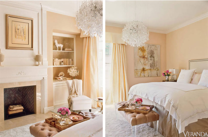
Neutral rule #1
Don’t mix clean and dirty colours.
Here you can see that the bedskirt and ottoman are a mid-tone, muted pink beige, while the walls and drapes are an apricot (peach) colour.
Clean and dirty. But the art repeats both colours and makes this room work.
Lesson: If all else fails, find some art that repeats both colours.
via pinterest
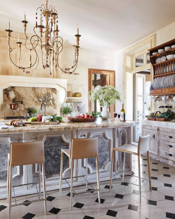
Pattern Rule #1
After you’ve chosen one pattern in your hard finishes for the kitchen or bathroom, that’s it. Your pattern quota is done.
It RARELY works to have two patterns in the same room.
However, most people unfortunatley don’t know this rule, which is the reason you mostly hate all the kitchens and bathrooms in real estate listings while shopping for a new home.
It’s also the reason why people with money often just give up looking for their dream home and build instead. WHY? Because they don’t want to pay for a previous homeowners trendy, busy, and MOSTLY WRONG choices.
In this kitchen (above), there’s a LOT of pattern happening. I would not have specified glazed and faux finished cabinets along with orange, brown and black granite AND a black and white floor, however this kitchen still landed in Veranda magazine.
The chandelier is fabulous and there’s a lot of styling happening here.
It’s too much pattern for my eye, but beauty is in the eye of the beholder. What do you think?
Lesson: Too much pattern? Find a chandelier that draws the eye up.
Related post: The Dangerous Side of Creativity
{via Tobi Fairley}
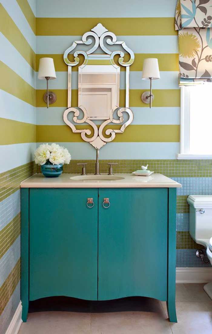
Neutral rule #1
Don’t mix clean and dirty colours.
See the taupe tile floor? She repeated the floor in the roman shade and then introduced bold colour after that.
Could you argue that it’s a clean/dirty combination? Not anymore.
Beautiful.
As a good friend of mine once said. If you repeat the offensive colour. . . it quietly goes away.
Lesson: Have some tile you don’t want to replace? Repeat the colour somewhere.
Obviously this idea will work better if it’s a solid. Busy tile with 4 or 5 colours becomes a lot harder to create magic with. That’s when you might have to just replace the tile.
Paint colour, fabric or the right area rug can create magic, but not EVERY TIME.
There is no such thing as a neutral rug or piece of furniture that you can just plunk into a room and never repeat it again.
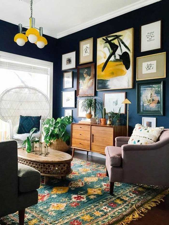
Okay, not never. Here in this room (above) we have a pink beige/violet looking chair that doesn’t relate to anything but with the dark navy blue walls and dramatic green rug along with the fabulous arrangement of artwork, we don’t notice it.
Lesson: If the wall colour is really dark and dramatic, it can often make the beige in the room disappear.
_________________________________________________________
I’m back from my whirlwind two weeks of workshops! We were in Austin and then Toronto (Mississauga).
Here are some photos from the first day in Toronto. We had a photographer in Austin as well but we didn’t get any photos from her because she emailed us two days later and said her dog ate her camera chip. I’m serious, that is what she said.
Our photographer in Toronto was Ella White and she was fabulous! If you’re in Toronto, I highly recommend her.
She took so many beautiful pictures of my participants. Here is one of Penny Straka along with the email she sent right after the course!
Penny Straka
Thank you so much for sharing yourself both personally and professionally these past few days. That is not an easy thing to do! Besides teaching your extraordinary system you provided exceptional direction regarding the business side. I am not a design professional but I was fascinated with all the information you provided the designers/decorators regarding social media, client interaction and the business side in general. Any design professional not taking your course is really missing an opportunity to grow and expand their business!
For me, you have given the tools and confidence to have a lovely home that makes my husband and me incredibly happy when we walk thru that door.
Besides being a very gifted and talented designer, you and Terreeia are very sharp business women and I have no doubt that together you will achieve all your aspirations and goals ahead.
I look forward to following your blog many years to come! Penny Straka
Maria Killam
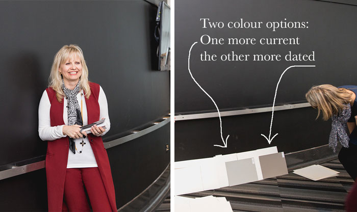
Here’s the class in Mississauga. The room was fabulous with floor to ceiling windows. You can see that there were some neutrals in the carpet and the center of the room had rounded walls painted black.
As we do in every course, we chose new paint colours for the meeting room using my large paint samples. Miraculously and because the system works, the right colour is ALWAYS found in a large paint sample for most neutrals so that YOU along with your CLIENT can see that the colour you’ve specified is the right colour!
This wall is TOO BLACK. One is fresh (Fieldstone) on the left and one is more earthy (a taupe shade)
Judith Taylor was one of my amazing volunteers, she was in my course a year ago and she was here to contribute and listen to the course from a new place. Since she’d been using my system for over a year, she’ll hear things she didn’t hear the first time which is always how it is when you review my course. Especially because my workshop is never the same!
She sent me this review of the course:
The beauty of Maria’s system is that it applies to EVERYTHING, not just paint. Selecting wallpaper, fabric, tiles, countertops, in fact, all the materials and finishes selection can be simplified (and it becomes so much faster) when you understand the undertones.
This enhanced knowledge is simply integrated into my daily design life because Maria is so generous with her teachings. These students left as colour experts and stronger designers.
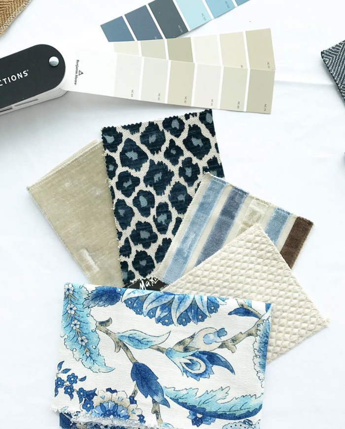
Judith took over my Insta-stories on day 2 and she did a great job. In one of my in-class exercises using fabrics, she snapped this pic and posted it on her Instagram. Follow her on Instagram here.
In-class exercises
To transform the way you see colour, become a True Colour Expert. Register here.
Have a great week my lovelies!
Related posts:
Do the Undertones in Dark Colours have to Match
This Colour Mistake will Make your House look Bad
Which Backsplash Tile Goes with Granite







I don’t love any of them. But I really dislike the kitchen with all the patterns. Sometimes I think pictures get put in decorating magazines just because of the designer’s name, not because it looks good.
I feel like I see that particular mistake pretty often in higher end homes, especially in kitchens and also bathroom – it seems like it’s often associated with the “Tuscan” style”. I think in some ways money covers some mistakes – room sizes tend to be larger and it seems like if you are going to have way to much going on in a room, it would at least be better if that room were larger rather than smaller. Also, at least some of the elements are sometimes of good quality or are by themselves beautiful (I think that helps a little). In some ways I don’t think money actually does cover mistakes . . maybe sometimes it enables mistakes. It just seems like such a waste.
Hi Maria,
Great tips you’ve pointed out for when to break the rules and also if one makes a boo boo, how it might be fixed. Sometimes I think that people freak when they are looking at a freshly painted room before everything’s put back and forget that it’ll look much different when all of the pieces are where they belong and the art is up.
Also, I love the first image on the right (peach room) because it demonstrates that one color often looks different on adjacent walls and why it’s so vital to make a separate sample and try it out in multiple places.
Maria
Just a few comments on your article. I am a member of the International Association of Color Consultants of North America part of the first graduating class from 1990 when Frank Mehnke first brought the teaching to the United States. This color system is the one they use in Europe. Your Pattern rule #2 talks about not using more than one pattern in your hard finishes is very limiting. It can work quite nicely to use more than one pattern provided you are taught the scale of mixing patterns together. Otherwise one pattern can be quite limiting.
Your Neutral rule #1
Using “clean” and “dirty” colors will work provided the tone of those colors is the same. The bedroom you show as an example works quite well because all the colors, “clean” and “dirty” have a yellow base and easily. Also, the colors I bet are quite close (white being the contrast in the room) in LRV which keeps hard contrasts to a minimum.
Plus the pics you show as an example are very sophisticated examples of interior design which evades most peoples preference.
Nice commentary Maria I enjoy your work.
Hi Deb, If you have seen as much mismatched, patterned, tile as I have in my career, you might feel the same way. However, it’s just my opinion, doesn’t mean it’s right. Thanks for your comment! Maria
Deb, I am so glad you said this! I COMPLETELY agree, this followed the extent of my knowledge of the “rules.”
I must admit, I loved the multiple patterned kitchen.
Thanks for shedding another view on this topic, very refreshing!
I like the idea in the bedroom photo to include art that has both the clean and dirty colors. It works. The kitchen is too much for me, but I think the chandelier helps…sort of. That’s a good trick in the bathroom to repeat the offensive tile color.
But no way does that pinky-violet-beige chair disappear because of all that color. To me it stands out like a sore thumb, and I wonder “what were they thinking?!!” Are they saving up for a slip cover or something? 🙂
Good post!
I like the last room, the dark walled one. Actually there is some pink in the art on the wall so not quite alone. None of the others appealed to me at all. I found the drapes in the peach bedroom jarring and the least said about the kitchen the better. No accounting for taste eh?
The kitchen with multiple patterns: probably frightfully expensive. The owner can probably afford to redo it when it becomes tiresome. Which, IMO, could be pretty soon!
Maria,
Maybe some of these landed in Veranda Magazine or whatever but they are just wrong, wrong, wrong. (For me, at least).
It took a lot of mind power to focus on them. The dirty/clean colors just aren’t right at all and the ” why can’t you just pick one pattern” kitchen left me dazed and confused.
Just because these rooms are being done doesn’t make them right (except for the person who likes this sort of thing). I hope the owners stay where they are so the next person doesn’t have to face changing all of this.
I agree with you on using color, patterns and most everything else. I started reading your stuff over 5 years ago.
When I started reading your posts I had never really heard it put into concrete terms before but what you said just made sense and is how I thought.
My last house was painted with antique white and I remember how the bathtub was off white or something like that and it clashed with the paint and you were talking about undertones and I thought, “oh that’s what is wrong here!”
I knew in my next home I wanted to get it right and I did! It is all very calm and soothing.
Thanks for your great work.
“If all else fails, find some art that repeats both colours.”
As an artist, I find this statement a bit disheartening. Art speaks to the heart and mind and soul. I would hope it is not merely an after-thought to pull together a decorating scheme.
I’m an artist too, and don’t view it that way. As long as you look for art you love that also happens to have the right color scheme, rather than just having the decorating put something in because it matches. In fact I recently decorated my guest room in gray/taupe with some purple accents, and did some paintings that pulled the color scheme together. They’re still in my artistic style, the scheme just set my initial color palette.
Our dog actually ate my son’s homework once. It was one of those school projects where you make a volcano with baking SODA and vinegar.
Haha, well that’s what I was wondering? Are we in high school? Thanks for your comment! Maria
I really dislike that bedroom combination. None of them look great in my opinion but I guess they have bought themselves some time until they can make changes. Useful because we all have to live with or cover up our mistakes at times!
I love the pallet that Judith put together! Now that is what I am talking about! The peachy room I could live with and your advice was good about the art. Also the designer added a lot of white which seemed to neutralize or at least take your eye away from the clean vs dirty look. The kitchen when I looked at it, I said OMG what are they thinking. I think the chandelier added even more confusion! I agree that sometimes magazines publish designers’ pictures because of their name. This was a good post in what not to do!
Good information!
That second picture (kitchen) hurts my eyes sooooooooo much. Kind of makes me dizzy too. The worst part for me is the grey/white island against the warm granite and creamy walls. Ouch and UGH at the same time. I’m a casual reader and faaaar from a designer, but I want to thank you for helping me understand why some combos are so repellent to me. The basic notions I’ve picked up from your blog have also helped me – even as a relatively untrained newbie – be more confident as we were picking colors, hard surfaces, and furnishings in a second home in Ireland. I will keep reading and keep learning! Thank you!
I don’t love any of the rooms but that kitchen is especially awful. I feel badly for whoever had to pay a designer for that.
That last pic of the sitting room with navy walls and a busy area rug? I thought to myself, “it’s crazy but it works!” before reading your comment about it. Then I read what you had to say about it and you mentioned a pinkbeige/violet sofa and I laughed out loud. I never even noticed or saw it for that matter!! Boy were you spot on hehe. Point proven!! Great post. Thanks for such great learning tools Maria.
Ooops! It was a pink beige/violet chair that disappeared in the pic. Not a sofa as I stated in my first comment. Slow down Robin lol
That kitchen…needs to follow Coco Channel’s advice and “remove” something or two (or 3 in my view). It looks like tyring to compromise for 2 owners with wildly different taste and failing. But it got into a magazine, so someone evidently liked it.
Would love to be a assistant if you ever come to Boston
Shari
Great post, and very interesting. I wouldn’t get much cooking done in that hot mess of a kitchen; it’s tiring just to look at it. Really liked the living room with navy walls and didn’t notice the chair. I keep forwarding your posts to my daughters in the hope they’ll take your advice Maria, when decorating their homes. At least it makes them stop and think before doing anything – and they actually ask for input from me (whereupon I’ll look back at old emails for an appropriate post!)
Hi, Maria…Every picture was jarring to me, even though some were pretty. Probably because I just learned what really works, at your Color with Confidence training!!!!! I would love to hear what you would do, to make those rooms, wonderful!!!!! Love you. Candy 🙂
No, don’t tell me the answers. I need to figure it out myself, and apply all the great things, I just learned. Thank you Maria, you’ve helped me, more than you know!!! 🙂
Hi Candice, thanks for asking the question, I’m sure others wonder too so you ask for everyone. In image #1. The bedskirt could have been the same fabric is the drapery and the ottoman perhaps white.
Image #2 – With the black and white floor, a black countertop, solid cabinets (not glazed) and a subway tile backsplash.
Image #3 – White tile would have been best, but the designer did the best she could given the tile was most likely existing.
Image #4 – the pink beige chair should have been gold.
Hi, Maria and friends,
I can’t get behind the “Veranda” busy kitchen. (I’m not a designer/decorator.) IF IF IF they would’ve painted the wood upper cabinet and the wood doorway trim the same color as the OTHER Doorway trim and hood color, THEN it maybe would’ve given enough continuity. But It still would’ve been a kitchen with a split lower and upper personality. thx!
I kept looking at that one too – in morbid fascination. (somebody’s been spending too much time touring historic palaces in Italy) I think the other doorway is a mirror. Not that it helps much.
But what an interesting and entertaining post!
Now add to that kitchen: people and their own personal clothing styles, food, dishes, school books, a purse, car keys, a cell phone, and all the things that wind up in a kitchen. Chaos. Isn’t it important to actually think about living in these designer rooms? It seems as if they are just for display. I’m interested to hear other people’s opinions on this. Does anyone else think about this?
Yes, I think about it. Lots of designer rooms have really well designed storage, such as charging drawers where you stow your phones and iPads. I’ve learned to corral things using decorative trays and bowls–a simple cutting board on the counter by the stove makes the olive oils and vinegars and salts and peppers that sit on it look neat and intentional. Paper is what does me in. We get piles of mail, for some reason–more than any other house our mail carrier delivers to–and it can quickly inundate the kitchen island. Since I forget about what I can’t see and thus dare not put it in a drawer, I have to force myself to stay on top of it. Finally, I do not allow myself to purchase anything, no matter how lovely or charming, that I cannot mentally place in some part of my house, knowing that it will fit in and look good and not add clutter. It’s a discipline, and it took me a long time to learn it.
Maria, I hated all those rooms, although I understand your explanations of what makes them work. The kitchen that ended up in Veranda is particularly awful. One thing I’ve learned from reading shelter magazines is that designers are often lauded for creating rooms that are downright ugly. What goes on reminds me a little of the art world, where a major museum purchases cans of some “artist’s” excrement, pretending that some important statement is being made. In the same way, decorators are lauded for their “bold vision” and “creative use of color” when the result is a mess. Your aesthetic is very different from mine, but I can still see the beauty in what you create because you are obeying deeply classic standards of the beautiful. Those standards give us enormous leeway and allow us to create things that express our different personalities, but when the incessant quest for what is new leads people to discard those standards as holdovers from the past, we get cacophony and ugliness.
I have seen rooms like these all my life-none appeal to my taste. Since everyone gets to choose their own homes it is all good.
Great post! I think the Veranda kitchen is waaaay too busy. Yes, the chandelier is great, but all the faux cabinetry mixed with the patterned floor and countertops make me dizzy. Happy Easter, and have fun in Vegas!
Great pics from Toronto! At least the walls were not beige! The bedroom feels good. I noticed it has a healthy dose of cream? in the rug, trim and bookcase, duvet. There is little in the way of pink beige.. would it work if the items I cited were pink beige ? 2. Way to busy. Also dislike the island has doors with exposed hinges and knobs where your feet are. 3. Cute. The vanity still seems off. The top is not white and the painted base I feel does not relate well to the window treatment nor walls.. the blue on the walls would have been nice or maybe white. 4. Lol I noticed the chair immediately after the rug. Maybe it is their “fun chair” that they tend to swap and therefore you can break rules in color and style 😉 Enjoy being home Maria!
Hi… I don’t want to ruin anyone’s fun, but reading the comments, reminds me that people can put too much energy into “not liking things.” I thought all those rooms were beautiful, in one way or another. Even though only the apricot bedroom was something I’d be inspired by, for my own home. There are so many ways to see and create beauty. And I mostly hate rules. Or I love to break them. I realize an interior design blog will have opinions about interior designs – but what I saw in those pics was not ‘staged for sale’ rooms. They’re someone’s home and probably spaces they love and invested themselves in. I see stunning contemporary designs, for instance, but wouldn’t choose them. But I love them. My mom has an apartment she’s decorated in “early little old lady” – not a style I’d choose, but I appreciate that it’s her expression, she put her heart in it – and as such, I love it. It even makes me want to incorporate some “little old lady” in my home decor, just for the sake of defiance of the ‘rules.’
it’s just better to appreciate by default, rather than ‘dislike.’ I’m not even saying negative critiques are bad – just that if one of those pics were MY expression of MY home, I would feel bad to have them held up as “wrong.” This comment could come off as absurd or whiny – another factor I acknowledge – but I’ll say it anyway, knowing that I might roll my eyes at it, myself, if I read it from someone else.
I love the advice here, and the way you pull the lesson out so it becomes a new tool of expression for the reader. But some people actually find magazine-style-trend rooms to be mockable or antithetical to the visual expression of one’s own unique home and style. I love to be inspired by the ‘decorating-gifted’ but I have this mild aversion to “what everyone’s doing.” I love rule-breakers, especially when it comes to art, design and personal expression. And lastly, I’m not saying I never react negatively to a design (or non-design) I just prefer to appreciate their unique expression, where people have expended creative energy and expression. I think this may mean I’m more of an ‘experimental decorater.’
Love your comment thanks! Maria
Not even that chandelier can rescue that kitchen. Oh my gosh, that floor with the countertop with the backsplash with the faux treatments on the cabinetry just gave me a headache.