These tips come to you from Eileen Kathryn Boyd inside Lonny Magazine. I am a huge fan of Eileen’s work and loved her colour tips on balancing bold colours. And if you look at the photos I’m showing and the rest in the magazine, you’ll see what she’s talking about!
I was quite fascinated to see that the common ‘bold’ colour that Eileen uses throughout her home is Pink! Or Raspberry. Or Pantone’s Colour of 2011. Pretty interesting don’t you think?
Are you ready to introduce a new bold colour in your home?
If you would like some help introducing bold colour into your home, contact me for on-line or in-person decorating and colour.
Related posts:
How to Decorate with Throw Pillows; 5 Rules to Follow
Bright Colours need a Healthy Dose of White
5 Ways to add Happiness to your Space using Colour Blocking
New to this Blog? Click here ; Subscribe to my free Monthly Newsletter; Become a True Colour Expert


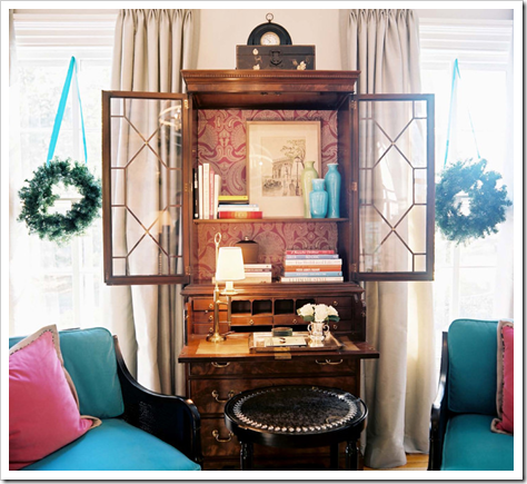
I love every single word of this post I always think that flow from one space to the next is what makes a home feel comfortable, just as she is talking about with balancing color and layering. I love the wallpaper on the back of the secretary — much like what I did for Christmas in mine ! 🙂 (Nice to be validated by someone so fab!) Check it out if you get a chance — it is part of how I carried red throughout the house this season.
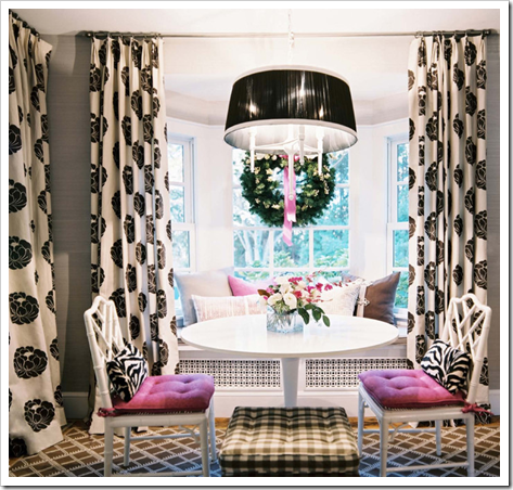
Loved this issue of LONNY and this article in particular. Isn't her home amazing? The breakfast table is fabulous.
xo,
cristin
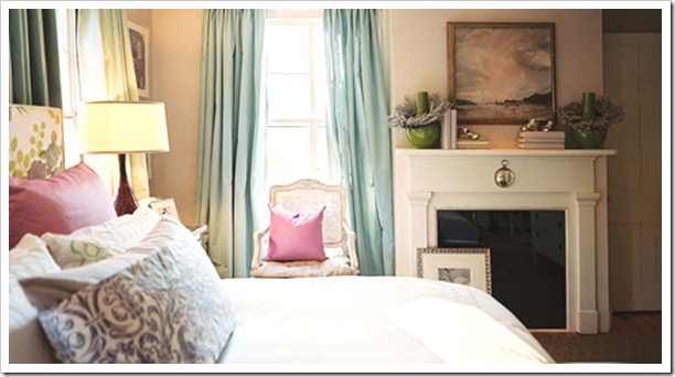
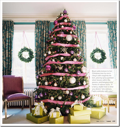
I liked the touch of navy introduced on that pillow in the first pic, a little extra sophistication. The tree picture was lovely too with the acid green to balance the pink {which I find too sweet!…bubblegum!} The last photo is pretty but my nightmare lodges there…lattice patterns and pink and big bold lillies and primary emerald green…spells the '80s. Must I be resigned to revisit that era??? {sigh 🙁 } I know I have to restrain my distain for that colour…I won't complain again about it in your comments section…ok!
yes, one pop of a fresh color – would be a nice accessory for my home….I think I would love some orange or maybe even a pop of pink!
looks good with white.
pve
Maria,
I am agree! We should use the bold color in accessories too! Good you remind us of that!
xx
Greet
I love the pop of colour, not too much, but that's the balance part right!! lol
Lovely tips! And that Christmas tree is just gorgeous with pink! Have a lovely day, Kellie xx
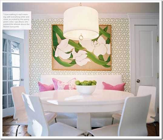
Ok I'm an all white girl and I would take ALL of these rooms. The soft nature of 1 is closest to my style but I'd be happy in all those rooms and just swooning in the last one. That table / color / art….oooh! I haven't been able to read all the mags yets but cannot wait.
Oh, so important to have balance in our houses! That's what make a house feels comfortable to the eyes. It feels "organized… not just a mess.
Great post, maria.
BTW, if you can, please take a look at my post today. It's about bedrooms and sitting areas. I hope you take a look and let me know what you think.
xo
Luciane at HomeBunch.com
Great post. Funny that the first thing I noticed too was that her accent color was the pink – I am seeing that color everywhere now and am amazed how much is actually out there. If you want to smile check out the hot pink trees I saw yesterday: http://sherricassaradesigns.blogspot.com/2010/12/casual-dinner-pink-christmas-trees.html Too funny! Wish they had named the pink 'raspberry' or something easier to identify – not sure about the name honeysuckle – that doesn't read pink to me. 😉
I want, must have now. Her bedroom. the headboard, the blue curtains, the whole room is exactly what I would pick out if it was mine. Just F.Y.I. ,you've completely converted me to raspberry.
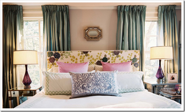
I ADORE these rooms! That third picture with those purple lamps, Oh my goodness! Love! I'm a purple lover and she used it in that bedroom so well and that tree, those big purple balls, gorgeous! Love the way she mixed all these colors so perfectly. I'm not a huge fan of pink but it looks quite nice in these rooms. That table! That picture! That wallpaper! And I don't even like wallpaper. lol Everything in that last picture needs to be in my kitchen, I have a wall just like that where my table is and can't seem to find anything that looks like I want it to on that wall. The settee would be perfect! But with 3 kids it would need to be made with plastic. hahah There might be something out there that would still look as good but kid friendly. Ahh the joys of parenthood!
excellent tips! thanks for sharing, Maria.
Clicked on her website and she did a PURPLE tablescape for the holidays! WOW Drooling!
What a fab post and I am feeling very proud of myself, Maria! I have somehow instinctively followed your fab tips with the bright colours in our home and that must be why it works 🙂
Angie
xoxo
What a great post! Simply gorgeous pictures! I can't wait to start adding color to my house!
cheers,
kate
If you do pick one bold color and weave it through your home, be prepared to receive gifts that are this color every Christmas and birthday! My sister has purple in every room of her home and if she gets a gift from family it is usually in purple!
Maria, great ideas! Beautiful examples too! Love the pick one color and weave it in idea! Great way to pass on to clients! And is a great magazine!
PS: Why don't you join me for my first give away?
Hope to see you!
And I hope you are enjoying the holidays!
xoxo
V.
Thanks for the very sweet holiday card today Maria!
Adore your blog & happy holidays to you too!!…..
all the best,
Jeanette
We just did a similar treatment in our dining room. I love the pop of pink with the gray walls.
http://thenestinggame.wordpress.com/2010/12/09/color-of-the-year/
Ms. Boyd's draperies are to die for, too…
That is one very pretty house and she is a major talent. I love all the rooms.
cheers
Susan
Great tips, Maria.
I'm hoping to carve out some time over the holidays to read the new Lonny. It looks fantastic!
xo
Brooke
Wonderful images…love the breakfast room – so charming and fresh!!
Love all of these images!!! I have to admit, I love pink. In the spring you'll find it outside my home in mass…and indoors you'll find it in my living room….but otherwise, it's not really prevalent. But, it seems to be tied to my identiry. So, I was surprise, tickled and delighted that 2011 will be a pink year!
i love the current issue of Lonny… this was a great feature for sure. I am working on my master bedroom…walls are the main bold colour… the tips here in your post will definitely be of help!
Maria,
Photos are so important when you're working with a client whose deciding to take a big step into their future room. Without a helpful visual you can't ease color fears.
Love all of these snaps and I too love Eileen's work.
Bette
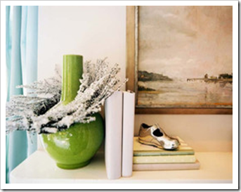
The last image is so beautiful! The design is simple an pleasing to the eye.
As I was reading I was thinking.."I'm going to ask Maria if she thinks this is red enough for Pantone's Honeysuckle?" and then you answered it for me in the end!
I'm with Belinda on the purple lamps, I spotted those right away! Love them!
What a fabulous article. All of the photos are great representations of how color can play off a space/other color combinations…We were particularly taken by the bright pink on the Christmas tree, and we're completely enamored by the way that the green in the portrait in the final photo picks up on the green on the wall. Brilliant!
such a great read and inspirational photos to boot (i especially love the christmas tree – the ribbon is FAB!).