My eDesign department is hopping with exterior colour consultations this time of year. We help clients get the fresh updated look they want while making sure the colours relate to any fixed stone, brick and roof colours.
Because once you understand colour, it’s really easy to spot when someone wrongly assumed that their stone or brick was simply “neutral”. That means, the didn’t bother considering the undertones in the stone when they chose other neutrals. And that usually means it looks less than beautiful.
Specific colour ways of brick and stone will typically only work with a very limited range of neutral undertones.
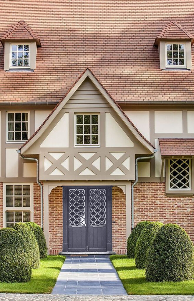
Here’s a really pretty example below.
Extremely rare is the brick or stone that looks right with stark white.
There are plenty of styles of exteriors that look better in softer, even earthy palettes, and painting them black and white not only screams trendy – it looks terrible. This is an unfortunately good example that a reader sent me recently.
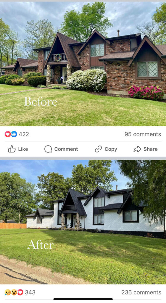
I definitely prefer the before. What do you think?
Many designers feel it is their job to give you (the homeowner) the latest trends
There are plenty of designers who believe it is their job to install the most current trends in every home.
But I have to say it again for those at the back: black and white is NOT for every house. An experienced designer, one who has been through a few trends, can see past the trend jar we’re all in and caution against excess. That’s the designer you want to hire.
Here’s the perfect example. My eDesign client got a recommendation from a local designer for updating his exterior. They suggested cream for the stucco and – you guessed it- BLACK for all trim, fascia, soffits.
By the way, we get a lot of business from people who get their colour specifications from a local designer or eDesigner and knew instantly that it’s wrong. So they turn around, start searching for other alternatives on the wild, wild web, and then find me, and happily, that’s what happened with this client.
Because, here’s the thing, and this was something we talked about in my Chicago True Colour Expert training last week. We rarely do revisions to our eDesign packages.
Wait whaaaaat?
That’s right.
We don’t not do revisions because it’s some kind of policy. We don’t do them because it’s super rare that anyone asks for one. To be clear, I’m not saying we don’t occasionally get a client who is not happy, we don’t live in a perfect world after all, but it’s usually because they are someone who really needed a designer to come to their home. Find out here, if eDesign is for you.
Anyway, back to my point. In person and virtually, I’ve been in over 20,000 homes, so I know if what you’re asking for in your inspiration photos is going to work for YOUR style of home. Which as I mentioned here, is very important.
Plus I invented the Killam Colour System so not only do you get the correct colours, neutrals or whites for your home, my design advice is also accurate.
Which proves that there actually IS a right way AND a wrong way to choose finishes for your home and if you hire me, you’re getting the right advice, EVERY TIME.
What does a timeless update look like?
So let’s take a look at his house. First thing I noticed was the perfect landscape that had recently been installed. You can always spot a professional landscape design by its gracefully undulating curved beds. So pretty!
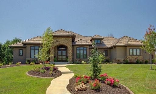
But next, what do you see? Yes a somewhat drab taupe colour scheme that could be much fresher. What else?
We have a taupe/brown and orange roof and orange and brown stone.
NOWHERE in either of these variegated patterns, the roof tile and the stone blend, is there any black.
Could the stone be creamy? Well yes. But it’s really beige.
Choosing the right colour is about the subtle undertones of neutrals
So the right question to ask to find the new fresh stucco colour is:
WHICH subtle undertone of beige do we see in the light creamy stones?
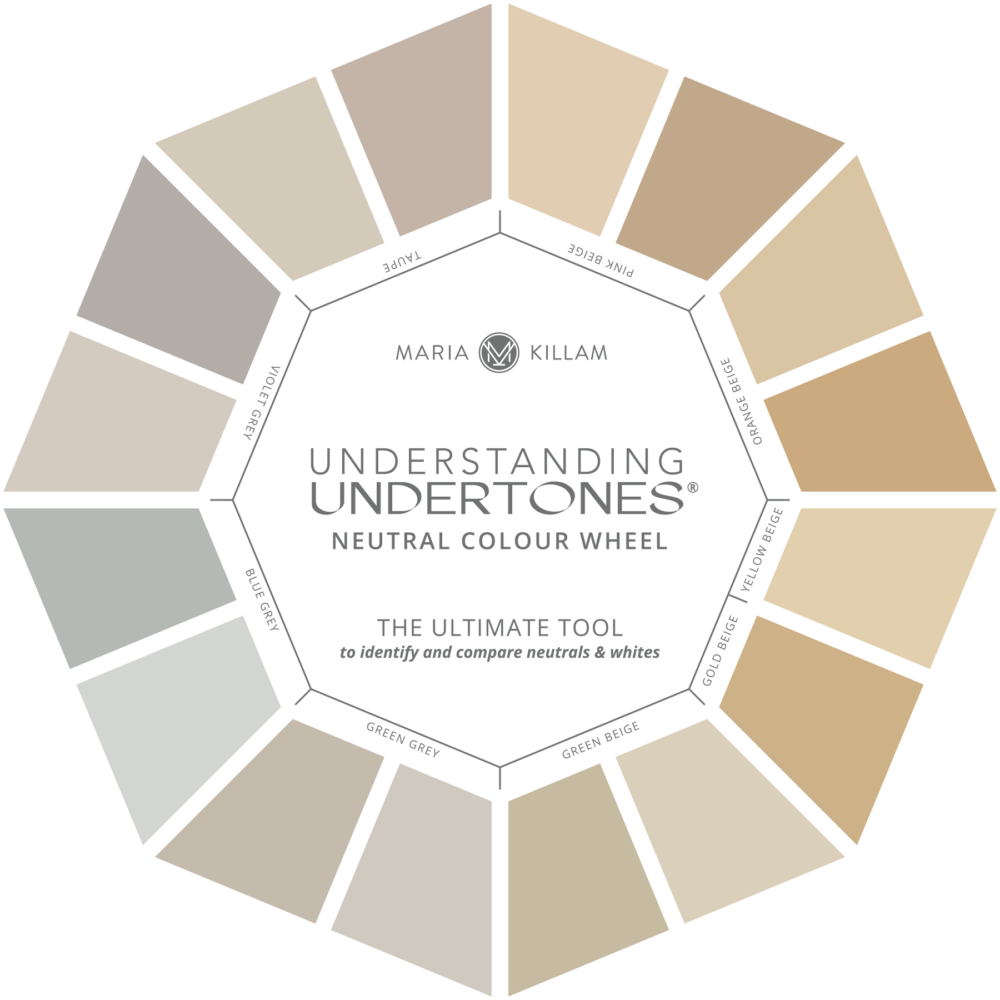
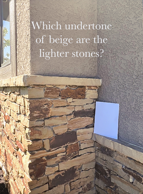
Which undertone do you see in the lighter stones? Keep reading for the answer.
A better black (alternative)
If you look closely at this stone, the darkest tones are red brown and at the window frames are bronze. There is no reason to randomly choose basic black when the deep accents in your colour scheme are already a rich bronze.
Which by the way, choosing BRONZE is a really great alternative to trendy black for windows and high contrast accents on exteriors. Bronze is often a “better black”.
Even without having stone that so clearly wants to be paired with bronze, I often recommend bronze to my clients for exteriors. Simply because if you choose black right now, you are time stamping your exterior to a trend that is on the fizzle.
But it’s also because bronze is simply a softer choice than black with great longevity.
A trendy “update” versus a timeless update
So let’s take a look at the house photoshopped with the designer’s original recommendation:
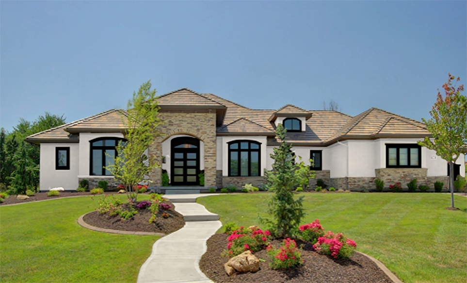
See how heavy the thick black trim looks, weighing down the otherwise pretty facade. And how the stone sticks out as simply wrong? That’s because nowhere has any of the colour in the stone been repeated.
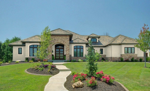
Instead, if we choose an orange beige complex cream to relate to the stone in addition to repeating the rich bronze accents in the stone, and the window frames, not to mention the taupe/brown/orange roof, we have an intentional harmonious look that at the same time looks updated and fresh.
The bronze paint colour and orange beige neutrals (along with the rest of my curated neutrals and whites) that we specify over and over again, can be found in my bonus book of colours for Benjamin Moore and Sherwin Williams in either of my ebooks here.
And that is how it’s done, every single day in our eDesign department. You can see all our packages here.
If you have an exterior that needs to be painted this season, you can also purchase my Exterior Colour Selection Masterclass here.
My True Colour Expert Training will be in Dallas in the Fall, register here.
If you’re a homeowner working on house projects, new builds, and renovations, my Create your Dream Home course is for you.
Related posts:
The Black & White Exterior Colour Mistake EVERYONE is Making
My Nearly Finished French Country Exterior (& Expert Colour Advice for Stone)


Not only did they make that poor Tudor black and white, they also removed the beautiful diamond panes windows AND ripped out the shrubs. Every decision was made poorly. It looks like Cruela DeVil lives there now.
I had actually bookmarked the post about that house on facebook when I saw it, it made me so sad! It really was a lesson of what not to do. I’m glad to see Maria had a chance to address it, it makes me feel like the fate of that poor house might serve to save many others. RIP beautiful tudor!
Wow, what a great job you did on the exterior!!! I really does make a huge difference. You have proved that a beautiful house can turn into an ugly house with the wrong color choices.
This black and white trend has really been taken too far. I wish it would go away, because people are ruining lovely homes just to have an “updated” look. Maria, I wish your blog were required reading for everyone! I love what you did in the last pic – the orange beige and bronze look great on this already lovely home!
Hey Maria!
I haven’t commented for a long time, but still follow you…..
So happy that you did this particular post to renew and refresh my mind on the basics of color choices.
It just so logical and not” rocket science”!
Similar to choosing an outfit.
Trends are made to sell products mostly.
Staying true to basic principles of color, proportion
and restraint in design is something everyone can do.
Thank you again for your faithful teaching & training!
Love,♥️
Paula VH
I had guessed that the “better black” was going to be the green/black I was advised by a real estate agent to paint my shutters on my southeastern home to mimic historic homes in Charleston. It was a nice look for that 1999 two story traditional home with pale grey (almost white) drivit siding and white trim. I was horrified to drive by that same house recently to see that the new owners have painted the shutters, trim and even gutters/downspouts matte black, even brickmold around the old windows that needed to be replaced. I do agree about the bronze being a “better black” for new window choices and will keep it in mind
I love Charleston Green 🙂 – (which isn’t black but very dark for those who aren’t familiar)
I’m not following the first example. Yes, the house itself — brick and roof and trim — seems to be well-coordinated and complementary. But the photo shows a cool gray walkway and some cobblestones just visible in the photo, leading up to the doorway. My sense is, houses do not exist in vacuums, and we need to take into account sidewalks, driveways, walkways, style and colors of landscaping, including pebbles and dirt, and even neighbors, if they are close.
The brick tudor, now painted black and white, had so much going for it in the original photo. The main issue, in my opinion, was the landscaping, which was overgrown and needed better flower colors suitable for the red brick, plus a larger blossom size. Red flowers against red brick isn’t the best choice and I would have suggested a paler pink or apricot (depending on the brick undertones), cream, perhaps yellow, etc. The brown roof with warm brick is a unified look and elevates the height of the house. The black roof makes the white house look squat, as if the roof is pushing it into the ground. I could understand if they wanted to paint the brick a lighter color (although that’s a gorgeous brick) but white with black was a clear mistake, as Maria pointed out.
Oh wow, that first before and after is tragic. They ruined that beautiful house. I don’t even like the original color of the brick and still think the before is so much better!
For me, the most unsightly was the pathway leading up to the front door. It calls attention to itself in all three examples but is the least offensive in the third example where bronze is used. And, by the way, the third example is by FAR the most harmonious looking. What’s going on with that pathway? It’s awful!
I had to lie down with a cold pack over my eyes and try to unsee that black and white house.
Ha ha ha!
I love how the orange beige paint on the last house also looks so much better with the front walkway! That walkway is all I saw in the first photo.
The “before” brick is definitely better than the white/black. The before looks a little busy, but it seems like they could have worked with it. The true benefit of a brick home is never needing to paint or replace siding. Painted brick looks terrible when it starts to flake… and it will… eventually.
There is a type of paint that becomes one with the brick and will never come off. Sarah Richardson (the designer) used it on a house and it was a new product for her.
I really like the color you recommended! So much better than the white recommended by their designer. However, one thing I noticed is that in the first two images, the walkway seems to be pretty yellow-ish, but on the photoshopped image with your color recommendation, you seem to have toned down the yellow to better match your paint recommendation!? Does that mean you also recommend that they paint the walkway? There was no mention of the walkway in the text…
Thanks for clarifying!
Question for Maria’s bronze design:
why is the trim surrounding the window and doors not painted bronze and only the windows and mullions colored bronze?
Good question, because it would get unbalanced and too heavy looking. Maria
I’ve been thinking this about bronze in the context of kitchen hardware for months. Some kitchens can’t handle black, but the cabinets need something dark for contrast, and bronze is there for you.