I have had lots of conversations with clients who have said “I have decorated many homes with great success over the years but this house has me stumped.” They call me because they need an objective opinion to get past something they can’t see on their own.
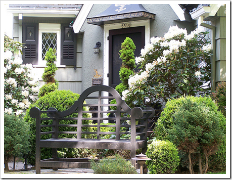 Image via Inspired Room
Here is a great example of what I’m talking about. . .
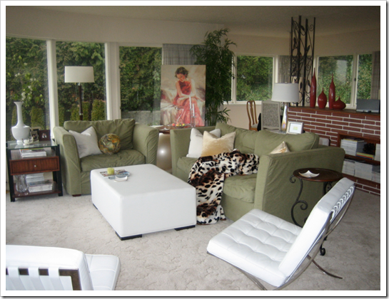
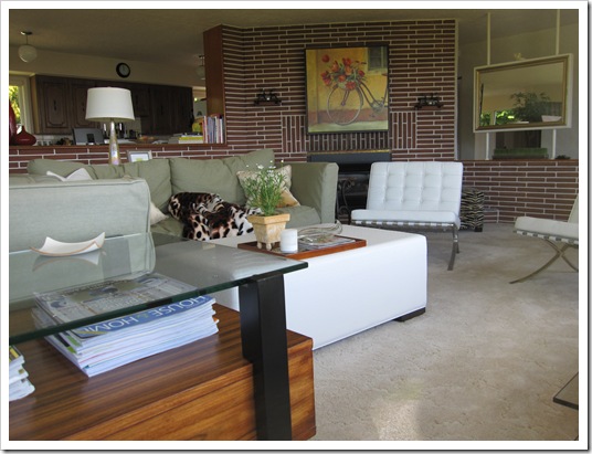
See this lumpy green furniture below (lumpy to me because of the chair and a half from the 80’s—truly, even though this chair style is comfortable, the scale is too big for most homes in general) well this was in my last house (below).
I wasn’t ever very happy with the whole room and I think I only showed this living room once on my blog because it did not represent ‘my look‘ and we were renting so I was just working with what I had.
However when people walked into the room from the front door (this is exactly what you saw–above), they barely noticed the furniture because it practically blends right into the green hedge outside. Really, your eye goes right past the furniture and straight outside the windows.
And then the fireplace sitting behind my sofa overpowered it visually because it was so big.
So my green furniture? It was almost in the background because there were so many other elements that visually took over.

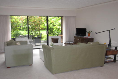
Then, fast forward—we move the same furniture into a new space and suddenly, you walk into the room and all you see is the back of it all, eeeeek (below) not to mention it had totally faded in spots from the sun in the old living room.
Now I had already decided I was starting again in the new place because this furniture I acquired in a break-up, but it was sure hard to look at now!
Anyway, I got so depressed (okay I’m exaggerating but those of you that are highly affected by your surroundings understand) sitting in this room before my new sofa arrived (below) I barely spent any time in it for the first 3 months that we lived here, I just sat in my new office upstairs which was the first room I decorated.
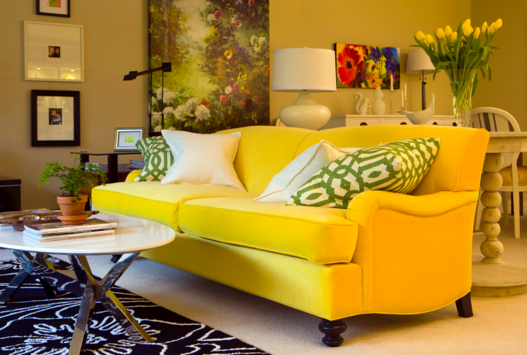
(After) Interior by Maria Killam
So, if your furniture looked great in your last house and here it’s not quite right, this might be one of the reasons.
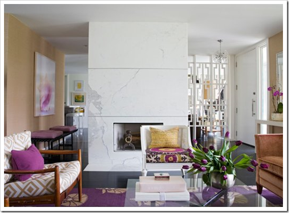
The lesson here is to pay serious attention to the first thing you see when you walk into any room because whatever you’re looking at many times is the focal point of the room and it’s not always the fireplace (below) even if you have one. I wrote a great post long ago that elaborates on this further, ‘10 Ways to Save money NOW by Creating a Focal Point’.
Bottom line, if there’s something in your house that bothers you and you can’t quite put your finger on it, email me for my on-line rates or find a designer you trust to help you. Trust me it will save you time, money and a lot of angst!
What bothers you about your house?
If you would like your home to fill you with happiness every time you walk in, contact me for on-line or in-person consultations.
Related posts:
Virtual Colour Consultation; Before & After
2 Questions to ask before you Renovate vs. Decorate
Danger; The First 24 Hours after you Take Possession
New to this Blog? Click here ; Follow me on Facebook and Twitter; Become a True Colour Expert
While you’re here, subscribe to this feed so you don’t miss out!














I have found that it is often the wall color that makes furniture look bad in a new house. If the wall color is right, then the furniture fits in so much better. I bet that is half the reason you hated your room so much when you first moved in.
Maria, This is such a good piece of advice with great photos to demonstrate what you mean. I've moved 23 times since 1987. Just about the time I got everything right..curtains, furniture, art, decor and everything felt 'right', we'd move again. I ALWAYS felt depressed. The last house was always perfect or almost so, so why would the same furniture and decor make me feel so bad in the new house. Like you, I gravitated to the first room that felt 'good'.
I've been in our present home four years and this is the first year that everything feels like it is 'clicking'. I keep carrying the old 'arrangements' and decor with me each time we move and it's so frustrating. And that never works in a new home. I have to learn to give up my past styles and arrangements and really 'die' to them before I can begin to embrace the new.. It seems to me, from a frequent mover's perspective, that a new house is going to call the shots for the most part and you have to be willing to work with what is there if you can't change it. You really have to have an open mind when you move to a new home. I think a new home 'speaks' to you and sort of tells you what it needs in some ways. But I'm always so attached to my old ways, that I don't listen very well.
Wow–you know I'm no decorator, Maria! I'm almost afraid to express my opinion about this. But I've had to redecorate 23 homes..23 kitchens..etc. This is the one thing that has been consistent. It takes me (a non-decorator) at least two years to even begin to figure out what I need to do in a new home. I almost think I ought not to buy a scrap of anything until I've lived in a new home at least a year. Or bette yet..I could hire you the next time we move. Probably a designer could spare me the long trial and error period.
I will probably link to this post this summer when people are starting to move again. Sadly, I'm quite the expert at moving. Sigh..
Lovely photos and great points!!
xo
Donna
* This was a really good & interesting blog today, Maria… and as I said a while back, your new LR looks WONNNDERFUL (yummmmy sofa and color choices!)!!! (Soooo full of LIFE!!!)…
And, since we moved 28 times in 38 years, I DO KNOW about your subject here!!!
Thanks~
Linda in AZ *
[email protected]
What bothers me about my house is I don't have the time or funds to create the look in my dreams. Sigh…
I totally understand what you mean about your own house making you question your creative eye! Sometimes I get attached to objects (especially those that belonged to my great grandmother) and I can't move past them! Sometimes I feel like my own house doesn't look nearly as good as other rooms I have designed. Being overly exposed to design doesn't help either. Great post!
Your new sofa looks great! I love the cheery colour.
Well, you know what Maria? thank you for this post. I am not crazy after all…do I have talent? who knows in this rental with stuff I have to make work even though I am a designer. I feel like my hands are tied…so, I try to make it work with not a lot of cash right now. Luckily I don't have a carbunckle (sp?) to look at, except maybe my ugly desk. Great post and food for thought!
Maria I can't believe how lovely your new living room is looking. My eye went right to your new sofa and then out the window to that gorgeous patio. I had to look back to the before photo to make sure the patio was really there – and it was, just hidden by that green sofa.
I have moved well over 40 times in my lifetime (54 yrs) and half that many in my adult years. Homes do not always go back the way the were each time you move. I have become an expert (plus being a designer doesn't hurt) at using pieces in different ways and in different rooms. It is quite like doing a jig-saw puzzle. Afterall, one cannot buy all new or reupholster every time.
It is true too that wall colour makes all the difference in how furniture fits in a room!
xx
There are at least two things in our living room that bug me–Jim's 50" TV that is too big for our small room and Jim's ugly recliner. Unfortunately, I am stuck with both, at least until I can convince him to get a new chair. I don't think I'll be able to convince him to get rid of the TV.
May I make a suggestion?
I've found that taking photos of the room that troubles you helps you to be more objective. Seeing the room as other do highlights the flaws that you may not have noticed in person.
Good post idea, Maria!
-Ann
The rooms that seem to stump clients (and the reason they call me) are the long, narrow rooms which we have a lot of where I live. Agree that creating a focal point is key. (Love your yellow sofa every time I see it!)
What bothers me about my house? Me! hahaha. I can never get out of my own way. I can't decorate for myself to save my life. I've decided to fire me. Sometime soon. Or, I need to pay me by the hour and then maybe I'll get somewhere! lol. There are just.too.many.choices. And, once I get into a project, I get bored with it because my budget doesn't allow me to do things all at once. Sad story, huh? Good thing I can decorate for my clients!
I am such a big fan of your work.. you have a keen eye for beautiful decor. Your articles about interior are so beautifully written. It is surprising and sad that your first home's decor (at least in these pics )was so simple and dull. The pics of your new home with the yellow sofa looks very cheerful.
Maria,
First, I have found the amount of daylight in a room to be very important at the start.
Second, daylight and wall color combined start to speak to me.
Third, daylight, colors and furniture elements make the room sing.
There is a formula for every situation and it comes together.
Bette
I know exactly what you mean ,for me it is our dark green leather lounge which I bought in 1990 and which is still in perfectly good condition, the thing with leather lounges is they last and last and last ….
Also I have a husband that does not like spending money when "we have a perfectly good lounge" but now after 20 years ,it has to go ,this may be THE year!
I love your Blog!
~Sharon~
Oh, holy heck, that's MY sofa and chair you're bemoaning. (If you can call that monstrosity a chair.) The model is called "The Titan," I believe, and for good reason.
Yeah, the scale is too big for the current living room, so I was thinking of taking the back cushions to an upholsterer for a little "liposuction." What do you think, Maria, is that pointless? Then maybe the furniture could just sorta "hunker down" out of the way of the windows until we're ready to replace it.
-katkins
Hi Katkins,
You are so funny, I laughed out loud when I read your comment! Well it's hard for me to say what you should do because I think the biggest thing that needed to be done to my green sofas was that the cushions needed re-stuffing because they had become so lumpy over the years.
IF yours are even fatter than the ones here though maybe that would make a difference.
Thanks for your fun comment 🙂
x
Maria
What bothers me about our house? My husband'a Lazy Boy recliner. I made a slip cover for it this past summer which helped but the shape of the chair is still there underneath.
The other thing that bothers me is the lack of flow with the flooring. Tile next to carpet next to another tile. But last night the hubs said we can get hardwoods installed through-out. I'm so excited!
Do you think it will make his chair look better? HaHa!!
Love your posts, as usual.
I have a Stylish Blogger award for you, please visit my blog to accept!
What bothers me the most about my house is that my living room doesn't get a lot of natural light and there aren't any lights wired in (1920's house). I've read your post "a light colour will never come to life in a dark room" so many time I can recite it! I'm hoping one day you'll write about small & dark living spaces and which colours to choose…
Oh boy, don't even get me started!
First of all a builder designed my home….not an architect or residential space planner. So you guessed it. Wasted space, poor traffic flow, minimal electrical outlets, most of which are not polarized, an overhead light in the center of each room, a kid's bathroom over my entry hall. Yep, you guessed right, you can hear the toilet flush and the shower curtain never seems to keep that dripping noise from occurring now & then. Speaking of entryways, when my front door is open all the way, it blocks the main entry into my formal living room which is ok because no one ever goes in there anyway…more wasted real estate!
ALL the bedrooms upstairs open to the same landing and my son's walk-in closet which he has turned into a "soundproof" recording studio backs up to right where the MR. lays his weary head every night!
Ok, ok, I'll stop.
I'm actually waiting for both kids to move out so I can buy something small, old, and charming. I like quirky old houses, not new ones!
Love ya Maria for letting me go on here.
Xo Lisa
You may have already shared where you found that lovely yellow sofa…but it is the sunshine of that room.
I love how everything went from drab to fab.
pve
Great post. I think for me as a designer the hardest time I have designing a home is when the client has clutter, clutter and clutter. and can't get rid of it. Then there's nothing that works, no matter what angles, what background..anything!
Donna said, I almost think I ought not to buy a scrap of anything until I've lived in a new home at least a year.
Good idea! I recommend that people wait a year (if possible) before attacking landscaping, and spend that time observing the way the space affects the way they interact with it.
I recommend they remove the "truly ugly" – in my case it's dead stuff, trash, and movement blocking things. And then take lots of pictures.
In a new house, it would be paint the walls to a default neutral that makes your furniture look OK or good, and then live there.
A new home has different scale rooms, a different traffic flow, different orientation, and different lighting.
Spend a full year seeing what the light does, what the best traffic flow would be, etc.
Maria–great post, and I appreciate your transparency in showing us your previous spaces that you're weren't over-the-moon about. Although I think that the first space with the green sofas looked very welcoming, comfortable and put together! That last image you posted is delicious as well!
If you have a moment, head over to my blog:
http://cottagemodern.blogspot.com/2011/01/do-you-like-this-kitchen.html
I posted today about House & Home's black kitchen (December 2010 issue). I'm a kitchen designer, and really struggling with this color application, and wondering if its a trend at all….I'd love to get your opinion!
I have found that I am ADD with my paint color choices, I constantly want to change them and always find myself choosing the safest, Ivory or Brown.
I am doing a giveaway on my blog right now and would love to have you enter!
http://bonjourfrenchie.blogspot.com/
What bothers me about my house?
Oh my. Poor traffic flow. The awkward and inadequate builder's kitchen (built in 1949), the non-working fireplace, the deteriorating hasrdwood floors, the miserably small back entry way, and the unpainted old douglas fir staircase railings and trim upstairs. (Yes, my husband is a druid. No, I have other battles I choose to fight.)
Thanks for the post. I love seeing how folks "progress" in their decorating–you really are your colours aren't yopu! I'm so glad you are happier now.
Maria,
Today I was thinking about you. Let me explain why…
I used to live in Vancouver and moved to the Okanagan and now I'm living in the Maritimes for about 3 years. I love here, it's beautiful, but I'm starting to miss Vancouver so much. And every time I come here, I miss Vancouver even more..lol… I was thinking about you, because I was reading here another day about you saying that when we're renting, we can change too much around, and if, we decide to move back to Van, we'll rent too, until we find the right place to buy. The thing is, I don't go there for 3 years and I wonder how much it has changed. So, I was thinking about asking your opinion about that… we have 2 small children and I don't want to live in a "bad" area, if you know what I mean. I wish we could live in West Van, but the rental there is just crazy, maybe North van… Do you have any impute?
About your place, I love your new yellow sofa. So beautiful! You truly have a vision for color, Maria. I'd never buy a yellow couch, because I'd be too scared, and look at your space! It's gorgeous! I love seeing the red pillow too. It's just perfect.
Well, drop by, if you have a minute and let me know about the places there, but if you're busy, I totally understand, ok?
Than you and have a very blessed week!
xo
Luciane at HomeBunch.com
Wow! This is such a powerful visual description. Thanks, Maria! The green furniture *did* blend into the outside green of the old house so much better. It's amazing!
It's so true that some houses/flats are harder to decorate than others, especially if you move into a different sized living space – and none of your furniture fits 🙁
At the moment nothing about our house bothers me – other than that I want a Viking stove and new dining room chairs!
A wonderful post! xo
You made the point very clearly with your old and new houses images. The layout of a room, the light coming in, the height of the walls and many more factors create or destroy the design.
Maria,
I've just made a post about Colorful Interiors…. Come take a look and let me know what you think, ok?
I hope you're having a beautiful day!
xo
Luciane at HomeBunch.com
I love love love your new look. The scale looks perfect and the white leather chair looks fabulous with that yellow. Looks amazing. I'm stumped on my living room – I have a design degree and I'm good at space planning but I'm having a hard time with my living room. The shape is odd and it creates major space planning issues which frustrates me because I want a change. My living room is soo not me as I'm operating with a sofa that is 13 years old. Dying for a change but need more money 🙂
Like everyone else, I love your new living room and yellow sofa! However, I am curious about your previous living room because it was beautiful as well. Had you not been renting, what would you have done with the space (not including changing the furniture)? Would you have painted the fireplace and changed the carpet? With the expanse windows and lovely landscape, would you have incorporated more colors that would have competed with the beautiful views? I love your design style and truly appreciate hearing your thought process.
I love your “New” Living Room Maria! It is You!!
I am thinking a new sofa in the near future!
xoxo
Karena
Art by Karena