Just in case you thought that you can’t mix white and cream, you certainly can.
But sometimes it can look like you made a mistake.
Or maybe you finished the room and it doesn’t seem quite right.
For example, what if you chose all your kitchen finishes, countertops, flooring and backsplash in white or cream, with only one exception? You might be staring at your kitchen and wonder if there’s something wrong.
Here’s how to fix it.
Better Homes & Gardens
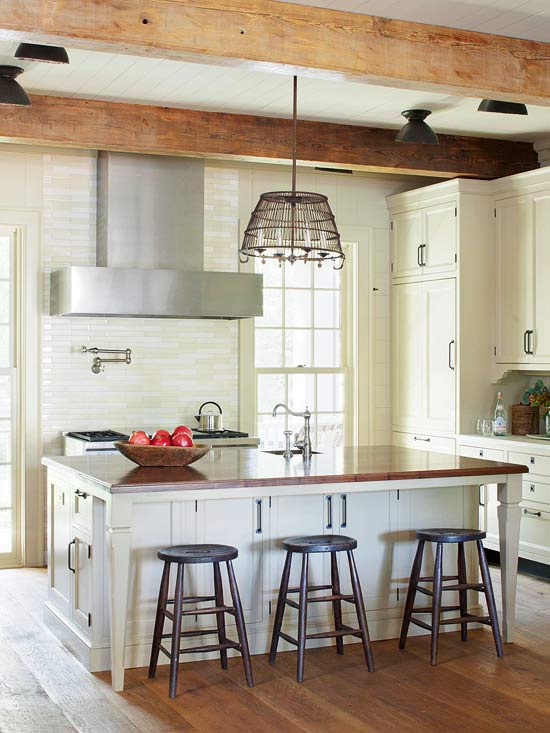
See this kitchen (above)?
If you scroll through ALL the images one by one you’ll see that this entire space is mostly CREAM (above).
It almost seems as if this homeowner was absolutely convinced that too much white would be clinical and cold (maybe). And, all of it could also have been totally intentional because the thing that pulls this entire kitchen together is the cream and white subway tile backsplash. (See first image)
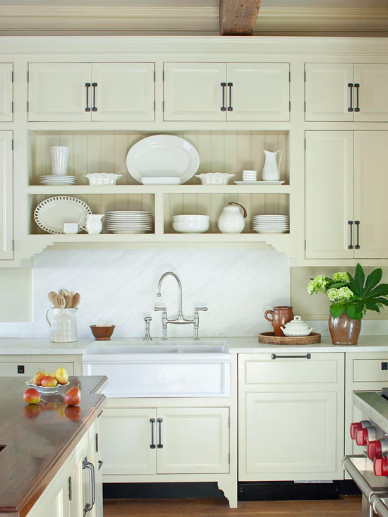
Then, the pure white is repeated in the marble countertops and this slab above the sink. And, the white dishes displayed on the open shelving.
Overall, the combination of white and cream in this space is very pretty.
How can you make it work in your interior?
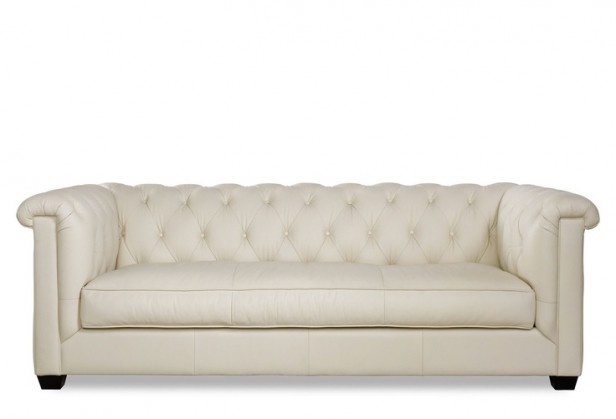
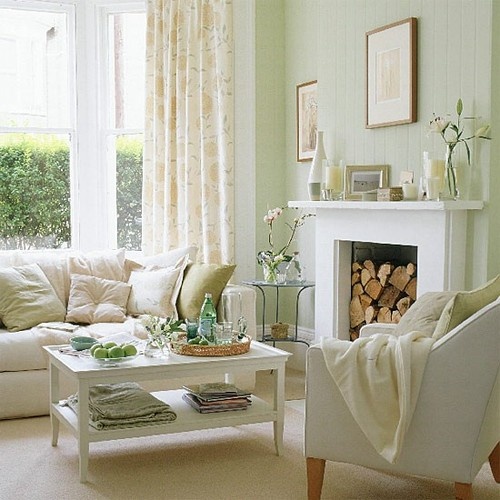
What if you have a cream leather sofa in the living room like the one above?
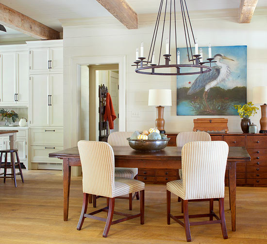
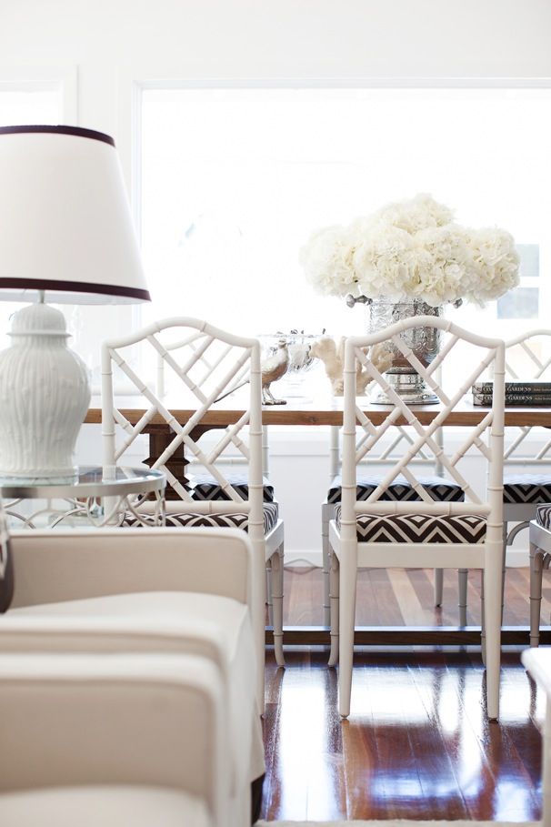
And white dining chairs in an open concept space?
Make sure you repeat both the white and cream at least once in something big and make it look intentional by repeating them both three times in a gradation of small, medium and large elements.
For example, your drapery fabric (above) could be a combination of white or cream (that takes care of the “large” element).
Etsy
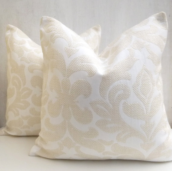
And then you could add some cream and white pillows (that takes care of the “medium”).
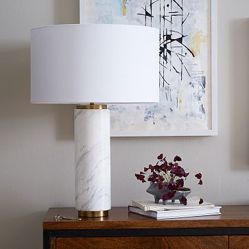
A white lamp (“small”).
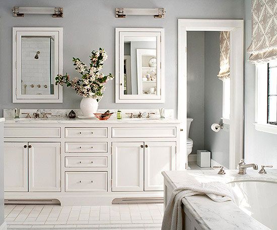
Here’s another example in this white and cream bathroom (above).
The reason this works is that the walls are painted the same cream colour as the cabinets. If the cabinets were cream, the walls painted some kind of colour and every other surface was white, it might look like the cream cabinets had just been painted the wrong shade of white. Right? If the cabinets were the only cream item in the room, you could think it was just a white mismatch.
Or if you already have cream cabinets and white countertops, floor and fixtures, perhaps tying in the baseboards and crown moulding with the same colour cream would pull the bathroom together.
Better Homes & Gardens
Here the white countertops are repeated in the bathtub, window casings, and the directors chair. In addition to the white matt in the black and white framed photo above the vanity.
{click on images for sources}
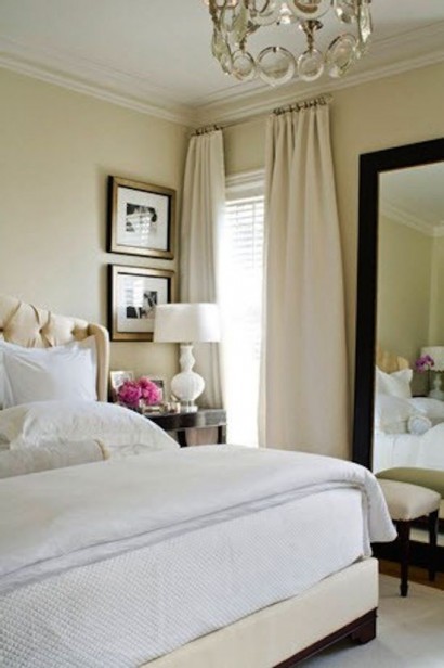
What would make this bedroom (above) perfect is if the walls were white to provide contrast to the cream drapery or if the drapery was white. Then some pillow shams in cream and white as well as a cream coverlet placed at the end of the bed.
If you have lots of cream in your house and want to incorporate white, these are some tips to help introduce white into your home!
Where in your house do you need an injection of cream or white?
Need help choosing the right whites and creams? My White is Complicated: A Decorators Guide to Choosing the Right White eBook will help you get your whites right for your cabinets, trim, ceilings, and walls. This eBook also includes my Bonus book of Whites which will take the guesswork out of your decisions.
You’ll need them both if you have an entire house of whites and neutrals/colours to choose, get them here.
If you would like to transform the way you see colour, become a True Colour Expert.
Related posts:
Can I Paint my Walls White even if the Room is Dark
Dated Oak Cabinets to White & Fresh: Before and After




Absolutely brilliant! Thank you!! I’m taking notes, lol.
LUV it! As a Gemini, 6/6 Maria, I like colour but then I see white and cream and I LIKE that. I think I need a plan to ‘have it all’!!! :O
You are wonderful and so correct! You are the color expert!
So, I can put white and cream subway in a pattern on a kitchen backsplash assuming I follow the rules?
Thank you Maria!
Cannot wait for the white book! I think this post should be in it. Very helpful xo
I have a biscuit colored tub and a white sink and toilet. I’m trying to think of a way to tie it all together. Maybe a mosaic stone tile that is cream and white? I’m not sure if that would match closely enough with the tub to ensure it doesn’t look like a mistake. Biscuit colored walls and white trim, perhaps? I have some Danby marble subway tiles leftover from another project I was thinking of using, perhaps mixed somehow with white ceramic. ???
Unfortunately there is no solution to your dilemma except to have them all match. Until you change the tub it will always look like “new sink and toilet, old tub’. Maria
Kat, there’s actually a very easy solution. For about $500 or so, you can have your tub reglazed white to match your sink and toilet. It’s a much less costly and messy option than tearing out and replacing your existing tub. And with a quality reglazing, your tub will look brand new. Once all your fixtures are white, your color palette choices are wide open … Good luck!
Just be really careful with the contractor and product used as there are a lot of complaints registered for that particular type of project. Supposedly it looks great for a while, but the durability and maintenance can be a big problem. I chose against it as it seems most consider it a short term solution, unless the tub is separate from the shower and used infrequently. Mine is combined and gets used everyday at least twice.
I did this once long ago. Shortly after it was finished I dropped something in the tub and it nicked the glaze in a couple of places. Over time those nicks grew and other nicks appeared. Horrible. You also can’t really scrub the tub anymore. You have to use harsh chemicals (which I hate) that clean without scrubbing, but even when I rinsed well I felt like there was chemical residue left behind — not great for bathers. Eventually I had the old tub torn out. I will never do a tub reglaze again.
i had my old tub reglazed about five years ago and it still looks perfect – despite having three small children that use it for baths with all of their toys. As far as not being able to scrub, are you talking about an abrasive cleanser? You should never use abrasives on any glazed surface as they make fine scratches and dull the finish over time. I “scrub” weekly with a mild cleaning spray and a sponge and the tub is as clean as a whistle.
Great tutorial, learning so much about repeat and doing things that look wrong in repetition makes them right! You’re the best. Thanks for sharing.
Thanks for this. I think about this alot! I have cream floor tile, and like the combo of white and cream, but it is tricky to make it look intentional.
Wonderful post Maria. You have answered many of my questions. I always think I have it right but you have made it so simple that now I won’t have to guess. You are a blessing to us all!
This was so helpful. Thank you for sharing your talented self with us! I love the combination and it just may help me finish my friend’s Kitchen renovation.
Thanks Maria! We are onto our next project, the kitchen! Kitchen is open floor plan, and all our walls are cream. Trim and ceiling white. Had thought about repainting walls, at some point, but would most likely stick with an off white, or a different cream. Thought I would get white cabinets and subway tiles/backsplash in the kitchen. They don’t have to match the cream on the walls, right?? Thought they needed to match the trim. I’d appreciate your thoughts!!
You just made me take another look at my guest room. It has a white coverlet on the bed. But the white isn’t repeated anywhere else in the room. I better get on that!
Thanks for the tip.
Lovely post, you are so talented at explaining difficult concepts. I’m eagerly awaiting your new e-book, I hope it comes out before I begin my remodel in a few weeks!!!
Timely! We have cream (light warm beige) 18″ tile in the kitchen, and are replacing our counters and backsplash since the dark brown (reads black) granite cracked. (Secretly glad.)
The quartz colors I like don’t play nice with the warmer floor.
The kitchen is large and the tile continues into a large laundry room/pantry so removing it isn’t a great option.
We have contemporary, medium cherry (orangey) cabinets. Painting them the right way would cost thousands (there are a lot).
I like cool, slightly grayed down colors so am stuck, other than going with a pale blue for the walls that works well with the cabinets and floor.
Part of me says the floor reads like beach sand, and everything looks good on sand. ; )
Maria, my guess is you’d suggest going cream (like Cambria’s Cuddington) for the counter. IOW, not to have something whiter for the counters and creamier/more yellow for the floor?
There’s lots of counter – an island, big L, a buffet.
Thank you for this helpful rule of thumb. I’m looking critically in each of my rooms to see how I’m doing. Why are whites so confusing?
Because there are so many of them. My eBook will help with the confusion!
White and cream is a tricky combo–but what a great way to move into the more current color white if you have a lot of cream already.
As always a very helpful informative post!!
I am always careful with the whites and beige they are so tricky! When we first installed the crema marfil counters in our master bath my first reaction was to panic and see the lighting in every angle to make sure it didn’t look pink/beige. It didn’t, and I haven’t finished that room because I wasn’t sure what I wanted to do to to pull it all together. Thanks for this blog now I know how to finish decorating that space!
Love the visuals you provide Maria. Really looking forward to you new book!
Yes, all the picture by picture explanations and extra details were very helpful:)
Maria,
This is perhaps one of your best posts, ever!
Thank you for this gem.
I have always LOVED the combination of white and cream.
So what is your opinion of the cream and white subway tiles for the backsplash? Love it or hate it?
I think it’s a great solution!
Thanks for this article! When I moved in, my house had white fixtures except for the one piece tub and surround which is either cream or off-white. Just to make it more fun, this is in 2 bathrooms, so finding the resources to budget for a complete overhaul is double the challenge. I’ve been ignoring the tub, but it does look dirty compared to the other fixtures, so I try to keep the shower curtain closed. Oh, and the 80’s oak and brass cabinets don’t help, either! I’m definitely going to paint the cabinets and do subway tile, but maybe will use cream instead of the white I envisioned, and try to balance out the paint on cabinets and walls to make it work. I absolutely love all white bathrooms with a hit of colour, but maybe I can find a way to love the white/cream look until I am able to completely renovate. I can’t wait for your white book!
Wow, I’ll certainly have to keep this post as reference or at least until you publish your e-book!
I think we all agonize more over whites and off-whites and creams more than any other colors! From the comments, it sounds like we’re all “chomping at the bit” to get our hands on the white book!
I have this issue with our exterior. Cream bricks, white windows, black roof and black painted cedar siding. I’m trying to decide what color to paint the door which is currently white. I would like a blue color but not sure how to tie it all together and we don’t the the ability to repaint the cedar at this time. I would love to know if anyone has suggestions for something that goes well with cream and white in this situation or even accessories that could help incorporate it all like you were discussing in your article. Thanks!
Hmmmmm….guess I followed the ‘rules’ already. Then again, sometimes rules are meant to be broken 😉 Lovely pics. Great post.
Someday I hope to have a client ask for an all white or white/cream room. I’ll be in 7th Heaven 🙂
I love it when your post is like a mini seminar! The content and examples are great. So helpful and informative. It’s things like this that keep me coming back for more. Thanks for the continued education (not to mention the eye candy).
Hi Maria,
Thanks for using my question about cream and white!
Martha
I’ll never forget touring the gothic Mormon temple in La Jolla, Calif., before it was dedicated for private use. Everything–walls, carpet, art–was a mixture of white and cream. It looked very celestial, though I wondered how they’d ever keep it clean.
What a timely post. Just decided a couple of days ago that the 30-year-old creamy white, almost very pale yellow trim in my bedrooms and baths is so perfect for my colors in those rooms and I’m even happier they didn’t paint those rooms with the rest of the house. Not only would the probable Dunn-Edwards Jakarta (yellow beige) be very limiting but the Dunn-Edwards Swiss Coffee, a quite crisp white, would have been totally wrong as well. Not even sure it’s right in the LR/DR with the Jakarta and, if not, won’t be changed any time soon, but at least I know how to evaluate. This, on top of Summer School, plus the fun of revisiting “related posts” made my day. (Unfortunately I had to do “real work” this morning so I’m late in responding.) I’ve taken a peek at my Sherwin Williams white color boards and am so eager for your e-book on whites.
Should you match the white of the bathroom sink, toilet and tub for the trim & backsplash or keep the same white trim colour used in the rest of the house? Thanks – great post.
Rebecca, black painted siding sounds so heavy and dark….I don’t think I’ve ever seen a black house. Painting it yourself would be my suggestion. It is time consuming but cost effective. You could do a grayed blue or gray or a cream…….I would do that, then worry about the door
And flow to views thru windows.
At client luncheon yesterday, 2nd visit to DIY client, a year later.
Her bedroom color is echoed outside to a wedge of garden view by her side of the bed into the garden. With her 1 acre property it’s a 4 board fence near the property line.
Standing by her bed, turning to her, she immediately said, ‘I did everything you said.’ “It’s enough to save your soul at times, yes?”, I replied, she hugged me hard and cried.
You have formulas for interiors, I have a garden design formula. And adore your detail with your interior design formula. The words used for the 2 professions are a bit different. Interesting.
With garden design ‘copy’ is the 1st rule, then ‘repetition’. Totally loved your verbage rules, then you adding rules within rules about scale within the ‘repeat’.
You now understand how I came inside to direct interiors too. The garden !
Garden & Be Well, XO Tara
I’ve been taking the course, and evaluating my house 🙂 It turns out that I have been mixing White and cream like crazy and breaking the color rules for years. I haven’t decided if my new knowledge will make me crazy or not! Thanks for the pictures above, they are helpful.
Hi Nicole,
Nothing wrong with mixing white and cream as long as it looks intentional.
And even then, there are so many other factors that make a room work or not even if the rules have been followed or broken.
Is that a contradiction or what? But that’s the world of decorating.
Maria
Hello Maria
Thanks for the tips for using the cream and white together so it seems intentional and delightful as shown in the examples.
This is what I love about your posts – you give the perfect visuals for people to see how colors are used in the space.
Thanks
at first i loved all the posts. then went back and looked again.
the ones i REALLY loved were the ones with the same/complementary undertones. there are some with ‘clashing’ undertones that just look wrong, no matter what. As if someone tried too hard and missed. (wondering now if it is the dirty/clean rule that went awry. will go back again and look)
another lesson — if the undertones are wrong, even repetition and deliberateness is trumped by suitable and undertone family harmony.
wow.
again again again, thank you!
ALMOST ready to start learning how and when broken rules ‘work’. 🙂
I saw a dirty/clean exterior the other day and almost took a picture to send to you. It WORKED. it was amazing.
Am STILL puzzling out why it worked.
(love a good mystery, don’t you)
Next time send it over 🙂
I’m having a terrible dilemma with my kitchen “white” issue.
The backsplash is white subway, but it has a gray undertone.
They were installed previously, so if I had my way they would be a bright, clean white.
But my problem is that I have a 1930’s type of retro look going (subtle) on with red coffee maker, thin line of accent trim in red along counter edge & red vintage pieces.
The white on the cabinets has yellow undertones which not only doesn’t work, but is making the tile look even more gray!
I’m wondering if a white w/ gray undertone like Ben Moore “ballet white” would look bright & clean while & not clash with the red accents?
I want it to work with the red, but ideally a white that would somehow make the subway tile look brighter.
SO appreciative of any thoughts you may have!
If Ballet white matches your backsplash tile then it’s definitely a good option to try. Or it might just need to be a plain white like SW Extra White. Paint them up on large samples and tape them on top of your cabinet. That’s the only way you’ll know. Hope this helps, Maria
I so appreciate your generosity of time
to answer my question!
I’m actually in parking lot of hardware store & going in to give this a try, thank you again & I too look forward to getting the book!
Good Information
I have to decide on counter top for large island, 12 ft and backsplash. I looked at frosty carinia but to be honest i like more of a white look .
leaning towards organic white ceasarstone or pure white
Help!
My cabinets are walnut and white very contemporary
any ideas?
Whichever white is in your cabinets should be your countertop colour period. If you need help deciding, we can help you in our edesign department under hard finish consultation. Hope that helps, Maria
Hi Maria,
I have a problem…or at least I think I do. We are building and though we have built 6 times in the last 20 years I am really struggling this time with my color choices in my kitchen. I chose bright white shaker cabinets and thought I had chosen white quartz with gray swirls…turns out, the quartz has a creamy or off-white background and I don’t feel as if it flows. I have painted the walls repose gray and I have a medium to dark brown hardwood floor in the kitchen. I have lots of natural light and I have an open concept with the family room and dining space all in view. I have chosen a gray leather sofa and I did choose two off-white (creamy) swivel chairs with some fun pillows to bring that all together with the grays, creams, and pops of color (lime and blue). I feel like I may have made a mistake with the quartz being creamy instead of white. I don’t want it to look like a mistake…there is lots of white board and batten trim, as well as, some white shiplap over the fireplace and on the side of my stairs. Oil rubbed bronze and wood in most of the light fixtures and the ceiling fan in the family room. How can I pull this together in my kitchen? Can I do that with a backsplash so the contrast looks planned? Please help and thank you! Jill
Well without seeing photos I would say there’s nothing you can do in this scenario except repaint the cabinets if there is no white in the countertop. Sorry to be the bearer of bad news.
PS. Style up the kitchen though, it’ll help distract your eye.
Need quick help.
Love that I found your great page. I have a cream slip covered sofa Rather than try to match the cream of the sofa I’m thinking of doing a bright white cotton for the reupholster on a gorgeous older sherrill brand club chair. There is not a pair of chairs. Just one.
Can I send you pictures or what do you think is the proper answer I love how you tied waiting with accessories and pillows a.m. to make it look deliberate just afraid I won’t like the chair in cream as it might look like I tried too hard to match it. -or would the white chair look too opposite. How do I tie it in together.
Thank you.
Julie
Naples Florida.
Hi Julie, I can help you with photos with this eDesign package: https://mariakillam.com/product/interior-colour-question/
Thanks for your comment, Maria
I bought a very light beige sofa. Originally I wanted the three pieces, two chairs and a sofa to be the same fabric, but the sofa was delivered with defects so I want to buy the chairs somewhere else, can I use white fabric chairs with the very light beige sofa?
Yes you can! Do not try to match the sofa because of course nothing will match except more of the same fabric! Hope that helps, Maria
Help! My husband and I just built a new home and the walls are cream (white dove) in the open concept kitchen, living, dining. My light fixtures were all just installed. The metal is black and the lamp shades themselves are white (there are 6 wall sconces and 1 big drum dining light). I’m finding the white too stark but it would be costly to replace all the lights. Should I just continue to decorate with white as suggested above? The majority of furniture is cream as well.
Maria, I love your posts and the info you share! I’m hoping you can share some paint colors that work with SW Creamy. I’d like to use it but would like a darker color to go with it or even a lighter color that coordiantes with it. Please let me know your thoughts!