


I recently posted about an on-line consultation where my client had a very bossy carpet. In the main living areas of the house, you should try very hard not to ignore the wall-to-wall carpeting when decorating your home. So if your carpet clearly has a strong undertone of either green, pink or yellow beige, (let alone an actual colour) it becomes a colour that should be repeated in your soft furnishings.
My advice on ignoring carpet is that you can pretty much get away with it in average size bedrooms,like the kids rooms in your house.
A bed (and whatever it’s dressed in) is usually the focal point of the bedroom and as most average size homes have small bedrooms, you can generally get away with totally ignoring the carpeting in the room when creating the colour scheme.

It’s the master bedroom where again the carpet must become a part of the colour scheme because it’s usually a much bigger room as well. If you really cannot handle the existing colour than it’s a good idea to buy an area rug in your colour scheme. Or if the floor is too dark or too light, it could still call for an area rug to ground it or to lighten it up depending on the look you are creating.
By the way, it’s very difficult to find a beautifully decorated bedroom on the web without coordinating flooring, however the reality in most homes is that carpeting is chosen so that every single speck of dirt doesn’t show, especially with children! Therefore, rule of thumb is to go ahead and ignore it in smaller bedrooms but either introduce an area rug or work with the existing colour when you are in a bigger space where it cannot be ignored.
Do you have bossy carpet in your house? What colour is it?
If you would like your home to fill you with happiness every time you walk in, contact me.
Related posts:
10 Guidelines for Choosing an Area Rug
Attention on Area Rugs
The Colour of Wood Flooring vs. Wall Colour; How Important is it Really?
New to this Blog? Click here ; Follow me on Facebook and Twitter; Become a True Colour Expert

LoL – I was just saying to my husband last night how I hated my carpet because it had NO color! Funny. It came with the house and is a boring beige. What's a Color Specialist to do?
Actually Maria, the only saving grace in my case is that there is substantial color on the wall so I guess my carpet would and should be beige. If I had my way though, I would remove all the carpet and replace it with wide plank wood.
Good post Maria and good advice as always, Kathysue
I have a crazy load carpet in one of the guest rooms and it runs through to the study. It definitely helped me choose how to decorate these rooms.
Here's a peak if you would like to see my crazy carpet (most of my friends said pull it out but love it now that they see the rooms)
http://megardengal.blogspot.com/2011/04/favorite-room-and-im-missing-it-greatly.html
Ha! I just commented a bit ago -we're both writing today! Unfortunately, we have strong colored carpet in this 'new-to-us' house and won't be changing it for a few years. You'd cringe…colors are from the 80's: green, deep red, black – none of which goes with the decor I want to do. I'm ignoring it! Though I will pull up the black – I cannot have black in my new work space!
I'm really torn about this one. We have that wall-to-wall late 70s marbled dark brown. (I grew up with that stuff and then we buy a house filled with it.) I wanted to rip it out before we moved in; I was willing to live on the subfloor with trow rugs, I said. I knew if we did not rip it out, I would be living with this carpet forever.
Fast-forward three years and we're attempting to pick out paint color and occasionally add furniture. I want to give up most of the time because everything looks like shit in a north facing room with little natural light and that carpet. My husband keeps saying it's temporary, but we've been married 15 years; I know how long temporary is. ;-/
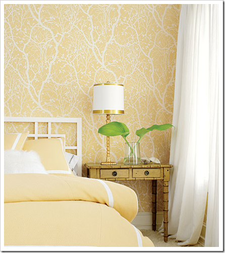
MAria, do you have any product info on the beautiful soft yellow wallpaper? I love it.
Hi Maria, How I've been thinking of you this week. I've missed getting to read your posts, but it can't be helped. I'm scrambling to get ready for the graduation party and get a driver's license for a son and host Tim's boss…and, and…I need a vacation!!
On a brighter note I am finally doing couch pillows!!! Yippee! I knew you would smile about that. Yes–yellow! I'm also repairing the antique quilt that will match them.
I'm just going to have to take photos and send them to you as they won't be part of this week's post. I will probably do a separate post all about the livingroom and how to make the pillows. Think big yellow pillows with a big button in the middle of each. I kept telling hubby, "Oh Maria is Sooo going to love this!)
And zebra striped ones that are smaller but perfectly match the rug. The yellow is a little paler than you might have been thinking of but it works with the quilt. Thanks to you I'm getting VERY brave–and ignoring my family's input completely. I'm deaf to them.Ha! :o)
I must say that this has always been a PAINFUL topic for me as we have been stuck with many an unforgiving color of carpet.
After following your blog this last year, I now know how true your advice is. It really makes a difference to work with the colors you have if they are very BIG or change them. But ignoring doesn't work. We've lived in 20 houses and I've learned most of the time, to just work with the color at least in the livingroom and master. Otherwise it just bugs me to death. :o) Great advice, Maria!
xo
Donna
I did a room where I hated the carpet…it was a girls room that used to be a boys room, and the carpet was royal blue. And the little girl wanted pink and green! But there was no money in the budget to change the carpet, so I did an area rug with pink, green, AND blue in it. I think by tying the blue into the color scheme, it made it work: http://www.conspicuousstyle.com/2011/04/portfolio.html
Stacy @ http://www.conspicuousstyle.com
I've been sticking to bordered sisal in my house to have some peace among all the color. But lately the safety of a uniform color on the floor and ceilings has bothered me. So thinking of some bossy carpets and painting some ceilings!!
Oh goodness, yes, I have a bossy carpet right now! We just moved into our house 2 months ago, and it was built in the mid 80s. We have a tealish/seafoamish carpet in the dining room and formal LR (which we use as a study). It is in great condition and I can't justify removing it just yet (hardwood will be going in there soon, but realistically it will be at least 1-2 years unfortunately!). We removed wallpaper and painted a neutralish color but it was tough to even find a neutral that worked. Any neutral/tan with even the slightest pink undertone turned bandaid/fleshy on the walls. It was crazy. I finally started holding up a paint chip close to my carpet color next to any paint chip in the paint store I was interested in, and instantly the neutral/tan would turn pink. We finally found something that works for now. And now I'm stuck trying to figure out if I should pick curtains that "go" with the teal/seafoam, whether I should stick to neutral curtains, whether I should ignore the carpet entirely and get curtains that I'll be happy with when the hardwood goes in, etc. It is tough! My carpet is kind of close to halcyon green from SW if you were comparing to a paint chip. I keep reading this color was kind of big at High Point, but I think if my house wore it the first time around, it shouldn't be trying to wear it the 2nd time around…like fashion 😉 I have tealy slate in my entry but it is grayed down and I actually don't mind it. Still trying to find paint to work with it though.
and if any of you have any advice on working around or ignoring my bossy tealish/seafoam carpet (aren't you jealous??! LOL), I'd love to hear it. I'm trying to decide how to avoid being matchy matchy, but working with it, without having to have teal curtains. Hints of red? My front door is a nice shade of red that looks pretty with my blue slate when the door is open. Not sure if that would work?
Posts like this are why I read your blog. Most of us look to magazines for inspiration, but they never address problems that many of us face.
I read shelter mags to find ideas to incorporate into my own space. It unfortunate that the standard of beauty is unattainable to most people. I want my home to look it's best–I'm not expecting it to show up in House Beautiful any time soon. Thanks for keeping it real!
BTW, you may enjoy a post from Little Green Notebook, from April 15 regarding layering rugs.
If only there were just one bossy carpet. At our new place (admittedly a fixer-upper) we have maroon in the master bedroom and purple in the other bedrooms. I went with a gray wall color to try to tone it all down until we replace the floor. I also had to pick the accent wall color in my daughters rooms rather carefully with all that purple. Can't wait to be rid of it all!
Can you believe they had a pink bathroom in the master to go with the dreadful maroon carpet? Yowza.
Christine in Alaska, hating all my carpet
Hi Marci,
Thanks for your kind words!
And Nan, I loved that wallpaper too which is why I posted that photo but I have no idea where it comes from!
I love everyone's stories on their bossy carpet. . . flooring is a biggie!
Thanks everyone!
Maria
It's not carpet, it's tile … except for the bathrooms, the whole house has a "saltillo" looking 16×16 tile with VERY definite peach cream rust mottling. It's the tile equivalent of the dreaded pinky-beige carpet.
I love the tile, it's a classic look for the southwest, hides the inevitable desert dust, but it is very bossy. It must be consulted and respected during any color selection from wall color to rugs to cabinetry to the kitchen counter tops.
Fortunately, the tile and I like browns, rusts and creamy yellows (Behr's Apple Crunch). Faded denim blues go well, too, and an extremely pale lavender (barely to the pink side) is the absolute winner.
***********
Anonymous … Don't use a paint chip "close to" the carpet color and try to pick colors in the store under the store's lighting. Take the chips to the carpet and let the carpet do the choosing.
If I had that tealish seafoam carpet of yours, I would use this technique for selecting paint colors.
http://www.associatedcontent.com/article/45843/how_to_pick_perfect_paint_colors.html
One of the classic color combinations with blue-green is blue-grey (silvery cool grey, not on the brownish mouse-grey end). Another is brown – anywhere from Etruscan red to mahogany.
The wall color should come last … paint stores can mix anything. Window coverings and furniture will be harder to find.
This made me laugh!!!
I always have so much fun here, Maria.
Have a Happy Day!
xo
Luciane at HomeBunch.com
Love the fact that the carpet in my house is silver berber! I ignore it all the time! We got lucky. Now if ignoring it would just make the stains my kids left on it go away! 🙂
Well, I did do a lot of paint swatches on the walls and after having lots of them turn fleshy and bandaid or just plain weird on my walls, I started holding up a paint chip in my carpet color against the paint chips I was interested in. I did that for the sole purpose of narrowing down what test pots to sample, because I was having trouble even finding testers that were going to work. And that approach did help actually. If the more neutral swatch turned pink up against the paint chip close to my carpet color, it always looked even more obviously pink on the walls. Whereas if the carpet colored paint chip did not cause the wall paint chip to look weird, it usually worked out to a better option. I did test on walls, I just used my little carpet swatch/wall swatch experiment to narrow down what I tried on the actual walls.
The other challenge in my case (seafoam/teal carpet) is that my woodwork is a medium wood tone. (It is nice quality and I'm trying to live with it for a bit before I commit to painting it as DH likes it, and we have 3 young children…meaning I'm thinking the stained wood will hold up better at this point in our lives vs. painted trim. Gray looked terrible (revere pewter turned the color of a band aid on my walls), and with the wood trim it was a little tough to work around. Eeek. You can see why I was struggling LOL.
I love the commentary on your blog; it's the same as being in a room full of women, all of whom have SOMETHING to say, and it's all pertinent! What about Bossy Hardware? Any fab tips on hardware??
I so agree with Linda..reading the comments is half the fun!
Maria, I just wanted to mention that I linked to you today though most of my post was about an article by Ellen Sherman. (Thanks so much for mentioning her!) It was about giving people our undivided attention. I thought you might really enjoy it.
Thanks so much for the sweet comment. Have a great week!
Your friend,
Donna :o)
Great points and I like your term "bossy carpet" – brilliant!
Anonymous – You said Revere Pewter "turned the color of a bandaid". Of course it did … it's a light grey with warm undertones.
Warm = pink
You need cool grey, which will have blue or no undertones.
Hi Anonymous and Lazy Gardens,
Revere Pewter has a green undertone and I would be surprised to see it go pink but that is why I love colour, it endlessly surprises me. However it is definitely green. If it looked pink, I would question what you are painting it on. Once people start testing colour on existing colour, that's when it really can look wrong.
Also I have yet to find a gray without undertones. Colour people in the 'know' claim that there is one that is 'neutral' but I have never found that to be true.
Thanks for your comments!
Maria
Yep, RP was most definitely band aid fleshy pink on my walls. I will say I was painting it over previous owner's baby blue (pastel!) walls, which is what she paired w/ her teal/seafoam carpet. I know that definitely impacted how RP "read" but I think the blue carpet was also throwing it way off. It wasn't good with my trim either, so it would have been a no go regardless. I definitely had a lot of swatches turn really, really weird colors in that particular room. I've never had such trouble picking paint colors for a home so far. This is my 4th house in my adult life and it certainly has the bossiest fixed elements so far…it is giving me a run for my money LOL. I have BM subtle on my walls right now and that's working for me for now with the tealy seafoamy carpet. MIL gave us a beautifully made dining set (she's downsizing) and the chair upholstery oddly enough works with the carpet and walls for now. Still stumped on curtains though.