Kirsty Swain from Hyphen Interiors wrote a post today showing a great example of how she saved her friend from making the mistake of combining a pink beige backsplash with a yellow beige granite countertop in her new kitchen.
I have written about this before here but I think this topic is so big that it needs a dedicated post.
1. Can you combine a patterned countertop with a patterned tile backsplash and/or floor or vs. versa?
Image courtesy of a client who inherited this beauty.
No.
I have been in countless homes and seen photos of thousands and I can count on one hand how many times a patterned hard surface looks good with a coordinating patterned hard surface.
It’s virtually impossible.
2. If you have existing tile in your entry (for example) and you decide that the adjoining laundry or powder room needs tile too, should you find a coordinating pattern?
No. Don’t even bother to waste your time looking. You will simply end up with a floor that looks like you tried to match it and failed.
Use the same tile in the adjoining space if you are renovating or if you can’t find the exact tile because time has passed, use a different flooring material if possible.
If you must use tile and it connects directly to another tile look for something considerably darker or lighter so that it’s obvious that you are not trying to match the existing tile. And if you have done your best, shopped the city, and you’re still not happy with the final result, know that the reason you’re not happy is because you are trying to do the impossible.
When I did some google searches to see if anyone else was offering this same advice, I was amazed to read article after article by writers droning on about how tile options were endless and wasn’t that fabulous?
Here’s the news flash. The options for tile or stone that are both beautiful and timeless are very slim indeed.
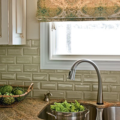
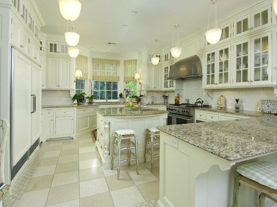
So if you have a patterned countertop (above), go with a solid colour backsplash and a solid tile floor (below).
If you have more than two colours in your tiled floor, choose a solid quartz countertop. And make sure the colours relate. I have been in many homes where the floor tile in no way relates to the countertop.
The first time I had a client who needed tile for their laundry room to connect to their already tiled entrance, I scoured the city and found something very close.
And it did not match. The undertones were different in addition to the fact that the existing tile was 13″ x 13″ and the closest one that I could find to ‘match’ was 12″ x 12″.
So don’t make the same mistake that I did many years ago, and you will have a beautiful space that makes you happy when you walk in the door!
Related posts:
Is Quartz sexier than Granite?
Selecting your Kitchen or Bath Backsplash; Accent Tile or Not?


Great advice Maria. Hope you are enjoying your new home 🙂
Winner advice–once again! Thanks for explaining and showing pictures to illustrate your point.
I went to the Parade of Homes this weekend, with some spectacular modern homes. The only traditional one, however, was horrible. A million dollar home, with granite and other stone finishes abounding…the ENTIRE home was painted a strong pink beige. Seriously. Even without your undertone book which I’ve read and read, I would have hurled when I saw it. I made a point to find out the designer’s name so I would never use her.
My grandmother used to call it “underpants pink”…kinda fleshy. Uggh.
Great advice, and yet many decorators don’t even understand that. Thanks for the post!
Thanks for explaining in such a clear manner with examples to illustrate. I am staying away from trendy stones and tiles in our new home. Your article has been very helpful. Thank you
Most people don’t seem to understand the concept of “simple”. Very well said, Maria.
Some concepts, like this one, need to be stated over and over! Great illustrations Maria. I’m so appreciating your aesthetic for it’s cleanliness and simplicity. Life itself is too complicated to deal with…..why bring complicated and expensive (to change) elements into the space we all would like to think of as our “sanctuary” ??
K.I.S.S. is still a good motto.
Love all your backsplash posts, but haven’t seen you post about this dilemma! Where do you stop the backsplash when the upper cabinet run ends about 8″ before end of the countertop below?
I have a peninsula and the countertop extends past the upper cabinet! I should have had the uppers extended out further, but didn’t even think about it until backsplash decisions came up.
Should I extend the backsplash past the cabinet? With a subway stagger it to soften the hard line of tile???
Thanks for a great post Maria.
I couldn’t agree more with your ideas. So often
people try to match a tile,to a tile and never looks good, it always look like they “tried” to match, go for
a completely different look. Also of course solids next to patterns, unless your making an ugly christmas sweater to match patterned pants.
Would a bead board backsplash be too busy with Tigris Sand Silestone and a tile floor that is set on a diagonal? Thx!
Lisa, I am looking at Tigris Sand for kitchen counter. I’m curious–do you like your choice? Sometimes I think the undertone looks peachy, and at times more greenish. Do you have an opinion on the undertone? Thanks!
I think I may have made a mistake with my countertop selection. It’s tigris sand Quartz. I’m seeing pinkish undertones. I’m hoping its the lighting, which is still being addressed. I’m wondering if encore silver/grayish tile might work. Would this be a god pairing, or should I stick with off White? Cabinets are a creamy white. Any input is greatly appreciated! Thank you
You can’t make the pink go away with a grey backsplash tile. Stick to creamy white backsplash to relate to your cabinets. Maria
Thanks for the insight. I Really appreciate it. I’m taking a cabinet door to the tile shop and will try to match that. Hope I’m on the right track with that thinking! Thanks again!