All the Colour Professionals that gather at each CMG Conference arrive with their NOW Colours (colours they are using in their industry currently) and NEXT Colours (colours that clients are beginning to ask for that will be happening next). Photo by Maria Killam
I arrived in Portland with time to spend walking around and taking in the city. I loved this image from the Pearl District (what a great name). It’s black white, gray and charcoal with a vintage feel all in one photo! Exactly where colour is right now!
The first day of colour workshops, this is what our board looked like with everyone’s colours pinned up.
What keeps me ‘in the know’ on colour is blogging of course, in addition to local as well as on-line consultations I conduct every week with clients all over the US and Canada. One day I’ll be in Virginia and Florida and the next, LA and Calgary. What colours are my clients asking for RIGHT NOW? Greeny grays, blue grays, charcoal, white and black with blues and greens thrown in for some colour.
The NEXT ‘brown’ that was chosen was warm and more orange (nothing espresso there). And it’s important that you interpret this particular shade of brown as ‘warmed up wood’ NOT as a wall or sofa colour. At the same time that every single one of my clients wants gray, they wish to eradicate ‘orange spicy’ tones everywhere else.
Lauren from Pure Style Home recently wrote a post headlined Warm Brown and her post is right on trend because all the gray, raw, limed wood that is very hot needs the mix of warm woods to add ‘patina and character’. John Troxell from Wood-Mode Inc. a cabinet manufacturer reported that 10-15 years ago everything had to be perfectly smooth and now there are lots of requests for imperfect looks, crackled glazes, worm holes and knots and they have a dozen finishes that have 20+ steps to get the distressed looks that people are demanding. And if you think about it, embracing the environment is also about embracing imperfections.
We have a small oak gate leg table that we are using as a dining table in the interim while I’m looking for a new one, but it’s already in the exact warm tones that I want (it’s too bad it’s the wrong size).
I posted earlier this week that a purple/pink undertone gray was also NEXT. Overall gray was declared NOW and almost a classic colour (classic for now, it’s not like gray has been classic at all in the past 10 years since brown has been ‘in’) so my interpretation of this purple gray tone is that it will be re-mixed in wood tones much like the ‘pickled pink oak’ of the 80’s but of course in a new finish that we would potentially like – although I’ll reserve my opinion until I see it in person.
The first day in the break-out sessions my group didn’t see yellow as an important colour and I would have to agree. It’s not a colour I’m specifying at all these days for anyone but myself 🙂 I’m curious to know what your take is on yellow at the moment – it’s rare that I choose one for a client, even though gray and yellow are fabulous together!
Tim Wetzel an Industrial Designer from Rejuvenation said his take on today’s colours is that they are influenced by the mid-century palette. Rejuvenation designs their products around historical colour trends. I had a tour of their store and loved all the old mixed with the new. Here are some of the images from the store:
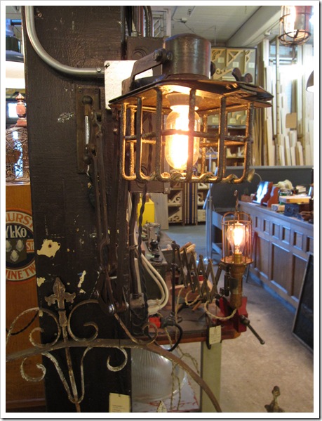
I tried to take a photo of this very cool light fixture and there was too much in the background to get a good visual of it. I’m posting it anyway because I like the blue workbench in the background, the whole image just feels old and cool. Very Steampunk!
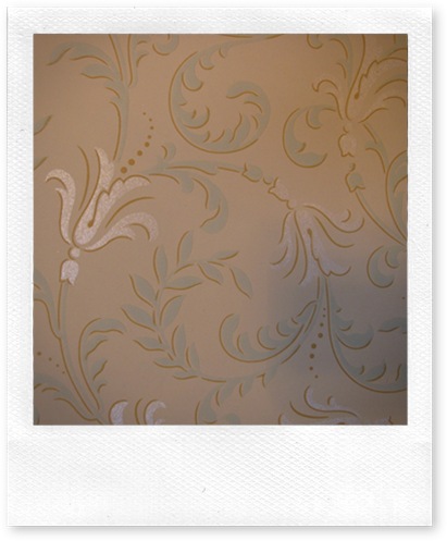
This is their library filled with wallpaper books, magazines, and other elements from 1890 to 1970. Here are a few pages of wallpaper from a wallpaper book from 1895:
It looks very ‘today’ doesn’t it?
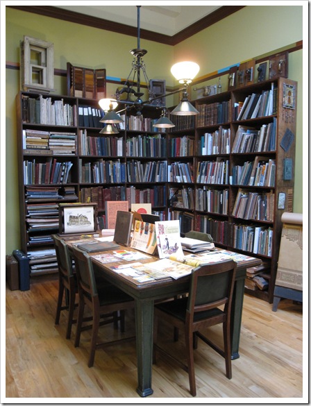
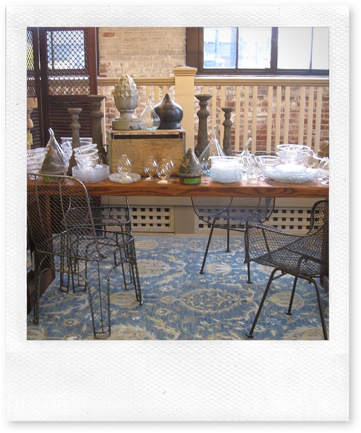
Some vignettes from around the store:
Really what they do is specialize in Authentic Vintage Lighting and Restoration Hardware. Built-to-order reproductions of classic designs.
So that’s the trend report from the conference. The reclaimed wood, mixing old with new, adding patina conversation is still strong as ever (I talked about this back in April when I was in Brooklyn).
Over to you, which colours are you going to introduce in your home NEXT?
If you would like your home to fill you with happiness every time you walk in, contact me for on-line or in-person decorating and colour.
Absolutely am loving grey and yellow at the moment. I have been buying yellow and grey fabrics and am painting a bedroom grey as well. Also love orange and grey, especially orange pops of colour in a grey room. Yellow must be buttercup/sunshine yellow and a soft or charcoal grey.
Hi Maria, It's so good to hear all the news from you after your recent trip.
I ADORE yellow–especially sunflower goldish yellow. I'm using it as an accent in the sewing room and in a golder tone in the living room.
Having a few things in that color is like bringing sunshine into the room. I don't foresee using gray at all, anywhere in the house. It strikes me as being very modern which our house isn't.
But I do love the idea of distressed and natural surfaces. I'm very glad that is what is in because it fits perfectly with my decor.
Thanks for explaining all of this, Maria. Little by little..some of it starts to sink in for me. :o)
The walls in my current home are a light golden yellow because I love that sunshine feeling and the mental energy yellow inspires. But the home I'm building will have cream walls, at least to start. I'm curious if I'll want to go back to the golden yellow because it really is my favorite (that and all tones of red). While I admire designs using grays, I'm not interested in living with it on the walls unless it's a foil to showcase color. I do find more clients asking for purple based gray and pink though. It's a good thing I'm a designer, so I can indulge my love for all color with clients instead of constantly repainting my house!
I guess it is different in Australia, because we are heading into summer, and even our winters are pretty mild, but yellow is certainly very strong here – it sneaks its happy little self into all kinds of schemes – and I am finding that it is a colour that my clients are responding very warmly to. This is a really GREAT post – you give it a "almost there" feel.
I think I agree with the historical aspect of this. I just picked out all of the colors of my home because I read a book about Marie Antionette, and I've always loved Louis XVI style furniture so viola there you go, great furniture and a nice color palette to go with it. By the way I also like the way that yellow warms up a space.
After many attempts at color change in my sitting room and dining room, I still love the BM straw on the walls…there is little direct natural light, thanks to the covered lanai so most colors look dingy gray…very depressing. But this "straw" is very warm and inviting. As one decorator told me (when she came to Art House), the rooms look like sunshine…very welcoming. Jane (artfully graced)
Hello Maria – it's Michelle from Downunder. I have just received a new, updated colour consulting fandeck and one of the new colours that really stood out for me was a dark purple undertoned grey – so delicious! Yes and as design is now mixing old and new I love your pics on the antique greys. I'm going to research that with my fandeck tomorrow. You are the one who inspired me start my own interior design blog and I wanted to say thankyou – it's up and running now and I am having so much fun with it! Cheers!
I was glad to see the yellow greens. I'm currently on yellow greens mixed with blue green, greeny cream and brown. I've always loved all shades of green, especially blue greens, and soon I will be off trend with it and brown, but that's ok because I love it. What a great conference, huh? Any dates for New England and your workshop yet? 🙂
I'm so thrilled to see the warm orange-y browns, as so many of my existing furniture pieces are in this color and I was feeling very alone during the espresso trend.
Great post, Maria. I always look forward to these reports from the conference! We've just picked Behr's Antique Tin for painting the interior accent walls in our industrial loft. I was worried at first that it read too purple gray on the wall, but now it seems like the perfect balance against the dark greeny-grays of our exposed steel beams & corrugated metal ceiling. I'm also loving how that purple-gray looks equally great against both the warm, aged wood tones of some of my inherited furniture AND the more modern/industrial pieces. Gorgeous!
I used to do a lot of yellow (albeit soft yellow) walls … now I put more pops of bright yellow with more neutral / gray walls. I am loving the neutrals (grays, creams) as a backdrop to the brighter colors in objects that can be changed (pillows, vases, trays, smaller easy to upholsterer pieces) when you tire of them. I am still loving turquoise as an accent color. Thanks for the color update!
I’m curious to know what your take is on yellow at the moment – it’s rare that I choose one for a client, even though gray and yellow are fabulous together!
I tie house color to the views out the windows. And right now it seems to align with what's coming up fashionable.
I'm planning a creamy yellow straw dead grass kind of color for walls.
With some of that deep grey-red-purple for anchoring it.
Maria, Fist off I am looking for yellow and some design forward places are using it (I'm sure you know this) like Dwell Studio. And I think Yellow will be asked for in the future because brass is back. And I think that people will want some yellow so that their new brass fixtures aren't the only shade of yellow in their entire house. That's my amateur, no clue what I'm talking about opinion! 😉
Love this post. Thanks for sharing all of your knowledge.
Thanks so much for the update! I enjoy your musings very much. We recently purchased a new home and are completely overhauling it. Gone with the rust and green/blue and in with a pale yellow and blue gray for the master bedroom. First time in my life I have decorated with blue and yellow! Color is fun! Stressful to get the "right" one, but fun!
I was so happy to read this post as I have just finished painting (most) of my house a green-grey (BM Quincey tan), and my kitchen bar stools orange (buttered Yam, or something). Completely love it too!!You made me feel validated in my choices, thank you! Now to get ride of the peach backsplash…
It is funny that I just read you aren't seeing requests for yellows. It is about the only color I can find even possible for my basement apartment dining area. Basement apartment = serious lack of natural light.
Any advice? I have a gorgeous modern farmhouse style table in distressed/antique white.
Very cool. Im still spec'ing spicy orange. Really tired of it actually. But Nashville is always a year behind. At least we have gotten away from blue and brown!
I have been into shades of grey for the past few years. I am starting to look at colors, love a touch of lime green. it looks beautiful in my showroom with all the natural fabrics, dark floors and chocolate brown walls.
Maria, I have to add that I loved your photos explaining all of this. I was just shopping this weekend at THE DUMP…a great place for furniture that is new and trendy, but recently clearanced from major furniture stores and department stores. So many of the brown and gray themes were evident. And distressed wood..It was everywhere! I mean, it looked like someone had taken a hammer out and gone at it! Ha! I did love a couple of rough hewn stone coffee tables I saw. Many of the things you described were evident in this great warehouse. (It was all beautifully presented..not at all 'dumpy'. What a funny name!)
You are right on target in my opinion as a layman consumer.
STILL not loving gray, but can see that when used properly, can be very sophisticated. My sister's kitchen was painted *bright* yellow doors, white frames…very happy and cheery.
Loved reading about the conference, and photos of the designers' boards.
I also read a blog, more for web designers?, occasionally, called 'design seeds' that's all about specific palettes and their inspirations, and it's interesting to see how y'all relate: http://www.design-seeds.com/
(PS-I have no affiliation to that blog, other than being a 'facebook friend'; in fact, I don't always agree with the palettes, but good food for thought, and interesting since web design drives and is very quick and easy to adopt/adapt much design, and trends nowadays)
hey there! LOVE your blog….I stumbled across it and thought your name sounded familiar…then I saw your CMG post! LOVE it..I am also in CMG….I actually chaired the Portland Conference, I LOVE your beautiful recap!!! I am subscribing! Hopefully will meet you in person soon! Suzanne
One of the comments said that brass is back. Is this true? Is it in different form. I'm working on redecorating my home that was built in the early 90's. Brass everywhere and totally dates it. I want to update my home, but don't want to do brushed nickel if it is on the way out.
Hi Maria, I have a 1946 brick cottage and and the kitchen needs a remodel on a limited budget. I have the original hardwood floors in the home that have a golden oak finish. I will paint the cabinets one of the creams/white you have suggested. Counter top I am lost. Marrying my kitchen colors with the golden oak floor (should I replace?)I am lost at the color scheme I should use. My appliances are white. Also, I need a backsplash -like stone or subway tiles. I cannot attend your conference but wonder if you have web conferencing? I love your ideas and suggestions.
Hi Carol, Without seeing photos of your overall space it's hard to give you the right advice. email me for my on-line rates at [email protected].
I will start webinars this year so make sure you are subscribed to my monthly newsletters, at mariakillam.com so that you can be the first to know. Maria
Maria Love your blog! As far as this grey trend goes, I've just completed a guest room with soft weathered grey Scandinavian furniture paired with bright coral with creamy white fabric and accents. I ABSOLUTELY LOVE IT!!!! I too share a love for yellow gold and buttery tones and I studied in London where the light is muddy so my shaded great room is a golden Pratt & Lambert Beeswax, my French Blue & Yellow toile guest room is a buttery P&L Italian Straw. Regardless of trends, I adore my dining room in a grey green that changes colour with the light (Porter Paint Griffin Gray) mixed with creamy white crown moulding and shutters, dark cherry woods and oatmeal linen fabrics and my kitchen has black painted cabinets (matte Sherwin Williams Greenblack) stainless handles and appliances, light creamy granite countertops, a sage green distressed island (BM Nantucket Gray) with black granite provides the pop and stoney taupe walls (BM Manchester Tan) ground the room. My wood floors are a medium dark brown (Pecan), a neutral tumbled marble back splash and a plaid silk window treatment in sage, stone and plum ties it all together. you didn't mention black and taupe kitchens much but we love it!
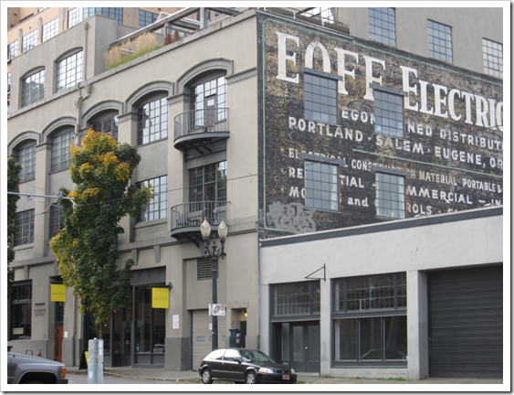 Photo by Maria Killam
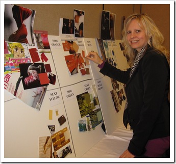
 Image via Pure Style Home
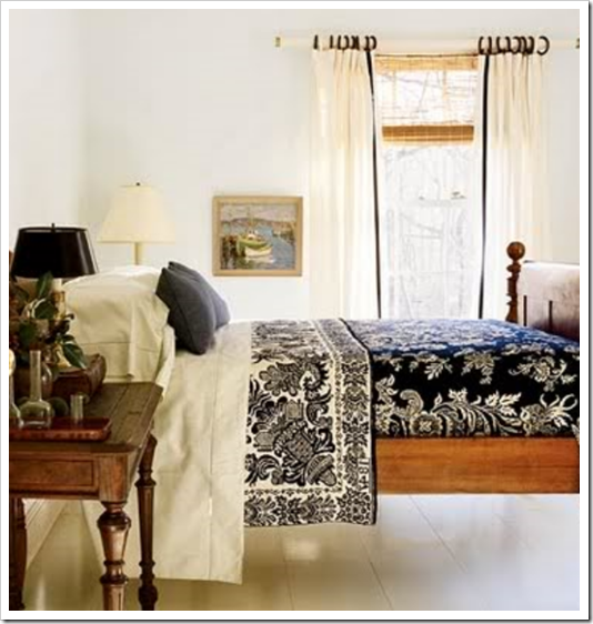 Image via Pure Style Home
 Image via Pure Style Home
 This is their library filled with wallpaper books, magazines, and other elements from 1890 to 1970. Here are a few pages of wallpaper from a wallpaper book from 1895:

 So that’s the trend report from the conference. The reclaimed wood, mixing old with new, adding patina conversation is still strong as ever (I talked about this back in April when I was in Brooklyn).


Absolutely am loving grey and yellow at the moment. I have been buying yellow and grey fabrics and am painting a bedroom grey as well. Also love orange and grey, especially orange pops of colour in a grey room. Yellow must be buttercup/sunshine yellow and a soft or charcoal grey.
Hi Maria, It's so good to hear all the news from you after your recent trip.
I ADORE yellow–especially sunflower goldish yellow. I'm using it as an accent in the sewing room and in a golder tone in the living room.
Having a few things in that color is like bringing sunshine into the room. I don't foresee using gray at all, anywhere in the house. It strikes me as being very modern which our house isn't.
But I do love the idea of distressed and natural surfaces. I'm very glad that is what is in because it fits perfectly with my decor.
Thanks for explaining all of this, Maria. Little by little..some of it starts to sink in for me. :o)
xo
Donna @ Comin' Home
The walls in my current home are a light golden yellow because I love that sunshine feeling and the mental energy yellow inspires. But the home I'm building will have cream walls, at least to start. I'm curious if I'll want to go back to the golden yellow because it really is my favorite (that and all tones of red). While I admire designs using grays, I'm not interested in living with it on the walls unless it's a foil to showcase color. I do find more clients asking for purple based gray and pink though. It's a good thing I'm a designer, so I can indulge my love for all color with clients instead of constantly repainting my house!
I guess it is different in Australia, because we are heading into summer, and even our winters are pretty mild, but yellow is certainly very strong here – it sneaks its happy little self into all kinds of schemes – and I am finding that it is a colour that my clients are responding very warmly to. This is a really GREAT post – you give it a "almost there" feel.
Thank you for eductaing me :). Have a great weekend Maria!
I think I agree with the historical aspect of this. I just picked out all of the colors of my home because I read a book about Marie Antionette, and I've always loved Louis XVI style furniture so viola there you go, great furniture and a nice color palette to go with it. By the way I also like the way that yellow warms up a space.
Thank you for the wonderful info.
After many attempts at color change in my sitting room and dining room, I still love the BM straw on the walls…there is little direct natural light, thanks to the covered lanai so most colors look dingy gray…very depressing. But this "straw" is very warm and inviting. As one decorator told me (when she came to Art House), the rooms look like sunshine…very welcoming.
Jane (artfully graced)
Hello Maria – it's Michelle from Downunder. I have just received a new, updated colour consulting fandeck and one of the new colours that really stood out for me was a dark purple undertoned grey –
so delicious! Yes and as design is now mixing old and new I love your pics on the antique greys. I'm going to research that with my fandeck tomorrow. You are the one who inspired me start my own interior design blog and I wanted to say thankyou – it's up and running now and I am having so much fun with it! Cheers!
I was glad to see the yellow greens. I'm currently on yellow greens mixed with blue green, greeny cream and brown. I've always loved all shades of green, especially blue greens, and soon I will be off trend with it and brown, but that's ok because I love it. What a great conference, huh? Any dates for New England and your workshop yet? 🙂
I'm so thrilled to see the warm orange-y browns, as so many of my existing furniture pieces are in this color and I was feeling very alone during the espresso trend.
It's wonderful to hear all the news. I've enjoyed the trend report from the conference 🙂 thank you!
What a delightful visual romp! Thank you for showing us what's next with your excellent photographs from the CMG conference.
Great post, Maria. I always look forward to these reports from the conference! We've just picked Behr's Antique Tin for painting the interior accent walls in our industrial loft. I was worried at first that it read too purple gray on the wall, but now it seems like the perfect balance against the dark greeny-grays of our exposed steel beams & corrugated metal ceiling. I'm also loving how that purple-gray looks equally great against both the warm, aged wood tones of some of my inherited furniture AND the more modern/industrial pieces. Gorgeous!
I used to do a lot of yellow (albeit soft yellow) walls … now I put more pops of bright yellow with more neutral / gray walls. I am loving the neutrals (grays, creams) as a backdrop to the brighter colors in objects that can be changed (pillows, vases, trays, smaller easy to upholsterer pieces) when you tire of them. I am still loving turquoise as an accent color. Thanks for the color update!
I’m curious to know what your take is on yellow at the moment – it’s rare that I choose one for a client, even though gray and yellow are fabulous together!
I tie house color to the views out the windows. And right now it seems to align with what's coming up fashionable.
I'm planning a creamy yellow straw dead grass kind of color for walls.
With some of that deep grey-red-purple for anchoring it.
It's the color of the grass and the mountains where the house will be:
http://photos.igougo.com/images/p240232-NW_New_Mexico_NM-Desert_Landscape.jpg
http://jdebordphoto.zenfolio.com/img/v3/p530843187.jpg (sandia mountains with a storm coming in)
Gold browns:
http://www.bonneycanyonranch.com/wp-content/uploads/2010/02/Bonney_Landscape_001.jpg
Even the plants and the animals can be purple-grey:
http://www.bonneycanyonranch.com/wp-content/uploads/2010/02/Bonney_Misc_Deer_137.jpg
I still love yellow ! Does this mean my orangey wood floors are coming back ?
Hi Tammy,
Well I guess it would depend on how orange they are. I would say more like the colour of my dining table. A medium brown wood tone.
Maria
Maria,
Fist off I am looking for yellow and some design forward places are using it (I'm sure you know this) like Dwell Studio. And I think Yellow will be asked for in the future because brass is back. And I think that people will want some yellow so that their new brass fixtures aren't the only shade of yellow in their entire house. That's my amateur, no clue what I'm talking about opinion! 😉
Love this post. Thanks for sharing all of your knowledge.
Thanks so much for the update! I enjoy your musings very much. We recently purchased a new home and are completely overhauling it. Gone with the rust and green/blue and in with a pale yellow and blue gray for the master bedroom. First time in my life I have decorated with blue and yellow! Color is fun! Stressful to get the "right" one, but fun!
fascinating sneak peak into the inner workings of your forecasting group, Maria. thanks so much for taking us along!
I re-painted three rooms the past two years.
Now, we're trying to decide on a color for our sitting room.
I'll keep you posted.
I was so happy to read this post as I have just finished painting (most) of my house a green-grey (BM Quincey tan), and my kitchen bar stools orange (buttered Yam, or something). Completely love it too!!You made me feel validated in my choices, thank you! Now to get ride of the peach backsplash…
It is funny that I just read you aren't seeing requests for yellows. It is about the only color I can find even possible for my basement apartment dining area. Basement apartment = serious lack of natural light.
Any advice? I have a gorgeous modern farmhouse style table in distressed/antique white.
Very cool. Im still spec'ing spicy orange. Really tired of it actually. But Nashville is always a year behind. At least we have gotten away from blue and brown!
I have been into shades of grey for the past few years. I am starting to look at colors, love a touch of lime green. it looks beautiful in my showroom with all the natural fabrics, dark floors and chocolate brown walls.
Maria, I have to add that I loved your photos explaining all of this. I was just shopping this weekend at THE DUMP…a great place for furniture that is new and trendy, but recently clearanced from major furniture stores and department stores. So many of the brown and gray themes were evident. And distressed wood..It was everywhere! I mean, it looked like someone had taken a hammer out and gone at it! Ha! I did love a couple of rough hewn stone coffee tables I saw. Many of the things you described were evident in this great warehouse. (It was all beautifully presented..not at all 'dumpy'. What a funny name!)
You are right on target in my opinion as a layman consumer.
xo
Donna @ Comin' Home
Still doing yellow here. With white/cream and pops of Hermes orange, greeny greyed distressed wood.
Also turquoise/acqua with fresh white and that same orange.
Grey doesn't do so well in the southern hemisphere.
cherill, south australia
STILL not loving gray, but can see that when used properly, can be very sophisticated. My sister's kitchen was painted *bright* yellow doors, white frames…very happy and cheery.
Loved reading about the conference, and photos of the designers' boards.
I also read a blog, more for web designers?, occasionally, called 'design seeds' that's all about specific palettes and their inspirations, and it's interesting to see how y'all relate: http://www.design-seeds.com/
(PS-I have no affiliation to that blog, other than being a 'facebook friend'; in fact, I don't always agree with the palettes, but good food for thought, and interesting since web design drives and is very quick and easy to adopt/adapt much design, and trends nowadays)
hey there! LOVE your blog….I stumbled across it and thought your name sounded familiar…then I saw your CMG post! LOVE it..I am also in CMG….I actually chaired the Portland Conference, I LOVE your beautiful recap!!! I am subscribing! Hopefully will meet you in person soon!
Suzanne
One of the comments said that brass is back. Is this true? Is it in different form. I'm working on redecorating my home that was built in the early 90's. Brass everywhere and totally dates it. I want to update my home, but don't want to do brushed nickel if it is on the way out.
Hi Maria,
I have a 1946 brick cottage and and the kitchen needs a remodel on a limited budget. I have the original hardwood floors in the home that have a golden oak finish.
I will paint the cabinets one of the creams/white you have suggested. Counter top I am lost.
Marrying my kitchen colors with the golden oak floor (should I replace?)I am lost at the color scheme I should use. My appliances are white. Also, I need a backsplash -like stone or subway tiles. I cannot attend your conference but wonder if you have web conferencing?
I love your ideas and suggestions.
Carol
Hi Carol,
Without seeing photos of your overall space it's hard to give you the right advice. email me for my on-line rates at [email protected].
I will start webinars this year so make sure you are subscribed to my monthly newsletters, at mariakillam.com so that you can be the first to know. Maria
Maria
Love your blog! As far as this grey trend goes, I've just completed a guest room with soft weathered grey Scandinavian furniture paired with bright coral with creamy white fabric and accents. I ABSOLUTELY LOVE IT!!!! I too share a love for yellow gold and buttery tones and I studied in London where the light is muddy so my shaded great room is a golden Pratt & Lambert Beeswax, my French Blue & Yellow toile guest room is a buttery P&L Italian Straw. Regardless of trends, I adore my dining room in a grey green that changes colour with the light (Porter Paint Griffin Gray) mixed with creamy white crown moulding and shutters, dark cherry woods and oatmeal linen fabrics and my kitchen has black painted cabinets (matte Sherwin Williams Greenblack) stainless handles and appliances, light creamy granite countertops, a sage green distressed island (BM Nantucket Gray) with black granite provides the pop and stoney taupe walls (BM Manchester Tan) ground the room. My wood floors are a medium dark brown (Pecan), a neutral tumbled marble back splash and a plaid silk window treatment in sage, stone and plum ties it all together. you didn't mention black and taupe kitchens much but we love it!
Right now I am completely in love with bright yellow. I'll probably use it as a major accent in our living room and kitchen.