I have seen this mistake so many times with exteriors, that when Terreeia and I drove around the French countryside and saw the houses I had her screech to a halt while I jumped out and took a photo.
Ok. I took more than one. It’s a fun thing that Terreeia and I (okay just me, and she just tolerates my obsession and drives me around) like to do when we travel to different cities.
So here’s the big mistake that I have seen many, many times, in my career as a colour designer.
You go on a trip and fall in love with everything about an exterior (or interior) you encounter in another country. There, it looks amazing. When you bring it home and slap it on or inside your existing house, well not so much.
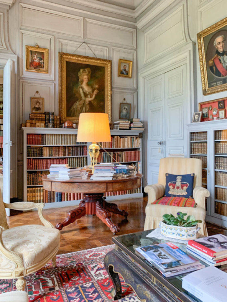
First, Terreeia and I spent two nights in this dreamy chateau in Normandy during our visit to France.
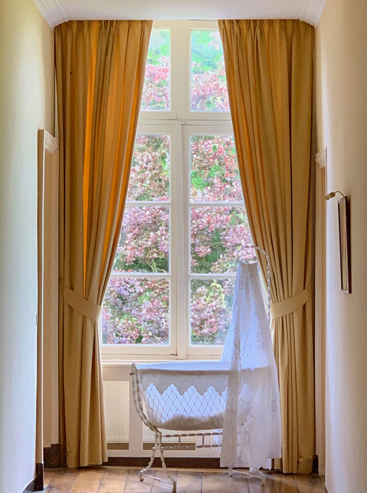
I loved this room (above) and this adorable baby bassinet (below) casually placed at the end of the bedroom hallway. So pretty.
Our travel planner recommended that we rent a car and drive out to the country to see the French countryside and I’m so glad we did. It was completely enlightening!
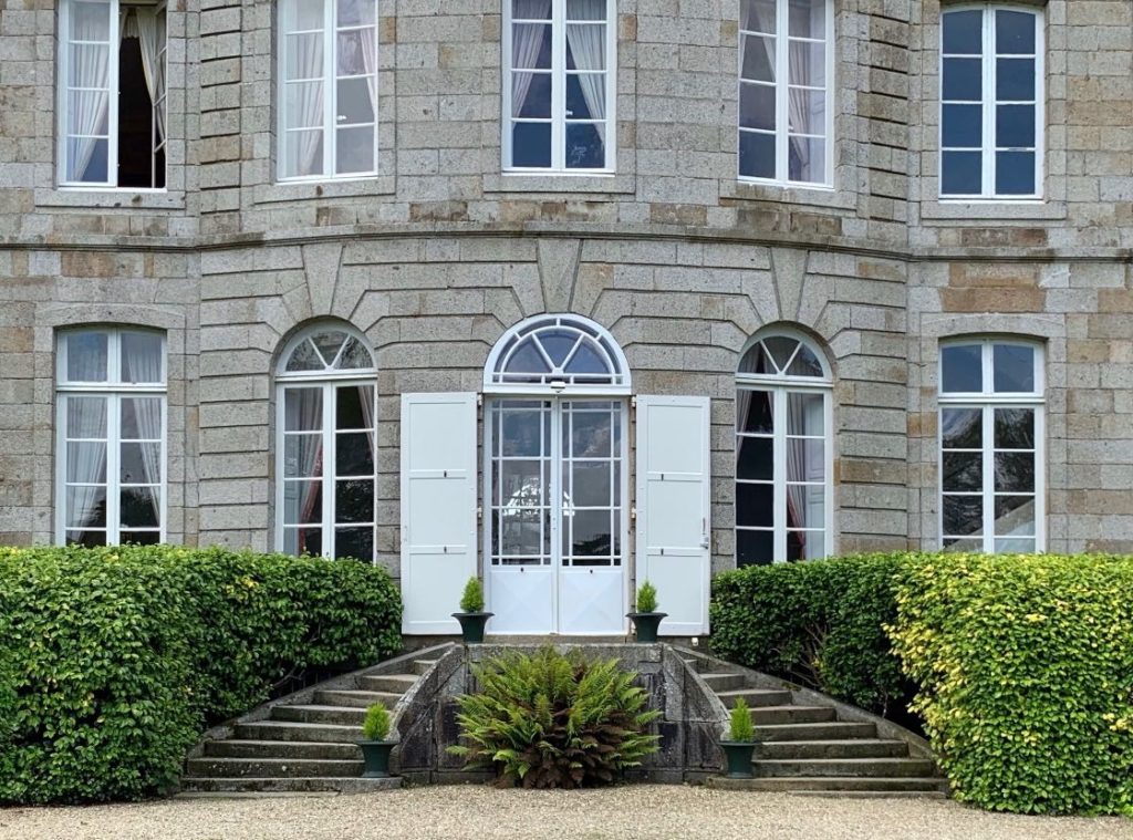
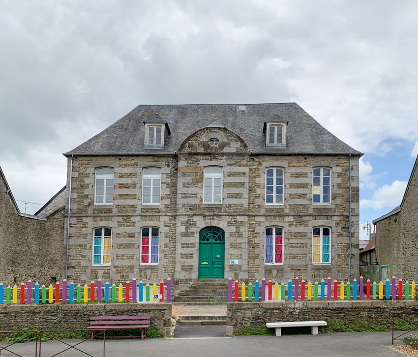
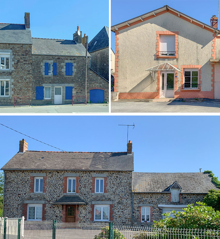
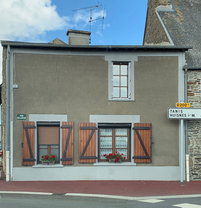
Look carefully at the next few photos. Notice the placement of the stone as casings around the window.
This was a pre-school (below) in one of the villages we drove through looking for cheese one night:
OMG we found the cheese (below). Cheese, wine and bread are very inexpensive in France. And the bread of course tastes the best. I don’t know why but it really is that good.
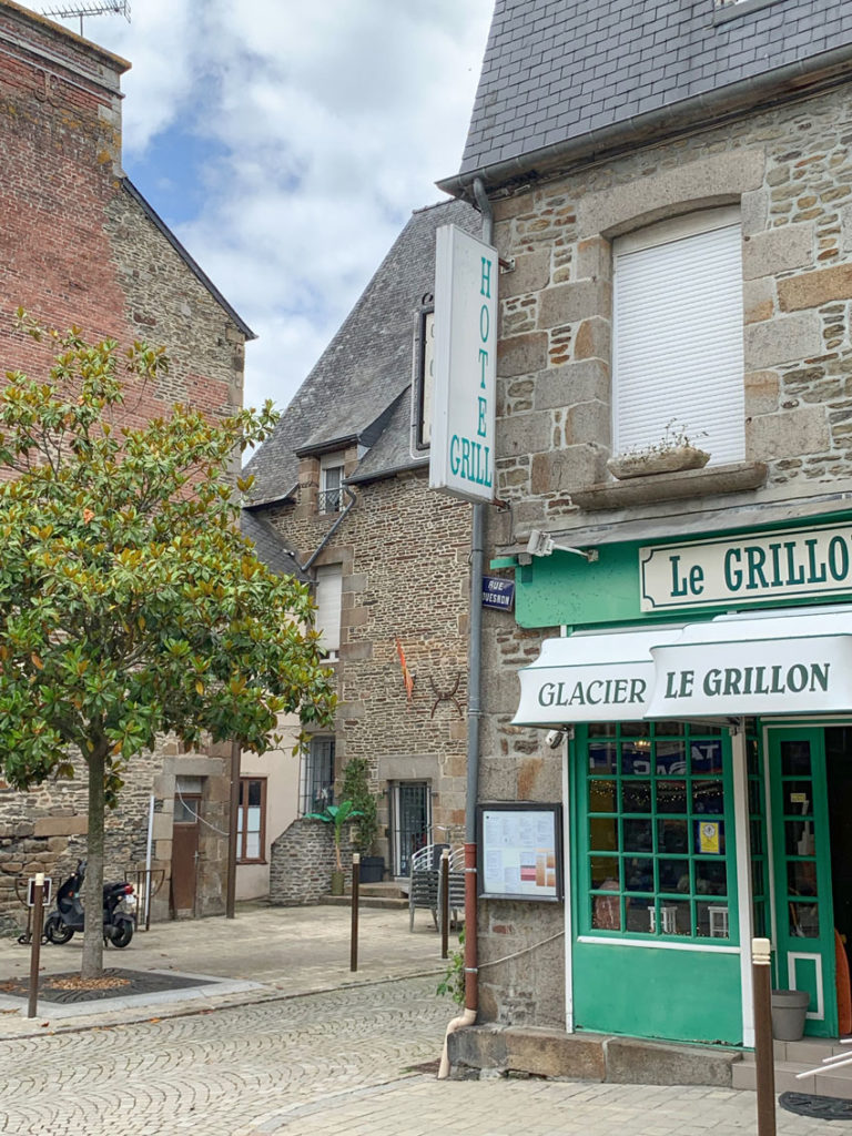
We drove through little villages like this one:
So charming right?
I mean, all these houses that look like a tissue box with black slate roofs.
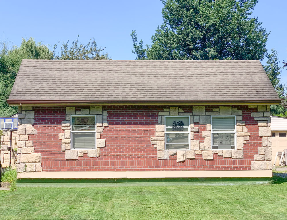
And the reason I snapped these homes was because of this house (below):
Are you ready?
It’s located not far from where I live and my sister and I have ridden our bikes by it many times.
When I first saw this house, I wondered how on earth it ever came to be.
But now I know. This well travelled colour designer has now seen this house, just not anywhere in North America, haha. The owners were obviously either in France or they watched a movie and fell in love with the look that they incorporated onto the exterior of their home.
And I’m telling you right now, we are not in Kansas anymore.
This house belongs in France in a village close to this Chateau. It does not belong in Canada.
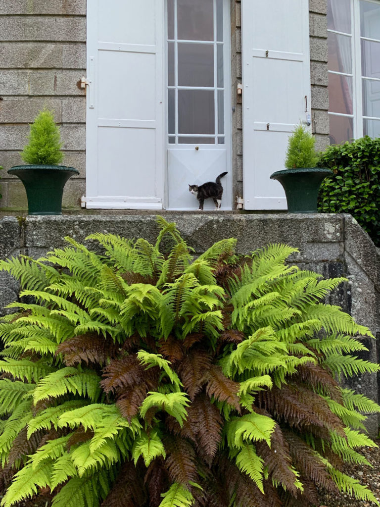
I couldn’t resist snapping a photo of their kitty cat waiting to be let inside!
Here’s Terreeia and I in Amsterdam after our trip to Paris!
Over to you my lovelies. Name some doozies you have seen in a house you inherited?
Related posts:
An Open Letter to my Lover on Decorating












Dragele mele,
Superb, superb,superb!!!
Ceea ce vad in fotografiile voastre este incantator. Franta este de asemenea fermecatoare, mai ales… partea rurala! Branzeturile sunt “punctul nostru fierbinte”, suntem… fan branzeturi frantuzesti si nu numai!
Va imbratisez calduros, Mia
Hi Maria. This post is so funny! I love your writing. Interesting houses.. ?
Here in England, the houses that look wrong are often 80s Mock Tudor. The faux beams just look cheap.
However, the Mick tudors built between the world wars are now a coveted style all their own. Perhaps these pastiches just need time to “marinate”?
I have been told that the reason the bread is so good is because the water is not treated with chlorine and/or fluorides.
No sure if this is true, but I agree with you!
What beautiful photos of la belle France! Thank you for sharing them with us!
I’ve often made the same mistake when buying clothing on my travels–the flippy little super-femme micro miniskirt in Spain, the wildly colorful floral muu-muu in Hawaii, well-made but drab and bulky knit sweaters in England. Each of these items looked perfect on their home turf, but once I got them home to the US, they looked all wrong. Travel is a bit like a drug–it disorients me, I think, and makes me believe anything is possible! Then I sober up, lol!
Thanks for making our world more beautiful on the daily!
Haha that is so true. The linen dresses I wear all the time in the heat in Italy, not so much here, I don’t know why? Thanks for your comment Connie! Maria
What is the fix for this? Paint the stone and the brick a light color to get it all to blend better?
I guess, but in actual fact they colours don’t clash, it’s just so out of place here. Maria
Maria, I did the same thing with a dress. When I was in Hawaii years ago I bought a long dress with a large hibiscus pattern that I loved and wore in Hawaii, but when I came home I never wore it again because it look so out of place back here in the mainland…especially since I almost never wear any clothes with patterns. But the “Hawaii Me” loved that dress!!
OMG it’s true, my Mom and two sisters went to India this year and bought some Indian clothes there with the sarongs, pants and long dress like tops with slits in both sides. . . . they have never worn them again here. Thanks for your comment! Maria
A new house in our area: Tiny little ranch style new build trying to be a white farmhouse. Pristine white siding, Heavy black garage door, black trim, and (worst of all) black downspouts. Skinny little wood pillars holding up the porch that just look like unfinished temporary 2×4’s.
Too funny! Luckily, all we inherited with our current home were pink and purple walls, which we immediately repainted. Cute pic of you and Terreeia! ?
Authenticity is key here. Certain styles just don’t belong outside of their region. A weathered cape cod with cottage garden does not belong in Florida or Arizona any more than an Adobe structure belongs in New England. Our love of certain styles sometimes has to remain in pictures! I have inherited faux tudor in our downstairs recreation room …. Struggling to find a solution that does not entail a complete overhaul as we already remodeled the entire upstairs and don’t want another big expensive project. Ugh.
Hi Vicki, well said thanks for your comment! Maria
Many houses here in South Florida that were built in the 1980s are made from smoothed concrete block (hello, hurricanes). But I guess the builders thought that looked too plain and added ‘decorative’ concrete block that protrudes out along the front side edges of the house. Those blocks were then painted a contrasting color (usually white). Now when I notice houses repainted, it seems people are still painting the blocks different from the body of the house. It never looks quite right. When our neighbor repainted their house recently, they got gutsy and painted over the protruding blocks with the same body color. But that doesn’t look quite right either. Like you painted over something and didn’t bother to sand it down. Maybe landscaping would help divert the eye from the differing textures? Or, light bulb moment…maybe I need to open a business that sands down those protruding blocks!?! lol
I think one of the reasons the last house feels “off” is that while they remembered that they loved the look, they didn’t pay attention to the details. There should have been a single lintel above each window and coining around the sides instead of the random sized stones they used all around. Also, the house should not have been brick. If stone was not an option (and I would have advised against it anyway because it is difficult to make that feel authentic) then it should have been stucco. The mortar lines of the brickwork are fighting with the stonework. I encourage my clients to create spaces that inspire them and reflect their personality but execution is everything.
Such a fun post! Love all of the pictures!
The main problem with the stonework on the house shown is that there is no symmetry or balance to it. If the windows, window surrounds and quoins had been symmetrical, it wouldn’t have looked too bad.
Love your post and all the beautiful pics of European homes. It has always annoyed me that the external stones placed around windows here (like your photo) along with random bricks placed on the walls protrude. I always thought that the intent was to make it appear that it was exposed after the (ancient) stucco surface has worn or broken away so it should be level or recessed. I find it crazy here too in Canada, especially western Canada, where houses are built to look like they are hundreds of years old…and yet most homes here seem to be considered “old” when they are 60 years old and get torn down ?
Local architectural styles often are there because they solve a particular problem. Minimizing dangerous snowfalls or icicles mean New England eaves are almost nonexistent; in Hawaii the problem is rain, so wide eaves and changing slope fling it away from the house and slow it down before it hits the ground. Local material make a big difference, too: in Georgia, I love the lacy semi-open brick walls around older houses, made from the ubiquitous red clay of the area. “Farmhouse” style uses skinny posts that minimize the use of relatively expensive imported lumber, or even kit parts, on the plains. Thick limestone walls are ubiquitous in Central Texas, a solution to both a hot climate and a cheap local building material. Above, the decorative stone in the local house looks pasted on, whereas that in the French houses appears to be (and maybe actually is) providing support above the windows in and the corners of the structure.
Good proportions are the other factor. The local house about looks strange in part because the roof is sitting too low over the decorative stone. A little breathing room there would really help.
That little house could be rescued a bit with the right landscaping, some tall greenery on the corners so that the house is peeking through and the proportions don’t hit you in the face. A low wall or similar structure made from that stone could help ground the design as well. Just my two cents.
I’ve been watching a lot of Monty Don gardening shows on Netflix recently, and the thing that really strikes me is how he so successfully gets people to drill down to what they love about various gardens or styles they want to evoke, and then helps them achieve that in their local climate, with available plants, and with their available budget. People building houses would do well to take that approach!
I tried to reply to Jill Valleri, but something was wrong. Anyway, she is exactly right about the lintel, the hodgepodge of stone, and the brick. The houses in France never have that random, any-old-way-will-do look to them. I think the house would look just as wrong in France as it does here.
I live in…an eccentric neighborhood in the city. Historically, this little neighborhood has seen many an immigrant in the past two hundred years, and it still a famous cultural hub and housing for refugees. There’s a three block stretch of Polish immigrant-built housing that, in its entirety, has been labeled as Historic Property. You never know from one house to the next what you’re going to get. We have a lovely completely stone French cottage that looks like someone shipped it straight from 1400’s France butted up against a modern, ruby red steel A frame. There’s a canary and cyan Russian gingerbread snuggling with a demure, if not imposing, Georgian revival. My 1911 Dutch colonial revival is flanked by what I can only describe as Japanese Modern box-of-glass-wonder and a bright pink 1930’s Tudor revival. I think that in the rare situation where you end up in a neighborhood like this, you get to rock your historic roots :-).
The issue with the little red brick house is the window stone is simply an inappropriate style for that house. It’s trying to be something it isn’t. The saying bloom where you are planted come to mind. Enhancing the original style can be done tastefully but this is a miss.
Actually Joanna Gaines has a real talent for knowing what to do to improve/update a facade. The giraffe is the perfect example.
By the way Maria you are positively glowing!
Just read this post and screamed with laughter! My goodness! You set that up perfectly and certainly made your point! Lol
Loved reading this post Maria! This house just looks ‘wrong’ on so many accounts that I can’t imagine it looking at home anywhere…
I give the owners kudos for their ingenuity. I’m sure some landscaping would soften the results.