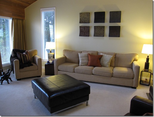
I arrived at a colour consultation yesterday and my lovely client Deborah agreed to let me photograph the consultation for my blog. She needed a colour for her living room. A new colour to freshen it up, she liked this one but knew it wasn’t right.
You can see the existing yellow shade was looking a bit green next to her sofa and drapery which were more of a goldy beige.
The reason I took out my fan deck to match the existing colour was because she didn’t want to re-paint her entry (which was the same colour as the living room) because that colour continues back into the kitchen which she will be renovating. I had to make sure the new colour worked well with the one we were keeping.
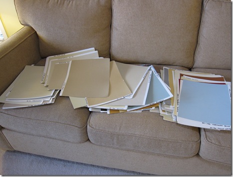
I have approximately 50 – 75 larger painted samples [above]. When I studied colour in the beginning of my career—many years ago–was with the Daystudio in San Francisco. Joanne [Day] said, every time she picks colour for anyone’s house (and she’s been doing this for 35 years), she comes back with a 5 ft by 5 ft painted board [for each room], and tells the client to look at it in the morning, at noon and at night. Why? The light will dramatically alter the colour throughout the day. And if you are mostly in that room in the evening and you hate the colour then, you might need a different one.
This is why I have always used 11 x 17 samples when I conduct consultations because there are many times, when I have picked the colour I thought was right from my architectural kit, (and they are approx. 2” x 6”) and then when I have held up the bigger sample, it was SO WRONG. Not using big samples like this would be mostly hit and miss, because we as designers can guide the client to picking the right colour. . . but first, we need to be able to see the undertone with all the existing finishes in the house, and second, they need to see what a bigger sample looks like because I can’t predict whether my client will like the colour once it’s painted on a bigger sample.
So back to the colour consultion:
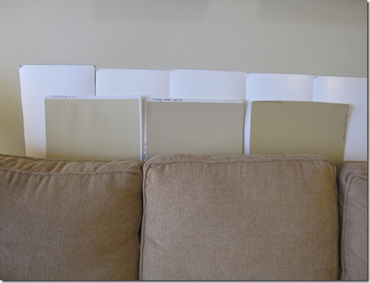
If there is an existing colour on the walls you must look at the new colour with a white background. Otherwise, you will visually be comparing the new colour to the old one and that will influence your colour choices. We propped 3 samples up on the sofa (from left to right): HC-28 Shelbourne Buff, HC-34 Wilmington Tan, and HC-38 Decatur Buff. All of them were close but HC-34 looked like it was the best one.
Then we found some lighter ones, and propped those up as well (along with the Wilmington Tan which was the winner out of the above 3). The above two (from left to right) were HC-35 Powell Buff and HC-26 Monroe Bisque. Here the Powell Buff was the right choice because (compared to the sofa) it had a little more orange in it (compared to the Monroe Bisque which looked green). And actually in the image above, you can see what I’m talking about.
Before you go running off to see the ‘orange’ or ‘green’ in either one, you need to understand something about beige. One beige colour will have more than one undertone depending on which beige you are comparing it to. I’ll explain this in another post—this one would get too long.
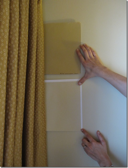
With our choices narrowed down to HC-35 Powell Buff and HC-34 Wilmington Tan, we walked over to hold them up next to the drapes. We didn’t like the Wilmington Tan anymore because it looked too green next to the drapes (which you can see in the photo). Here you can also see that the Powell Buff is slightly darker than the Vichyssoise but it has more orange in it (with yellow, remember it’s always either more green or more orange depending on which way it’s moving on the colour wheel).
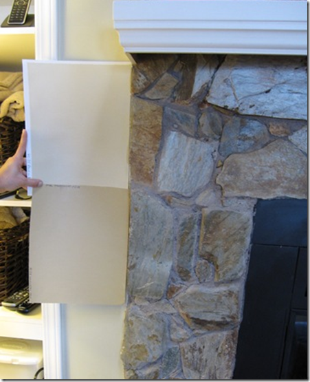
Then we held it up next to the fireplace stone and you can see here that the Wilmington Tan brings out the warmer gold tones in the stone. We briefly considered painting this wall the Tan (it was opposite the drapery) but decided against it because (I should have taken another photo here) there wasn’t enough wall space to have it work as an accent wall. The colour would get too choppy next to the built-in shelving on either side, etc.
Then we held our chosen colour right beside the carpet. Here you can see that her carpeting is a pinky beige but she will eventually be installing hardwood flooring so we are ignoring the carpet. Even if she wasn’t changing the carpet, we would ignore it because there is nothing in her furniture that is even remotely pinky beige. A colour professional must know which elements of a room must be ignored and which you should work with to get the colour right!!
By the way, if you had art in the room, you would do the same thing. . . hold the samples up behind the frame to see how they look with the colours in the artwork.
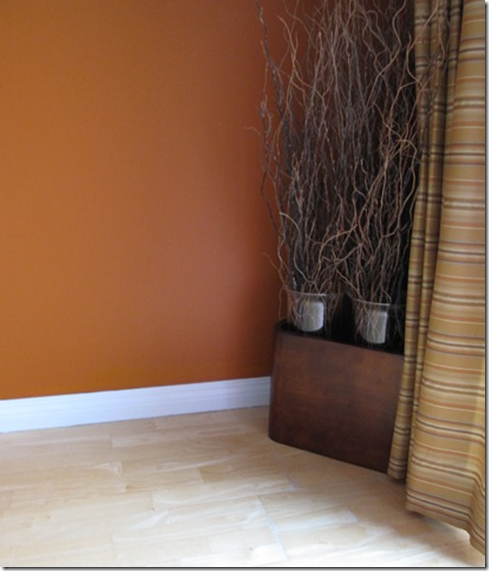
Next she asked me about trim colour because all of it needed to be re-painted.
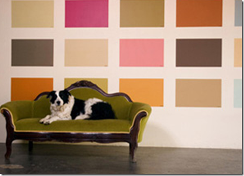
A word about testing paint colours: This is what NOT to do. When you stick a bunch of painted samples up together on the middle of the wall (or worse paint them directly on the wall) you are now visually comparing them to each colour. I hear people say, “well I like that one because it’s warmer (like in the example below, the blues on the bottom look warmer than the top row because there’s more purple in them).” That doesn’ t necessarily mean it’s the right colour. Technically, you can’t even call a colour cool or warm unless you are comparing it to a ‘warmer colour’, or a ‘cooler colour’.
When people say, “that’s a cold colour’, its usually because they are not seeing it in the context of the space.

In a colour consultation (when I was new) I had a client show me the tiniest little baby 1” x 1” stain samples on a brochure and ask me which one I would recommend for their hardwood floors?
In that moment I thought ”Well I’m the designer, I should know shouldn’t I?” I left and called a designer friend of mine who said, “Tell them to get their hardwood floor people to paint up some bigger samples and that’s how they will know!”
I tell you this story because here I am, someone that understands that wall colours cannot be chosen from tiny baby samples on a fan deck, and I still got caught up in “I should know right?” in that moment. However, why would a stain colour be any different? Because it’s not!
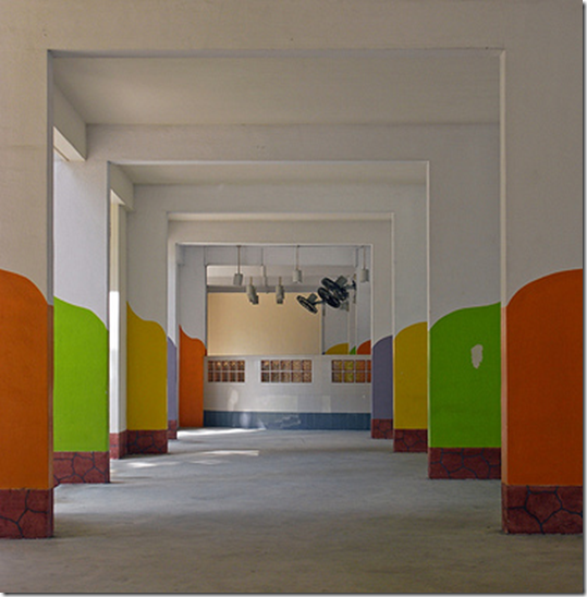
See the colours on the pillars below? Now that is the size your samples should technically be. Especially when you are picking exterior colour for your house!
Bottom line: Testing is very important. Perhaps you can begin to understand also why a colour consultation (that was just one room) takes longer than 10 minutes. I have been doing this for so long I can pretty much narrow down the colour the minute I walk into a space. When I whip it out that fast, the client is thinking Why is it that one? Why not the other 2000 colours in your kit?”. So part of the process is showing them the pink undertones or the green undertones or other colour possibilities so they can begin to understand why the one I have chosen is the right one. By ‘the right one’ I mean when working with existing furniture and furnishings, obviously if the space is empty that’s a whole other conversation, for another post.
That’s part of what the client is paying for when they hire a professional. People want to know why the colour they have chosen is the right one or why it doesn’t work. The cost of hiring a professional gets very small when the right colours are chosen in the first place because it costs the same to paint the wrong colour as it does to paint the right one.
And now you can buy my 50 large samples to get instant confidence in specifying the right undertone in your home or your clients.
Related posts:
Must-Have Tools for Colour consulting
What Everyone Should Know about Beige
What’s an Undertone?
Clean vs. Dirty Colours
Colour is Context
The Right way to Create Flow using Colour
The first Mistake a New Colour Consultant will make Every Time









I love this post and the timing is perfect.
I'm studying Colour Theory in College and we just started some exercises on grays & undertones and how you can't tell if a colour is warm or cool unless you compare it to another. This post is a wonderful addition to my Colour Theory class.
Thank you Maria!
Great Post!
I need you for the outside of our house…just cannot figure it out. When we lived in NY I met a *color psychologist* (she didn’t call herself that, but I did) She would do a rendering of the outside of your house with the colors she chose…she was amazing. Sounds like you.
So do you do online consulting??Hmmmm?
Wow – brilliant post and explanation.
I tell my clients that they cannot remember colours (they often think that they have something in a certain shade, and when they bring it out it’s completely different), as being able to distinguish the subtleties of colour is like having perfect pitch, there are a few who have the gift, everyone else needs a comparison tool like your samples.
great post maria! however, this may have been a little more useful to me before i handed in my project yesterday, especially those trim colours!:)
you just might get me to like beige by the end of this semester afterall!
-danielle
One of the most important points you make here when picking color is the size of the sample and that it be free standing. A movable large sample that can be placed around the space to be painted. Taking into consideration all elements in the space, the lighting as it changes and how it flows into another space. Great post Maria.
Thanks for letting us in your consult! I love the large paint samples…can you buy those, or have you just collected them with projects?
I have painted each one and just added to my collection over the years. You can by the Designer Classic (cc colours) colours now in big samples (in some stores) and of course the smaller paint pots to paint yourself. I’ll have to write a post on the best ones to collect first!
Maria,
Thanks for sharing your knowledge and expertise. Looking forward to more posts like this.
I’ve picked the wrong colour more than once…. in fact, three times I’ve painted a room, and then re-painted it immediately because the colour was just wrong.
I hope I can pick the right white for the dining room on the first try!!
Thanks for the informative and helpful post 🙂
Kelly
Great post – I love the last photo! That’s so creative!
Thank you so… much for a wealth of information! This is something I hope I can remember as look into painting our master br/bath and our great room. A super post- thanks again! Have a golden weekend!
As you know, I have recently gone down the path of picking a paint color that ended up emphasizing the thing in the room that I hate the most…I had no idea that colors had such subtle interactions with each other!
If I lived in the same city as you I can guarantee not a single paint decision would be made without hiring you! I feel lucky that I am able to read your informative posts so I at least have an idea of how important these things are even though I am not able to do it (and sometimes can’t see it) myself.
I wish all the clients had the patience to go in detail with a colour consultation. I am so sick that people think that a colour is a colour and it will work regardless.
I honestly appreciate the fact that you are taking the time to explain WHY is so important to consider a colour in any light, the trick about having a white frame around the colour is so good and overall why people need to take the time to select the best colour. After all you will be seeing that colour morning, afternoon and night because that colour is in your home walls.
Absolutely Fantastic Post, Maria!!!
I think I’m going to have to go back and read it several times to be sure I get it… not fully get it, mind you because I think you’d agree that developing the kind of colour understanding that you have takes years of study/practice… but get it enough to start watching for undertones in paints and the way they read with diffent elements in the room.
Thanks for this!
Victoria from EdinDesigns @ DesignTies
WOW. I had no idea there was a science to it, well the picking of colors i mean. That was a brilliant post.
Oh I changed your URL thingie. And thanks for the congrats on my new job.
Maria, You are so right about painting a sample board and moving it around the room throughout the day to test the color from every angle.
It’s the one step most people don’t take the time to do…I think they just get antsy… they either read about a color, ask a friend what colors they have used or pick it from a tiny chip and hope for the best.
Colors are not only affected by the location but what surrounds them as well.
To me the money you spend to hire someone like yourself who can get it right the first time can save time and money every time. After all those endless cans of sample paint can really add up… not to mention the cost of having to have a freshly painted room repainted!
Great post, thanks for sharing all your colorful knowledge!
Very interesting post. It really does pay to have a professional consultation! Hope we can see the final reveal! I bet it will be beautiful! 🙂
Awesome post Maria! I have tried to read many articles on colour and undertones but you always explain it the best. I love the way you have used an actual colour consultation at a clients house to explain the process of selecting a colour. It really makes me realise how much I dont know about colour but now I am slowly learning!
Mrs B
btw…for some reason, your blog link has defaulted to an older date on my blog list and does not refresh everytime you make a new post. I have no idea how to fix it?
Really interesting & informative. Thanks!
I just love reading your blog…I ditto what Mrs. B said. Thank you for your inspiring words. Would love to see that list of “best colors to collect” from Benjamin Moore.
Cheers!
Very informative. Thanks.
Maria, you share a wealth of color information that many of us neophyte homeowners don’t have access to then struggle when choosing colors. Thank you for taking the time to write your wonderful blog and educate those of us who want to learn more about the dynamics of color in our lives and on our walls.
Blessings,
~~ Victoria
omg – you are brilliant! please move to houston!!!!!!
Can I have the room in the first picture? Oh, and is the dog included??
LOOVE your blog! Just did a post about it here- http://www.materialgirlsblog.com/2009/03/colour-advice-from-true-expert.html
I need to go to sleep but I am up reading all your posts! 🙂
Emily
Material Girls Blog
I am so weird…I like the high contrast between the bronze tone and the white trim 🙂 But that's why I'm NOT a designer.
Maria,
This was great post to revisit. I saw on Facebook that Benjamin Moore suggested this post as how to choose the right color. You are so good at explaining the details on how the process works and good in reminding people that relying on the professionals is invaluable. xo