She said “I learned about color theory and practice from Maria Killam who spent hours on the phone with me until I understood when orange on the fabric swatch will look red on a sofa (and why you should never do color on your wall without a consult from an expert).
In case you’re wondering what she’s taking about, here is the explanation: Penelope loves strong, bright colours, so after we had chose the sunflower yellow walls for the kitchen, blue for the living room and raspberry for the dining room we then worked on picking out furniture for her new house (and since she’s in Wisconsin everything is purchased on-line).
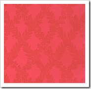
 Wallpaper source
So if you chose BM Raspberry Pudding 2004-30, it looks pretty pink where it sits in the fan deck, but if you take it and compare it to Peony 2079-30 now it looks orange because Peony is even more red (these are wallpaper samples I found to show what I mean, they are not the actual colour).
Therefore, it goes back this post where I talked about warm and cool and how you technically cannot call a colour cool or warm unless you compare it to another colour.
Yes, anyone can personally define any colour as cool or warm however, be careful how quick you call it because I have selected many beautiful warm grays and taupes in my day because comparing a taupe (BM 983/094) which looks gray all by itself on the chip suddenly looks beige and fabulous when I compared it to a colder gray like 1605.
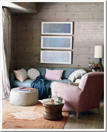
 source (blue and taupe together)
Of course, now that the gray trend has arrived, I don’t get the same ‘that’s cold’ reaction when I suggest a taupe or warm gray like I did in the past.
Which colour leaves you cold?
If you would like your home to fill you with happiness every time you walk in, contact me for on-line or in-person consultations.
Related posts
What Everyone should Know about Fan Decks
Colour is Context
Why you Can’t Afford NOT to Hire an Expert
New to this Blog? Click here ; Follow me on Facebook and Twitter; Become a True Colour Expert
Vancouver Colour Expert
Vancouver Colour Consultant
Vancouver Interior Designer
Vancouver Interior Decorating


I'm so glad you provide teaching time on color theory for your readers. It seems that most people just pull a color from the paint store wall and go with it! I did a color consult yesterday, and when we moved from room to room she could see how much the light changed the hues. It took over an hour to choose colors for 4 spaces and I left with a happy client. There really is skill in selecting colors, and you do a great job of helping people through the process.
You always have such great ideas and advice! 🙂 Love love love the wall paper here!
The color that leaves me cold is a "pearl gray" – I just bought a coat that is that color which I intend to wear with white denim and a myriad of smoky colors…to warm it up.
pve
Oh! That's so cool Maria! I read Penelop Trunk's blog all the time. She's really intelligent, funny and quirky. It must have definitely been an experience to have her has one of your clients.
I love the colour mood board you put together with the guilt side table…..for me personally the bounce of colours you chose actually made it quite interesting.
In no way am I taking away from the other fab girls it was just in comparison my personal opinion was yours grabbed my eye. Well done.
Love this post!
What color gives me a cold reaction? Pink mauve! It reminds me of hospitals. Our current house had that color on every wall, ceiling, and even the brick. I couldn't paint over that color fast enough.
It must be so lovely and fun to see your influence continually expanding. Thanks for sharing Simplified Bee and your beautiful mood board.
Fondly,
Glenda
cloud white is too cold for me. Especially when I see it on trim and on doors. I have it in my home from the previous owner and I don't think it works because the kitchen cabinets are not cloud white – they have some kind of tone, (not sure what tone).
I so agree! I've had a Duron fan deck for 20 years (yes, time for a new one, maybe BM or SW) and believe that's enabled me to chose the right colors. You can really see the undertones and narrow it down.
My dilemma at the moment is to choose a color for my main areas, since they all flow together. The same color looks so different because of the lighting.
I'm clicking on "What everyone should Know about Fan Decks" right now…
This was a great article by Penelope. I can see why you enjoy her articles so much. What do I do? That's always a fun question to answer..Ha! I guess if you want the short answer, you'd have to ask, "What do you NOT do?" Thought provoking content there!
Which color leaves me cold? Well..the first thought color that pops in my mind is a Med deeptorquoise. BEHR 550B-5. It feels like a color I see in hospitals.
Oops..family home from classes..gotta go!
xo
Donna
Maria,
You get me every time! I can't go a day w/out visiting your blog! I wish I knew you personally…
Thank you for each post! They're always so good!
By the way, drop by if you have some time, ok? I posted today about a Swedish House… talking about splash of color… I think the Swedish know how to use it very well.
xo
Luciane at HomeBunch.com
I just love the color combination in the first picture.
Loved what you did over at Simplified Bee … and I could TOTALLY tell which one was yours!!
Of course I could pick out your board on Simplified Bee and I haven't been reading your blog for more than two months! As for cold colours… I find it most difficult to like cold blues (in art they would be mixes from unltramarine). So many people simplify the warm /cool aspects of colour and forget that every colour is relative to another.
Thank again for participating in the series. Your design was a big hit!
xo,
cristin
Maria: My take away from the lesson is that everything is relative, and be sure to always place all the selected colors next to eachother, before anything becomes permanent.
Best,
Liz