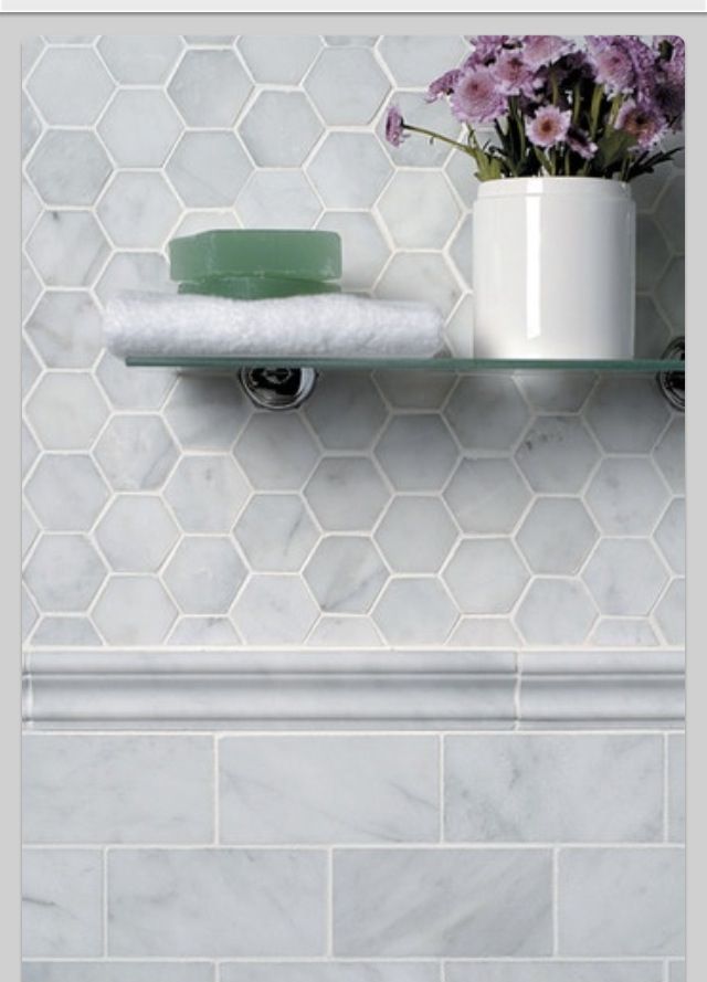
On vacation these last few days when I posted a restaurant rest room and an ice cream parlour, both happened to have hex tile floors.
Someone asked if they were trendy and I said yes.
Then another reader posted that they are classic and date back to the early 20’s or maybe even before, just like subway tile.
So here’s the thing. You’re both right.
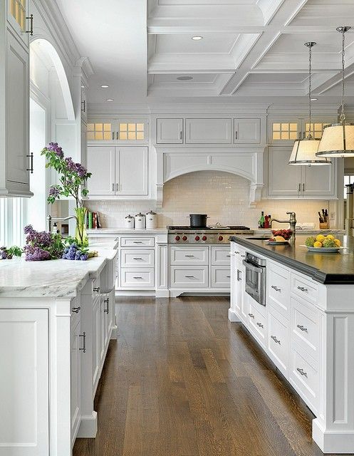
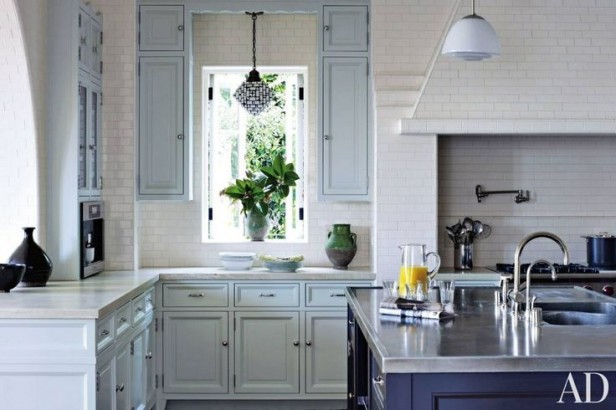
White kitchens are currently a huge trend. And at the same time, a classic. Same goes for hex tile and subway tile.
Here’s what will make hex tile look trendy. If you are only replacing the floor in your dated bathroom, that’s when it will scream ‘new floors, old everything else’.
Speaking of classic, that was a big conversation as always, in my Specify Colour with Confidence™ training in downtown Toronto less than two weeks ago, where I met 21 women.
I am always amazed by the talent and creativity that walks into the room and this time was no exception. Every one of these ladies was vibrant and passionate about becoming experts in colour.
I’ve spent the past four years working hard to create a transferrable way to help the planet see and understand colour and this spring I’ve been introducing my new MK CONFIDENCE Method™ that takes the key elements of my training and puts them into a 10-point acronym.
CONFIDENCE. And, you know what? The confidence level at the end of the three days we spent together rocketed up.
Here are some comments:
“As soon as I arrived home, people are now asking for my help, including a colleague who now wants to hire me to consult even though she has been doing this longer than me, she is now second guessing herself after listening to me talk about all the great things the seminar did for me, ie confidence that I really do see it and have information that others don’t and that they need.”
Caroline McKay Caroline Mckay Design“The time in Toronto was truly a rewarding experience for me. Wow, I learned a lot and am anxious to put it into practice. This is my second color class and the two could not have been more different. Each one pushed me along to a greater understanding and appreciation of the logistics of why some colors work and some just don’t work. Wish that we would have had more time together! I could have used 2 more days of practical exercises.” –Georgene Perlman, The Reimagined Space, Tampa, FL“Just wanted to let you know how much I enjoyed the 3 days on Colour with you. I learned sooooo much.
First client back on Monday we were going through colours , she was trying to do the whole clean & dirty thing, so we avoided that catastrophe. She was painting colour patches on my freshly primed walls (wince). So I got out my big colour samples and held them against her fireplace and floor (instead of the middle of the wall where she had painted her blotches)….all of a sudden the light came on and she could choose her colour much easier. 🙂 It turned out to be a good day! I felt so in control of the situation instead of just nodding and going along with her choices. A great big thank you for sharing your knowledge. Looking forward to future courses for sure.”
Maureen Blanken, MB Interiors, Dundas, Ontario
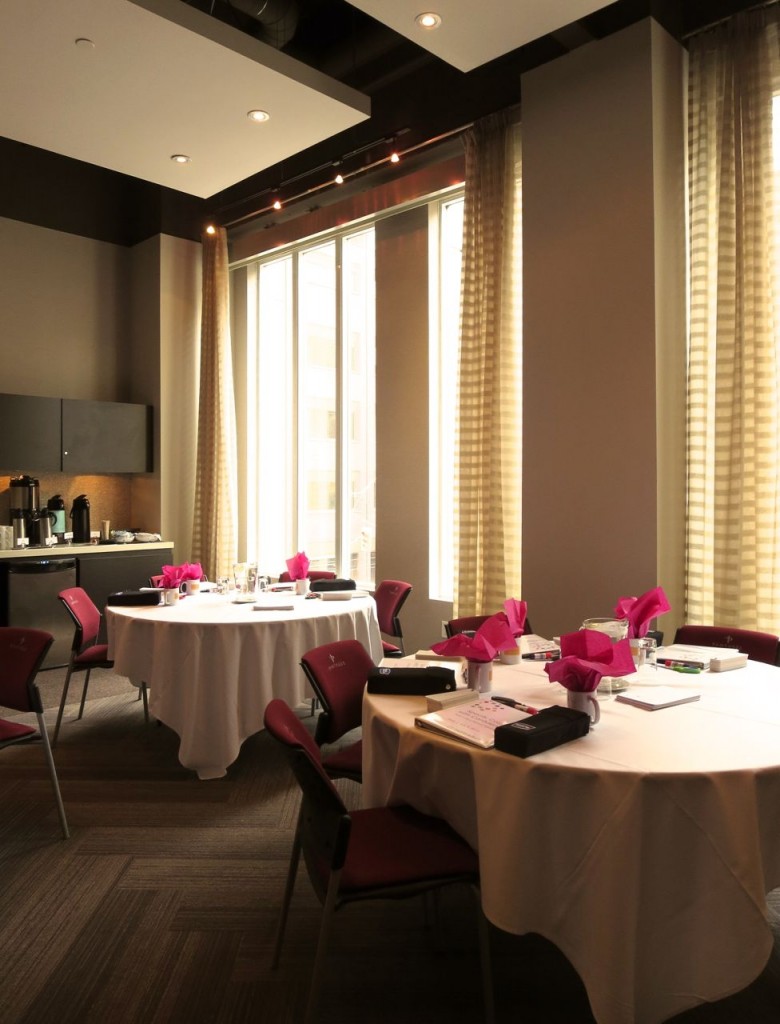
Room at the Pantages Hotel, 200 Victoria Street, Toronto, Ontario
Top left: Kit Lee & Susan Crema-Martin, Top right: Karen Wistrom & Eugi Triandos
Bottom left: Carrie Higginbotham & Amy Cotton, Bottom right: Robin Coleman & Maureen Blanken
Left (front to back): Gina Pardoe, Amy Cotton, Lara Maira
Right (front to back): Irene Hill, Carrie Higginbotham, Jan Phillips, Dana Mozaffari
All about specifying colour with confidence!
Front row (left to right): Maureen Blanken, Barbara Collins, Georgene Perlman, Gina Pardoe, Lara Maira, Eugi Triandos, Amy Cotton, Carrie Higginbotham, Maria Killam, Jan Phillips, Adrienne Gerein, Carolyn McKay, Kit Lee, Jody Pear, Robin Coleman.
Front row (left to right): Kathy Cook, Tara GIlligan, Karen Wistrom, Dana Mozaffari, Kathleen Ricciardelli, Melissa Clarke, Susan Crema-Martin.
I’ll be opening up my Fall course dates soon!
Which bathroom tile is your favourite?
Related posts:
What Everyone Should Know About Porcelain Tile
How to Coordinate New Tile with Old Tile
If you would like your home to fill you with happiness every time you walk in the door, become a client. On-line or In-person.
Download my eBook, How to Choose Paint Colours – It’s All in the Undertones to get my complete step-by-step system on how to get colour to do what you want and to make sure the undertones in your home are right, get some large samples!
If you would like to learn how to choose colour with confidence, become a True Colour Expert.







I am one of the most recent graduates of Maria Killams Specify Color with Confidence work shop. I found her online a couple of yesrs ago and immediately bought her E book and large color samples. I couldn’t believe how much sense her system made. I went from hating to specify color to loving it, because I now have a system to do so. I am always in control of my consults because I can
explain to my clients why the colors that I am specifying, whether it be in paint, counters tops or
tiles are the right choice for their project. Maria’s workshop was one of my best business investments!
Thanks for more on the hex tile — trendy or classic? — debate. (I’m one of those pesky commenters.) When we installed it in our bathroom it was part of a from-the-studs makeover, and it is consistent with the period of our house. (We also used T&G beadboard which wasn’t ubiquitous at the time, almost two decades ago.) Oh my, maybe we were momentarily trendy in our desire to be classic — so confusing! 🙂
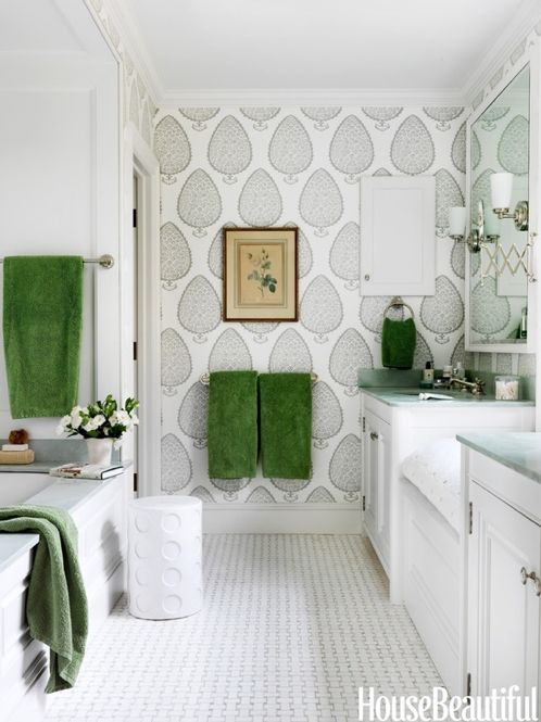
I love black and white basket weave tile. It’s also a classic — we used it in another bathroom (converted from old-time “sewing room”) for the shower floor. In addition to looking good the pattern provides a non-slick surface so there’s always that safety consideration! Like hex the classic version comes in a matte, not glazed, finish.
a wind back in velvet – classic and trendy
a wingback in chevron – classic gone trendy
am I getting it?
The Colour With Confidence workshop was excellent training for color selection. The aspect that makes a live class with professionals vs. an online class the most rewarding is the ability to learn from your classmates as well as your instructor. I was fortunate to have people from different professions at my table of 5…one had worked in a furniture store for years picking fabrics and another had worked in a paint store so was familiar with the paint names that Maria was referring to in class. This was the best investment in my career thus far. Thank you to all who enhanced my experience!
Loved the herring bone floor in the Toronto restaurant. Thinking about doing a skinnier version in luxury vinyl tile in our playroom. Trendy or classic? How do you feel about LVT?
Love you and your blog! Robert
Basket weave!
I have white hexagon tile in one bath in my house, and it was installed in 1985 by the builder. I’m so thankful for it!! The other bath was done in a mushroom/brown tile that has long since been ripped out. I think the white hexagon tile will stick around for a long time in my home.
On the basket-weave tile photo: is that wallpaper that I see before me? Maria could you do a future post on wallpaper? I thought it was “out”, and reviled today, but have been seeing it in photos like this. (looks good here)
Wallpaper is very much in vogue here in the Toronto area. It has been making a slow comeback for a number of years now. The technology has changed, it is no longer your “grandmothers” wallpaper, it actually isn’t even paper in most cases anymore, hence why it is called wallcovering now.
Pretty confident that is Katie Ridder Wallpaper
love it
I love them both but in their classic setting (the white bathroom with the basket weave tile in your post makes me beam with delight). I realize, however, that neither tile would work in my 1986-built desert southwest home in Arizona – they would probably scream “classic old floors, newish old house – what are you thinking, girl???” This is such a good post on classic and trendy, Maria. I think being true to the style of your home (if your lucky to have a true one) AND creating a look you love, and marrying the two together gets too little attention in the face of trends. I think this is why I get so annoyed by the push for hardwood floors everywhere all the time in every house everywhere in the country. When I see HGTV house hunters who tear out walls and then install a sea of dark hardwood floors, or worse, Sun City West/Arizona residents who fill their already open floorplans with a sea of usually too red hardwood floors, I get seasick and I despair. It all seems so off and wrong, and all the furniture looks like clutter or, if the area is really huge, it looks like a museum. Thanks for more clarification on classic versus trendy and all your continuing efforts to educate us beyond choosing the right colors.
Sandy, I couldn’t agree with you more, My least favourite is the MCM turned into country. It never works because the architecture with its lower ceiling and smaller windows, etc. just don’t lend itself to beadboard and panelled doors. Open plan needs to be really well thought out or it’s just a hot mess.
The classic white kitchen and bathroom arose out of the new awareness of germs and the sanitary movement, c. 1890s-1920s. Unglazed white porcelain tile set in 1′ or more of dark grey mortar (known as a “mud job”) in hex, pennyround, basketweave and other patterns were common for floors, often accented with borders or hex flowers in black. Walls were glazed white ceramic tile, with subway and 4″ square being the most common, with molded or liner accents. Colored tile and fixtures began to appear in the 1920s, and were popular through to the 70s, mostly in strong pastels, like seafoam, aqua, powder blue, pink and yellow, and set with grey (early) or white hairline joints. Sometimes the plaster was scribed to look like tile, and with layers of oil-based enamel paint, was nearly as durable.
I love the traditional white bathroom, but I also like the cheerfulness of the mid-century bathroom and am the proud owner of two early 60s bathrooms–one in pink and one in butter yellow. They each have mud job mosaic tile floors and a level of craftsmanship that is hard to find these days. Now that 50 years has passed, they have gone from dated and hideous to retro funky, and I’m keeping them that way.
Another great post Maria. As a member of the recent Toronto workshop I agree with the comments of my tablemates posted above. I am so excited that my large colour boards arrived yesterday!! I am no longer afraid of colour consultations now that I have Maria’s system to work with. Another great benefit of spending 3 intenseive days with other professionals from a variety of fields, all with the commonality of needing to better understand the effects of the right vs the wrong colour, is the sharing of information and the relationships created while working together on the group exercises. I was amazed that of the 21 women there, only a few of us were from the Toronto area, all the rest came from the United States, other provinces or quite a distance from Toronto in Ontario, what a huge testiment to your program Maria! It is always interesting to meet professionals from other places. Thanks Maria for bringing us all together. I have already been in contact with 2 members since the seminar.
I love basketweave, I have it in my main bath on the floor. It is both timeless and trendy at the same time. I like the hexagon too, I just question it on the floor of those commercial spaces in your last post, just tooooo much grout to clean and maintain in my opinion.
Could not agree with you more. Loved meeting other designers and I too just received my large boards. I just used them yesterday for the first time and my clients were very impressed. “Where did you get these? Are they real paint? I’ve never seen these before.” They were more interested in my boards than in what I was telling them 🙂
Closed on our new home yesterday and so happy with my black and white kitchen and bathrooms.
Maria, you have been so inspirational and I’m so glad I took your TCE workshop as it was worth every penny:)
Enjoy the rest of your break!