It’s really hard to pull off a trendy kitchen design that actually outlasts the trend. Your kitchen cabinets may be good quality and expensive, but that doesn’t equal timeless. Here’s my advice for a reader who wants a fresher kitchen, without a costly major renovation.

My dated cherry kitchen cabinets were expensive! Must I still paint them?
Over the 20 years I have been in this business, I have come across this question often. However, I don’t think I have ever directly addressed it on the blog, so here’s the question:
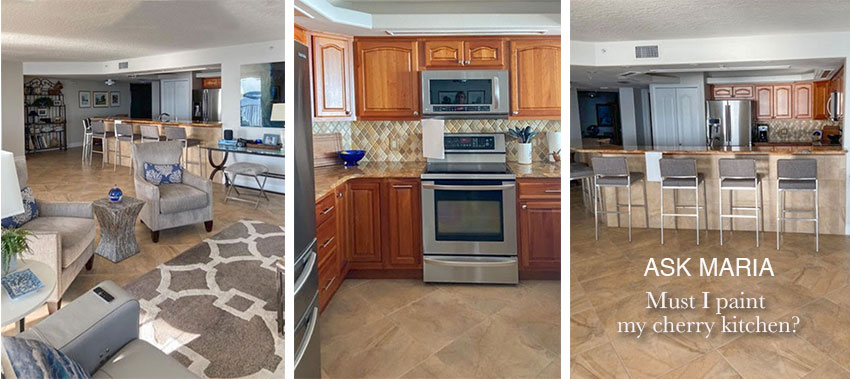
“I am struggling to deal with “Tuscan Leftovers” in my kitchen. The whole house was this way with the previous owners. Once we painted the walls BM Pale Oak (per your edesign consultation) and introduced our furniture in shades of grays and blues we feel like it is now calm and serene. Except for the kitchen which is a dark tuscan corner set in a very bright and open condo.
When we moved in, we were sure we were going to paint those cabinets white because we have always had white cabinets and like them. But even I, who loves white cabinets, started thinking like a man: “that sure is expensive cherry”. (They are natural cherry with a cocoa glaze.)
We can’t do an entire kitchen renovation, but I’m wondering if we were to change the countertop and backsplash to something lighter would that be enough to freshen up the tuscan? And maybe even the lower the hightop bar on the peninsula so that it is all one level and lets in more light. While I don’t want to go to that expense if it is going to look like a little bit of new and fresh combined with the old, I truly hate the granite. Perhaps in the living room pictures you can see that our style is somewhat modern but with some traditional touches also.
If that is indeed the way to go I have no idea how to marry the floor tiles, the existing cabinets and the countertops/backsplash. If you suggest that we paint the cabinets we could probably do that as well as the countertop, but again I don’t know how to pull it all together. Basically, how do I make this old design look fresh?
Thank you or any insight you can provide. I’m sure there are others dealing with the same issue.”
Third Rule of Design: Expensive Does Not Equal Timeless
So first, let me just say that I completely understand you’re dilemma. If you have a good quality kitchen, it does seem wrong, not to mention wasteful, to rip out perfectly good finishes when they are far from being worn out.
And, in the end it’s YOUR HOUSE, you can do whatever you want.
But the reason you’re asking this question is because, you know it could look so much better and fresher.
And, just because you paid a lot of money for a designer bag, or a designer outfit, for example, that doesn’t automatically make it current, or BEAUTIFUL.
Solid Wood Does Not Necessarily Make a High End Kitchen
Whenever I warn my readers about the perils of a trendy kitchen, it’s mostly because I have seen enough kitchens in my time to know that a fabulous, TRENDY kitchen done well, and so well that you won’t want to rip it out 10 years later, is REALLY HARD to pull off.
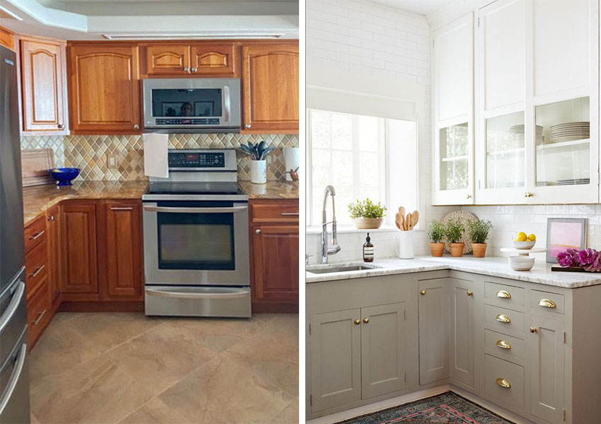
There’s nothing special about this kitchen (and I know I can’t offend you, dear reader, because you inherited this one) it’s the kind of pedestrian, run-of-the-mill, kitchen no one would look at twice — the type of kitchen installed by cabinet makers all-day and all-night.
Before you get offended because your kitchen looks very similar to this one, what I mean by ‘pedestrian’ is simply because it’s just a kitchen with uppers, lowers with no added details to give it personality.
So, let’s set aside that it’s expensive cherry and ask yourself how long you want to live with a kitchen that does not fill you with joy when you walk in?
If the answer is ‘Not a minute longer’ then it’s time to get your paintbrush out.
Plus, I would definitely take out the ‘bar’ when you replace the countertops and make the entire peninsula, countertop height.
Photo on the right: Stephanie Kraus Designs and Kyle Smith Born
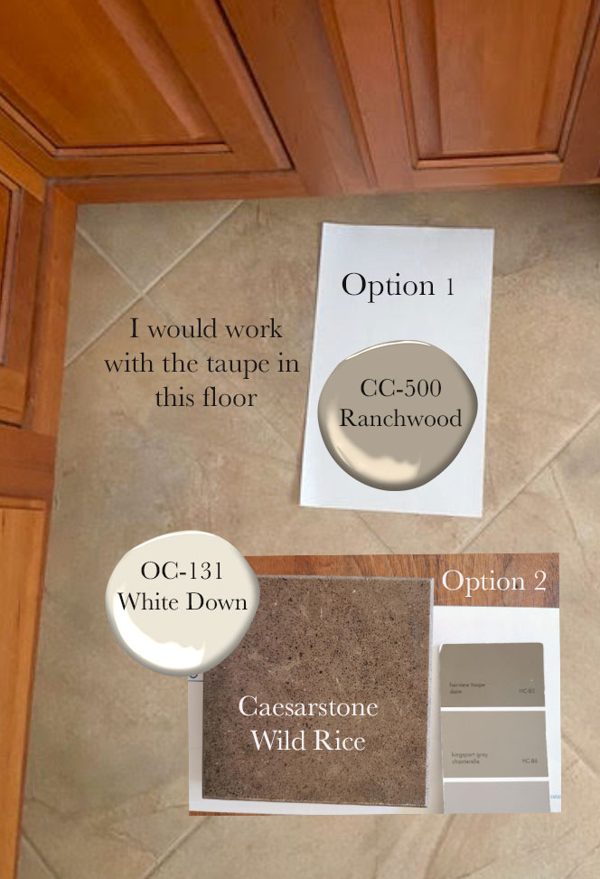
Option 1 (above)
This would definitely be my first choice, I would paint the lowers taupe to tie in the floor tile. Then go with off-white uppers, and a solid off white countertop and backsplash.
Option 2 (below)
Introduce taupe countertops to relate to the floor and paint everything else cream:
Because a countertop is installed on the horizontal, it is a nice way to repeat an earthy floor because it is not too dominant visually. Taupe contrasts nicely with soft white, cream cabinets.
Decorpad
Don’t Ignore Your Floors When you Update Your Kitchen
What I would advise you NOT TO DO, is to install any kind of countertop that looks like marble. This is such a common DIY mistake, I see it all the time. It only creates the dreaded ‘old floor, new countertops’ kind of look.
WHY?
- Because you need something to repeat the earthy taupe tones from the floor to create a cohesive and intentional look. You cannot simply ignore an older tile floor and install a new white kitchen.
- And often with a tile floor, that something, should be the countertop which is a similar stone like material installed on the same horizontal plane so it creates a sense of balance when it relates directly to the floor.
- This earthy floor has a PATTERN. If you install a competing marble pattern, it will disappoint the expectation that it should relate. The patterns will clash and make the floor look even more wrong, and OLD.
If the plan is to update the floor sometime in the future, I would go with option 1, painting the lowers and installing solid off white quartz with no pattern. This way, when the floors are replaced, the lowers can simply be painted to completely refresh the look.
On the other hand, if the floors are staying for the foreseeable future, tying them in with relatively solid taupe countertops instead is also a great choice.
When a Two Toned Kitchen Works Best
The other reason why it will work well to paint the lowers a different colour than the uppers is because she does not have a pantry that makes this choice difficult. I often advise against a two toned kitchen when there are elements like pantries or housings for wall ovens that span both the lowers and uppers. That’s when it starts to look arbitrary and unbalanced to introduce two cabinet colours.
Taupe is a Great Choice to Update an Earthy Kitchen
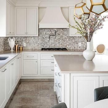
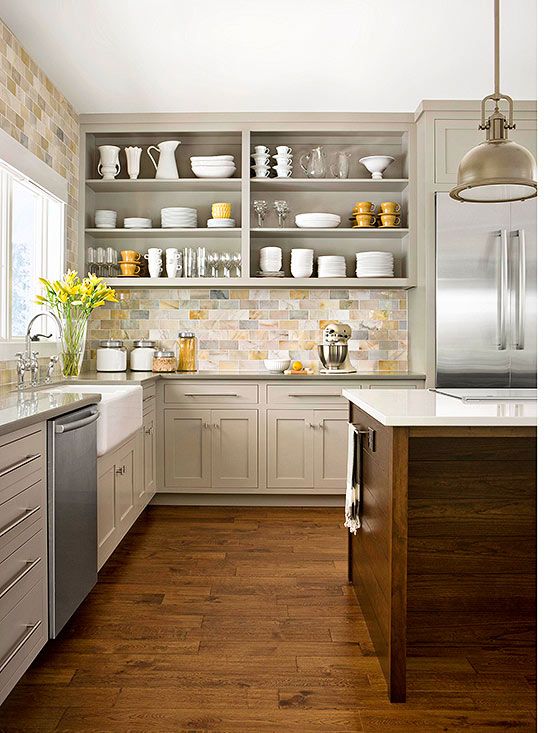
Here’s another taupe kitchen with a backsplash that has been repeated in the decorating. Note that the earth toned backsplash is the star of this kitchen and was chosen before the cabinet colour.
When you have an earthy finish in your kitchen, it work better to repeat it rather than ignore it. That way it looks intentional and integrated.
Red and Orange Wood Tones are not as versatile and timeless
The truth is, cherry is simply too orange/red to be either timeless or current.
Even if they WERE back in tomorrow, they would be combined with a totally different colour combination that would take them far away from the dated look we’re looking at right now. With a respectful nod to the wood gods, I would not hesitate to paint cherry cabinets and appreciate how well made they are, UNDER that fresh coat of paint.
Related post: An Open Letter to my Lover on Decorating
Resist the Temptation to Install New Black Fixtures and Hardware
My other hot tip is DO NOT install black hardware in this kitchen.
WHY?
Because there’s not a stitch of black in here. Right now, black plumbing fixtures and hardware are trendy. So it’s easy to assume adding them will “update” your kitchen. However, if there is no black already in your decor or finishes they will just stick out as wrong and draw undue attention to themselves.
It’s Hard to See What is Possible when you are Attached to What Is
I can’t stress enough how important it is to take an honest assessment of what you’ve got and make the best of it.
And yes, that usually means reaching out for expert help. Because it can be difficult to make an objective judgment of what needs to happen in your own kitchen. Whether you love the look of it or not, your kitchen is like a good friend. You’re familiar and attached. You might even have become friendly with the warm cherry cabinets.
I know there are existing colours that I have already decided I’m going to live with (for now) in my house (specifically my exterior siding colour and porch) so much that I don’t see them anymore.
And it’s freaky to face decisions on how best to stretch your budget. When you look at the cost of painting cabinets and replacing countertops, you need to feel confident that you are going to get a worthwhile and beautiful outcome.
Trying to figure out where to start and where to spend can be overwhelming. Without the reassurance of an unbiased and experienced eye, it’s easy to get paralyzed with indecision.
And it’s especially tricky when you are working with a bossy element like a tile floor that’s not changing. Or an existing stone fireplace in your great room (which you also cannot ignore when updating your kitchen).
If you would like help with the best options for your kitchen refresh, you can find my popular Create a Classic Kitchen eDesign consultation here. I will walk you through the best options for your kitchen renovation so you can make the best of your investment and be assured of a beautiful result.
Related posts:
First Rule of Design: Boring Equals Timeless











AH. YES!! when we bought our home, the original owner splurged on some very specific things in it. One major expense were the Sherle Wagner puking Brass swan fixtures. They were really just UGLY, along with the cream and mauve and cream and blue swirled marble sunken tubs. We took great delight in the removal of these and went with TIMELESS (following your undertone methods).
Thankful for your wisdom!
Bravo, Maria – I loooove your option #1 for this home. And I love your clear descriptions of WHY you suggest the options you give. This is why I continue to read everything you write. Our home initially had bright orange stained solid maple cabinets – I mean they really glowed – and I can’t recall hearing a peep from my anti-painting-wood hubby when I verbalized my plans to get them all painted white before we moved in. They were that bad, thank goodness, that we avoided an argument about it. I love them now!
Thank you SO much for this post!! My daughter bought a house, built in the 1800’s, that has been renovated – including the kitchen. It looks very similar to your kitchen, except her countertop and backsplash make yours look fabulous! I have been thinking about what she should do since she moved in (She is happy for my involvement). As much as I love my newly renovated white kitchen, I thought white or cream cabinets would accentuate her floor and make it look dirtier. I have toyed with idea of either taupe or even navy to minimize the contrast. I LOVE your first option and even if I can’t get her to spring for two different colors for cabinets, taupe on the uppers and lowers would be great. Thank heavens I have all three sets of your color boards at her house!😊😊😊
If she does decide to paint the cabinets, she should also do the door or pantry to the left of the fridge to match the cabinets. It looks unbalanced now and needs to be integrated.
My vote would be to paint the cabinets first a cream colour and then see if she can live with the granite and backsplash.
You are such a gift to your followers Maria. Never miss a beat! The “why’s” of your decision making are a real help. I remember some time (maybe years) back you said BM paints could be translated to Dulux paint colours in Australia. Can you talk about this again in a post in the future please? Stay well and stay happy in these challenging times.
Paint those cabinets! Nobody is ever going to want cabinets in that style and color again so it doesn’t matter what they are made of; a new owner is going to rip them out or paint them so you might as well do it and love your kitchen! I’d consider replacing the doors on the uppers too with a style that doesn’t have the curved detail on top, and maybe even do a few with glass. It doesn’t seem like you have too many uppers so it wouldn’t be crazy expensive.
I love Option 1 in Maria’s reply. I’m not usually a fan of two-tone designs, but the taupe lowers are so pretty and fresh with the off-white uppers! I hope you send after photos after you complete your makeover!
Hi Maria!
Great post.
What are good paint choices for dated maple cabinets with golden oak wood floors? Backsplash and counter tops will be replaced. Surrounding rooms have warm blues, greens and ivory area rugs and upholstery; iron accents.
Always enjoy your blog!
Thanks-
Marianne
Hi Marianne, AFTER you choose the countertops, that’s when you choose the paint colour to coordinate. Hope that helps, Maria
Hi Maria
I think there are two important issues to consider here.
First, I think many of us are dealing with a philosophical dilemma called the sunk cost fallacy. We spent so much on those cherry cabinets that we have a hard time letting them go. We feel foolish that we made such an expensive choice, and now we don’t like it. Or we lament that we may regret painting cabinets or ripping them out, even though we KNOW that we will never be satisfied with those red cherry cabinets. It’s a tough situation to be in, since it is so incredibly expensive to redesign a kitchen. But if we can afford it, I think we should move past this dilemma and feel good about making a change that will make us happier.
Second, I think that many of us have been victims of the builder kitchen, which appears to have come to prominence from the 1950s through the 2000s. During that time, in my opinion, design took a back seat to the desire for increased square footage at a lower price point. Recently builders, most of whom are not designers, sold us on the idea that granite, tile backslashes with accent tile, and wood cabinets are “high end”, undertones and design principals be damned. I know that these builders think they know how to design an aesthetically pleasing kitchen. History shows us that they do not. I long for the day when builders hire designers to stock tile, countertops, flooring, and cabinet choices that are aesthetically pleasing, and, hopefully, relatively timeless.
Builders should stay in their lane, stop cutting corners on aesthetics, and hire talented design experts to recommend finishes that stand the test of time. Some would say that this is too expensive, but I beg to disagree. White cabinets, tasteful quartz and subway tile are not more expensive than busy granite, earthy backslashes and ugly floor tile. Builders will benefit in the long run, because having a designer specify finishes will allow their houses to shine above that of the average builder grade home.
For most of us, our homes are our largest financial investment. They are one of our biggest emotional investments as well, since we LIVE inside them. I think even the most modest home can, and should, be aesthetically pleasing.
As you always say, one mistake pays for the designer. In my part of the country, an “average, builder grade home” costs 260,000.00. It’s time to start putting in kitchens that people don’t hate.
I hope the builders are listening….
Such a great comment thanks for taking the time to post it! xo Maria
I like option #2. It seems more harmonious. In option #1, although I like the taupe lowers, I think the off white uppers are too light and bright. (I would want to paint them!)
Personally I would start by painting the back of the island and the pantry doors the same as the wall colour. I might even paint the entire “coffer” ceiling in the kitchen the same so it “disappears” more. Then I would change the backsplash and counters, (maybe even use a laminate, cause of cost) and possibly lower the bar height. Only then would I look at painting the cabinets, and then I would start with the uppers in a cream ( as Maria suggested) and change the hardware. Do the lowers, if I still don’t like them. I would go one step at a time and stop when it looks better with the space. I am not convinced that she will be happy without ultimately ripping out the kitchen. So I would do smallish updates, one at a time before I threw too much good money at bad. Replacing counters with a new stone is a lot of money on this kitchen, in my opinion.
What a great post!!
I’ve been reading every single one you wrote since 2012 and I still learn so much every time. I’m leaving in France right now and we’re supposed to come back to Canada this summer. I’m sure you will not be surprised if I say that the houses that are on the market are FAR from having your aesthetics… I will need to focus on the bones and overall potential of those houses, that’s for sure! But with the help of your posts, books and probably e-services, I’m confident that we’ll be able to make a beautiful home out of that futur house 🙂
Thank you for your generosity
Cyntia
Wonderful information! And great explanations! But I think it should be noted that the difference between her cabinets and your design is much more than paint. In each of the examples, the style of doors and cabinets fronts is completely different making a huge impact on the overall look. I have seen people paint or have it done by a professional and then realize that the old style curve in the door or the scroll or whatever is still dating the look. Maybe what she should be looking into is not just paint but new cabinet fronts. The cost to then paint the boxes would be less and even a possible DIY project. Also, some people are still buying or having expensive cherry cabinets made and she might be able to sell the doors or give them to a Habitat Restore. It might be worth paying someone to carefully photoshop in the new paint over the old design and see then if she likes it. Barbara
Caesarstone Wild Rice is too dark for your inside kitchen. There are lighter options to consider for your windowless kitchen.
I recently completed an update of my 2007 Tuscan kitchen in the home I just purchased. I chopped down the raised bar, put in new countertop and backsplash, updated the under cabinet lighting, replaced sinks and faucets and changed cabinet hardware. The result is a huge difference. I installed a creamy quartz with limited pattern. I kept my maple stained cabinets and they now have new life.
My upper cabinets have raised panels, but without the arch that yours have. If your budget allows consider changing your upper cabinet doors, the arch design dates the look.
I agree that lighter taupe options could also be considered. Taupe is a HUGE colour in countertops and there is more than one option available! Thanks for your comment Bill! Maria
Fantastic post!
Hi Maria, Thank you soooo! much for your thoughtful, inspiring and cost effective suggestions and the rationale behind them, for kitchen challenges.
I would love you to share your knowledge and ideas about the design, colour and materials about sinks and hardware materials and colours other then stainless steel and their pros/ cons about them. Porcelain, fireclay, stone/granite/composite and the built in countertop/ sink stone all in one design. Their role in kitchen design, and colour are also important. Thanks very much.
May you and yours stay safe and healthy in these Covid19 times.
Cheers, Kim North
And this is why I love your blog! Real-life situations. Great explanations and advice. Thoughtful comments from your readers. Thank you, Maria, for helping to educate us!
Thank you for this great post, Maria. I really like option # 1. I have the same tile flooring as this post, but I’m dealing with golden oak cabinets. The question that popped into my mind was about trim color. With the open concept she has and I as well, would one be opening up the need to paint the trim in the adjoining room or rooms?
White Down!!!! The same color you specified 4 years ago to give me a “white” kitchen that would to “stand up” to the existing brick wall and arch. It is lovely and flows beautifully into my adjoining living and dining. Maria, hiring you to correct my early mistakes in paint choices for my ENTIRE DOWNSTAIRS was the absolute best decision. And you are right – your fee was just a fraction of only ONE of the paint jobs. In addition, my exterior also looks great thanks to your expert recommendations. I am spending my quarantine time at home landscaping the exterior to complement my deep purple (BM Kalamata) front door that you specified. Because I listened to you, I experience joy every single time I walk through one of these rooms or approach my home.
Let me be the voice of dissent.
1. The example pictures of kitchens you are showing are custom cabinets with inset doors. That will not give her the same look as the cabinets she actually has and how they will look when painted.
2. How will the first photo and the third photo not be “dated” in 10-15 years? That backsplash in the third photo is very taste specific. It is not one that a lot of people can live with. The taupe cabinets are not to everyones liking either. The 2nd photo is, IMHO, one that in 15 years, people can still live with and not feel the need to change.
I had a builder’s grade kitchen for many years. And, based on your recommendations thru the years and my husband and my sister helping me find my voice, I have a kitchen that fills me with joy every time I walk into it. But, what fills me with joy, may not fill others. So, I have white cabinets, white subway tile, Cambria Bellingham, white with a subtle pattern tile floors. I chose these because I have been saving pictures of my “dream” kitchen for >30 years. But, this kitchen can be made into any style one chooses thru accents and accessories.
The examples in pictures 1 and 3 cannot. They are what they are.
I know I am not explaining myself well. But, sometimes, you need to live with what you have until you know what you want. If the above poster has done that, that is all well and good. But, I think, jumping into something because you do not love it but you don’t know what you love, will not, in the long run give you joy.
They photos I’m showing absolutely will be dated, however I’m showing colours that will work with her EXISTING dated colours, which is why I posted those kitchens. And I agree with your other comments for sure! Thanks for clearing that up for everyone! Maria
No matter what you do with those cabinets, my daughter and I can’t get past that octagonal kitchen ceiling with the long rectangular recessed lights! It’s screaming ’80’s, when everyone had a glass and brass octagonal dining room table to match. White paint might make the best of it. That ceiling, and the fact that it wasn’t addressed in Maria’s post, is the main reason why, no matter WHAT you try to do to make a kitchen look fresh using the existing bones, there’s always going to be something that trips you up. We are very tall, so we would definitely notice that ceiling. 😉 Let’s face it, most of us are not in the income bracket to tear a kitchen out to the studs. So we make do. Which is exactly why I like to follow this blog. My favorite posts are always the ones where Maria crafts some new elements into the old.
Great post! Thank you.
Actually, I like wood. I would have kept the cabinets and spent the money on the fixing the ceiling, backsplash and countertop. It would have been nice to see Maria’s reccommendations for this scenario.
Hello Maria!
I just love your solution number 1! It’s so pretty, and I would not get tired of that for a very long time! Do you know what the taupe and creamy white paint colors are in that photo?
I have a similar question/situation for you: My kitchen has Shaker style orange maple cabinets with raw earthy Tuscan tiles. My floors throughout the house including the kitchen are yellow-orange oak, which won’t be changed. It’s a lot of orange! The counters are matte quartz in a dark brownish-grey.
You see the kitchen to the right, first thing upon entering the front door. I will be retiring and selling my house in about a year, so I don’t want to spend a lot of money, but do want to have a “wow” factor when prospective buyers enter. This kitchen really is not bad, but somewhat dated. What would you recommend in this situation?
Thank you so much for any consideration!
An avid reader,
Susan
Well if you want your house to look updated, you’ll need to paint your cabinets at the very minimum! When you’re ready, I can help through my eDesign department if you want to know exactly what you should do in your situation. It’s impossible for me to give accurate advice without photos. Hope that helps, Maria
I also agree that Ceasarstone Wild Rice is too dark and too busy to work well with the flooring. A simple light taupe would work much better.
Ah we’re in the same boat! We have a 15 Y.O. kitchen with a Brazillian Cherry floors and cabinets. and a Green granite counter top. We just painted the kitchen a Behr Silver Ask, light grey with a green under tone, and now it all kinda clashes. I don’t know if I should repaint walls, the cabinets, replace the counter tops or all the above. The only thing I don’t want to do is replace the floor. Please help.
Sounds like you might have needed a green beige then instead? You can find the list of green beige’s you could try in my bonus book of colours in one of my ebooks. If that doesn’t help, I would be happy to help through my edesign packages here: http://www.mariakillam.com/product/interior-paint-colour-consultation/
I love your solution in terms of colors. I will say that I still prefer high bars in many cases, and many of my friends are still putting them into high end homes. If done well I think it’s a great compromise between and open and closed kitchen to be able to have it open but “hide the mess.” Of course it depends on the design, the flow, the light, etc.
I’m the original poster and I want to thank Maria and all her followers for the advice and comments. Everything was so helpful and gave us lots to think about. We have decided to change the countertop and backsplash first mainly because I dislike orange but also that will give us the most change for our buck. Also the flourescent lights will be changed to recessed lighting around the side and a different fixture for the middle. We have racked our brains out trying to figure out how to get ride of the dreaded octagon bulkheads but this is a stacked unit condo where you can’t go into the ceilings and there is electrical and duct work in the bulk heads. I would like to find a countertop that has a bit of the color of the cabinets and flooring in it but that is much lighter in color. Then we can access if the cabs still need painting or doors replaced. Thank you all again for your advice.
Great post -thank you Maria for being a calm voice of reason with things like this. I do try to keep my clients from adding certain finishes or colors because they are trendy. Work with what you’ve got and make it work for you and look classic. Being a realtor I see a lot of poorly done fixes to try and make something look “now”…classic usually wins with buyers!
I’m kind of in the same situation in regard to my cabinets. I like a very fresh, bright clean look (but still neo-traditional) but am stuck with these fairly nice maple-y looking cabinets. I would have painted them in a flash, but I keep hearing how they always have to be touched up and require a lot more maintenance. Is there a paint that eliminates the chipping issue?
Thanks for your thoughts about this.
Not really. Perhaps you’ll be better off just installing white countertops and backsplash to get a fresher look in the meantime! Hope that helps, Maria
Always love your blogs as you are so on point! It is so much fun AND educational at the same time.
I do have a favor to ask (and you may not know the answer) please? Do you happen to know the color of the kitchen cabinets that you called “taupe” in the BHG photo and the Option 1 photo? (they I like the color of each of those painted cabinets and would love to consider them for my wood tone cabinets. look like a warm greige to me, but I still can’t nail undertones).
Maria – In Option 1, you mention ‘solid off-white countertops and backsplash’. But the photo looks to me like a marble/veined stone countertop. If the pattern/veining is very subtle, do you consider that to be enough of a solid not to fight with the tile floors? We are tackling a very similar kitchen update, so I want to be sure I understand. Thank you!