The other day while in a clients home discussing kitchen finishes, she announced “I’m going in this direction with the hardware because I want to mix it up a bit’. And I realized in that moment that there was a post in that statement because there is a danger in doing that. Not like ‘mixing it up’ is wrong at all, just be careful when you are selecting permanent finishes for your home that you don’t go too far to the extreme of doing something ‘creative’ or ‘new’.
Whenever I have specified a colour even slightly different from what I know it should be because I’m bored—that’s when it’s usually not as perfect as I would have liked.
I know what it should be and I specify a colour I haven’t seen up before because I’m thinking, ‘Been there, done that, let’s try something new.’ In those cases, I arrive later and think “Note to self”.
That is where the danger is. And the following is where it may apply to your house:
You look at your kitchen finishes, for example. If you have been staring at plain old arborite or formica countertops for 20 years, now you may be thinking; granite. But then, you order it, don’t quite get the colour right or you decide in the end that it’s now too busy but it’s installed. Forever. In your kitchen. Permanently.
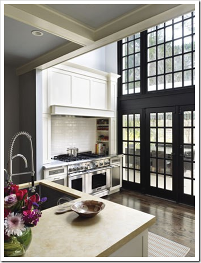
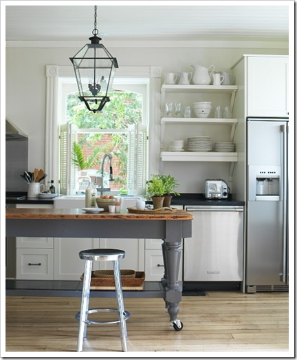 Via Simplified Bee
I recently had this conversation with a couple who were planning their kitchen renovation. The granite they were considering was gray and murky but the existing colours in their home were soft yellows and purples. I asked why they had chosen that granite and they said it seemed more ‘interesting’ than quartz because their existing kitchen had a very plain, solid colour arborite countertop. I pulled out quartz samples and recommended a wonderful stone backsplash with slight veining throughout and suggested they substitute the flooring tile for the same wood flooring that was in the rest of their house. I also showed them all the colours that would work with their new finishes, now that the countertop was lighter, there were many more options and they sighed with relief and happiness. The new finishes were so much more in line with the look and feel they were after.
If you have a brand new kitchen and you are not singing the hallelujah chorus every time you walk in, (like my sister who’s white kitchen is now finished, pictures to follow) well this might be exactly what happened (maybe).
When it comes to design and colour, we always go to the opposite extreme. It’s why white is the new brown in kitchen cabinets. And it’s why white will go back to dark after the gray and white trend comes to an end.
If you have had plain, boring old tile as a backsplash or NO backsplash for years and years, now you think, ‘let’s go with that snazzy new and trendy horizontal tile. But then you install it and it screams ‘look at me, look at me’ and your heart sinks.
A few years ago, I had a client who asked me to present her with some new fabrics for custom drapery and bedding for her master bedroom. And because she had been staring at blue and white angled horizontal striped drapery for 20 years and she said she did not want to see another stripe. Now that colour blocking is so big, that request is easy to pull off, but I had a hard time back then pulling a traditional looking palette of coordinating fabrics together without a stripe–which goes with everything–which always works. And are there stripes that would look miles different from the one she had been looking at? Of course. But it goes back to what I said earlier. We want the OPPOSITE of what we’ve had, and that can sometimes backfire.
There are so many tiny decisions that lead up to the overall look and feel of any space, therefore, the question you need to keep asking yourself is, “Am I trying to get too creative here?” When it comes to permanent fixtures, simple and clean with only one element (instead of many) that jumps out saying ‘look at me, look at me’ is always better.
Many times, I have walked into a condo with a tiny 4 x 4 tiled entry and immediately to the right or left is the kitchen and instead of taking the same tile through the small galley kitchen, the designer or homeowner tried painstakingly to ‘coordinate’ with the tile in the entry and failed. It’s almost impossible to match one patterned tile with another one. Better to not try and get that ‘creative’ in the first place and choose the obvious and simple option instead, the same tile.
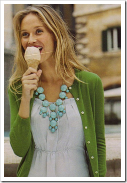 Love this creative outfit (source)
And one more thing, if you are agonizing over whether your interesting looking backsplash actually coordinates with your countertop, my guess is, it probably doesn’t. When the colour is right, it’s obvious to everyone.
Related posts:
White Kitchen Cabinets; Advice for my Sister
5 Steps to a Kitchen you will Love
Kitchen or Bath Backsplash; Accent tile or Not?
Which Hardwood Floor is the most Timeless?
It’s All in the Undertones, download my eBook here. (If you have a computer you can download my book).
If you would like your home to fill you with happiness every time you walk in, contact me.
To make sure the undertones in your home are right, get some large samples!
If you would like to learn to how choose the right colours for your home or for your clients, become a True Colour Expert.










I'm don't do the "matchy-matchy" decor but "mix it up a bit" would frighten me too! Thank goodness for professional direction 🙂
Very nice post, with really good advice. As designers, we have all been there. As homeowners, we have all made cringe worthy mistakes. Your advice is the same as I give my clients, and the house itself always has an opinion as well!
As everything in life, you need to have some good sense.
Mixing up is not throwing things together. That never works and it can look bad. "Mixing up" is more complicated than we can imagine. You do have to have some knowledge of what you're doing.
xo
Luciane at HomeBunch.com
cannot wait to see my glassos quartz countertops in fresh sparkly white!
pve
Your last statement is absolutely right. Nice post.
Good post. Lots to consider as I finally get to my kitchen redo. Not having much in the way of wall space above the counters (mostly appliances and windows to the lanai), a backsplash is the least of my worries…Countertops, however, present a dilemma. I am leaning toward a non-busy patterned quartz. Granite is beautiful, but the business of the patterns drive me crazy after awhile. Yes, there are some patterns that are not too busy, but…
J
Great post. You are so right, when it works you don't have to second guess yourself. I am not a trendy person, so I don't usually jump on the bandwagon, now I will think even longer before I do. Hugs, Marty
I think it's a good idea to stick with classic, simple and straightforward pieces for the big-ticket items, and get creative with accessories. For example, choose white cabinets and marble countertops for the kitchen, but install unusual bin pulls and handles or unique light fixtures. That way, when you get tired of them in a year or two, it only costs hundreds of dollars to replace them, not thousands.
Similarly, I'd choose a solid colour fabric in a medium tone for a sofa, do something similar for the curtains, but buy something a little more "out there" for the cushions and accessories. I think this is the way to handle trends, too, especially if you're not sure you'll like the trend ten years from now. If you buy classics for your main (expensive) pieces of furniture and go trendy for some of your accessories, you can change your home's look much more frequently than if you spent $5000 on a trendy sofa.
So agree with much of what you said, especially when you have to question something, chances are its all wrong.
Less is more, not everything has to be matchy matchy, mixing things up a big as long as you are using good taste and common sense is always a great idea and in general I advise against going with big trends in the kitchen as they often end up being costly mistakes.
Great post!
It is great advice Maria and jumping into costly decisions that will be around a long time IS a big mistake!
xoxo
Karena
Art by Karena
so true: when it's "right," it's obvious to everyone!
I can't believe the beautiful titles you invent, the informations you give, the interesting text, the gorgeous images…every single time…! Amazing!
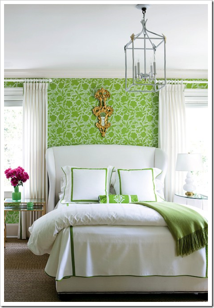
Wow! how gorgeous images!bunch of professional way of advices are so great..very well said.You are amazing as always.Loving the bedroom with the shades of green!thanks for sharing 🙂
I haven't been by for a while Maria and I've missed your terrific posts! This one is no exception… perfect advice!
Hope you're well!!
Victoria
Absolutely. It can take courage to opt for simplicity, particularly when expectations are high. Knowing how to bring your clients around and persuade them that less if more is a real skill.
All that said, there is also the danger of being bored when making all safe selections.
I'm definitely in the camp — think before you leap — but in decorating, the equation can be: analysis leads to paralysis. I really do want to love my purchases and decisions 5 years from now, incl. the white kitchen I have not opted for — yet!
Such a good post Maria! I remember when you did my consultation and I told you NO PINK! Absolutely none..because I had had way too many years of pink.
Then I kept seeing that gorgeous raspberry in accents, on one particular post and in various places on your blog and thought..wow–I guess pink isn't so bad after all.
Lesson learned. :o)
xo
Donna
I think you have the right on this. Sometimes you’re wiser not going too far out with design concepts. I have been wrestling with the design for the kitchen I hope to finally begin remodeling next year. Because I write about so many innovative kitchen designs, I would love to do something like that myself. What stops me is reality. Ours is a tract home, so a lot of those minimalist designs don’t really fit in. Also, it’s a very small kitchen and destined to remain so. So, once we factor in the necessary storage space and so forth, we’re left with a design that, although much better than the decades-old schlock now in place, is not the cutting-edge design I would have liked to have devised. But on the other hand, and this brings it back to what you wrote, it is something we will be able to live with forevermore. And that is the ultimate goal of a remodeling, I think.
I love the open cabinets and large table island in the kitchen! Simply beautiful!
Great post! I agree with just about everything you wrote. I'm now in my fourth house in seven years, and I've learned to trust my gut instinct. If it feels wrong, it surely is wrong, and I don't try to force it. I've also learned to sit with an idea for a while instead of jumping right in, and it's saved me many times now.
So true, what a great post. I do find that people who want something entirely different either end up unhappy, or go back to the colors they love and have had. Comfort with the same thing really is ok, and that goes for what you said about not being overly creative. Not everything can be the star. Love our advice :). Hope you are enjoying the start to the summer!
OK, I've been a lurker for awhile, but now have to post. Your advice is fantastic, and so timely. I've lived without a backsplash for 15 years and am now excited to install one since we have new granite counters (without the standard 4" backsplash thanks to you). Was considering the "skinny tiles" but after reading your blog agree that it would be too modern for my kitchen. Love the white Moroccan tiles so much I'm going to order them. I'm so relieved. It will be a decision I won't regret (as I usually do when over-analyzing things). A little different than subway tiles, yet not something that will be too dated anytime soon. Thanks again for all your help!
So true on almost every count! I heard some great advice once that when you think you are through with a design, take something out.
Simple is almost always better than too much, particularly if the complex is not exceptionally well done, which is quite difficult to do, particularly in a way that will wear well over time, especially with those more expensive and harder-to-change items like cabinetry, countertops, and tile. It’s also often quite tiring to the eye after a while, even if it is exquisitely executed.
As to getting bored, which others have brought up, we all eventually tire to some extent of almost anything we have, no matter how beautiful and perfectly done. Believe me, though, you are far better off to get bored with something classic and basic like white than with anything trendy when you’re dealing with things like kitchens that are so expensive and disruptive to change. You can always dramatically change the look of a classic white kitchen with an incredibly wide range of colorful accessories and even window treatments, all of which are a whole lot cheaper than changing the bones.
If you know you’ll be both willing and able to change it all out in 5-10 years when you get tired of something else, then by all means go for it, but for those who need it to last longer, classic and white will always stand the test of time – and it will also eventually always come back into vogue as we are seeing right now.
Simple, classic design always has style and looks good, even if it’s not the latest fashionable trend. Style is independent of fashion, and always more durable as a result.
Wow, Maria, your posts are great! Thank you, thank you! I’ve learned so much from you. And in the process I learned that my initial instincts were correct, i.e., mixing patterns does not work -most of the time. Prior to encountering your website, I thought my taste was not “educated” or “sophisticated” enough because several designers (including a couple with degrees in interior design) were directing me to choose a countertop with one pattern (granite or quartz) and a backsplash with another supposedly coordinating pattern. It just didn’t feel right to me and the undertones didn’t seem to match either. Now I know why and I know my gut feelings were correct. Thank you, Maria!