Exterior planning season is here. I’m releasing a new module on Wednesday in my Masterclass for Exterior Colour Selection.
Stone is a big deal. Not only is it expensive to add to your home, but it’s often added in the wrong areas of the exterior. Sometimes it’s not enough, most often though, it’s just not balanced.
And, now that the trends have moved away from earthy, and into the latest trend of black and white, there are so many homes that not only have earthy palettes and stone from the Tuscan trend, but also stone and brick that don’t match AT ALL.
What about homes that didn’t need stone in the first place?
That’s what I’m talking about in this module.
Here’s what you’ll learn:
Which style of home should NEVER be black.
Pay attention to balance when planning or adding stone to your exterior
When adding stone is not necessary
What Would Maria Do: Before & Afters
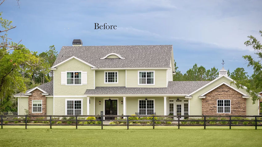
What would you do here (below)? I’ll show you the after, inside the course.
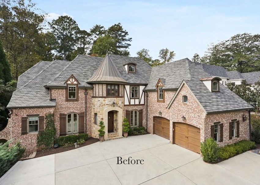
What about this mismatch of brick and stone? How do we fix this house (below)?
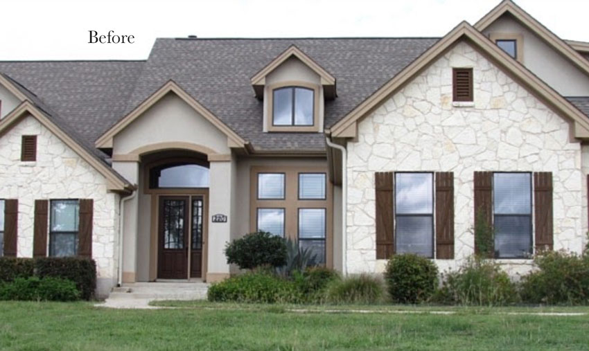
Here’s another one. What would you do here? What should we do about the trim? Do the shutters work? Do they stay, go? Do they need to be a different style?
Learn all this and so much more in my Exterior training. You can watch the first module here.
The course includes downloads to help you plan your exterior colour scheme as well as a quiz at the end of the modules to help you internalize what you’ve learned.
Remember, this course comes with lifetime access. You can watch it at your own pace, stop and start it at anytime. There’s 16 modules and total viewing time is 4 hours.
If you’ve already bought the course, you’ll have access to this new Module 16 on Wednesday, March 3, 2021.
If you’re ready to learn all about the world of neutral undertones AND how to choose the right colour for your classic and timeless exterior, you can buy the course here.
Related posts:
Ask Maria: Help me Update my 60s Exterior, Before & After









Hello Maria,
I ve been following your notes and am interested in knowing more details about your classes.
Presently, I am our communities HOA architectural liaison. I do have a BS degree in interior design. Have worked in the design area for over 37 years. So I may be able to add to your program thru collaboration.
Respectfully
MaryAnnGood
Ooooh, I don’t really have big problems with house 2 or 3, but house 1 is clunky.
We purchased an exterior package from Maria after our new roof made our house look pink. She gave us great advice on color as well as windows and trim. The transformation was so incredible some neighbors were stopping at the bottom of the driveway to ask if we just moved in. Thank you Maria!!!
The first home doesn’t need the brick to complete the house, plus the lone shutter needs to go. Would you white wash the brick?
I don’t know what they were thinking when they built the second one. A turret! And, why change to stone in that area alone. The grey roof does not go with the colour of the brick. How do you fix that?!
I like shutters on the third house but they are too farmhouse/rustic for the style of build. The trim colour goes nice with the warm stone and cement but not the black framed window, nor the roof. I’ll be interested in what colour you pick.
The second one belongs on mcmansionhell. It’s a tossed salad of design elements: 3 types of exterior (and 2 styles of brick pattern), 2 roofing materials, 2 dormer styles, and 4 styles of window. Somebody wanted all the pretty things and didn’t have anyone who could keep them focused.
The problem seems to be that the standard McMansion is built to impress and not to adhere to any standards of architecture, beauty, or utility. The number of roof planes makes me wonder how often ice dams form. The size of the concrete pad in front of the second house makes me think it doubles as a helicopter landing site. Some years ago on this site Maria showed an old European kitchen and remarked that it probably hadn’t been redecorated/modified in decades, and yet it still remained beautiful and functional. I wish we could return to old standards and classic styles that are meant to be pleasing to the eye, comfortable, and ultimately livable, rather than that which is meant to inspire awe and envy.
Oh, the misuse of stone on this SCALE is an abomination that only those with money can perform. Is the general public trained to think that just because it’s BIG, it must be OK? I’ve driven visitors through neighborhoods where every house is like this! Everyone “oohhs” and “aahhs”, but that house with the turret needs a drawbridge and a moat to complete the look. It isn’t the worst McMansion I’ve seen. We have plenty in my state. Seems it’s not just a California thing. Scroll through McMansionHell.com to be entertained with exteriors and interiors that defy logic. One interior is decorated like a circus tent crossed with an English pub. Why does endless amounts of money often translate to endless bad taste? I’m simply a commoner with a budget. There’s only so much damage I can do. Thankfully, Maria helps me make careful choices. Love this post today!
OK, now I must go to that website for a laugh!
Haha but you leave such fun comments, thanks! Maria
I’ve taken the Exterior Masterclass and can’t wait for this latest module! All the houses above need work. The funniest thing I see when I look at those examples, is on the first house there’s that weird curved thing on the roof and it looks like a handle to pick up the house! It would be so much better without that feature and also without any stone at all. House 2 makes me ill – so many things wrong with it. House 3 needs work too.
So interesting what we can learn from other peoples observations. I didn’t even notice the “handle to pick up the house”, but now I can’t unsee it. 🙃
I didn’t even notice the pull handle at first! You are correct, the stone just needs to be removed from House #1. It doesn’t belong there at all. What I think would be nice, if they want something to break up the expanse of vertical exterior and give the house some oomph, is that since it uses shingles, have those be two different tones between the floors. And they should unify their window style. It looks crazy now.
Well likely no one would actually REMOVE the stone, but the brick needs to be painted to match it yes! Maria
I have a feeling that the solutions might include paint! 🙂
Ah, it’s probably too costly and difficult (they still need to live somewhere don’t they?). Well, I’m publicly in support of painting brick when it’s needed or desired, so that would be fine with me. 🙂
Paint it all! Stone is like brick, easily fixed with paint.
Certainly is! The after photos are found inside my masterclass! Maria