image via Little Big Bell
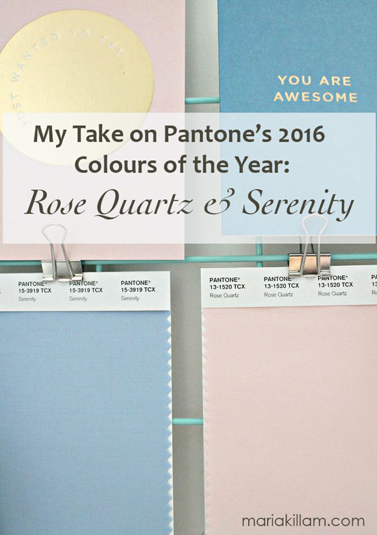
Pantone has been talking about their ‘colour of the year’ since 2000. This year was the first time they selected two colours. Since I was not part of the secret meetings where these colours are chosen ; ) I along with everyone else, can only speculate on these colours and offer an opinion.
Navy and indigo blues are the hottest colour story in interior design in terms of ‘what’s new’. But you can’t say indigo blue is a hot colour one year and then out the next. For example it takes time for designer fabric companies to embrace new colours because they have to wait until the consumer embraces them as well.
We’ve been decorating with turquoise for 15 years now since it came back in with brown in early 2000. When I first started specifying browns and blues in 2002, there was nothing available in home decor in those colours.
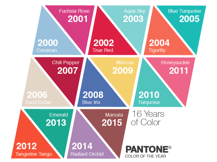
And if you look at the pattern of predictions below, turquoise was the colour of the year in 2003. No surprise there.
And you can see that turquoise had two more years in the spotlight after that for a total of three years (below).
My favourite yellow was announced for 2009 but it was only on paper. I searched in vain for home decor in ‘Mimosa’ back then and since, and it’s only ever been on the fringe.
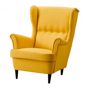
Then approximately 2 years ago, it arrived in a few key pieces at IKEA. That’s when you know it’s hit the mass market. However, that’s 2014, 7 years after Pantone announced it’s popularity which never happened.
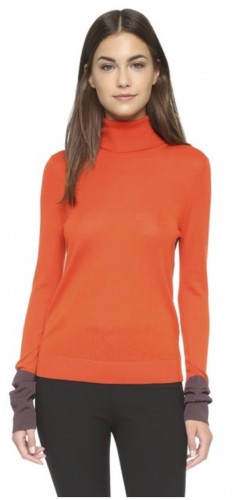
Tangerine Tango was announced in 2012 and orange has been hot ever since then. In fashion as well as home decor. Since I’m always looking for colour because I’m in the colour business, my closet is full of orange because that seems to be the only bright ‘colour’ that’s readily available. I adore yellow but it’s rarely found in fashion.
Then Emerald (below) arrived as the colour of the year and I noticed it for a short time in fashion but it was not embraced as a home decor colour.
Radiant Orchid? Well that Spring it was all over High Point. Designers loved it and included it in the showrooms but pale purple? Purple has always on the fringe of interior design for the 15 years I’ve been in the business.
Radiant Orchid (source)
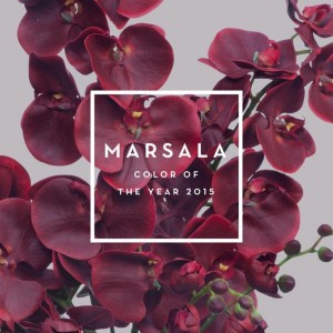
Marsala which was the colour of 2015?
Fashion, yes. Home decor, NO.
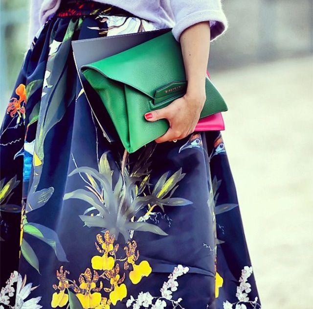
I’m still eradicating burgundy from dining rooms in the 80’s, it’s way too soon for that colour to come back in anything but flowers and fashion (below).
Maybe Pantone’s colour of the year is more about what it means and less that it should show up everywhere. Tweet that
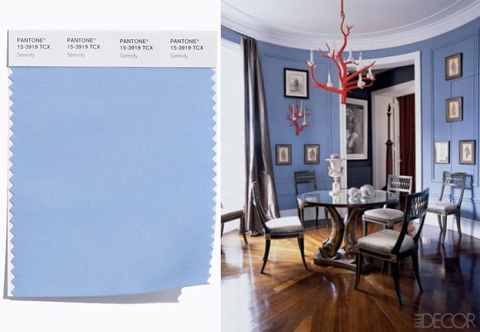
I would have predicted a brighter blue this year because we’re in love with stronger, brighter blues which are replacing the muted wedgwood and turquoise blues that we’ve been specifying for many years now.
And I talked about pink being a trend colour for 2016 in April this past Spring when I was in High Point.
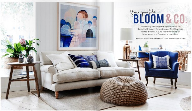
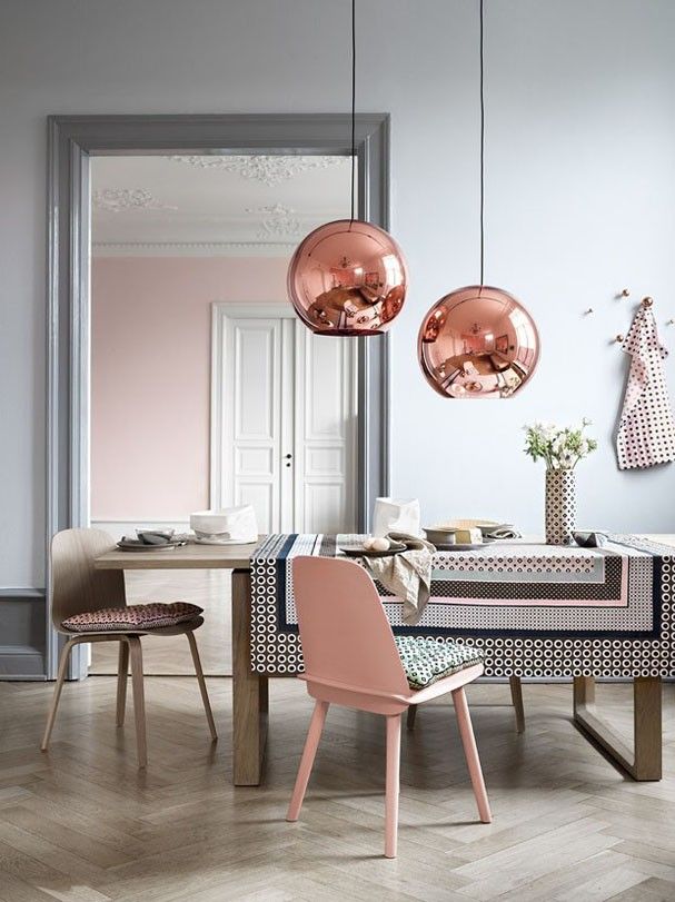
Here it is with indigo blues, and copper accents. Perfect with pink, and it warms up green greys beautifully.
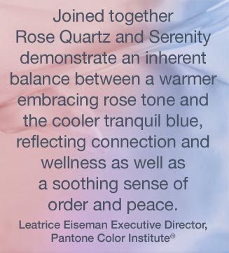
Few will decorate with baby blue and pink in the same room unless it’s for a nursery however, perhaps what we should all be talking about is the order and peacefulness that comes with blue combined with the connection and unconditional love that pink brings to a space.
My Mom came back from Finland and she said the tragedy in Paris was all everyone was talking about and it was overwhelmingly sad. I think we could all use a little more peace and love in 2016.
Over to you my lovelies, what’s your take on the colours of the year?
Related posts:
My Take on Pantone’s 2015 colour of the year: Marsala
My Take on Pantone’s 2014 Colour of the Year: Radiant Orchid



Blah, just blah. Too 80s, although that blue would do if it were a bit more periwinkle. I adored radiant orchid by the way and was horrified by marsala.
Agreed – these two together says 1986 to me. I love the pink by itself, but it is a very specific color – it’s not something that can be used everywhere like indigo. I have BM Queen Anne Pink in my bedroom, but I would never use it anywhere else, unless I had a pied-a-terre in Paris!
The blue is not my favorite – however, maybe it’s just seeing it against the pink. Context is everything!
In one short and succinct word: Barf..:-)
Ditto 😉
Ditto to Barf!
What Dolores said, or did.
I am not going to baby pink and blue anything. Even my clothes.
Haha Dolores! Well said
My thoughts exactly.
I love them. I’m always drawn to those combined colors in artwork, especially photography. They remind me of the soft, romantic, early-morning when the sun turns the fog a beautiful pink and blue.
I’m currently renovating our new house, and those two colors are in the color plan… They aren’t big players in the plan, but they are there in touches in just about every room.
Me too. I am always drawn to them as accent pieces against a neutral palette of black, white, grey and/or navy. They are also pretty much the only colours I wear outside of black, white, grey, navy and tan.
I like the colors but it reminds me of the mauve and blue combination in the 80’s – still in my Mom’s living room! LOL.
Exactly that! They also remind me of the colors often used on holy cards.
Maria, after this email arrived from you this morning, I later received an email via my son’s high school, from Jostens (for yearbook orders), and they are including a ‘bonus’ calendar with Pantone’s colors of the year. Other than your blog, I’ve rarely noticed anyone else mention Pantone. You’re definitely keeping us up-to-speed! Although I am really not a fan of this year’s colors at all – they do look faded and dated to me.
I used those colors in a previous house over 20 years ago.
I won’t be repeating them.
PInk and Blue? Really? Not in any of my client’s homes. We’ve been there and done that. I read somewhere that the lady who actually picks the colors said on NPR radio that the inspiration came from some dead flowers in her garden. The inspiration certainly didn’t come from what real clients are really asking for or colors they are choosing.
Maria, FYI, Anthropologie had several beautiful sweaters in a bright yellow this year. They went like hot cakes!
menopausal colors like mauve
I am not excited but I realized that as I’ve gotten older the Been There Done that Syndrome has taken over !
But for someone it will be new and exciting and perfect for themselves and their home…
I thought Pantone gotta be kidding ?
The pink and blue are too much like the mauve/blue from the late 80’s…so consumers of my era/age group will undoubtedly say “NO! Never again!” Funny how that works!
1980’s – enough said!
I love as accents, as in the Sofa pic. That pale pink can be nice in a bathroom if it is more on the side of white, and maybe fun for a closet, but not for any other walls.
Not sure why but these colors brought to mind the film frozen ! Maybe it’s because they seem child like and unsophisticated if that’s even possible with color. There is no way that’s happening in my house. It’s going to be interesting to see how designers use these together without looking blah 😉
I always wondered why the color of the year should be a color? why not a neutral? for example, White is really taking off with patterns and textures, even decorations. And since the world is overwhelmed with terror and threats this year, why not have White, the color of peace as Color of the year.
Benjamin Moore’s Color of the Year for 2016 is Simply White.
Well, the dining room shown is gorgeous with the accents of coral red, but it doesn’t look like the swatch. Color really does intensify when it bounces off itself. I definitely can see that color in my large, bright guest room, with its off-white carpet and light camel, coral and black furniture and accents. Of course, I’ll add things in blue to relate to the walls! Pink is something quite deceptive, and the ‘quartz’ aspect of the name leads me to believe it is more than just baby pink. Think of rose quartz jewelry set in gold with camelhair or gray. And think of Morganite jewelry, now gaining popularity, which is basically a peachy pink. The entire main living area in our old house was painted what I would have called rose quartz in 1989, and people entered that house and instantly feel comfortable. It is a warm but not cloying color, and ours definitely changed with the light. Rooms looked larger and brighter. It is fabulous with almost all wood tones. I am not a ‘gray’ person, but can see where Pantone is helping those who are with these new color choices. And, with all the talk of aging populations and low birth rates, maybe the company felt a need to subliminally ‘encourage and remind’? – crazier things have happened in the world!!
Maria, Pink and blue? I think not! Why is there a color of the year anyway? I can see being over all the drab Tuscan colors and I love all the newer bright colors. It was like coming out of the dark ages into the sunshine of a new day. Oh well go figure!
Maria,
When I look at the rose quartz, all I see is the pink beige I have been struggling to do away with in my home. It may be a cleaner shade, but, no thank you to that color of the year, Pantone.
I vote they should elect you and your design to select the color of the year.
Best wishes,
Nancy
Agree with Nancy. If I go in one more building or home with pink beige and a muted turquoise (1980’s) I too will barf! These 2 chosen colours are too close to that palette, and I can only imagine what’s going to happen, and it isn’t good!
Agree the colors are too close to the pink and blue I inherited in my 90’s home. But I love your post about the meaning! Of course I would…being a therapist! I’ve always been interested in the psychology of color.
I would hope that you as a therapist also know that before the 1940’s blue was for girls and pink was for boys. Hmmmm…..
Anyone remember the British TV comedy, “As Time Goes By”? (Dame Dench!) The entryway was pink, and I always thought it was lovely.
Not so sure about the blue, however. I eradicated it from a condo I moved into in the early 90’s…
We had these colors in our home in the 80’s. It made sense because our oldest son had just been born, and we used a majority of the blue with some very light pink accents. Now those colors scream baby shower pink and blue. Don’t think we need to recreate this in our environment again! Next year I’ll bet the color goes bonkers in a different direction–probably fire engine red. Whatever.
When I was eight years old, in 1962(!), we moved into a new house. The wallpaper in my bedroom and bathroom had these colors together! Really not into them! Seem old-fashioned, and not in a good way.
I’m always interested to see the new Pantone colors of the year, but I agree, I’m not sure how ‘predictive’ they are. The reality is, most people have a very narrow window of color that is tolerable to them. No matter what Pantone or any other color expert says, most homeowners are afraid of strong color or of anything they consider “child-like.” Which is a shame really, because they are limiting their world. Personally, I think almost any color can be attractive if it’s done right. Depends so much on how it’s used, what furnishings are chosen, and what other colors it’s paired with. That said, I don’t see dull, sad hues like Marsala making a comeback for many years.
The “color of the year” is irrelevant to most people. I’ve found that after so many years of mahogany wood, bronze, and muted olives people want clearer colors and I was excited to see navy hit the trend. But I’m still waiting for navy to hit the mainstream stores–they are still pumping out the turquoise. Most regular folk will be guided by what they see at Pottery Barn and Pier 1.
Susijo, I hadn’t thought about holy cards (I’ve got them in my Catholic background) but you’re so right. I always found them bland and uninspiring.
Pascale, check out Benjamin Moore paints – their color of the year for 2016 is Simply White and they take it a lot of different directions. I like your rationale.
Ug. I hate it! I get it, but it’s just bad. Let’s go with Simply White and Alabaster and stop there for 2016. No need to get carried away!
The B Moore color of the year is refreshing. I can make that into whatever I want. The Pantone colors of the year remind me of my great aunt, the hypochondriac that outlived her 7 siblings finally dying at the ripe old age of 99 years. Every year she would announce her impending demise…for like 20 years in a row. Like, these colors are never going to leave us. Ever.
My fixer upper has this blue shade in the LR, last painted 20+ years ago. It is not relaxing nor refreshing. Pantone has two strikes for two years running for me. I was hoping for a bright yellow green, or a yellow with a blush of red to push it just up to the yellow-orange line. Something with a little zing, something that says “Hey, you know you want to buy me…aren’t I gorgeous?”.
Instead Pantone gave us matching baby rattles. I will save more money in 2016. Thanks Pantone. I second the vote for Maria on the Pantone committee.
Chant with me..”MARIA ON PANTONES COMMITTEE”!! lol. You’re desperately needed there! NO for me on the pink and blue. Although I appreciate the new twist they’re giving it, I will not be incorporating it into my home–ever lol. (Ok–except for a baby rattle, maybeeee). After your HighPoint post last year, I remember seeing pale pink luggage in Home Goods. Very interesting indeed!
I echo the BARF on the colors of the year! Maria could definitely help Pantone with their color selections. How do we get her nominated to do this?
I do love the pink with the copper accents which I never thought about. It would be so sweet in a nursery. But, my nursery days are way behind me!
I still enjoy turquoise because it is a bright and happy color. It too is a color from the past. My mother-in-law had turquoise and gold in her 1960’s dining room and it was stunning.
Maria, I need to sit in the room (last picture) with the navy table accents, pink chair and room nearby. About a month ago I bought a “squall” jacket from Lands End: pale pink with navy accents. : )
i kept almost buying black, which I do love, but thought the pink with navy would feel calmer and fresher during gloomy weather.
Tnat Squall jacket is cute in pink/navy. And Maria,did you notice they have a yellow one too?
http://www.landsend.com/products/womens-hooded-squall-jacket/id_288463?sku_0=::AJW
Thanks for the info. Out of curiosity, what’s the purpose behind choosing a colour of the year as it relates to Pantone? I understand that having one color helps with ‘pushing’ a color but it is world-wide or US only? Where do they expect to see it first, in paint for cars, homes, commercial interiors, clothing, what sorts of products, etc.? It would seem, from an economic perspective, to choose colors that would over the years complement one another. Bold colors were fashionable in Europe (nail polishes, clothing, even hair color) long before they arrived in US. This past year, my 3 european exchange students were all wearing & craving all white sneakers, pants, t-shirts, hand bags, interior designs in magazines. Wondering if this will get here too in about 2 years. Thank you so much in advance for any insight.
Publicity!!! I honestly think it’s just a gimmick to get regular people talking about color – very successful!
Sorry, just read the comments and see that BM Simply White is their pick for 2016. Maybe they’re ahead of Pantone or take their cues from overseas. Personally, liking BM’s choice over Pantone’s!
Thank you Maria for a thoughtful & balanced take on the Pantone’s 2016 Colors of the Year. Great comment– “…what we should all be talking about is the order and peacefulness that comes with blue combined with the connection and unconditional love that pink brings to a space.” Again, much appreciated!
I hardly see myself using these two colors-even though I do like Rose Quartz. But they do remind me of late spring evenings, blooming lilac, things like that..))
I don’t have any bad associations with these colors in home decor-even though I was a little girl and then a teen precisely in eighties, maybe because I grew up in a totally different place..where we didn’t have dedicated nurseries))
I agree some colors just look better in fashion-small amount, very sharp, maybe furry or shiny..like Marsala. I never knew this color was called Marsala, I just wore it/version of it for many years)) But no, I didn’t want it in my decor.
On the other hand I got seriously hooked on Emerald. I didn’t know it was color of the year when it was..I just started seeing it more and more, and loving it more and more. Then at some point I realized it was a color of the year))
Yeuch yeuch and yeuch! Sure either of these colors alone might work in certain instances. But what really really really turns me off is this statement from Pantone’s own website:
” This more unilateral approach to color is coinciding with societal movements toward gender equality and fluidity…”
There is still a very large segment of society that doesn’t hold much weight with “gender fluidity”.
Gender fluidity?!!??! There IS no such thing! You are either male or female. Colors don’t matter to someone who’s secure in their own sexuality. Can’t figure it out? Check below the waistband honey!
Did I make myself clear on this point? Good.
Google is our friend. : )
Edwad, you sound like you aren’t very secure in your sexuality!
These are the exact colors of the tiles in the 1950s bathroom we will be renovating next year. Maybe Pantone should sponsor my reno – except that I’m ripping out their color combo.
For a blue a little on the periwinkle side, I prefer Serenata AF-535 by Benjamin Moore, which I may paint the room that was my boys’ when they lived at home, (or I may paint it dark blue.)
I also think Simply White feels right. Even though it is a bit too white for my home, except for ceilings, it feels like it fits the zeitgeist which is getting more and more white, more Belgian, more Patina Farm, etc.
I like to have a pink room in my house but haven’t since my daughter was small. (It since went predictably lavender, then dark turquoise. It will be last years’ colour, Guilford Green, when she moves out.)
I’m a little late to this convo, but from a hairstylists perspective, I think it’s genius. These colors have been super popular in hair fashion, and the ombre’/melts in hair color gave my industry a whole new twist. Not to mention I love the combo of warm AND cool. I don’t think you have to pair them, rather I thought of it as a one or the other option as well, to give everyone a chance to use and love them. Although I did have to look at the possibilities with fresh eyes, and really ignore the whole “nursery colors” vibe. Let’s just say it’s grown on me 🙂