The images are flying in with questions and I’m so excited about this Saturday’s FREE Webinar happening at 4:00 PM PDT.
Please continue sending in your questions because even if they don’t make the webinar, I’ll have lots of photos I can use for ongoing Ask Maria blog posts!
UPDATE: YOU CAN WATCH THE REPLAY HERE

Here’s sense of what you’ll learn:
The first question is from a lovely reader in Ireland.
Before I go on, can I just say how much your emails have cheered me up! So much love and so many great photos! Hooray, thanks so much!
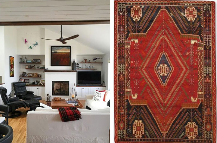
“Good luck at your webinar, I’m in Ireland so I think I might have to get out of bed for it ☘I have just painted our hallway Manchester Tan and the woodwork simply white.(There is only one BM supplier in all of Ireland and he posts me the paint here)I like the colour, but the hallway is now a bit dark, (please excuse the photos, I have not fully put everything back up and the dolls on the stairs are not mine I swear)I fell in love with a navy blue carpet a few months ago and am now wondering would this now work with the new paint.Be honest I can take it (even though I LOVE the carpet)walk softly because you are walking on dreamsWarmest regards to you all from Colette in Ireland.”
So first, Colette, I love what you’re doing here. It’s such a great idea to introduce colour into your entry with a fabulous accent rug like this! And while replacing the red and purple rug with the navy and white one would mean you could keep your paint colour, you could also re-paint so that your existing runner would look right as rain.
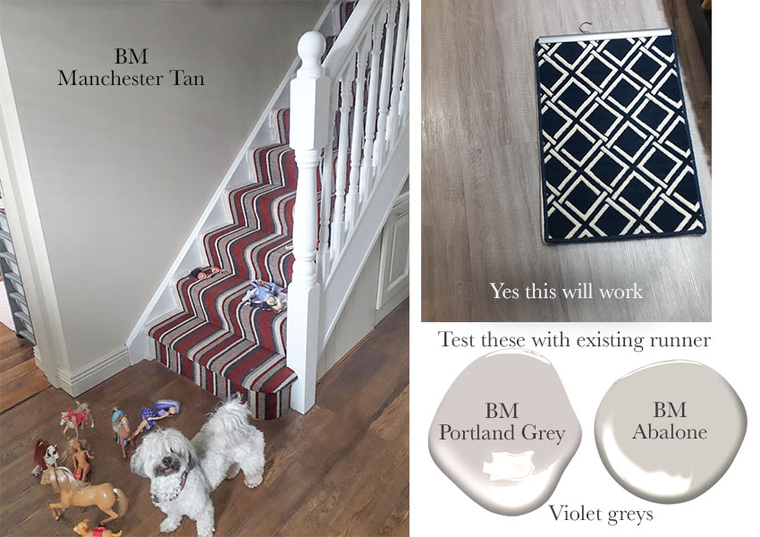
I would test both of these violet greys from my system.
By the way these can be found in the large colour samples that are RARELY on sale here.
I know it sounds like an obvious plug and Colette you don’t need them, but for anyone else in the business of choosing paint colours, it is kind of miraculous that what might seem like a random purple in a striped rug can actually be found in my large curated paint samples. Just sayin.
Okay where was I.
If you keep the existing rug, here’s an idea of what your decorating could look like:
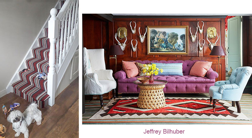
It’s a room done by one of my favourite colourful decorators. You can see that the purples are not the same, but you get the idea. And frankly, since purple is the trickiest colour to decorate with (because unless you NAIL IT exactly, it can look off) when the room is this colourful, we forgive the mis-match.
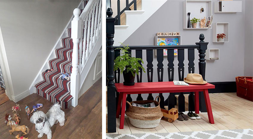
Image via Dulux
Hey, here’s a fun idea, paint the banisters black and along with the purple walls you could install a bench in the hallway and paint it red!
If you install the new navy and white runner, the same principles apply.
Creating flow is easier than you think! But when you choose a statement rug like the one you have, you simply have to be prepared to continue those colours in the adjoining area!
Here’s a question from Carol Ann and Stephen:
“What a sweetheart you are. Thank you for recognizing that while we’re all doing our part and self-isolating, we’re itching to make changes in our homes.
You have been a godsend in my life, and with the guidance in your books, the reason why our recently-renovated open concept living, dining, kitchen is painted Simply White when I’ve always been a dark and bold colour person.
We are a waterfront home and although everything says inspiration should have come from the blues and greens outside, I also love red and took inspiration from our antique red cabinet in the dining room. Overkill?
The space is calm and wonderful but the fireplace wall gives me heart palpitations. Everything is out of balance to start with. We are obligated to maintain 18” of clearance from the top of the firebox to the bottom of mantle so that space is too massive. The mantle itself is live edge black walnut but too puny. We have never seen a tile that we thought wouldn’t look too busy with grout lines competing with the interior of the firebox but couldn’t decide on what interior firebox backdrop would look better. We thought about painting the walls behind the shelves on either side of the fireplace too.
We have a small Persian rug in front of the fireplace that the dog appreciates. I would love to hold out for the perfect big Persian rug for the living room and take inspiration from that for colour, coffee table, throws and pillows, but that expense may never be my reality. Wayfair perhaps?
Help. We need you Maria, to tell us what to do with this fireplace wall.”
Carol Ann, Your fireplace wall doesn’t bother me at all, in fact because it’s so modern, I would leave it. Also, I like the asymmetrical arrangement of your bookshelves, I think a colour would hide that and I prefer the warmth of your walnut shelves against the white walls.
The bigger issue is definitely that you need an area rug.
Accent colours should be distributed in small, medium and large gradations in order to not look ‘bitty’ if you know what I mean.
Your decorating is lovely. Warm and welcoming with just enough black but not too much. I would add some coffee table books to your bookshelves to act as pedestals to some of your decorative objects as well.
One of my favourite sources for rugs these days is Lulu & Georgia. While a lot of stores are still trying to sell rugs that went out in the 80s, on their site, you don’t have to wade through piles of ugly to get to the pretty.
Here’s a one-of-a-kind rug that you need to snap up right away if its the right size!
Great questions and I have so many more good ones that I’m currently working on to make Saturdays webinar fun and very informative! I’ll have some kitchens and bathrooms in there too!
My ebooks are currently 50% off until Sunday, March 29, 2020 here.

My large painted colour boards are up to 20% off (more than they’ve ever been discounted) here.
And my Masterclass on Exterior Colour selection is $200 off.
I will be adding a deck and fence module on April 17.
And you will have lifetime access to all updates in the future!

And all of my products come with a 100% Happiness Money Back Guarantee, so it’s risk free for you!
This Cabin Fever Sale ends at midnight, Sunday, March 29, 2020.
Don’t forget to send me your Ask me Anything questions to [email protected]. I won’t get to them all but I will have lots of material for future Ask Maria blog posts!


I just purchased the hybrid collection on sale today. I’m thinking I should have held out for the most comprehensive collection once the Benjamin Moore boards are back in stock. Did I make a mistake?
What will I need to purchase to have the full set?
Hi Julie, email [email protected] and we will help you with that! Maria
Fun post Maria. I was wondering if you could record the Saturday webinar and then post later so that your followers around the world (are we a color cult?!) can watch at a more convenient time? Many thanks and stay healthy.
I second having it recorded! I’ll only be able to watch after my toddler goes to bed!
For the first pick, don’t paint banister black bc it’s so hard to paint, will chip, and will show all the dirt.
I love Manchester tan and warm colors are in. It IS a classic color. I’d get a neutral runner (look at StudioMcGee the runner options she had for her stairs) and then add the color you like as decorative stuff on the wall, pillows, throw rug at bottom of stairs by entrance, etc. do pop of color that way, but not permanent things.
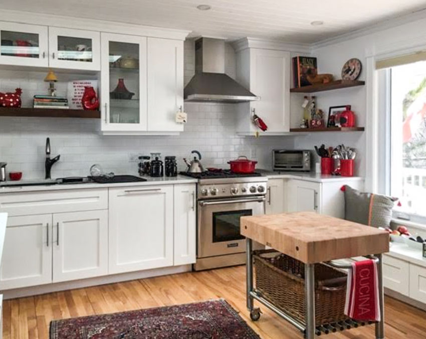
Is the white kitchen an illustration of how jumpy too many accents of the same color and size look?
Maria, I’d like to send you a question along with a photo. I remember you gave some advice as to how to take the photo with a white sheet of paper, without camera flash, etc. Can you tell me where I’d find that information again? I actually saved that particular blog but now can’t locate it! Yikes! Thanks Maria. I love, love seeing your posts come up in my inbox…..always creates a flutter of excitement as to what I’ll learn…not to mention the eye candy of colour!
Charlotte
Hi Charlotte, just without flash and in good natural light (no lights on as well) and if you have tile or something murky where it’s hard to see which white it is, then a white piece of paper is helpful. Maria
Hello MK Team,
I would love to submit some phot’s for tomorrow’s webinar. Would you kindly help me to send in pictures? Thank you so much, Loretta Barbetti
Hi Loretta,
Just attach them to an email, however my free class is full right now, but you never know, I might be able to use them in an upcoming Ask Maria post, I have lots of images for them now! Thanks, Maria
Maria, I was wondering, if I have a paint color and am trying to match a wallpaper to it, if the two match in the bright daylight is it safe to assume the two will match in a dimmer room?
It depends on how many colours the wallpaper has. If it’s textured, it could be like carpet where it changes in the light. However normally people will forgive the way colours look at night as long as they look good during the day. Hope that helps, Maria
How do I access your webinar tomorrow??? Thank you and stay well!
It’s in the post and here it is again: https://mariakillam.com/ama/
See you then,
Maria
I tried to post a comment yesterday but when it said submit a message came up that I had to include my email address. I wonder if anyone else had a problem?
I liked the response that you gave to Collette however I’m not always a fan of Jeffrey Bihuber. I do like his use of color but find his designs a little chaotic. I love her cute dog though!
I am looking forward to your webinar.
Hi, Maria…Loved the webinar! There’s always new things to learn! It was so helpful, with the photos, and what you would do. And great to see and hear you again! Love you, Candy 🙂
Hello Maria … thank you for your kind (and VERY timely) offer of advice. I have just had the popcorn ceilings removed from all the lower level rooms in the two story home we are preparing to market very soon. The flat ceilings look lovely and are all painted in BM White Dove. My question is whether it is advisable to paint all the walls as well in White Dove , perhaps in a different sheen for the kitchen family room and powder room … or to vary the wall color slightly in the entrance hallway (which goes all the way upstairs to the upper hallway), and also use Pale Oak the main floor office (which has french doors) and the powder room e.g….
I was thinking perhaps the BM Pale Oak may provide subtle contrast and be a good choice for the hallway and main floor office, and powder room, with the rest of the rooms in BM Whiite Dove, but I am uncertain if varying the shades of white is advisable, or if it more advisable to only vary the sheen, keeping every room White Dove. I am also wondering what recommendation you would make for the trim throughout.
I was advised that painting the house in all white is the best marketing approach, even though the rooms are all large with plenty of light from the windows and doors; this is my first time, however, working with all white rooms, so I am so grateful for your thoughts on this advice and the White Dove/Pale Oak colors choices.
The painting should be done within the next very short while so once again I am so appreciative of your timely offer of assistance and am very grateful I found your website…it is wonder-full :)!
wishing you and yours all the very best, sincerely, Beverly…
Hi Beverly, without photos it’s hard to give accurate advice, but White Dove will work with Pale Oak, hope that helps! Maria
Hi Maria,
I love the violet grey colors in you scheme in this post!! And I was enchanted by today’s webinar, where I could relate to each and every thing discussed .. 🤩♥️ Really, yellow seems to look different on the screen and in life, as I can’t imaging myself painting my room with the yellows shown on the photos .. 😕Now the visit to Ritz Hotel is on my bucket list ..👌I just need to buy Mac and I am ready to travel and make beautiful photos.. 🚘🛣 Thank you, Maria for your thoughtful ideas and straightening my thoughts through this webinar !! Looking forward to more of this!! Wishing you and your team a good health ..🎨💐🏠💞
Hi Maria,
I was dying to attend your webinar, but I wasn’t able to get in. My screen posted a host error. Did anyone else have trouble attending?? I bet it was awesome:))
Emmy Lou
YES, it crashed in the beginning but we got back up you can watch it again here: https://mariakillam.com/ama/
I watched the webinar and really appreciate the work put input by your entire team.
On the two brick exterior questions, I agree that the cream or white painted brick and trim looked great. But I also thought how frustrated I would be with those answers if I had a budget to cover trim but not a whole house or a husband who would adamantly Beto painting the brick. Painting it all white is BEST answer but what is the second-best but probably more realistic option?
Hi Adele,
Both of the options were there before I showed all the brick being painted. Right now, those are the freshest looks that people want. The first house everything was cream with the new columns and the second house the bad dentils and gables were a green beige! Watch it again and you’ll see 🙂 Maria