


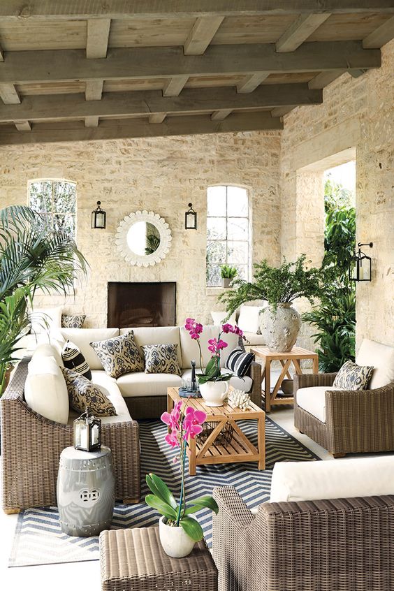
Cream stone and cream cushions, lovely | source
If you are not a colour expert or not even close, chances are, when you’re considering which colour is right for your interior, whether it’s flooring, carpets, furniture or paint, you might find yourself asking the question, do I go dark or light? Instead of the question you should be asking which is:
Does this ______ relate to this room? Does this ______ pull this room together?
Yes you should alternate contrast. So if your patio is charcoal, then you would not choose a charcoal rug, and so on, but that should only be one piece of your decision making process when decorating.
Allison called me the other day and said she’d just bought patio furniture and wanted to know if she should go darker or lighter for an area rug.
Allison is the gal I call when I need a facial. She has a lovely room in her house in Abbotsford, so her rates are much more reasonable than a spa. She gives such an amazing facial, that whenever I am somewhere else, like at a resort having one, I regret it almost as soon as I’m on the table when I start feeling the urge to just leap off the table and walk out, because it’s not Allison.
So now, I pretty much only go to her house when I want a facial. When I am having a treatment (except for a therapeutic massage) I want to feel transported somewhere because it’s so amazing. That’s what it’s like to be treated by Allison. You can email her here to set up an appointment.
Anyway, I asked her to send me a picture so that I could be more specific with my advice.
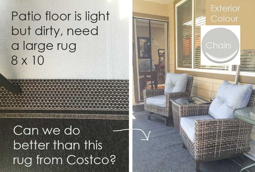
If your patio furniture is in an existing room like this one, note the colours and make sure they relate.
Allison’s chairs work with her house and trim.
Match the existing colours in the room to a paint fan deck. This way when you shop on-line or in-person you’ll know exactly which colours you are looking for.
Here her siding is a goldy orange shade and her cushions are a blue grey.
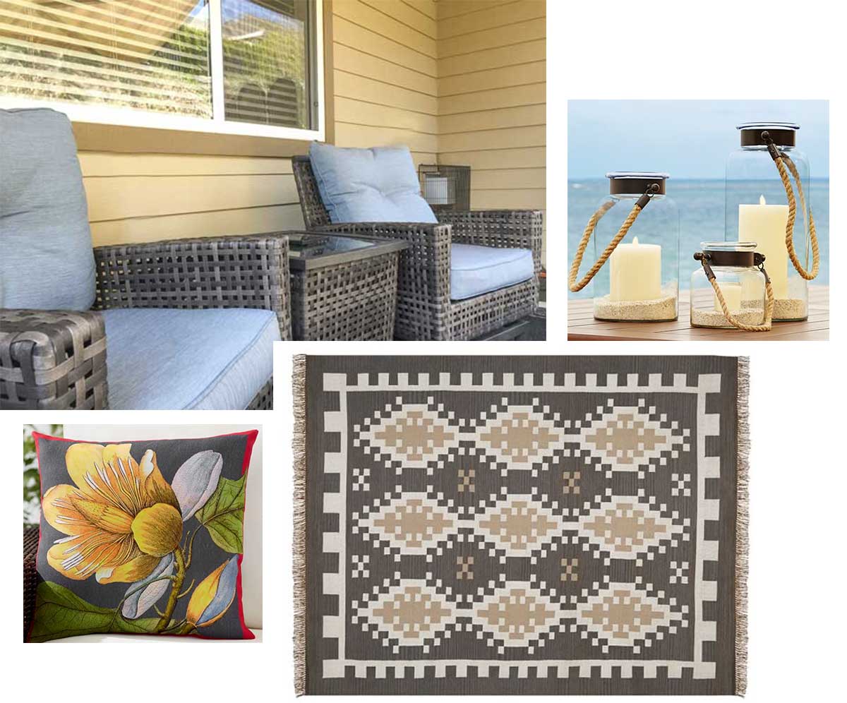
Rug | Pillow | Hurricane Lanterns
Because her exterior colour is gold which is from the Tuscan Brown trend, I chose a rug that picked up on the colour and a pillow that relates to the blue grey which is the only element that references the grey trend in this vignette. You could argue that the carpet is slightly more pink beige than the house but it’s as close as I could get given we are working with the brown trend and the grey trend here ; ) ; )
It simply looks more intentional to have your colours relate to what is happening in the space they are located in.
Notice in this picture (above) the cushions are yellow beige which relate to the gold/yellow beige stone and the cushions and carpet are blue. Simple, clean. Easy to live with.
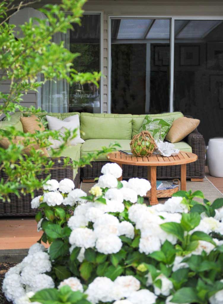
I chose green, white and natural (which looks orange beige) because my garden is all white and I didn’t want my patio furniture to visually stick out, I wanted it to blend in with the garden. See how the natural pillow relates to the patio colour?
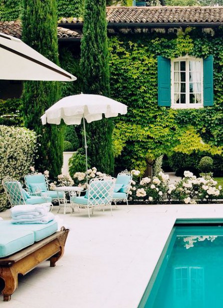
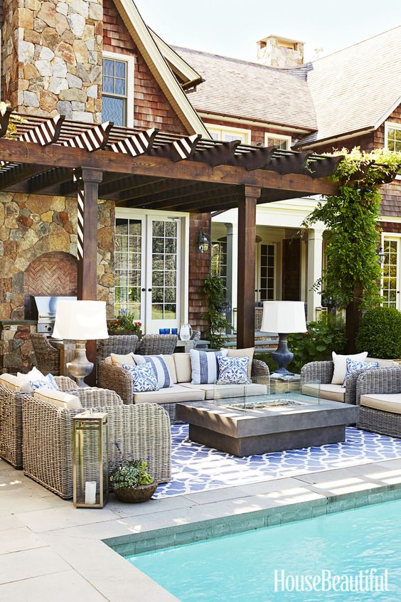
I love the way this outdoor furniture relates to the turquoise pool!
So instead of asking ‘Should I go lighter or darker?’ look at the interior or exterior, count the colours, match the colours to paint chips and find items that relate.
And then your patio will fill you with happiness when you walk outside with a glass of wine after a hard day.
Just like it should.
Have a wonderful weekend everyone! I’ve been too busy to blog lately and it’s stressing me out!
I’m flying to Charlotte on Sunday to lead my Specify Colour with Confidence™ event to a sold out group and I’m so excited to meet everyone! Then I’ll be at High Point market after that, who will be there? Let’s meet up!
Linda Erlam wrote a post about her experience in Vancouver’s course this year here.
If you would like to transform the way you see colour, become a True Colour Expert.
If you would like help creating a beautiful and classic exterior, we have exterior consultation packages available here.

This was a very informative article with great examples of real life peoples places and how to
relate colors to the room. Even with an unusual color scheme of the tuscan era and grey. Thanks!!!!
Hope you enjoy all the traveling you,ve been doing
for training and don,t get too tired!!!!
Thankyou for a great a great lesson on color
Carol
Maria thank you for a great Blog
You make decorating fun!
Have a awesome week – end .
Another reason your choice of rug goes so well is the pattern — it vaguely repeats the wicker pattern of the chairs. Looks great!
After all these years, still learning (and reinforcing) with every blog post!
You are the best, Maria!
Well said, Maria!…”It simply looks more intentional to have your colours relate to what is happening in the space they are located in. I would add that in the case of a patio that is connected to the home’s interior by floor-to-ceiling windows like patio doors and sliders, you should also consider if the colors are harmonious with your room because visually it is an extension of it. I learned this tip from an awning salesperson!
I can’t believe you can still teach this old dog some new tricks after all these years of reading your blog. I don’t have any patio furniture but if I did…I would try to make you proud.
Maria, Every post that you write is so informative with visual examples and explanations. I love reading all of your posts! Even a veteran designer gets new inspiration from you. Thank you so much for all that you do!
Enjoy your new class and your time at market.
Great post! Have a great time in Charlotte and at High Point!
ooooooh how I love the final picture!! Our pool is similar, I call it MAUI BLUE 🙂
Being busy and not having time for the things you enjoy can be very stressful. I am at this phase of the year right now too. Try to enjoy the cities you are teaching in!!
Darlene
http://www.BundleMeBaby.etsy.com
What a great post! Now I feel summer-ready!
I just recently found you, and I am so grateful that you are willing to share so much of your decorating smarts! I’d been debating kitchen back splash materials for YEARS… and 30 minutes into reading your blog I knew exactly what I wanted. We installed our (surprise!) white subway tile Saturday and I need to grout it this afternoon. : ) I LOVE your totally simple, no regrets approach to decorating! Thank you SO much!