One of my favourite ways to help my clients create a space that fills them with happiness when they walk in their door is the one day shopping service I offer.
If you just need an end table or two, lighting, pillows, possibly a carpet and accessories, you have comfortable shoes and a large vehicle, we can transform many a space together in just one day.
It totally fulfills my need for instant gratification as a decorator and stylist. My first business was called One Day Design so even though I love to create custom interiors from a totally empty space, this is a great service for homeowners who don’t have the budgets for a more customized look.
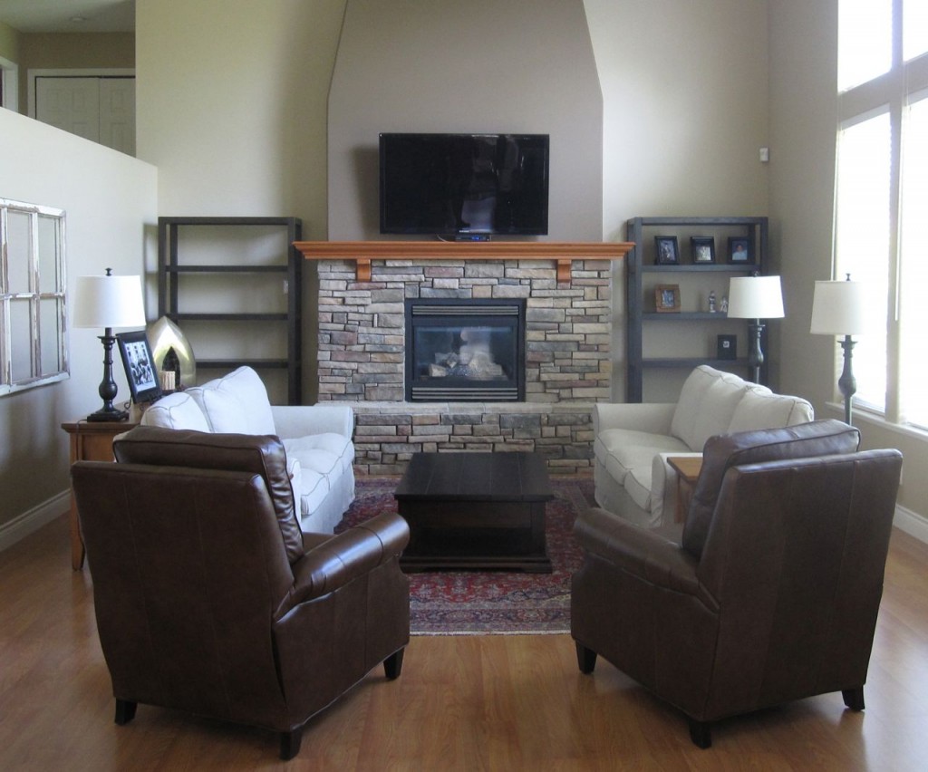
If you need more furniture, like Karen did in her house, we started with an initial consultation for colours and then sat down and chose furniture on-line.
She bought the bookcases (second image below) from West Elm, the sofa’s from IKEA and the coffee table came from the Urban Barn.
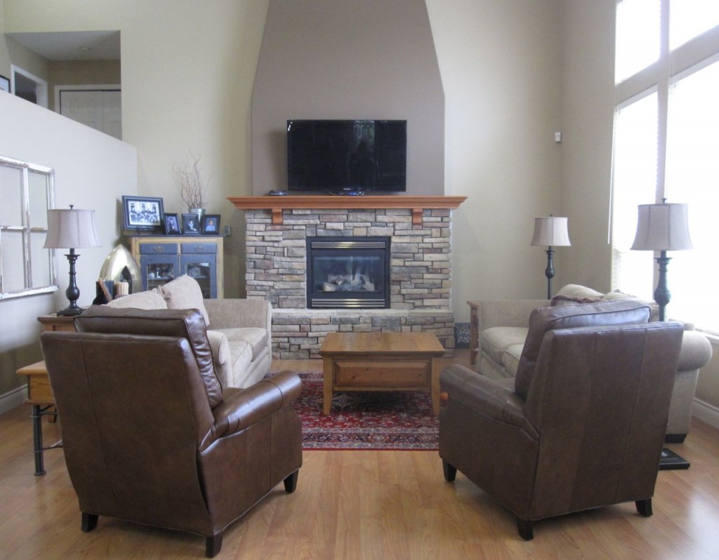
before
And then over the next several weeks, she ordered everything and when it had all arrived, she called me to schedule the shopping day.
Karen and her husband plan to downsize in approximately four years so she didn’t want to spend a lot on furniture only to have to get rid of it in a new smaller home.
They built their house 14 years ago, so in 4 years when they sell, this house will be almost 20 years old. She knows that the finishes are dated and new homeowners will definitely be renovating.
I recommended spending money on making the house look staged now which would create a space her family can enjoy for the next four years and then it will already have a look and a feel which is a huge influence for buyers and of course the reason why staging a home is so powerful in the first place.
During
When I arrived and saw everything installed, I suggested that we paint her mantle espresso because it now looked out of place. Even though the mantle currently relates to her floors, the end tables she still has and her dining room furniture, you don’t notice that because you’re so busy noticing how wrong it looks. Painting it the trim colour would also have caused it to jump out visually.
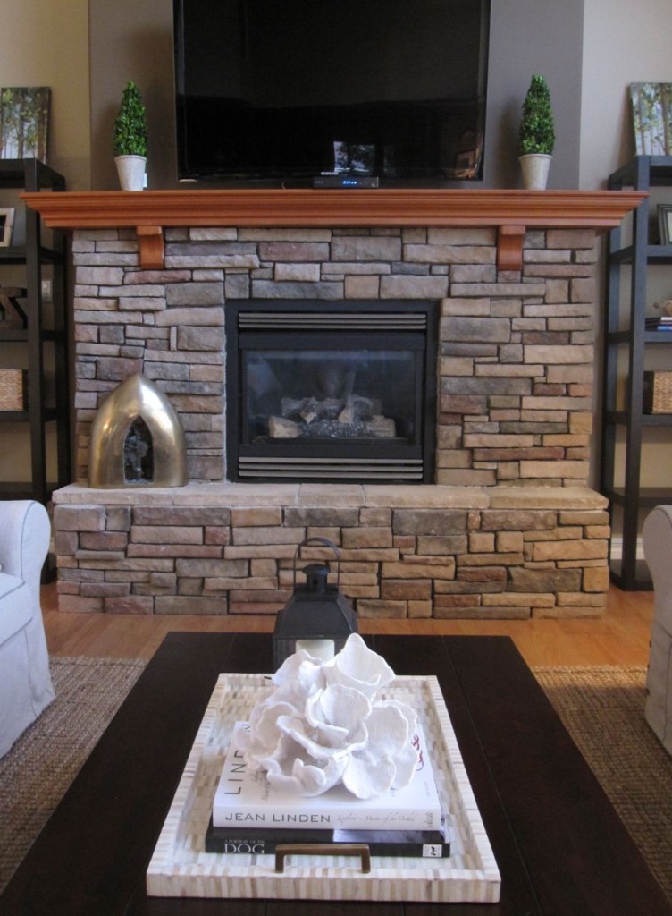
And then, before we got started, the first thing I did was match the colours of her fireplace to colours in my fan deck.
The bossy, earthy fireplace with the butterscotch, sage green, and rusty red tones as well as the lack of white anywhere certainly cancelled the idea of introducing any bright, fresh colours like mandarin orange, raspberry, and yellow, however, I knew that injecting cream would go a long way to creating a feeling of fresh which is what we all want right now in our decorating.
Karen said they bought their existing area rug at an auction when they first moved into the house. The second it went down she knew it was wrong because it did nothing for the fireplace.
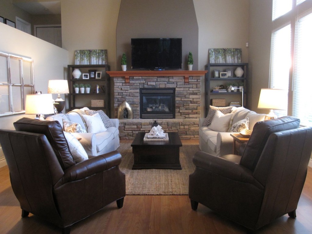
A sisal rug in the butterscotch tones of her fireplace looked right at home as well as updates her living room and immediately brings it into today!
Since actually bringing in bright colours wouldn’t work here, natural green elements always works in any interior.
The art above the bookcases still needs to be hung, I thought it was fun that they were both the same because of the highly symmetrical look we had created and the fact that it’s a forest so it would work. We found them from two different HomeSense stores that day.
I also liked the way it relates to the greenery in pots beside the TV and in the bookcases as well.
I loved this mother-of-pearl tray we found from Chintz & Co. Karen was doubtful about the coral but fell in love with it when I arranged it on her coffee table.
I have found that the best way to buy this many accessories all at once is to shop with my client. Accessories are more personal and it’s way more efficient to have my client right there to say ‘yes or no’.
Obviously the best way to gather accessories is over time and on trips, etc. but not everyone has the eye to be able to create that kind of collected look on their own and frankly, we all have our talents.
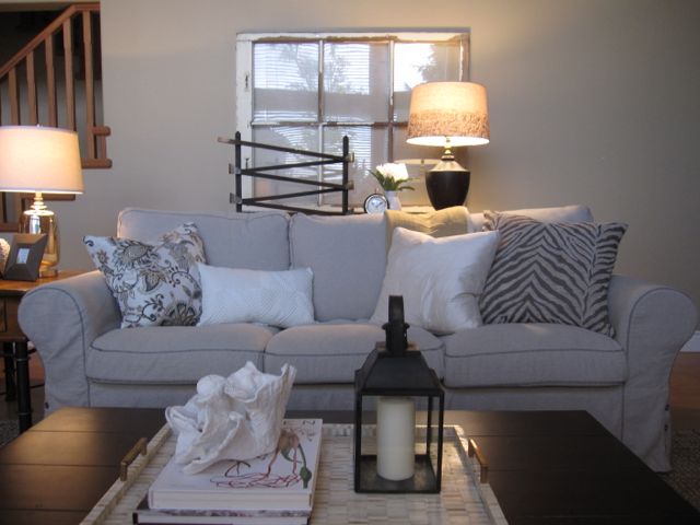
After
We found the marble track on the sofa table from Pottery Barn, she thought her boys would love it! The lamp and silk cream pillow is from Chintz & Co. The remaining cushions from HomeSense.
After
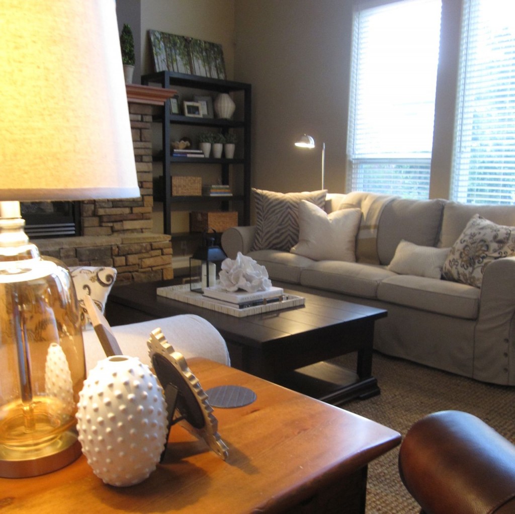
When I first arrived on Friday, we decided that the dated end tables (above) had to go as well but once everything was styled with lamps that coordinated (not matched), we decided to leave them. Especially because they are partially hidden by her two leather recliners.
See the small round lamps on the top of each bookshelf? Since these shelves clearly can’t be lit, we inserted these from IKEA to brighten up the corners) they are not lit for the photo because we forgot to buy light bulbs for them).
After
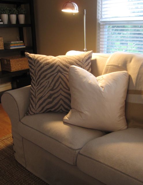
We bought two throws, one for each sofa (can’t have enough of them or pillows I always say).
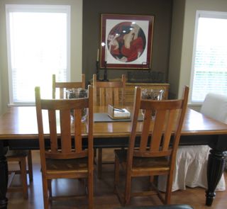
Dining room before
And here’s the dining room. Karen had recently replaced all her light bulbs with CFL bulbs because she felt that her living room was too dark but I assured her it was because she didn’t have enough lamps. Also, she didn’t notice–until I ran around replacing them with regular incandescents ASAP–that they actually cast a sickly green light!
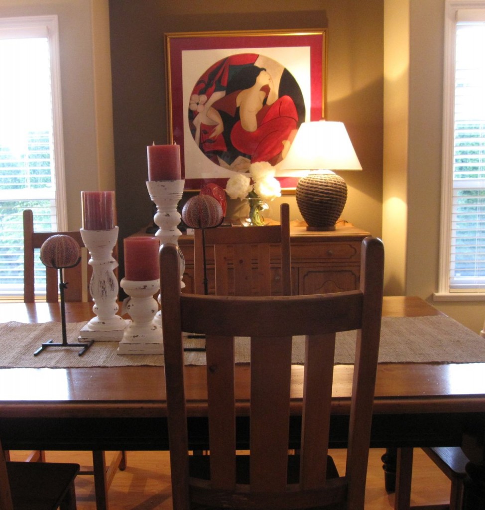
dining room After
Everything on the dining table came from the Pottery Barn, the Ralph Lauren lamp we found at HomeSense as well as the red, porcelain owl. The peonies are fake. Love!
My workroom who sews all my custom drapes and cushions calls me ‘The pillow lady’ because no one seems to specify more pillows than me, haha.
A couple months ago I discovered Etsy for toss pillows. I knew you could buy cushions on-line but what I did not realize is how fast I could find something for a client in an on-line consultation. Since I’ve been choosing toss cushions for my clients for so many years, I can quickly pick out a combination that suddenly make any space feel finished.
Now when I have an on-line client who doesn’t have any colour in their living room or really any pillows, we start there and have had great success. We also shop a lot on my Pinterest boards for the right lighting, end tables, well anything that might be missing from any given interior.

Here is the before again (above).
Paint is next although we debated in the end whether the brown accent on the fireplace wall should stay or go? I thought maybe it works now, it relates to the brown chairs and kind of balances out the space. The new wall colour will be HC-81 Manchester Tan. It can’t be greyer (like HC-173 Edgecomb Grey) or it will go purple as that colour in no way relates to the earthy stone.
My client sent me a lovely note and here’s what she said:
‘Wow, I can’t believe how much I love all my new stuff. The feeling in the room is so different now and I so enjoy spending time in this space. I could never have put all these things together so beautifully and in such a short amount of time. I think many of us look at the pictures in the decorating magazines and focus on the big expensive hard finishes not realizing it’s all the little things that truly make the difference. I’m so glad I put a big chunk of my decorating budget into accessories.
Thanks again for a wonderful experience.’ Karen P.
Over to you my lovelies? What’s your vote? Should the brown wall stay or go?
ps. Happy Mother’s Day to my favourite and best mom in the whole world and to all of you moms who follow my blog! You have a special place in my heart because you know me like me anyway. xoxo
Related posts:
The Enchanting World of Atmosphere
Colour and Condoms
A Case for Decoration
If you would like your house to fill you with happiness when you walk in the door, become a client on-line or in-person.
Download my eBook, How to Choose Paint Colours – It’s All in the Undertones to get my complete step-by-step system on how to get colour to do what you want.
To make sure the undertones in your home are right, get some large samples!
If you would like to learn how to choose colour with confidence, become a True Colour Expert. Space still available this month! Fall dates now open for registration.




Hi. I wish you lived here, I would so take you shopping.
I have an “Ask Maria” question for you. I have Oak in my house and as I shop for furniture….what other color of wood furniture can I buy? What colors of wood to avoid? Lord knows I don’t want more oak.
i would leave the brown accent, removing would make the fireplace stand out too much. but the mantle has to go, paint it cream or dark brown. i’m a fan of symmetry. but this is too much of a good thing. you could change out the tops of the bookcases. the rest of the room looks great, just needs minor tweaking.
Love this!! I love the fireplace wall now. Looks great! I am also in love with the furniture arrangement. Once I save up enough I want to replace our large sectional with 2 full sized sofas as well. Probably from Ikea too as I have 2 small kids and 3 cats. I don’t want them to break my entire budget either.
I love the transformation of the space. Funny, though, the only thing that struck me as off was the contrasting chimney color. My vote is to paint it out.
Would you consider an accent color for the left side wall behind the couch? A darker, warmer color there might add to the intimacy of the seating area.
PS I love the dining room changes
Great work on the one day decorating – it looks really good. You have a good eye for finding decor items quickly.
I kinda like the brown wall for two reasons. The first is that it helps ground the TV. If the wall was painted out a lighter colour then I wonder if the black TV would make the wall look too stark. The ceiling is tall and there would be a lot of empty wall space in the top half of the wall and the fireplace with bookshelves in the bottom half. It almost cuts the wall in half horizontally. The
second reason is that it emphasizes the focal
point and makes more of an impact. It adds some needed height to break up the bookshelves and mantel being almost the same height.
I think it looks great as it is. By the way, would love to know what the two coloirs are.
Mary
height to where
Your comment is exactly what I was thinking, I worried that if that wall was painted out, maybe my client would regret it. I am normally not a fan of accent walls unless they are well placed and probably wouldn’t have suggested it if it wasn’t already there but in the end I thought it worked. Maria
I agree with that too….but what happened to the idea of painting the mantle (cream?). Needs some change there.
What a great job!
Wish I lived closer to go shopping with you1
I am NOT good at accessorizing. Hopefully, I’ll be able to do this vicariously (online) with you someday!
The room looks great, but that brown over the mantle needs to go.
Love the transformation! I think the wall above the fireplace is fine for now. Maybe later if she wants to change the end tables, then a new color might work better. But like someone else mentioned, if that accent wall was a lighter color, the TV would stand out. I like it better when the TV sort of ‘gently disappears’ onto the wall.
I’m wondering, how much did you charge for this? 🙂 One day design is a great idea…I’ve been doing quite a lot of that sort of thing myself because lots of people in my area want a freshened up look but can’t afford to start from scratch.
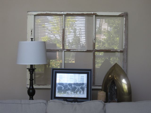
I have never been a fan of a contrast wall. I say paint it all the same color. The room looks great except for the antique window on the far wall. I’m aware that you need to give the client some free reign if this was the case. I have quite a few antiques mixed in with collected and modern pieces in my home and love the look but something just looks wrong with the window there.
Isn’t that a great service to offer? I’ve been doing it for a while too. It’s a nice service to offer after a color consultation. If you use a blue wall color the orange mantel may be ok.
Hi Maria, what about curtains? The windows look very bare. This would soften the space an perhaps provide a little more subtle pattern. You have done a fabulous job. Faux flowers – never! but they look fine in photos and I can’t tell the difference
Yes drapery would be amazing but since they will be moving soon, there are other updates my client will spend that budget on. Maria
hi!
what a difference! both rooms look fantastic! on the before I was thinking that the accent was all wrong but with the addition of the shelves, the art & the tv, it makes much more sense. what is still bugging me is the mantle color. the mantle is the focal point to me right now because it pops off the brick so much but, at least from the photos, it doesn’t look like it is so special that it needs to be highlighted. does that makes sense? I’m probably using all of the wrong terms!
Yes as I mentioned in my post, it’ll be painted out! Maria
I love one-day makeovers, which is probably why I love staging to sell so much! Instant gratification, right? Lovely job, Maria!
paint the fireplace wall it jumps out it is obvious
that it is the focal point the rest really came together for me the layers of texture added more than compensate for the lack of “pops” of color
Once the mantle is painted it will probably look fine. I agree that it is a balancing act with the brown chairs.
Nice job.
The new lighting makes such a huge difference! I would like to see the wall all one color and the mantel piece painted as well to blend in a little more. It’s much cozier now!
Hey Maria
I don’t mind the accent wall but I would paint out the wood mantle. You mentioned painting it an espresso but did you decide against it because you said it related to the floors? I think maybe a creamy colour or the same as the other walls. The wood doesn’t seem to go. Other than that, it all looks fab! Nice job. Claire
No that’s what I recommended, what I explained was that white would not work. Maria
Looks great! Glad that you changed the coffee table. Other one looked lost. Green have liven up the space.
The room looks SO much better after your special touch. I vote for keeping the accent wall because it takes your eye up, balances the room, and besides,it is the focal point.
What about the upcoming laws in 2014 about light bulbs (here in California anyway)?! We will not be able to buy the incandescent ones. Hope they come out with friendlier bulbs that do not cast that awful green or cold blue light.
Great job! Leave the accent wall, it helps soften the tv, and once you paint the mantle it will pull together even better. I agree with Melinda about the antique window–not loving that. Maybe move it to a bedroom? Best, Beth C.
Love the idea of the one-day shopping trip with your client and if you were here in Arizona, I’d be making an appointment. I would think just watching what your client looks at, goes back to, picks up, etc. would give you great insight into his/her likes and would trigger your own creativity.
Think that fireplace wall needs to be darker for the reasons everyone’s stated, but I don’t particularly like the color although it seems to tie in weel with the colors in the fireplace. I do like the color on the accent wall in the dining room – don’t have any idea what it is though seems to have some green undertone and monitors are tricky. However, I noticed on the BM paint chip for Manchester Tan that one color they paired it with was Jackson Tan (HC46). Don’t know how it would actually work with the fireplace or the mantel, but maybe some warmer color would be the way to go – might pick up the color from the sisal rug which I think was a perfect choice. Again, I’m no color expert and picking color on a monitor is highly risky, but just a thought.
And though I don’t always like faux flowers either, if it’s a choice between lovely faux flowers and no flowers at all, I’ll take beautiful faux peonies any time.
Fun post! And great service, Maria. My best friend in Portland, Oregon works with a home stager and their business has really taken off because they’re focusing on one-day staging, working with what the client already has and doing quick runs for small pieces and accessories. Have had numerous husbands come home and not recognize their houdr but love the look and actually smile when they see the bill!
I love this post because it shows how much can get done when you have the right person to shepherd you through it. I was also interested to see the TV in the pictures, and have a suggestion for a future post: now that the old hulking media consoles are “out”, what are some solutions for placing TVs in our homes? (example: Over the fireplace looks good, but isn’t it hot if we use the fireplace? And how can the TV relate to the rest of the room?) thanks —
Great updates. The fireplace accent color does relate, but I think it’s calling attention to an odd shape. Now I think the fireplace would look better if you could JUST focus on the stone without having your eye drawn up by the contrast above.
Jackson tan might work above the fireplace. It would certainly relate to the flooring and orangey wood.
Maria, regarding Margaret’s comment about window treatments and your client’s reluctance to invest in them, what about two drapery panels to frame the window? Some of these options are very reasonably priced.
Also, looking at the room, I believe that the third lamp is too high in relation to the others. I have seven lamps in my living room, and although most are different styles, they are all about the same height (and no exposed bulbs when seated).
Love the one day makeover. Know how good that feels. I agree with you, I would have changed mantle color. Darker or white washed. Also think the topi arise on either side of TV are way undersized. Franco
Yes they are but the price was right for my client–those faux boxwood topiarys are pricey 🙂 Maria
Love the use of dark/ black elements which takes the focus off the big TV as well as the new lighting fixtures. I can see how the earthy fall tones of the firepl surround would be nicely balanced w/ a warm greeny beige like manchester tan but i hv a question… How would the stone cause edgecomb gray to turn purple? Can u explain that to us color students(who cant afford to fly to canada for your course) its confusing …
What an attractive difference! The carpet, bookcases, and lamps make the room look much more put together.
Good changes. That brass dome thingy is awesome…you needed that bulk and modernity.
The chimney should stay dark IMHO. Can hardly wait for the mantel to go darker…espresso, or at least the leather chair color. That current orange wood tone is a no-go.
I’m wanting something green and natural in there to bring more green around the room. Plants look so beautiful with stonework.
Biggest fix…the RUG. WTG, Maria.
I think the brown wall should go. It looks dated to me here for some reason. Love the coral!
I would keep the wall over the fireplace the same, at least from this photo, but I would paint that mantel for sure. I feel it interupts the flow of that beautiful stone. The accessories where a great scoop of needed softness.
Room looks fantastic! What size rug did you use?
Did it come from Pier 1 or Pottery Barn?
Love your work!
I can’t believe I’m saying this, because I adore symmetry – but there is too much! The symmetry of the furniture is necessary and feels grounding, but the symmetrical styling of the bookshelves doesn’t work for me. I’d also change the accent color above the fireplace – not sure to what, but as I integrate what I’ve learned about your color theory, I’ll eventually figure it out! Thanks for sharing such a fun transformation.
I have throws and pillows on the sofas, which I use because I’m usually laying sideways on it, popped on the end with my computer, watching tv or reading. However I have found that my guests always look uncomfortable and won’t ever move the pillows out of the way if necessary to make themselves comfortable. Same with the throws, when they slip into a weird spot.
So now when I am having people over and know they will be sitting on the sofas, I have taken to removing all the pillows and throws and piling them in the corner. I’ve never heard this discussed. If you’re counting on these to make the room look better, then it looks bare when they are removed. But for instance in your photos, the pillows take up half the sofa and it certainly wouldn’t be comfortable to sit there unless you moved them. How do other people handle this problem?